npm install storybook-mobile
📱storybook-mobile
Deprecated!
Mobile web best practices are constantly evolving, and I haven't had the time to make the necessary updates to keep the warnings and hints up-to-date. Please feel free to fork this library. I don't recommend using this add-on for new projects.
Original readme:
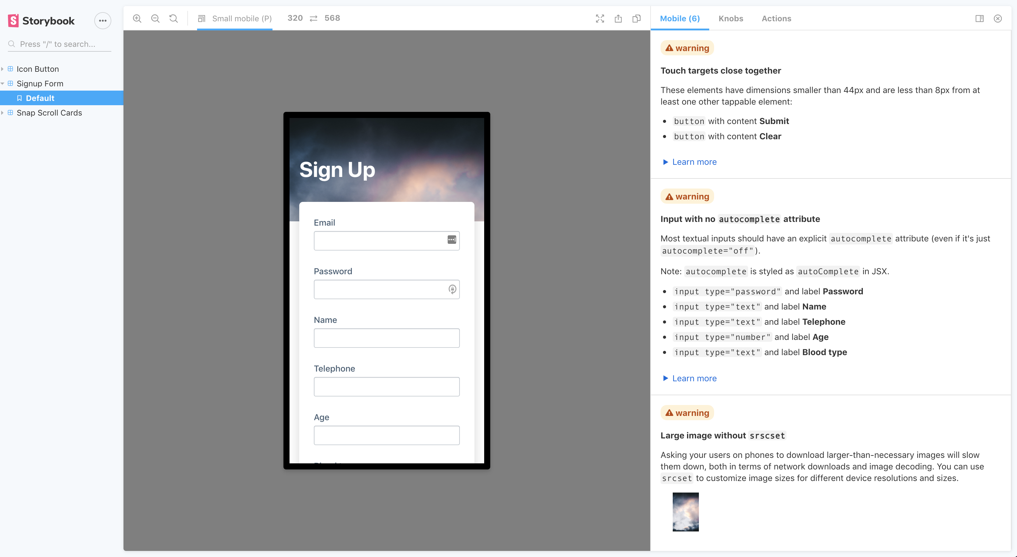
This addon offers suggestions on how you can improve the HTML, CSS and UX of your components to be more mobile-friendly.
To see all available suggestions, check out a live storybook demo here.
Quick Start
yarn add -D storybook-mobile or npm install --save-dev storybook-mobile
Next, add storybook-mobile to your list of addons:
.storybook/main.js
module.exports = {
  // other config goes here
  addons: [
+    'storybook-mobile'
  ],
}
This addon works best along with the @storybook/addon-viewport addon, so please install that as well if you don't have it already.
Contributing
If you have any suggestions or find any bugs, please make an issue or a pr!
NOTE: While developing this addon locally, if you are using npm <v7, you'll need to manually install peerDependencies like so:
npm install --no-save react react-dom