Component Encyclopedia sneak peek
Browse the world’s UI components to discover techniques that work

More teams than ever are building component-driven UIs. But every team is different and so is their choice of tools and workflow. It’s tough to figure out how to build complex UIs that are accessible, theme-able, responsive, and more.
You’ve probably read countless “best practices” that are just someones opinion. The quickest way to find out what really works is to see what your peers do. That means observing their UI development techniques to apply in your own work.
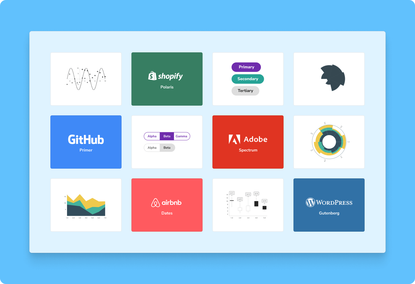
I’m thrilled to share a sneak peek of Component Encyclopedia. We scoured the web for battle-tested UI components from the likes of Adobe, Mozilla, GitHub, Wordpress, and more. Then we cataloged them in one place for you to reference as you build your own projects.
🌎 Browse the web’s UI components
🔍 Search components by framework + CSS library
▶️ Play with the live implementation (no code required)
🗺 View source to see how components work
♻️ Reuse components in your project

Wait, but why?
Thousands of teams use Storybook every day to build components for millions of people. But Storybook by itself isn’t a silver bullet – it’s a collection of tools that help you build, test, and document UI components.
Even with all the tools in the world, there’s still a gap that separates UIs created by leading teams from the UIs created by individual developers like you and me.
Most resources for UI engineering are introductory. They give you a broad overview of the discipline but don’t cover the specifics on how components are built. If you want to learn the techniques teams use to build UI components, you have to go hunting on GitHub.
Fortunately, with Storybook’s widespread adoption, we’re in an ideal position to showcase the top UI components for you to reference and reuse. That’s why we’re building the first ever UI component encyclopedia.
There’s a component for that
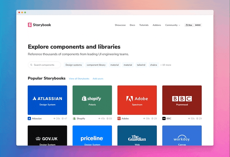
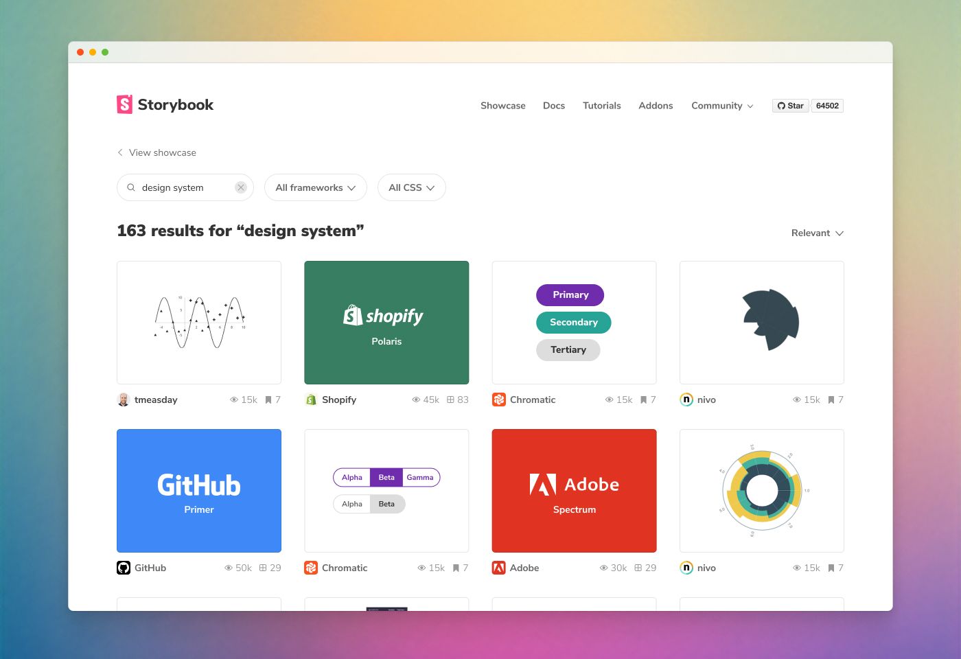
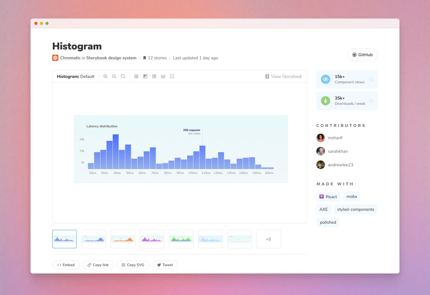
Component Encyclopedia is a visual showcase of UI components from public Storybooks that you can browse, reference, and reuse in your projects. You can see and interact with the bonafide components. No more spelunking through code or guessing about a component’s UX from a static image.
Peek at Twilio's design system. Reuse the Date component from Airbnb. Explore how GitLab builds their UI.
Browse visually
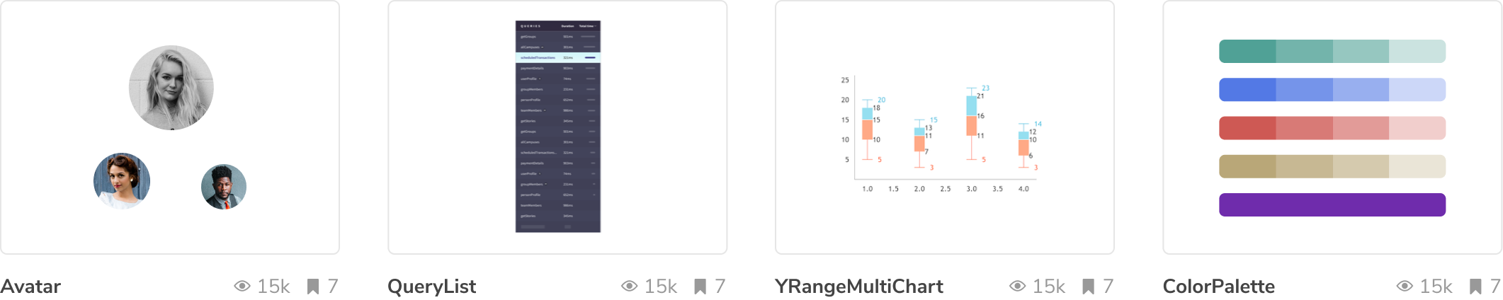
Get a visual overview of popular component libraries, design systems, and apps. Browse by tag to see all the components using a given technology like React, Vue, Emotion, and Sass. Or skim a hand-picked set of novel components chosen by our team.
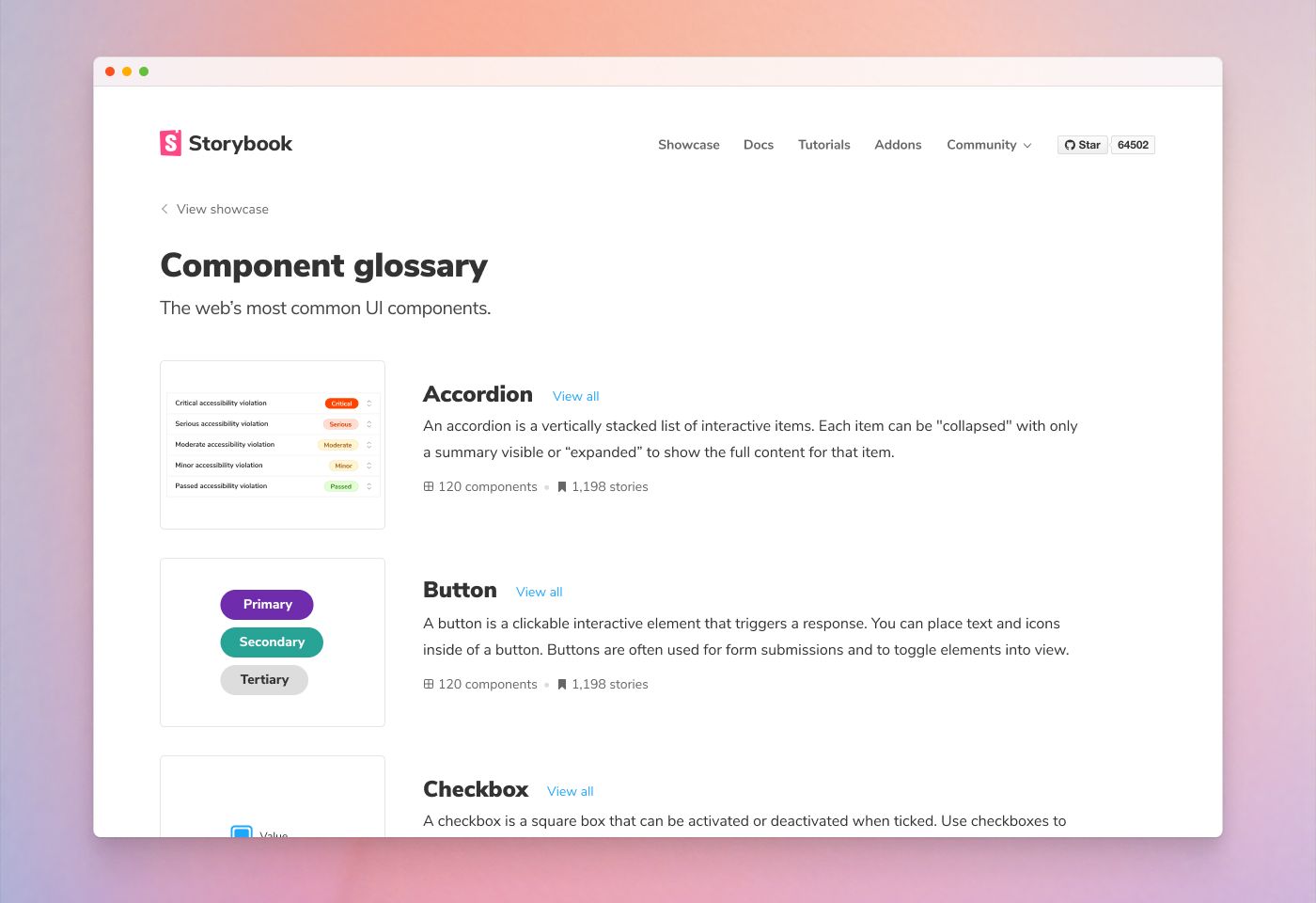
Cross-reference components
The component glossary lists the most common types of components on the web. Get a definition of what each component type is, how it’s used, and a set of canonical examples.
Search everything
We scan projects submitted to the encyclopedia to index every component. Each project’s metadata is organized by tag then ranked according to heuristics like maintenance, popularity, and downloads.
Interactive stories for live demos
Interact with the live component stories as if you’re running the code on your own machine. Jump to Storybook to see the full component development environment with Docs and addons.
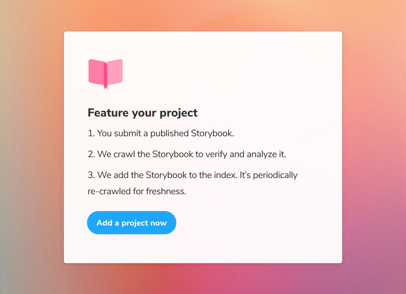
Feature your project in the encyclopedia
Our goal is to gather the web’s best components in one place for you to use a resource in building your own UIs. But it’s impossible to know where every Storybook is published.
That’s why we need your help to add projects to the encyclopedia. Submit the URL of your favorite published Storybooks here.
Sign up for early access
Component Encyclopedia is a massive undertaking that’s in active development. We need your help and feedback to bring it to life, especially during the early access period. Sign up to Storybook’s mailing list below to get notified of project updates.
Join us in Storybook’s Discord chat #showcase. We welcome contributions from new developers and veterans alike, especially when it comes to adding to the index.
Component Encyclopedia is developed by Kyle Gach, Amber Smith, Kevin Killingsworth, Tom Coleman, and Dominic Nguyen (me!) with feedback from the entire Storybook community. Special thanks to Iain Bean for the early guidance.
Sneak peek of Component Encyclopedia!
— Storybook (@storybookjs) December 8, 2021
We scoured the web for OSS UI components and put them in 1 place for you to reference while building your UIs. https://t.co/cI1IFGz7cA
🌎 Browse 1000s of UI components
🔍 Search across projects
▶️ Play with live UI implementation pic.twitter.com/f9GFs8pfsj