Stories are tests
A single source of truth for everything a component does

Imagine writing a complex function without unit tests. You would have to verify every scenario manually—over and over again. Quite cumbersome. Yet, that's how most teams build UIs. They tweak some code and then try to simulate each UI state by hand to check it. It's easy to miss bugs with this haphazard approach.
Storybook allows you to take a more organized approach to building UIs. You document a component's use-cases as stories, which are then rendered in isolation. These stories act as unit tests but for rendered components. You can actually verify the rendered output in a browser.
Storybook is the industry-standard UI development workshop for components. It's used by Netflix, Slack, Stripe, and thousands of teams worldwide because it allows them to adopt a test-driven approach for UIs. Let's see how.
Unit tests with eyeballs
Software is ever-changing. You fix bugs and ship new features. However, it’s unrealistic to go back and verify every component any time you make a change. Especially when you don’t have unit tests to assist you.
Contrast that with how most teams write non-UI code. Each function has a suite of unit tests. They’re executed on every push to catch regressions. They also allow developers to think clearly about what the code needs to do in different scenarios.
However, unit testing flops for UIs because it’s hard to isolate components, and most testing tools do not allow you, the developer, to visually verify the interface.
To test a function, you can use a framework like Jest. It enables you to write well-defined test cases and execute each one in isolation. Notably, the tests run in a clean environment and not the application.
If we try to use this infrastructure to test components, we run into one big issue. These tests don’t have eyeballs! They run in Node, probably using JSDOM. This means we can’t look at the UI and verify its appearance. For that, we have to render each component on its own—in a real browser.
What we need is a sticker sheet for coded components.
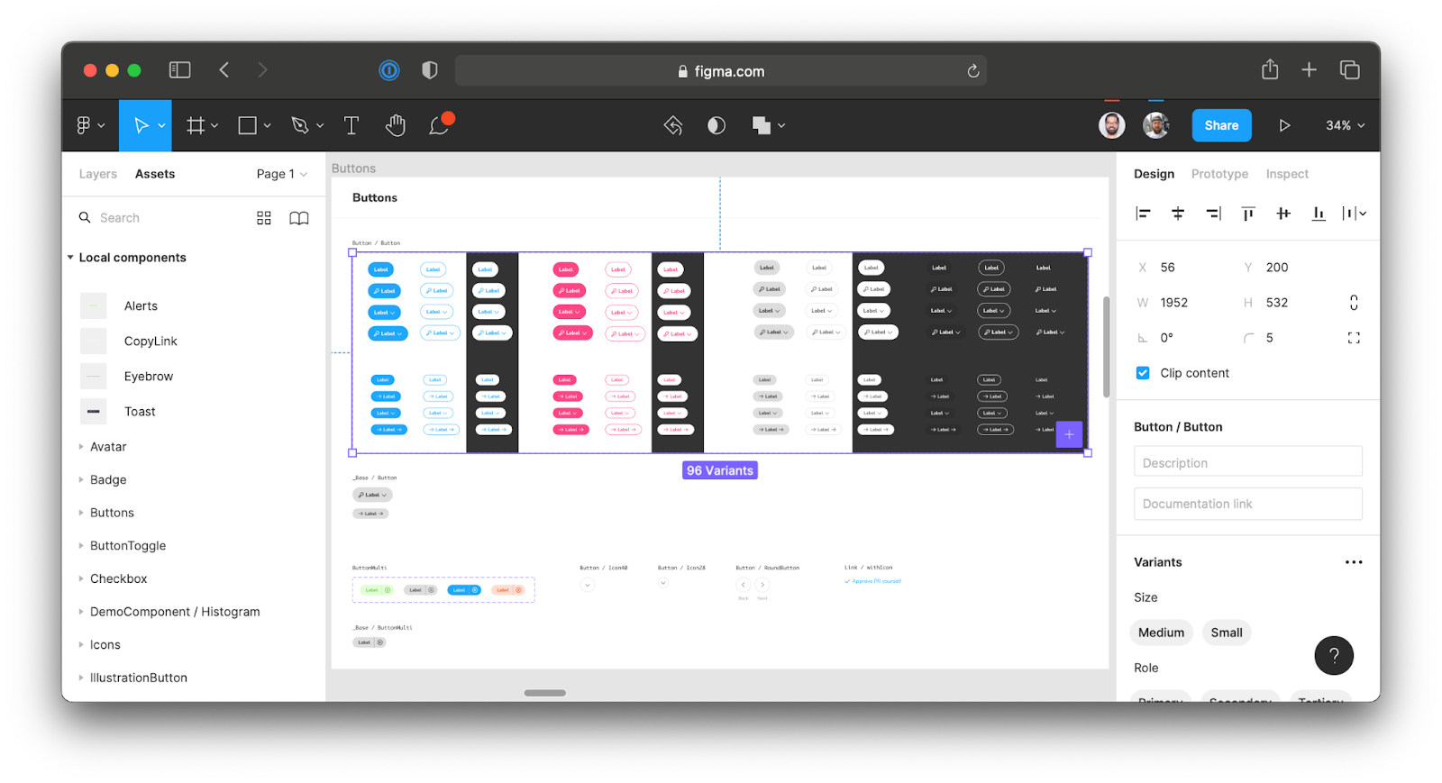
Ever noticed how designers set up Figma or Sketch files? They usually assemble a grid of symbols. Each represents one state of the component. Any time the designer makes a change, they can quickly verify all the variants for their correctness.
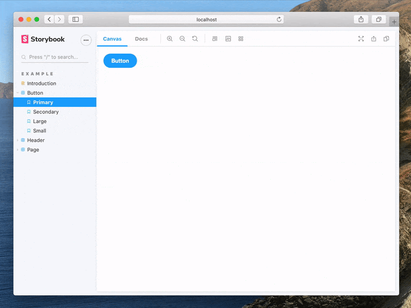
That’s what Storybook does for UI developers. It catalogs every component and the various ways they can be used. Components are rendered in isolation to simplify development and testing.
Stories are visual test cases
A test consists of three things: Setup, Action and Assertion. Let’s break that process down for Storybook:
- Setup: each story describes one use case of the component. You supply the appropriate props and data required for that state.
- Action: Storybook renders this component in a browser.
- Assert: You visually inspect the story and manually test interactions.
During development, you can cycle through the stories to run a quick manual verification. You’re effectively writing unit tests for the interface. A visual unit test!
That said, there is more to a component than just what it looks like. You also need to verify its accessibility, the underlying logic and how it fits into the larger system. Stories are a jumping-off point for automation and other forms of testing.
Write once, test everywhere
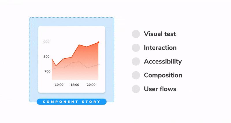
Before we begin, it’s worth revisiting the different characteristics of a component that warrant testing:
- Visual: does a component render correctly given a set of props or state?
- Composition: do multiple components work together?
- Interaction: are events handled as intended?
- Accessibility: is the UI accessible?
- User flows: do complex interactions across various components work?
There are different tools for checking each of these facets. If you test each facet independently, you end up replicating component states over and over. That’s a headache to set up and maintain.
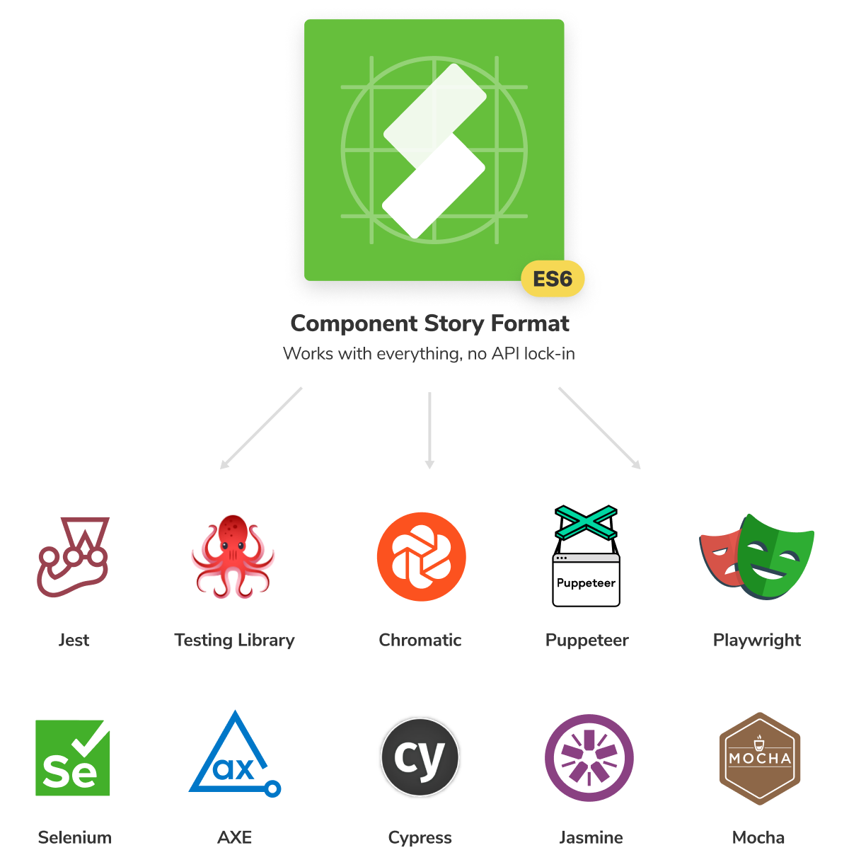
A *.stories file is a record of how a component can be used. It’s a source of truth for component states, which is also what you want to test in your UI. They are written using an interoperable standard based on ES6 modules called the Component Story Format. Each story is exported as a JavaScript function enabling you to reuse them with other tools.
You can use them with Testing Library to verify interactions and underlying logic. In Chromatic for visual regression testing. Or Axe to audit accessibility. Or Cypress to test user flows. All powered by the same set of stories!
What about components that are more than a simple function? Complex components rely on context, data, application state and more. Once you’ve configured that in Storybook, you can reuse the configuration in other testing tools.
Portable stories
Storybook and its ecosystem of addons allow you to mock data, state and even API responses. That enables you to build and test complex connected components in isolation. What’s more, any setup you do in Storybook is portable to other testing tools.
The @storybook/testing-react and @storybook/testing-vue packages provide utilities to hoist all the providers, context & decorators wrapping your stories. All that configuration you’ve done to isolate components can be re-used in Jest, Cypress, etc. Here’s an example:
import { render, screen } from '@testing-library/react';
import { composeStories } from '@storybook/testing-react';
import * as stories from './Button.stories';

/**
 * Every component that is returned maps 1:1 with the stories.
 * But, they also contain all decorators from story, meta and global levels.
 */
const { Primary, Secondary } = composeStories(stories);

test('renders primary button with default args', () => {
  render(<Primary />);
  const buttonElement = screen.getByText(
    /Text coming from args in stories file!/i
  );
  expect(buttonElement).not.toBeNull();
});

test('renders primary button with override props', () => {
  // You can override props and they will get merged with values from the Story's args
  render(<Primary>Hello world</Primary>);
  const buttonElement = screen.getByText(/Hello world/i);
  expect(buttonElement).not.toBeNull();
});When you write test cases once as stories, it’s easy to layer any form of assertion on top.
Storybook is made for UI testing
Developing components without unit tests not only takes longer but it makes it impossible to catch all bugs. It’s often hard to simulate all the test cases you want to cover. Or you might miss a state completely. Storybook makes it easy to render components in isolation and explore all their permutations. Allowing you to adopt a more organized and test-driven approach to building UIs.
A stories file is a catalogue of all the important use cases of your component. It’s a portable artifact that allows you to verify interactions, accessibility and application logic using other testing tools such as Testing Library, Jest and Axe.
Stories are the source of truth for your components. They allow you to spot check appearance during development. Catch regressions or check the functional qualities using automation. And finally, generate essential documentation for all your UI elements.
Unit tests, but for UI
— Storybook (@storybookjs) June 30, 2021
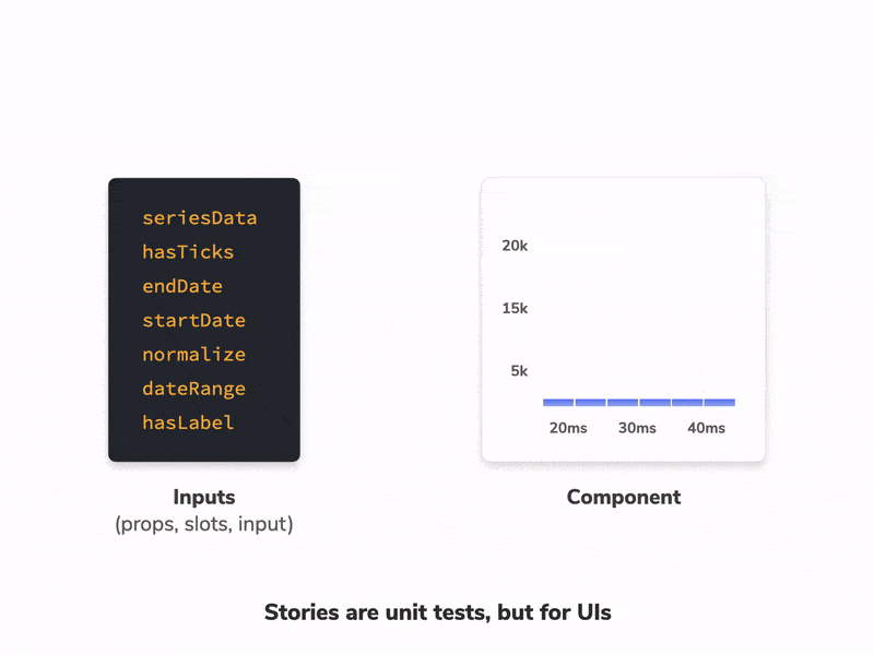
Each story has a fixed set of inputs, it renders in isolation and allows you to visually inspect the output. Just like a unit test.
You can even layer on automation to:
✅ Catch regressions
🩺 Check functional qualitieshttps://t.co/qG9bTn8Ve6 pic.twitter.com/6PfT1t0m6I