
Storybook 7.0
Next-level component development and testing

Storybook is the gold standard UI workshop environment. It’s used across the industry by teams at Monday.com, The Guardian, Intuit, and many others due to its unparalleled framework compatibility and rich features for development, documentation, and testing.
Today, I’m excited to announce Storybook 7 (SB7), our first major release in over two years and by far our largest ever.
It includes:
- ⚡ First-class Vite support
- 🧩 Zero-config support for NextJS & SvelteKit powered by the new Frameworks API
- 🔖 Component Story Format 3 with improved type safety
- 📝 Docs overhaul: MDX2 support & streamlined doc blocks
- 💅 UI design refresh
- ✅ Improved interaction testing & test coverage
- 🚥 Enhanced stability via pre-bundling and Ecosystem CI
- 💯 Hundreds more improvements at every level
Read on to learn about everything coming with Storybook 7. These improvements are also summarized in the presentations shared throughout Storybook Day.
Storybook: the next chapter
Storybook started in 2016. Since then, we pioneered the idea of a UI workshop environment for component-driven development, documentation, and testing.
During this time, the frontend ecosystem changed dramatically. IE11 has finally faded away. TypeScript is rapidly consuming the JavaScript landscape. Vite, Turbopack, and Rspack are giving Webpack some serious competition. And pnpm is now a major npm alternative.
Storybook evolved alongside these changes, and we’ve long supported mainstream conventions and emergent best practices. Storybook first supported Vite in mid-2021, for example, long before it reached its current success.
However, incremental adaptation is hard. Sometimes, you need a major release to clear the decks and modernize your stack. Storybook 7 is that release!
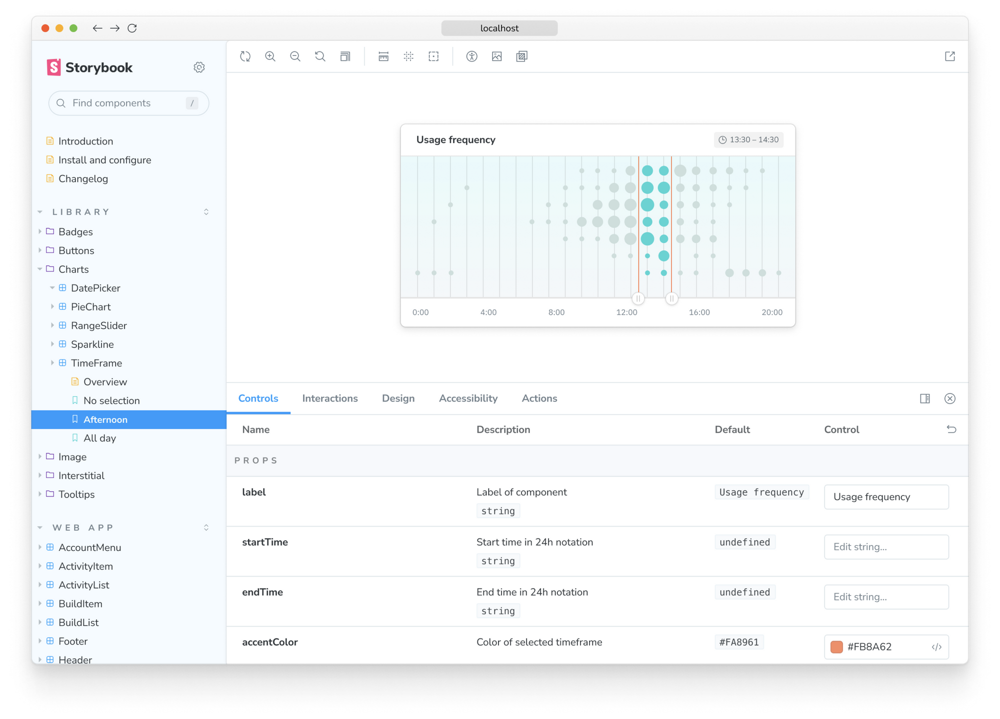
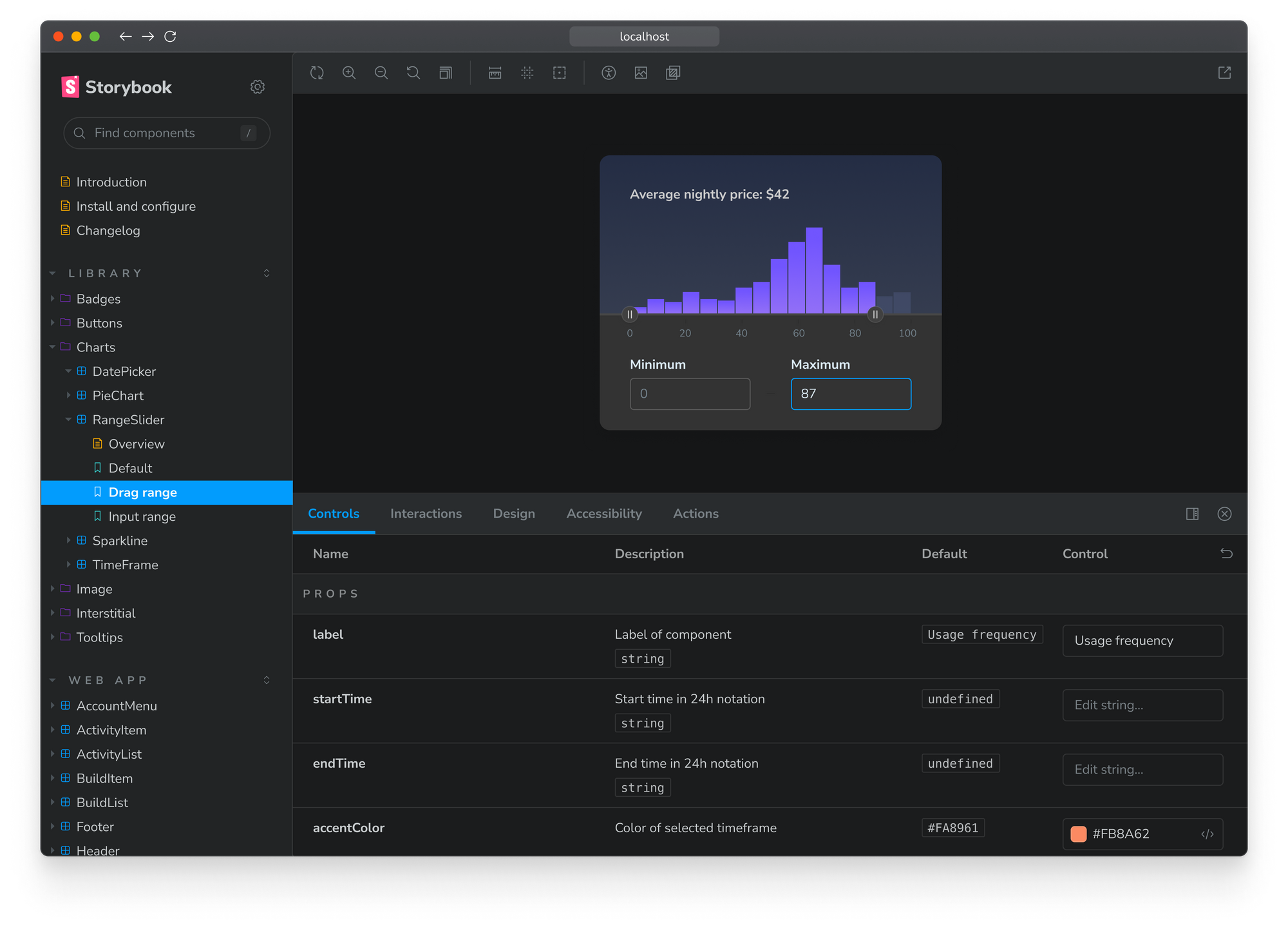
UI design refresh
You can now ship fantastic UIs with more ease than ever before with Storybook 7’s streamlined UI. The Canvas size has expanded edge to edge, providing more space for your components. We enhanced the sidebar with improved spacing and a subtler menu while keeping information density intact. Plus, we've redrawn over 200 custom icons for sharper visuals and faster loading. And let's not forget about automatic dark mode!
Pre-bundled for faster startup and zero dependency conflicts
The Storybook app now ships as a pre-compiled codebase, eliminating the need for you to compile it yourself. That means faster startup times and no more dependency headaches. Pre-bundling eliminates the need to install Storybook's dependencies in your codebase.
Zero-config support for Vite, NextJS & SvelteKit

Storybook 7 introduces zero-config Vite, NextJS, and SvelteKit support. Our new Framework API configures Storybook based on your app settings, including your choice of builder (Webpack & Vite), renderer (React, Vue, Angular, Svelte, HTML), and more!
For Vite, Webpack is now out of the picture. Storybook configures automatically from your application’s Vite settings, with reduced install size and startup times. Read more in First-class Vite support in Storybook.
For NextJS, Storybook now mocks the router automatically. There’s also in-built support for utilities including next/font, next/image , and absolute imports. Read more in Integrate Next.js and Storybook automatically.
For SvelteKit, this means framework-specific settings are automatically configured, such as safe retrieval of asset paths with $app/paths, support for $app/stores and the special $lib import alias, and enabling components to access $app/environment. Read more in Storybook for SvelteKit.
To learn more about the Framework API, check out: NextJS, SvelteKit, Remix, and the future of Storybook.
CSF3 with improved type safety

Storybook 7 brings major improvements to writing stories by making Component Story Format 3 (CSF3) its default format. CSF3 packs two major advantages over earlier versions: its brevity and its reusability. It streamlines your code by discarding lots of boilerplate and it automates aspects of stories like their titles and their sidebar location (based on disk location). Read more in Component Story Format 3 is here.
Improved type safety
We’ve revamped TypeScript support in CSF3. Stricter types provide better in-editor checking and autocompletion, which represents a huge quality-of-life upgrade for TypeScript users. For a full debrief, check out:
 Kasper Peulen
CSF3 migration
We provide a codemod that automatically converts your existing stories to the CSF3 syntax to save you time with upgrading. But SB7 is fully backwards compatible – so if you’re not ready to upgrade, you don’t need to change a thing.
npx storybook@latest migrate csf-2-to-3 --glob="**/*.stories.js"
Docs overhaul with MDX2 support
Storybook 7’s overhaul of Storybook Docs is the biggest change in SB7 and marks a massive improvement over previous Storybooks.
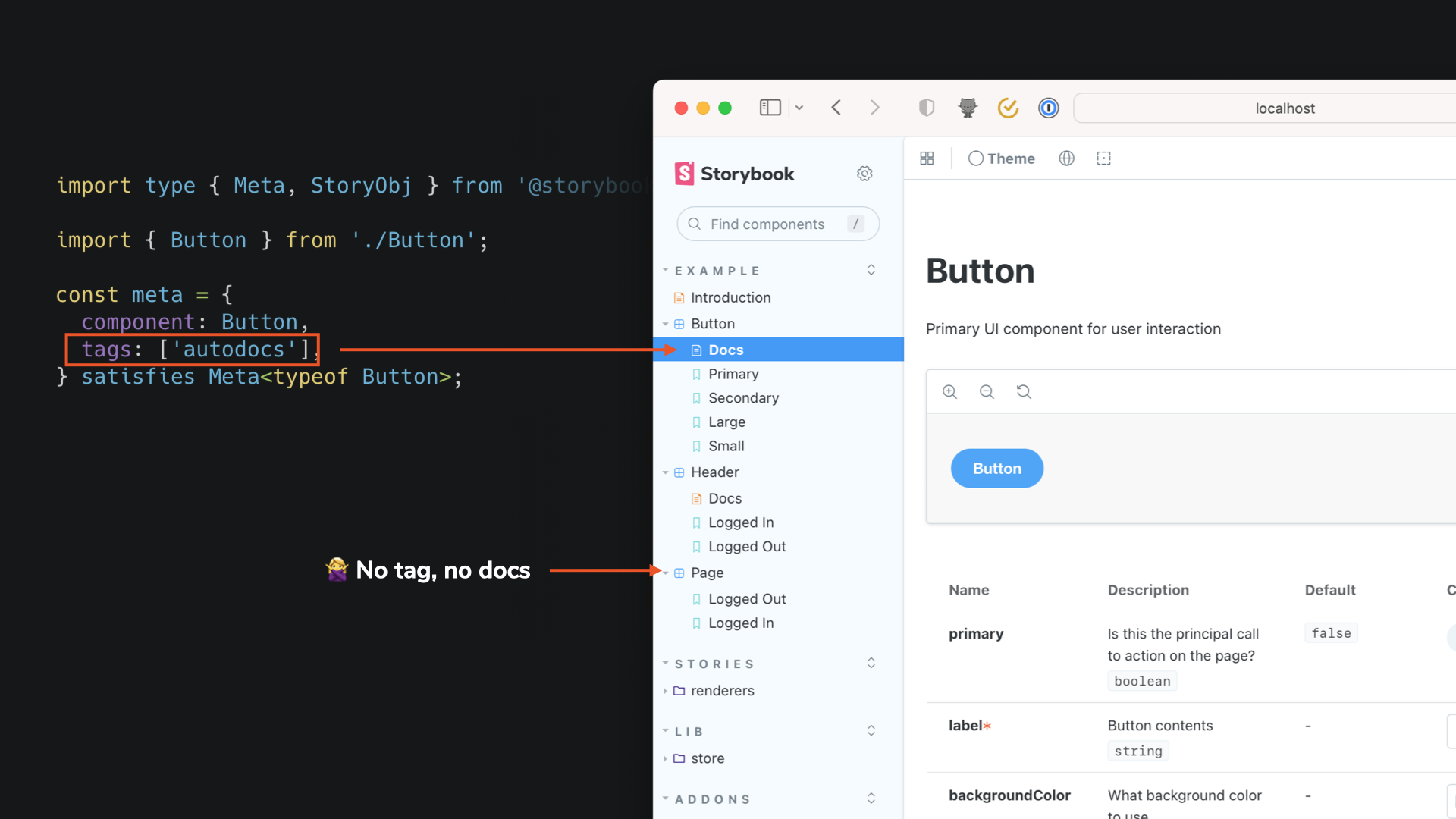
Autodocs are now component-centric
In Storybook 7, you can now attach docs directly to your components. Pages appear in the sidebar alongside a component’s stories, instead of in the previous tabbed UI.
You can enable auto-generated docs pages for a component by adding the autodocs tag.
Improved manual documentation with MDX 2
Storybook 7 packs enhanced manual documentation with MDX2 support. It creates a multitude of benefits – including improved performance and ergonomics. The new version compiles 25% faster and generates code that runs twice as fast. Plus, it provides much better support for nesting markdown within JSX elements.
To accommodate some breaking changes, Storybook will maintain opt-in support for MDX1 throughout the 7.x timeframe, ensuring a smooth transition for our users.
Import stories by reference using MDX
Storybook 7 encourages all users to define stories in CSF3 and then reference them in MDX. This gives you the best of both worlds: type checking and autocompletion while writing stories, plus ease of authoring with markdown. You can split existing MDX story files into a separate MDX and CSF file using the Storybook 7 migration script below.
npx storybook@latest migrate mdx-to-csf --glob "**/*.stories.mdx"
New Docs Blocks API – powerful yet simple
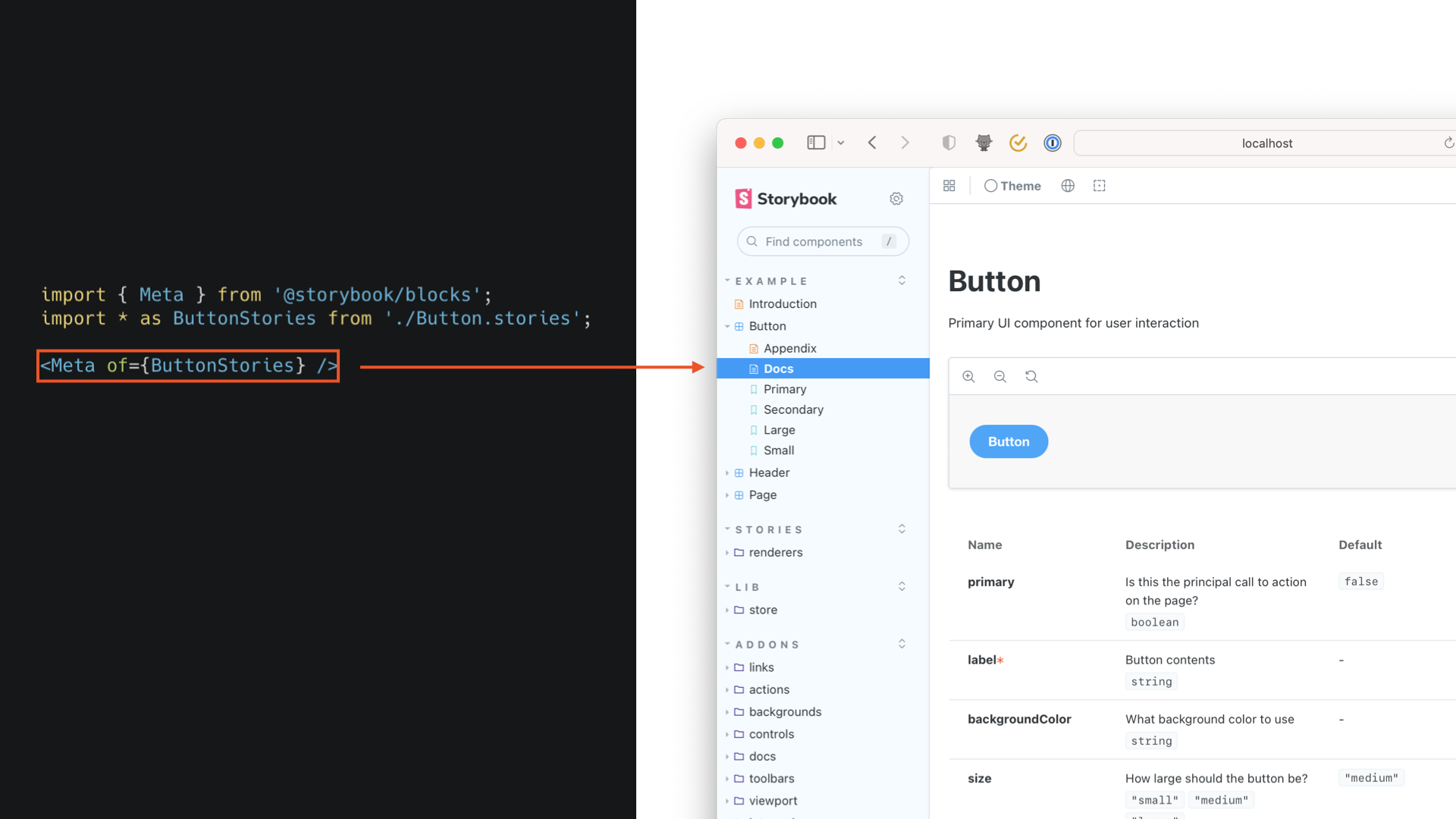
To make your docs even more effective, we’re introducing a more powerful and consistent set of Doc Blocks. These UI blocks are responsible for everything from rendering stories to displaying source code and generating the args table. They can reference stories using the of={} syntax, which is safer and cleaner than referencing story ID strings. Plus, we've included a useOf hook for creating custom Doc Blocks, letting you adapt docs pages to your specific requirements.
Read more about these changes:
Tom Coleman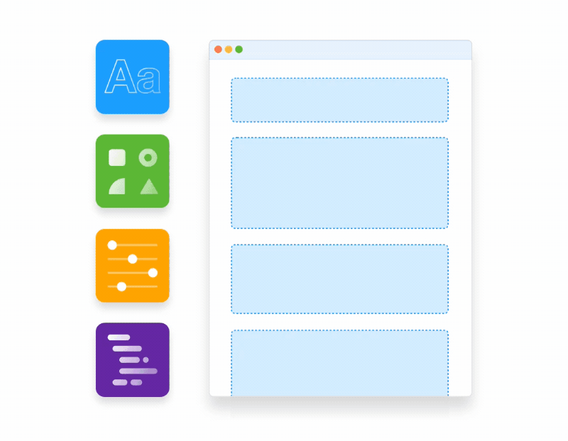
Improved interaction testing and code coverage
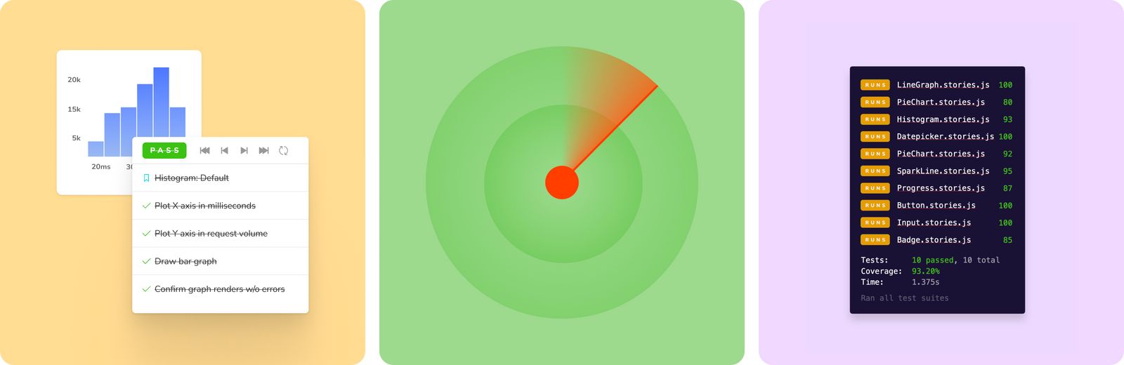
Storybook has quickly become the best option for testing components. You can transform a story into a test by attaching a play function to it. Then, use the familiar syntax from Testing-Library and Jest to simulate events and assert DOM structures.
This is especially helpful when testing complex UI interactions, such as form controls or other stateful components. You can debug event flows in the browser and use our test runner to execute all your tests from the command line in parallel.
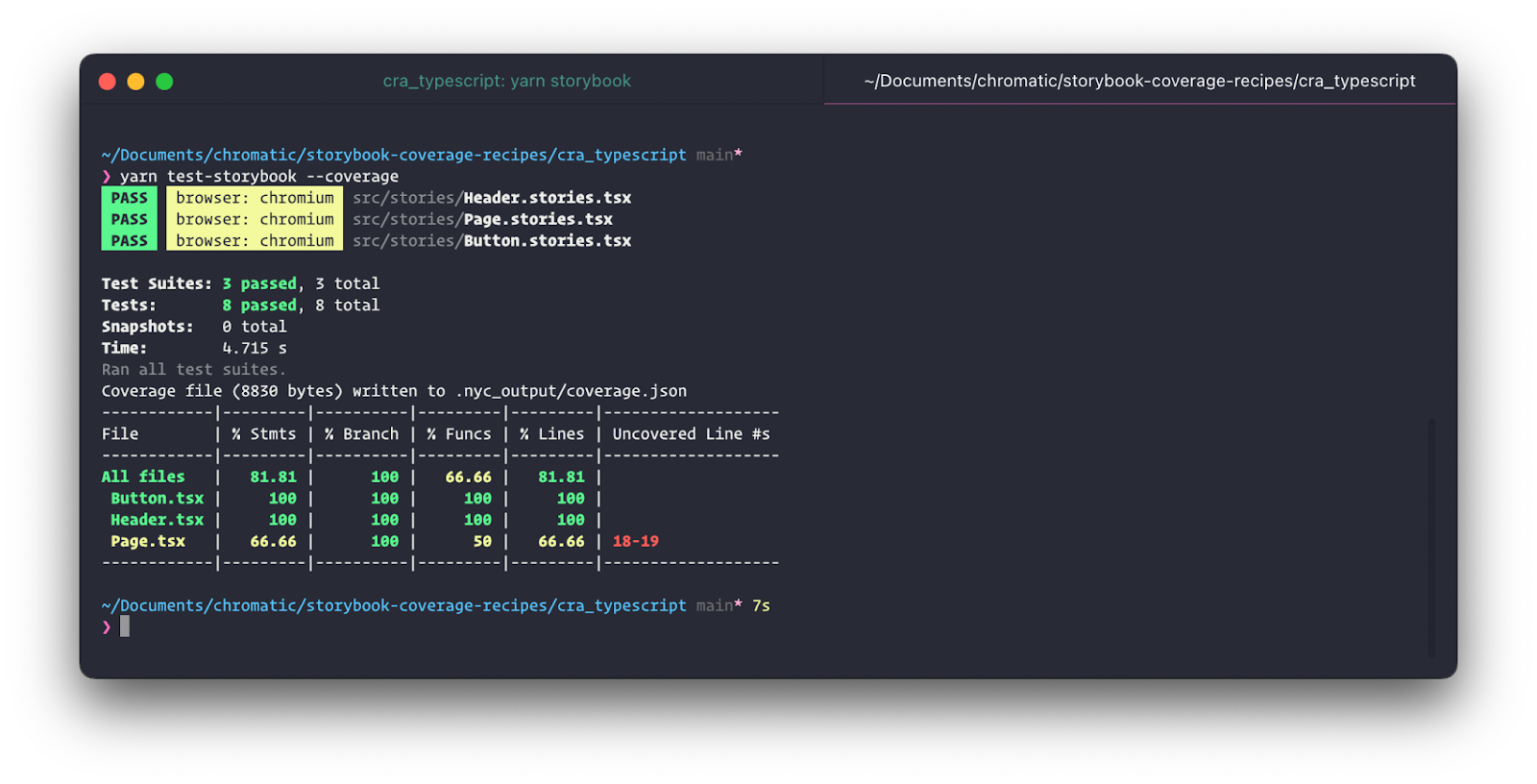
Coverage reports
In Storybook 7, we've improved testing support by adding code coverage, which scans your code for untested edge cases. It helps you write more comprehensive tests and increases your confidence in the UIs you ship. Read more in Code coverage with Storybook test runner.
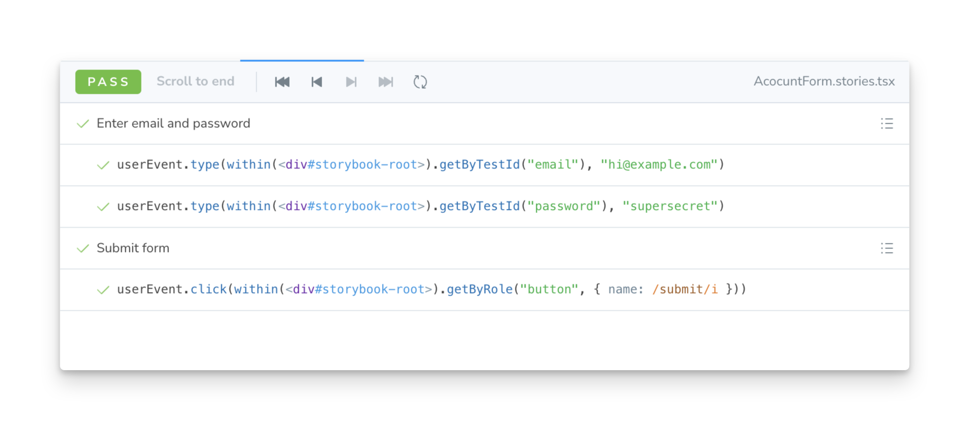
Group steps
To enable you to combine interactions into human-readable groups, we've added a new construct called step to Storybook's play function. This improves both legibility and reuse.
// SignupForm.stories.ts

// Replace your-framework with the name of your framework
import type { Meta, StoryObj } from '@storybook/your-framework';
import { userEvent, within } from '@storybook/testing-library';
import { SignupForm } from './SignupForm';

const meta: Meta<typeof SignupForm> = {
  title: 'SignupForm',
  component: SignupForm,
};
export default meta;
type Story = StoryObj<typeof SignupForm>;

export const Submitted: Story = {
  play: async ({ args, canvasElement, step }) => {
    const canvas = within(canvasElement);

    await step('Enter email and password', async () => {
      await userEvent.type(canvas.getByTestId('email'), 'hi@example.com');
      await userEvent.type(canvas.getByTestId('password'), 'supersecret');
    });

    await step('Submit form', async () => {
      await userEvent.click(canvas.getByRole('button'));
    });
  },
};
Ecosystem CI for better stability and smoother upgrades
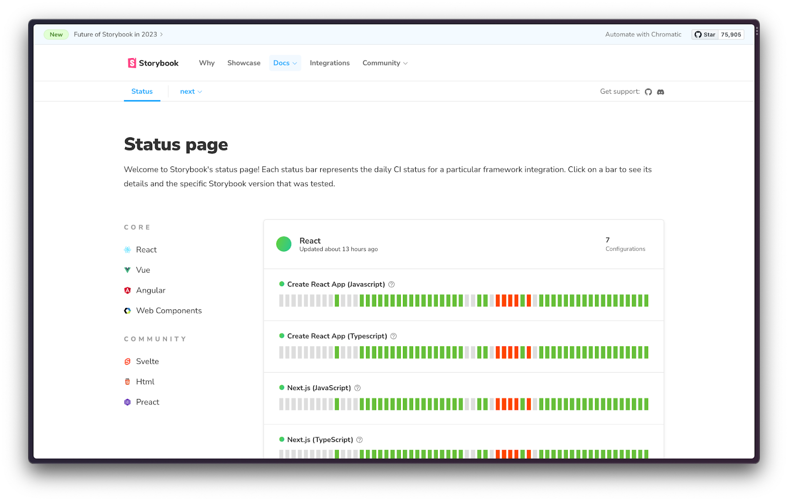
Supporting dozens of frameworks, renderers, and builders in a rapidly-changing frontend ecosystem is a challenge. To improve Storybook’s stability, we’re starting to treat Storybook like a service, and we want to maximize its “uptime” in this ever-evolving environment.
To accomplish this, we’ve created Storybook Ecosystem CI. This feature tests Storybook PRs against a large matrix of standard project configurations. This is all visualized in a public status page that shows the daily results and gives a snapshot of Storybook’s stability. If you notice something that seems broken, check this page to see how Storybook’s doing.
Read more in Storybook Ecosystem CI.
Styling addon for easier config
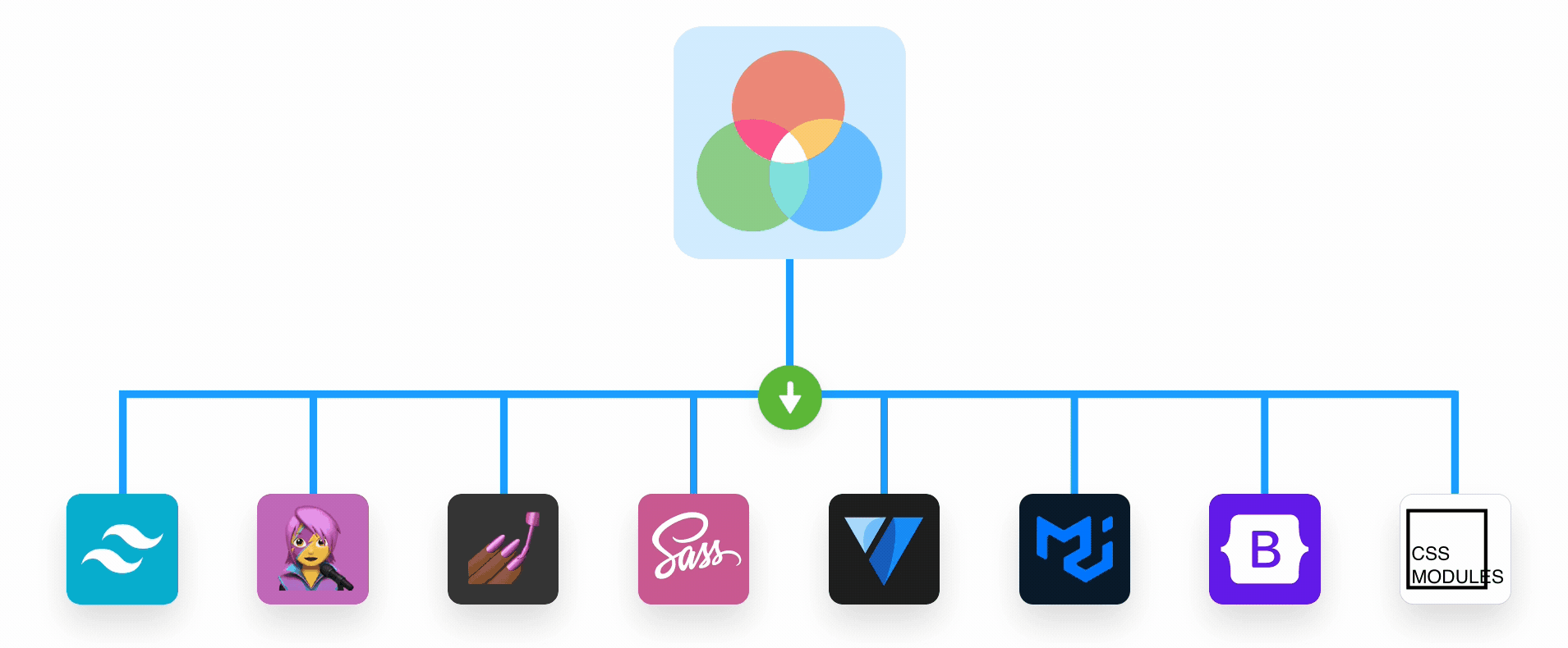
Setting up styling tools with Storybook is a common challenge for many developers. While there are plenty of articles out there (including several on our blog), these aren’t always up to date, leading to headaches and a time-consuming setup process filled with trial and error.
To make this process easier and more straightforward, we’ve created a new Styling Addon. This is a framework-agnostic solution that works seamlessly with popular tools like Tailwind, Material UI, Chakra, Emotion, Styled-components, SASS, and PostCSS.
The Styling Addon enables you to load and apply global styles to your components, as well as wrap stories with theme providers. It even features a theme switcher, allowing you to easily toggle between themes. Alternatively, you can override theme values at the story level using parameters.
Getting started is a breeze, check out: Styling Addon: configure styles and themes in Storybook
Hundreds more improvements
In addition to everything above, Storybook 7 contains countless other improvements and bugfixes. Highlights include:
- pnpm support. No more shameful hoisting needed!
- Angular improvements. Better installation. Dozens of bugs fixed.
- Vue3 improvements. Source snippets, slots support.
- Default exports in SB
main/previewconfigs with TypeScript types. - SolidJS integration. Community-driven SolidJS Vite support.
- Qwik integration. Community-driven Qwik support.
- Rspack integration. Community driven Rspack (Rust port of Webpack) proof of concept builder.
Browse the full changelog for the full list of changes.
Upgrade today!
To upgrade your Storybook, run:
npx storybook@latest upgrade
This will update Storybook dependencies to the latest version. It’ll also run automigrations. You'll be prompted for your approval during upgrade tasks, and provided with information on any necessary changes.
To mitigate any breaking changes, we’ve assembled a migration guide to help you upgrade from Storybook 6.x to Storybook 7.0 successfully!
Addon upgrades
While Storybook's addon API has remained mostly unchanged over the past couple of years, Storybook 7 features a few updates to the addons API and simplifies how addons are registered. Though register.js was deprecated in SB 6.5, it is now fully removed in SB7.
How does this impact you?
For addon users: All of Storybook's core addons have been updated and are ready to use with Storybook 7.
We're working with the community to update the most popular addons. But if you're using an addon that hasn't been updated yet, it might not work or Storybook might fail to start entirely.
When this happens, please open an issue on the addon's GitHub repository and kindly ask the author to update their addon to be compatible with SB7. Also, please notify the Storybook team by creating an issue on the Storybook repo, especially if it’s a popular one that causes a critical failure.
For addon authors: If you're an addon creator, you'll have to update your addon to use the new APIs. To help make your addon SB7 compatible, we’ve created an addon migration guide. We’re tracking the community addons upgrade progress here:
 storybookjs
Get support
If you run into issues while migrating, chat with the maintainers in Discord 🤝#support. We’re doing our best to help with questions and fix bugs.
The road ahead
Storybook 7 is a major milestone. The entire team is on deck to help you upgrade and iron out any bugs and use cases we missed during the prerelease period.
We’ve learned a lot along the way and, moving forwards, we plan to develop and release Storybook differently.
Annual major releases
Stacking up years of breaking changes causes a lot of pain.
- Pain for users waiting for breaking changes (dropping Webpack4, MDX1, etc.)
- Pain for users upgrading with numerous migration steps (even though we’ve automated a lot of it, there’s still plenty to go wrong).
- Pain for the team to maintain deprecated APIs and coordinate mega-releases like v7.
Packaging our changes into smaller, more frequent releases should make future upgrades much smoother for everyone. Meanwhile, automigration improvements will reduce extra headaches dramatically.
Solidifying abstractions
Component Story Format 3 is our fourth iteration of how to write stories in six years. Each step along the way has been incremental and had automated codemods, but it’s been a bumpy ride for our users.
We think Storybook 7 gets a lot right and intend that future major releases will be more around supporting the latest versions of various tooling, and less about reworking the fundamentals of how to develop, document, and test components.
Beyond that, we have big plans for 2023.
Performance and stability
We’ve made huge strides in both of these areas as part of Storybook 7, especially with first-class Vite support. But we’ll be continuing to push on these in 2023, and already have a couple breakthroughs up our sleeves that we’re excited to release over the coming months.
Framework support
Storybook 7 sets the standard for framework support, delivering first-class experiences for Vite, NextJS, and SvelteKit. We’ll continue to improve these integrations and more will come as we continue building with the Storybook community.
Setup and configuration
We’ll be investing heavily in the install and configuration flow for new users. Many of these improvements—e.g. better error handling and documentation—should also create a much better experience for existing users.
Testing
Storybook’s play function and testing capabilities are game-changing for UI development. SB7’s coverage reporting fills an important gap to make this more useful. We have a long list of quality of life improvements here that we’ll be rolling out in 7.x, especially around better mocking, full page testing, and compatibility.
Get involved
Professional UI developers rely on Storybook every day. When you adopt Storybook, you get a suite of tools, powerful addons, and out-of-the-box integrations that make development faster.
The project is maintained by 1,600+ open source contributors and guided by a steering committee. If you are interested in contributing, check out Storybook on GitHub, create an issue, or submit a pull request. Donate on Open Collective. Chat with us in Discord — a maintainer is usually online. Stay up to date with Storybook news on Twitter or by signing up to our mailing list below.
Credits
Storybook Day was a celebration of Storybook 7 improvements and use cases from the community. Massive thanks to everybody who participated. Enjoying the livestream together with our users was one of the all-time highlights of maintaining Storybook.
Storybook 7 core team
Michael Arestad, Yann Braga, João Cardoso, Michael Chan, Tom Coleman, Norbert de Langen, Shaun Evening, Kyle Gach, Gert Hengeveld, Dom Nguyen, Valentin Palkovic, Kasper Peulen, Chakir Qatab, Jeppe Reinhold, Kai Röder, Michael Shilman (me!), Mostafa Sherif, Varun Vachhar, Ian Van Schooten, Daniel Williams, Josh Wooding, Vanessa Yuen
Storybook 7 contributors
@abrahambrookes @acdr @acusti @agarun @agriffis @akarachen @alex-ahumada @alexandertrefz @alexguja @all-self-taught @andarist @ariperkkio @armujahid @b2y4n @barsheshet @bartlangelaan @benmccann @blackthread @blakegearin @bodograumann @bovandersteene @bryanjtc @bytrangle @ccatterina @chakas3 @clintandrewhall @coofzilla @d-koppenhagen @danielamram @dannyhw @darenbt @darleendenno @dartess@ ddalpange @delagen @domyen @donotlb @donskelle @dschungelabenteuer @duncan-c @edo-san @eirslett @eltociear @enterframe @esilverm @estebanfelipep @ethanmick @ethriel3695 @evad1n @ezmnysniper7 @fazulk @flynnfc @ganhinglong0423 @geisterfurz007 @georgialoper @geromegrignon @ghengeveld @ghidersamihaela @gipoezcan @gitstart @greglahaye @halkeye @hayawata3626 @huyenltnguyen @ianvs @imgbotapp @integrayshaun @interphased @jacob-mns @jahrock @javier-arango @jeangregorfonrose @jeroenhabets @jnschrag @johnalbin @jonathankolnik @jonniebigodes @josh-the-dev @joshbolduc @joshwooding @joycebrum @jpzwarte @jreinhold @jrencz @jsflor @julo01 @jungpaeng @justineloff @justineloffbbd @kasperpeulen @kingdutch @kk3939 @konsalex @kqito @kroeder @krofdrakula @kylegach @kylemeenehan @lalanthawi @lbbo @lifeiscontent @literalpie @liwn9527 @lubnafathima @luciana-mendonca @madarauchiha-314 @magicismight @mandarini @marcelckp @mariasimo @marioarnt @marklb @mattevenson @matthew-smith @mayank99 @merceyz @messenjer @michaelarestad @mihkeleidast @minimalsm @mnigh @mrb1nary @mrhappyma @mz8i @ndelangen @neogeek @nightvision53 @nix6839 @noahnu @noltron000 @nxtivision @nxtpge @ohana54 @okuramasafumi @orisomething @pankali @paulaxisabel @petermakowski @platiplus @pocka @prashantpalikhe @pratikkarad @programmarchy @projektgopher @raptor0929 @redbugz @reech-florian @rendez @richardnorton @rmariuzzo @roottool @ropereralk @rvrvrv @sabrinajess @saunved @sebastiankapunkt @shariqx5 @sheriffmoose @shilman @simenb @smores @sorakumo001 @sosensible @spaceribs @sriram-km @sruthigithub @ssams @sterashima78 @stijnvn @sueperstar @sun0day @ta1m1kam @tadavid-cae @thebuilder @timur-svoboda @tmeasday @tobiasdiez @tomastomaslol @valentinpalkovic @vanessayuenn @webblocksapp @winkervsbecks @yamanoku @yannbf @youngboy @yuisato1025 @yuri-scarbaci-lenio @zhyd1997 @zigang93
Storybook 7, the next chapter of Storybook, is here!
— Storybook (@storybookjs) April 12, 2023
🚀 Storybook’s biggest ever update – our first major release in 2 years!
⚡️ Zero-config support for @vite_js, @nextjs & @sveltejs
💯 Enhanced testing, Docs, UI, stability, and so much more
Read on:https://t.co/L8zqHkilis pic.twitter.com/nbmq4jDW6e