
Storybook + Netlify CMS
Bring your content to Storybook

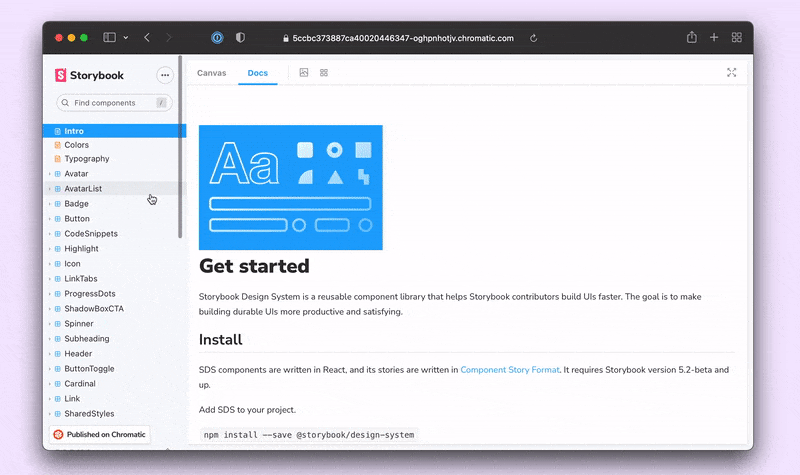
When you build components with Storybook, you get documentation for free. The Docs addon analyzes stories to generate documentation pages with code examples, props table and usage guidelines. Teams at Audi, Codecademy, Talend and Wix use Storybook to build their design system sites.
If you’re a developer, it’s handy for stories and docs prose to live side-by-side in MDX files. That way, you can theme the site using React components, compose in Markdown, and version control with Git.
But non-technical teammates might not use Git or pull requests. Design system docs involve designers, product managers, testers, and countless other stakeholders. This article shows how to wire up Storybook to a headless CMS to allow your entire team to contribute to documentation.
Why use Storybook for documentation?
Teams use Storybook for documentation because it analyzes a component’s properties to generate rich docs. That allows you to focus on writing usage guidelines instead of manually keeping API docs updated.
The docs feature is powered by MDX, which combines the authoring of Markdown and the interactivity of JSX. For developers, it’s straightforward to open the *.stories.mdx file in a code editor, add a commit, and open a pull request.
But design system maintainers often have a variety of stakeholders who aren’t technical. The git workflow that’s easy for developers can unintentionally limit who contributes to the documentation. Luckily, it’s straightforward to integrate a headless CMS into Storybook.
Source content from a Headless CMS
By wiring up Storybook to a headless CMS, you make editing easier for everyone. The CMS gives you a GUI editor for the text content while Storybook acts as the front-end. There are tonnes of fantastic headless CMS options. Pick the one that best fits your needs. Then during build time, Storybook will query this content and render it on the various documentation pages.
Example with Netlify CMS
We'll use Netlify CMS to provide a GUI editor for the MDX files used by Storybook. It treats your Git repository as the source of truth.To get started, you’ll need to publish your Storybook to Netlify first. Then to set up Netlify CMS, create an admin folder in your static directory and add a config.yml file. This configures Netlify CMS to source your MDX files and make them available for editing via the CMS interface.
# config.yml
backend:
 name: git-gateway
 branch: main

local_backend: true

publish_mode: editorial_workflow

media_folder: 'public' # Media files will be stored in the repo under public/
public_folder: '/' # The src attribute for uploaded media will begin with /

collections:
 - name: 'docs' # Used in routes, e.g., /admin/collections/docs
   label: 'Docs' # Used in the UI
   folder: 'src' # The path to the folder where the mdx documents are stored
   create: true # Allow users to create new documents in this collection
   extension: mdx
   slug: '{{title}}.stories' # Filename template, e.g., title.stories.mdx
   format: yaml-frontmatter
   frontmatter_delimiter: ['<!--', '-->']
   fields: # The fields for each document, usually in front matter
     - { label: 'Title', name: 'title', widget: 'hidden' }
     - { label: 'Body', name: 'body', widget: 'markdown', modes: ['raw'] }
The CMS requires a unique identifier for each MDX file via frontmatter—in our case, that's a title. However, MDX doesn't support frontmatter by default. That's why we've configured frontmatter_delimiter to provide frontmatter as an HTML comment. Now you can specify a title at the top of your MDX file. For example:
<!--
 title: introduction
-->

import { Meta } from '@storybook/addon-docs';

<Meta title="Introduction" />

# Introduction to the Storybook design system tutorial

The Storybook design system tutorial is a subset of the full [Storybook design system](https://github.com/storybookjs/design-system/), created as a learning resource for those interested in learning how to write and publish a design system using best practice techniques.

Learn more in the [Storybook tutorials](https://storybook.js.org/tutorials/).
Next, add in an index.html file to the admin folder. This will set up the editing interface for the CMS.
<!DOCTYPE html>
<html>
 <head>
   <meta charset="utf-8" />
   <meta name="viewport" content="width=device-width, initial-scale=1.0" />
   <title>Design system docs CMS</title>
 </head>
 <body>
   <!-- Include the script that builds the page and powers Netlify CMS -->
   <script src="https://unpkg.com/netlify-cms@^2.0.0/dist/netlify-cms.js"></script>
   <script src="https://identity.netlify.com/v1/netlify-identity-widget.js"></script>
   <script>
     CMS.registerPreviewStyle('preview.css');
   </script>
 </body>
</html>
Then deploy this update to your Storybook, enable Identity & Git Gateway (for auth), and your CMS should be accessible via: url_for_your_storybook/admin/index.html. Once you log in, you’ll be able to edit your docs.
Keep in mind that you’re editing MDX files which include React components. Netlify CMS won’t be able to visualize those. That said, in the HTML file above, I’ve included some preview styles that display placeholders for stories. You can grab that CSS file from the example repo.
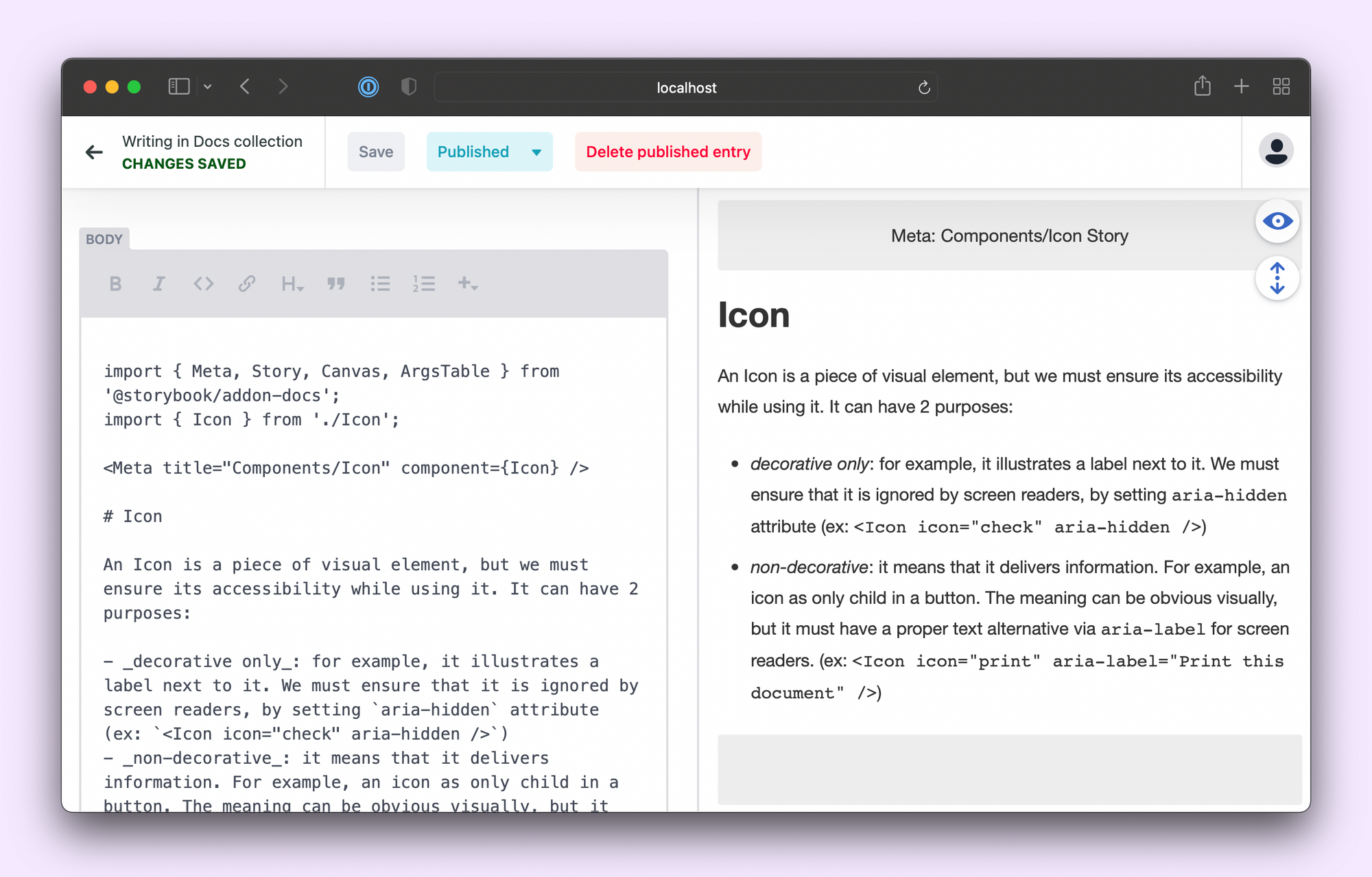
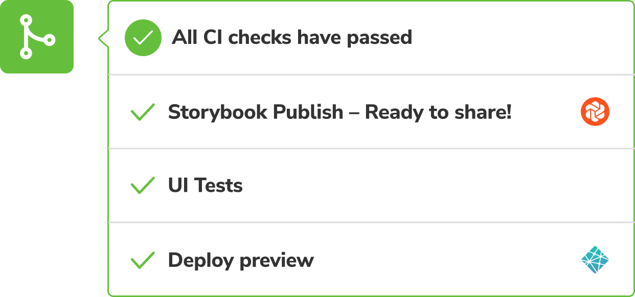
Once you're done editing, hit publish, and Netlify CMS will open up a PR with all your changes. Review the deploy preview, and if everything looks good, hit merge.
Conclusion
The secret to design system maintenance is to generate most of it and enlist your teammates to help with the rest.
Storybook Docs gives you design system infrastructure out of the box. It takes your stories and generates docs, props tables, and examples. You can then customize it further by adding Markdown.
Pair Storybook with a headless CMS to expand editing beyond developers to the rest of your team. Designers, PMs, and writers will get a GUI editor to modify the docs prose that Storybook will then source during build time.
One of the top reasons teams adopt Storybook is flexibility. Remember, Netlify CMS is just one option. You can wire up Storybook to any headless CMS that you want. I hope this quick tutorial can serve as a starting point for your design system docs.
Design system docs require cross-discipline collaboration between devs, designers, PMs & more.
— Storybook (@storybookjs) November 24, 2021
But git-based workflows limit who can contribute 🙅🏽
Pair Storybook with a headless CMS to give your team auto-generated docs with an easy-to-use GUI editor.https://t.co/xS23FKCO3X pic.twitter.com/cbMJMVfWA5