Last chapter we learned that stories correspond with discrete component states. This chapter demonstrates how to use Storybook as a workshop for building components.
Sidebar and Canvas
A *.stories.js file defines all the stories for a component. Each story has a corresponding sidebar item. When you click on a story it renders in the Canvas, an isolated preview iframe.
Navigate between stories by clicking on them in the sidebar or use keyboard shortcuts (for instance use opt/alt + ◀️ ▶️). Try the sidebar search to find a story by name.
Toolbar
Storybook ships with time-saving tools built in. The toolbar contains tools that allow you to adjust how the story renders in the Canvas:
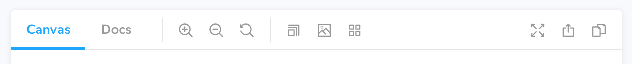
- 🔍 Zooming visually scales the component so you can check the details.
- 🖼 Background changes the rendered background behind your component so you can verify how your component renders in different visual contexts.
- 📱 Viewport renders the component in a variety of dimensions and orientations. It’s ideal for checking the responsiveness of components.
The “Docs” tab shows auto-generated documentation about components (inferred from the source code). Usage docs are helpful when sharing reusable components with your team. For example, in a design system or component library.
The toolbar is customizable. You can use globals to quickly toggle themes and languages. Or install Storybook toolbar addons from the community to enable advanced workflows.
Addons
Addons are plugins that extend Storybook's core functionality. You can find them in the addons panel, a reserved place in the Storybook UI below the Canvas. Each tab shows the generated metadata, logs, or static analysis for the selected story by the addon.
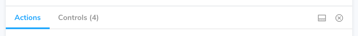
- Controls allows you to dynamically interact with a component’s args (inputs). Experiment with alternate configurations of the component to discover edge cases.
- Actions help you verify interactions produce the correct outputs via callbacks. For instance if you view the “Logged In” story of the Header component, we can verify that clicking the “Log out” button triggers the
onLogoutcallback, which would be provided by the component that made use of the Header.
Storybook is extensible. Our rich ecosystem of addons helps you test, document, and optimize your stories. You can also create an addon to satisfy your workflow requirements. Read more in the addons section.
In the next chapter, we'll get your components rendering in Storybook so you can use it to supercharge component development.