Storybook is a tool for UI development. It makes development faster and easier by isolating components. This allows you to work on one component at a time. You can develop entire UIs without needing to start up a complex dev stack, force certain data into your database, or navigate around your application.
Use Storybook to build small atomic components and complex pages in your web application. If it's a UI, you can build it with Storybook.
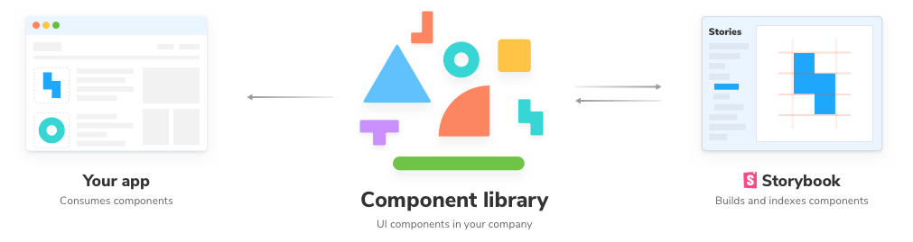
Storybook helps you document components for reuse and automatically visually test your components to prevent bugs. Extend Storybook with an ecosystem of addons that help you do things like fine tune responsive layouts or verify accessibility.
Storybook integrates with most popular JavaScript UI frameworks and (experimentally) supports server-rendered component frameworks such as Ruby on Rails.
Learning resources
If you want to learn more about the component-driven approach that Storybook enables, this site is a good place to start.
If you want a guided tutorial through building a simple application with Storybook in your framework and language, LearnStorybook has your back.
Read on to learn Storybook basics and API!