New
You're viewing older docs for version 6.5. View latest docs

IconGallery

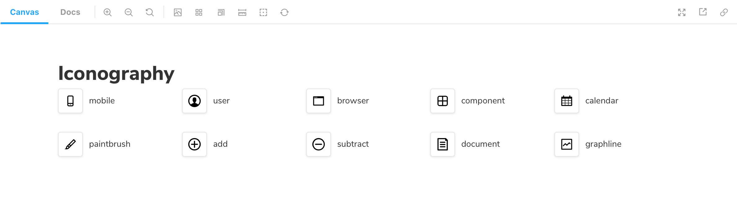
Storybook's IconGallery Doc Block enables you easily document all icons associated with your project.

Storybook gallery icon doc block

Working with MDX

Similar to other documentation-oriented Doc Blocks such as TypeSet, or ColorPalette, the IconGallery is also typically used with MDX. It allows you to provide additional customization via options. Below is a condensed example and table featuring all the available options.

OptionDescription
nameSets the name of the icon.
<IconItem name="add"/>

Was this page helpful?

Markdown accepted ([link text](url), _italic_, **bold**, etc). Your anonymous feedback will be posted publicly on GitHub.

✍️ Edit on GitHub – PRs welcome!
Storybook
Join the community
6,565 developers and counting
WhyWhy StorybookComponent-driven UI
DocsGuidesTutorialsChangelogTelemetryStatus
CommunityAddonsGet involvedBlog
ShowcaseExploreProjectsComponent glossary
Open source software
Storybook

Maintained by
Chromatic
Special thanks to Netlify and CircleCI