Storybook
TwitterBlueSkyLinkedIn
Go to Docs

Introducing Storybook 9

The lean, mean component testing machine. We combined the best of frontend testing into one unified workflow. Test just as your users would across key dimensions like interactions, accessibility, and visuals. All with rapid feedback as you develop.
Get started
Upgrade existing project
Test every component in one click. Storybook's new Testing Widget runs tests on every component at the same time. Configure specific test types to run and filter results by error or warning.
Component test for Form component. The test simulates a user filling out a form with an email and password fields and then clicking the sign-in button. On success, the UI displays a green success message.
Interaction tests simulate user behavior like click and type. In Storybook 9, run every interaction test at the same time. Automatically trigger tests on save by turning on watch mode.
Powered by Vitest & Playwright
Component test for Form component. The test simulates a user filling out a form with an email and password fields and then clicking the sign-in button. On success, the UI displays a green success message.
When you navigate to a story, automated accessibility checks are run and the results are reported in the Accessibility addon panel. The results are broken down into three sub-tabs: violations, passes, and incomplete.
Accessibility tests find WCAG violations. Storybook’s redesigned accessibility addon runs across all stories so you can catch bugs instantly during development.
Powered by axe-core
Automated visual tests check for pixel-level regressions in your stories.
Visual tests pinpoint UI regressions. Storybook scans every possible UI state to check if visual changes are intentional updates or accidental bugs.
Powered by Chromatic
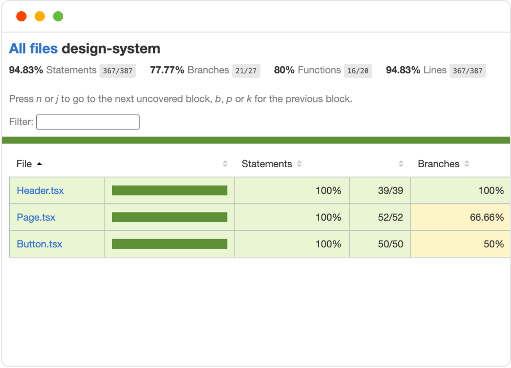
Track test coverage across your component library. Storybook 9 automatically measures and reports test coverage for your components. Identify untested components and track progress over time.
Powered by Istanbul
A dashboard showing test coverage metrics for different components, with visual indicators of coverage percentage and untested areas.
Clicking the filter button in the Storybook sidebar allows you to toggle tags to filter stories and components.
Tag to organize stories and components. Create custom tags like alpha, deprecated, and feature-flag to associate related stories. Filter by tags to focus on the components that matter to you.
A visual representation of global styles and themes in Storybook, showing how design tokens and themes can be managed.
Set themes, viewports, and locales. Story globals help you quickly test and document your UI under real world conditions: dark mode, mobile/tablet, right-to-left, and language.

48% Lighter

Storybook 9 is less than half the size of Storybook 8. The dependency structure is now much flatter. With such a lightweight bundle, Storybook installs faster and won't conflict with your project's dependencies.

Before (Storybook 8): a full-height and very complex dependency graph.Storybook 9 has a much simpler graph approximately 10% the size of the other one.
Auto-generate stories directly inside Storybook. Click to add a component with a default story, or tweak an existing story’s Controls and save that variation as a new story.
You can search for components within your project and auto-generate stories for them.
A new, instant-on Next.js integration. Storybook 9 upgrades the old Webpack-based integration with a modern Vite-powered development experience. It’s a drop-in replacement for Next users that’s fully compatible with Storybook Test and Vitest.
Svelte 5 ready. Our upgraded Svelte CSF story format works perfectly with Svelte 5, including support for new language features like runes and snippets.
Revamped React Native. Storybook React Native and React Native Web can now run side-by-side in your mobile project. Develop components across platforms with Storybook’s full testing and docs superpowers.
Made for React Native
A visual representation of React Native support in Storybook, showing how components can be developed and tested with React Native features.
Get started
Upgrade existing project