Component glossary
The web's most common UI components
Accordion
View all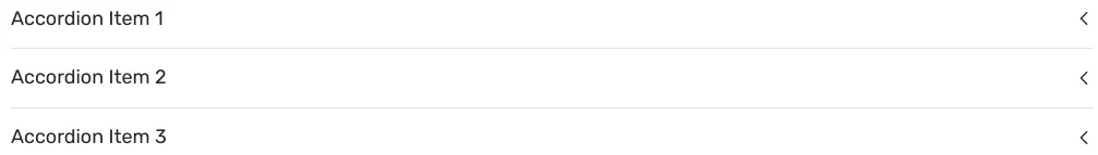
An accordion is a vertically stacked list of interactive items. Each item can be "collapsed" with only a summary visible or “expanded” to show the full content for that item.
Alert
View all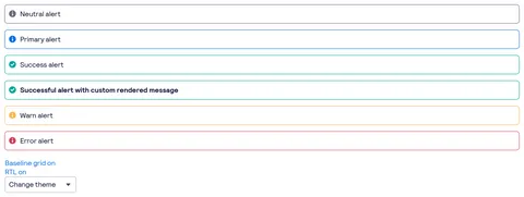
Alert is a short message that provides contextual feedback in a prominent way.
Autocomplete
View all
Autocomplete is a text input that proactively suggests options based on the user’s initial input. The suggested options appear alongside the input in a panel.
Avatar
View all
Avatar is a graphical representation of a user or entity. It’s often a photo, illustration, or text initial.
Badge
View all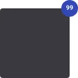
Badge is a compact label that appears beside a primary interface area which is used to represent status or metadata for that area.
Banner
View allBanner is a prominent message that is used to inform users about changes or give context to the page content. It’s often displayed as one of the first items on a page or section.
Breadcrumb
View all
Breadcrumb is a list of links that shows the location of the current page in an app hierarchy. It helps users understand where they are relative to other pages and provides convenient links to navigate to other pages.
Button
View all
Button is a clickable interactive element that triggers a response. You can place text and icons inside of a button. Buttons are often used for form submissions and to toggle elements into view.
Calendar
View all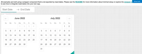
Calendar is a date selection interface that allows you to choose a date or a range of dates using a calendar view. It’s often used to filter information by date.
Card
View all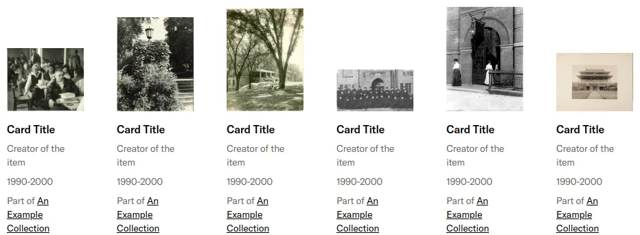
Card is a content container that represents a single object and related actions. For example, an article or task.
Carousel
View all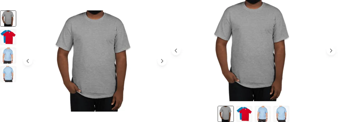
Carousel is a slideshow that cycles through content like images or text. Carousels may include support for previous and next controls.
Chart
View all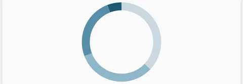
Chart is a graphical representation of data. A chart visualizes large sets of information to help users understand trends and relationships between data points.
Chat
View all
Chat is a display of chat logs between users of a system. It includes a number of sub components to compose different types of chat items.
Checkbox
View all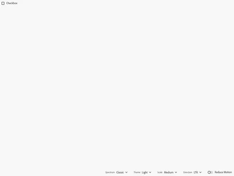
A checkbox is a square box that can be activated or deactivated when ticked. Use checkboxes to select one or more options from a list of choices.
Chip
View all
Chip is a compact label that appears beside a primary interface area which is used to represent status or metadata for that area.
Code
View all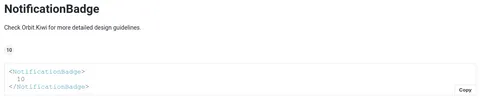
Code is used to display strings or small blocks of code. Code can be copied and inserted in a code editor.
Collapse
View all
Collapse is a vertically stacked list of interactive items. Each item can be "collapsed" with only a summary visible or “expanded” to show the full content for that item.
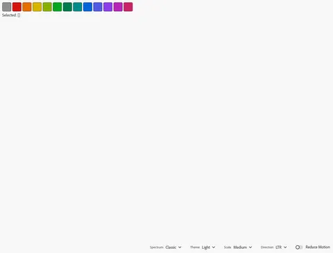
Color picker
View all
Color Picker is an input that allows users to pick from predefined colors (swatches) or a color field. When picked, it will return color values in RGB, HEX, or HSL.
Combobox
View all
Combobox is an autocomplete input that proactively suggests options based on the user’s initial input. It allows you to filter a list of options and select from predefined options. The options appear alongside the input in a panel.
Context menu
View all
Context Menu is a menu that offers a set of actions related to the current state of what a user clicks on. Context menus often appear on right (default) or left click.
Data grid
View all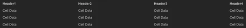
Data grid is a table that visualizes a data set and includes options for filtering, sorting, templates, row selection, row grouping, row pinning and movable columns. Data grids are often used with dynamic or large data sets.
Date picker
View all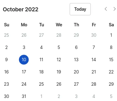
Date picker is a date selection interface that allows you to choose a date or a range of dates using a calendar view. It’s often used to filter information by date.
Details
View all
Details is an expandable panel that displays a summary of content and expands to reveal more help text when clicked on. It’s often used to make a dense content easier to skim.
Dialog
View all
Dialog is a prompt that appears above other content containing urgent information or decisions. Dialog’s intentionally interrupt the user flow and require user input to be dismissed.
Disclosure
View all
Disclosure is an expandable panel that displays a summary of content and expands to reveal more help text when clicked on. It’s often used to make a dense content easier to skim.
Divider
View all
Divider is a separator between sections of content or groups of items. It often contains a horizontal line.
Drawer
View all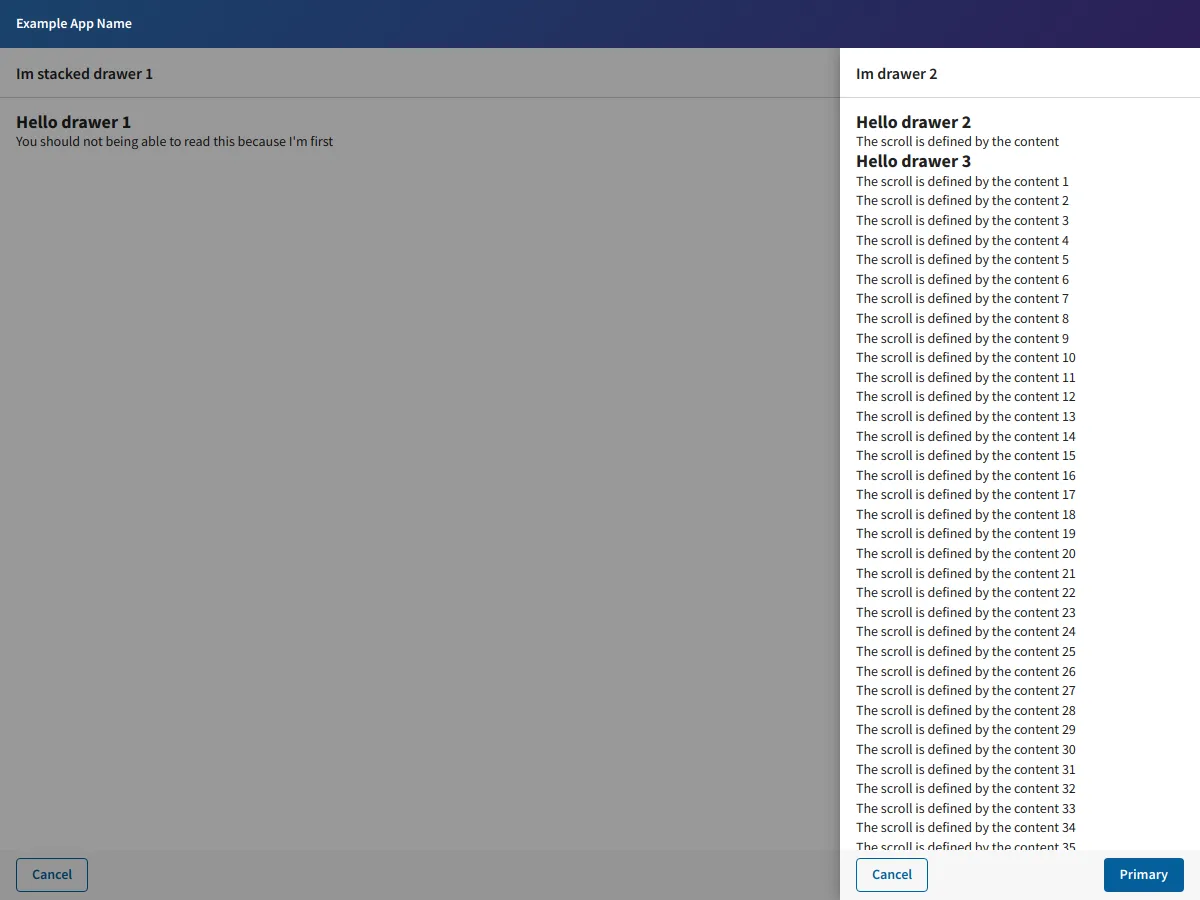
Drawer is a panel that slides out from the edges of the screen. It’s often used for navigation, menus, or to display details about the page a user is on.
Expandable
View all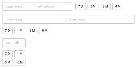
Expandable is a vertically stacked list of interactive items. Each item can be "collapsed" with only a summary visible or “expanded” to show the full content for that item.
Flex
View all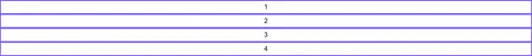
Flex is a layout container that uses flexbox to position its children.
Footer
View all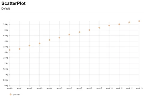
Footer is a section at the bottom of a page that displays links to related content, copyright, or legal information.
Form
View all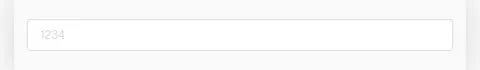
Form is used to collect user input to be submitted to an application. It’s often composed of form elements that include inputs, buttons, checkboxes, and radios.
Grid
View all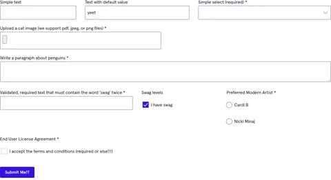
Grid is a container used to build layouts that align to a user-defined system of columns and rows.
Header
View all
Header is a section at the top of a page that displays site name and navigation.
Heading
View all
Heading is a title or subtitle displayed in a web app or website. Heading often varies in size depending on importance of the content it represents.
Hero
View all
Hero is a large banner or image that appears as one of the first items on a page. It’s a primary visual element that is used to focus user attention on key content or promotions.
Icon
View all
Icon is a visual symbol that indicates the purpose of an interface element. It’s used to represent ideas, content types, and actions.
Image
View allImage is an element for embedding images. It’s often used to display images in different sizes and formats depending on device capabilities and viewport size.
Label
View all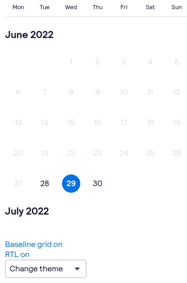
Label is a text caption or description that describes the type of input a form field requires. Labels are often positioned beside the form field.
Layout
View all
Layout is a layout container that is used to position children in predetermined areas. It’s often used to apply consistent positioning for content across pages in an application.
Link
View all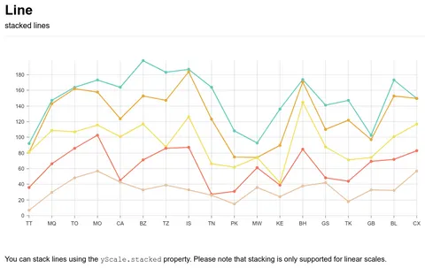
Link is a reference to a location on the web. When clicked, a link will direct you to a destination like a document, asset, or email address.
List
View all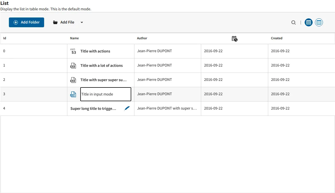
List is a grouping of related items. List can be ordered with numbers or unordered with bullets.
Listbox
View all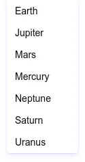
Listbox is a vertical list of interactive elements that users can select from.
Loading
View all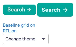
Loading is a visual indicator that shows the status of an ongoing process happening in the background. It’s often used to communicate that the user has to wait before the interface is ready for interaction.
Menu
View all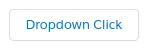
Menu is an interactive list of options that a user can choose. The options are hidden by default and revealed when a user interacts with an element. Menu is often used to show actions or navigation. It’s different from Select because it’s not a form input.
Modal
View all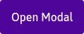
Modal is a full screen overlay that sits atop the page content. It’s used to focus attention on an important task or message and requires user input to be dismissed.
Nav
View all
Nav is a container that’s used to list navigation links. It’s often used to direct users to other pages in an app or as a table of contents for the current page. f
Notification
View allNotification is a message that informs users of updates or changes to system status. It can appear above or inline with the content.
Page
View all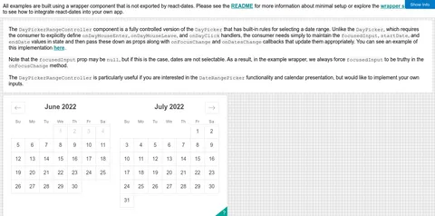
Page is a layout container that is used to position children in predetermined areas. It’s often used to apply consistent positioning for content across pages in an application.
Pagination
View all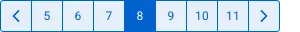
Pagination is an end user’s controls for navigating in between data that’s been broken up into multiple pages like a list or a document.
Pill
View allPill is a compact label that appears beside a primary interface area which is used to represent status or metadata for that area.
Popover
View all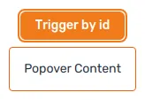
Popover is a message box that displays extra information about an element. It can appear on hover, click, or tap.
Progress
View all
Progress is a visual indicator that shows the users progress through a series of steps. It’s often used to keep the user focussed toward completing a task.
Radio
View all
Radio is a circular element that can be activated or deactivated when ticked. It’s used to select a single option from a list of choices.
Rating
View all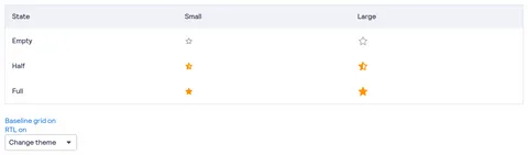
Rating is a widget that allow users to submit and view feedback. It’s a straightforward way to visualize the sentiment surrounding a product or item.
Search
View all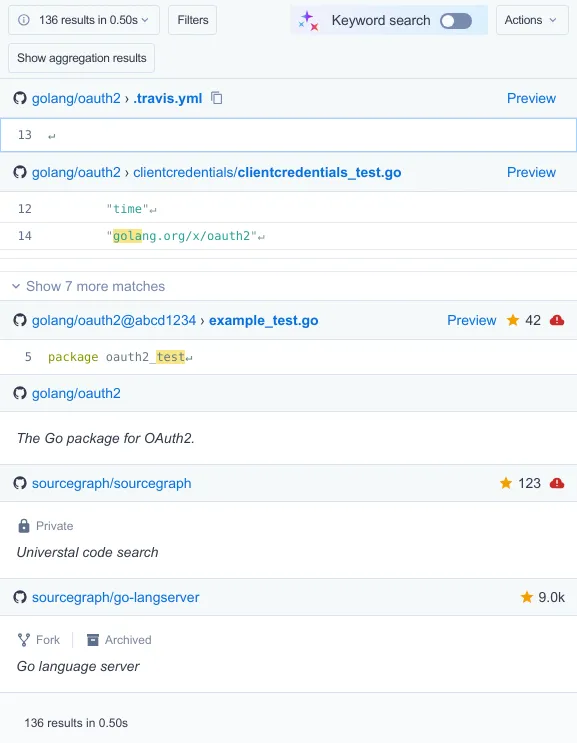
Search is an input that allows users to find content by entering a word or phrase.
Select
View all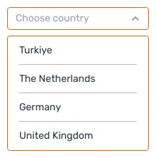
Select is a type of input that allows users to choose one or more options from a list of choices. The options are hidden by default and revealed when a user interacts with an element. It shows the currently selected option in its default collapsed state.
Separator
View all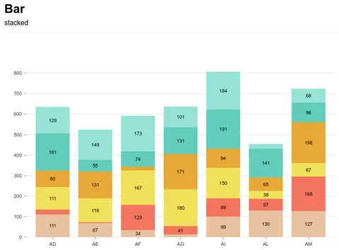
Separator is a separator between sections of content or groups of items. It often contains a horizontal line.
Slider
View all
Slider is a form element for choosing a value from within a range of values. It’s often used to adjust settings by moving a slider handle along a horizontal track.
Spinner
View all
Spinner is a visual indicator that shows the status of an ongoing process happening in the background. It’s often used to communicate that the user has to wait before the interface is ready for interaction.
Stack
View all
Stack is a layout container used to apply consistent spacing between its children.
Table
View all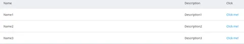
Table is an element that visualizes a data set in rows and columns. It’s often used to embed structured data in a way that’s easy to scan.
Tabs
View all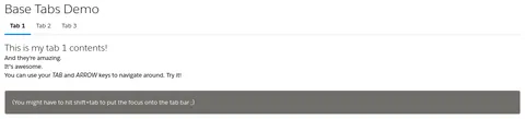
Tabs is a way to navigate between multiple views of information. It’s used to fit more information in a smaller area.
Tag
View all
Tag is a compact label that appears beside a primary interface area which is used to represent status or metadata for that area.
Text
View all
Text is a style component that renders a string of characters, words, or paragraphs in a consistent font size and weight.
Textarea
View all
Textarea is a form element that accepts multiple lines of text.
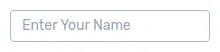
Text field
View allText field is a form element that accepts a single line of text or multiple lines of text.
Title
View all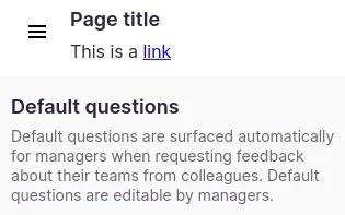
Title is text that describes the content of a page or section. It often varies in size depending on the importance of the content it represents.
Toast
View all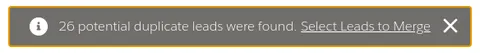
Toast is a short message that informs users of updates or changes to system status. It appears above the content.

Tooltip
View all
Tooltip is a message box that displays extra information about an element. It can appear on hover, click, or tap.
Typography
View allTypography is a system of font sizes and weights that is used to organize content.