Storybook for Vue & Vite is a framework that makes it easy to develop and test UI components in isolation for Vue applications built with Vite. It includes:
- 🏎️ Pre-bundled for performance
- 🪄 Zero config
- 🧠 Comprehensive docgen
- 💫 and more!
Storybook for Vue & Vite is only supported in Vue projects.
Requirements
- Vue ≥ 3
- Vite ≥ 4.0
- Storybook ≥ 8.0
Getting started
In a project without Storybook
Follow the prompts after running this command in your Vue project's root directory:
More on getting started with Storybook.
In a project with Storybook
This framework is designed to work with Storybook 7+. If you’re not already using v7, upgrade with this command:
Automatic migration
When running the upgrade command above, you should get a prompt asking you to migrate to @storybook/vue3-vite, which should handle everything for you. In case that auto-migration does not work for your project, refer to the manual migration below.
Manual migration
First, install the framework:
Then, update your .storybook/main.js|ts to change the framework property:
Extending the Vue application
Storybook creates a Vue 3 application for your component preview.
When using global custom components (app.component), directives (app.directive), extensions (app.use), or other application methods, you will need to configure those in the ./storybook/preview.js file.
Therefore, Storybook provides you with a setup function exported from this package, which receives as a callback your Storybook instance, which you can interact with and add your custom configuration.
Using vue-component-meta
vue-component-meta is only available in Storybook ≥ 8. It is currently opt-in, but will become the default in a future version of Storybook.
vue-component-meta is a tool maintained by the Vue team that extracts metadata from Vue components. Storybook can use it to generate the controls for your stories and documentation. It's a more full-featured alternative to vue-docgen-api and is recommended for most projects.
If you want to use vue-component-meta, you can configure it in your .storybook/main.js|ts file:
vue-component-meta comes with many benefits and enables more documentation features, such as:
Support for multiple component types
vue-component-meta supports all types of Vue components (including SFC, functional, composition / options API components) from .vue, .ts, .tsx, .js, and .jsx files.
It also supports both default and named component exports.
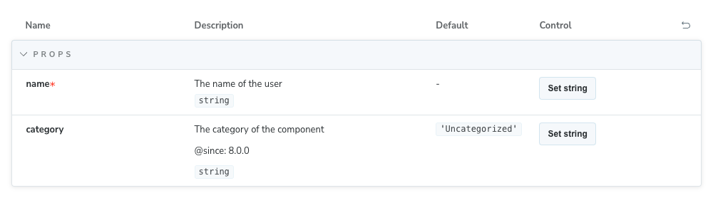
Prop description and JSDoc tag annotations
To provide a description for a prop, including tags, you can use JSDoc comments in your component's props definition:
The props definition above will generate the following controls:
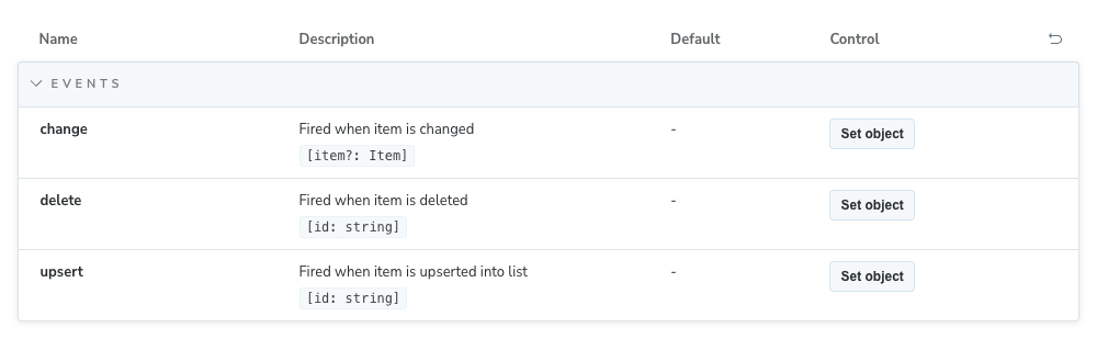
Events types extraction
To provide a type for an emitted event, you can use TypeScript types (including JSDoc comments) in your component's defineEmits call:
Which will generate the following controls:
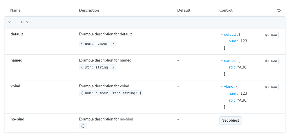
Slots types extraction
The slot types are automatically extracted from your component definition and displayed in the controls panel.
If you use defineSlots, you can provide a description for each slot using JSDoc comments in your component's slots definition:
The definition above will generate the following controls:
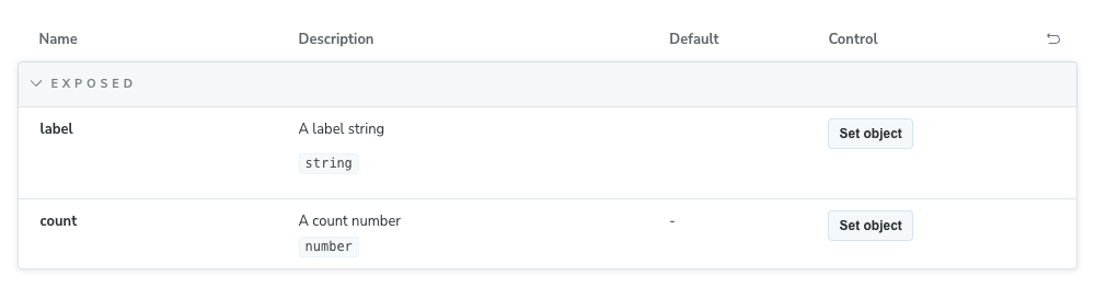
Exposed properties and methods
The properties and methods exposed by your component are automatically extracted and displayed in the controls panel.
The definition above will generate the following controls:
Override the default configuration
If you're working with a project that relies on tsconfig references to link to other existing configuration files (e.g. tsconfig.app.json, tsconfig.node.json), we recommend that you update your .storybook/main.js|ts configuration file and add the following:
This is not a limitation of Storybook, but instead how vue-component-meta works. For more information, refer to the appropriate GitHub issue.
Otherwise, you might face missing component types/descriptions or unresolvable import aliases like @/some/import.
Troubleshooting
Storybook doesn't work with my Vue 2 project
Vue 2 entered End of Life (EOL) on December 31st, 2023, and is no longer maintained by the Vue team. As a result, Storybook no longer supports Vue 2. We recommend you upgrade your project to Vue 3, which Storybook fully supports. If that's not an option, you can still use Storybook with Vue 2 by installing the latest version of Storybook 7 with the following command:
API
Options
You can pass an options object for additional configuration if needed:
builder
Type: Record<string, any>
Configure options for the framework's builder. For this framework, available options can be found in the Vite builder docs.
docgen
Type: 'vue-docgen-api' | 'vue-component-meta'
Default: 'vue-docgen-api'
Since: 8.0
Choose which docgen tool to use when generating controls for your components. See Using vue-component-meta for more information.