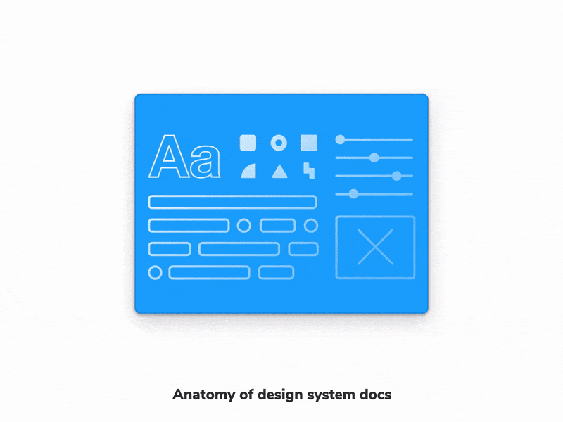
4 ways to document your design system with Storybook
How to show UI components, specs, and usage guidelines together

Storybook is used to build the most popular design systems on the web, including Shopify Polaris, IBM Carbon, Salesforce Lightning, Auth0 Cosmos, and Github Primer.
Frontend teams everywhere can ship faster with less work using Storybook’s Docs addon. It auto-generates documentation from your existing stories. But that’s just a starting point. Expand your documentation workflow by integrating Storybook with more tools.
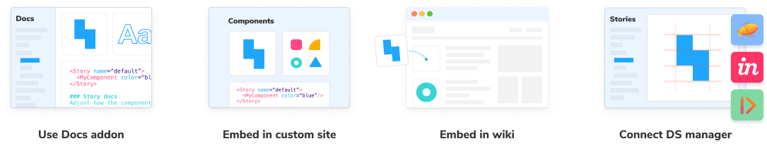
This article shares how real-world design systems use Storybook to enhance their design system documentation. You’ll get a glimpse of four proven workflows:
- Write docs using official Docs addon
- Embed stories on a custom docs site
- Embed stories in a workspace like Confluence or Notion
- Connect stories in a design system manager (Zeroheight, Zeplin, InVision)
Why document your design system?
Documentation is crucial for design system adoption. It consolidates usage guidelines to help developers, designers, PMs and other stakeholders ship predictable UIs.
Design systems document everything from high-level guidelines to granular components. Since Storybook is a component driven tool, that’s what we’ll dig into in this article. Nathan Curtis (of EightShapes) breaks down component documentation requirements into four broad categories:
- Description of the component, its name and what it does.
- Examples illustrating the component's variants, states. Users prefer rendered code that they can interact with instead of static images.
- Design reference including visual guidelines, responsive behaviour, when to use a component, and do's and don'ts.
- Code reference detailing the component API—props, event handlers, etc.
There are many ways to build component documentation. Teams do everything from off-the-shelf tools to building their own custom sites. Let's take a closer look at the options and their tradeoffs.
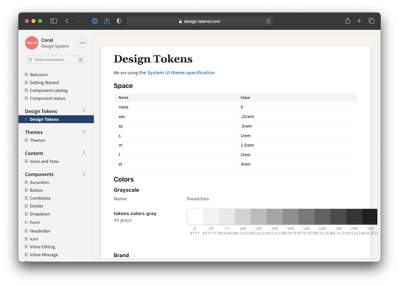
Use the Storybook Docs Addon
Storybook's Docs addon offers a lean option to document your UI components. You get to focus on writing documentation whereas, Storybook manages all the tooling complexity to generate a static site with live code examples.
Teams already use Storybook to build their design system’s components. They write stories to demonstrate how each component is used. Docs addon uses these stories to auto-generate documentation for each component.
What you get:
- Component examples: stories get rendered live in the browser along with their source code.
- Component API: as an ArgsTable. It's interactive, so you can modify the args and see how the component updates.
- Usage guidelines: generated from Markdown. You can add prose to any part of the page and provide more context.
- Design assets: Storybook’s addon ecosystem offers integrations with all your favourite design tools. For example, embed Figma files in stories or connect them to Zeplin.
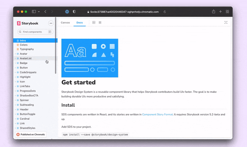
What’s more, it’s all powered by MDX. So you can customize and theme to your heart’s desire.
Bringing content into Storybook is one option. The other is to take Storybook wherever your content lives. Each story renders in an iframe allowing you to embed it in other tools used for all kinds of documentation.
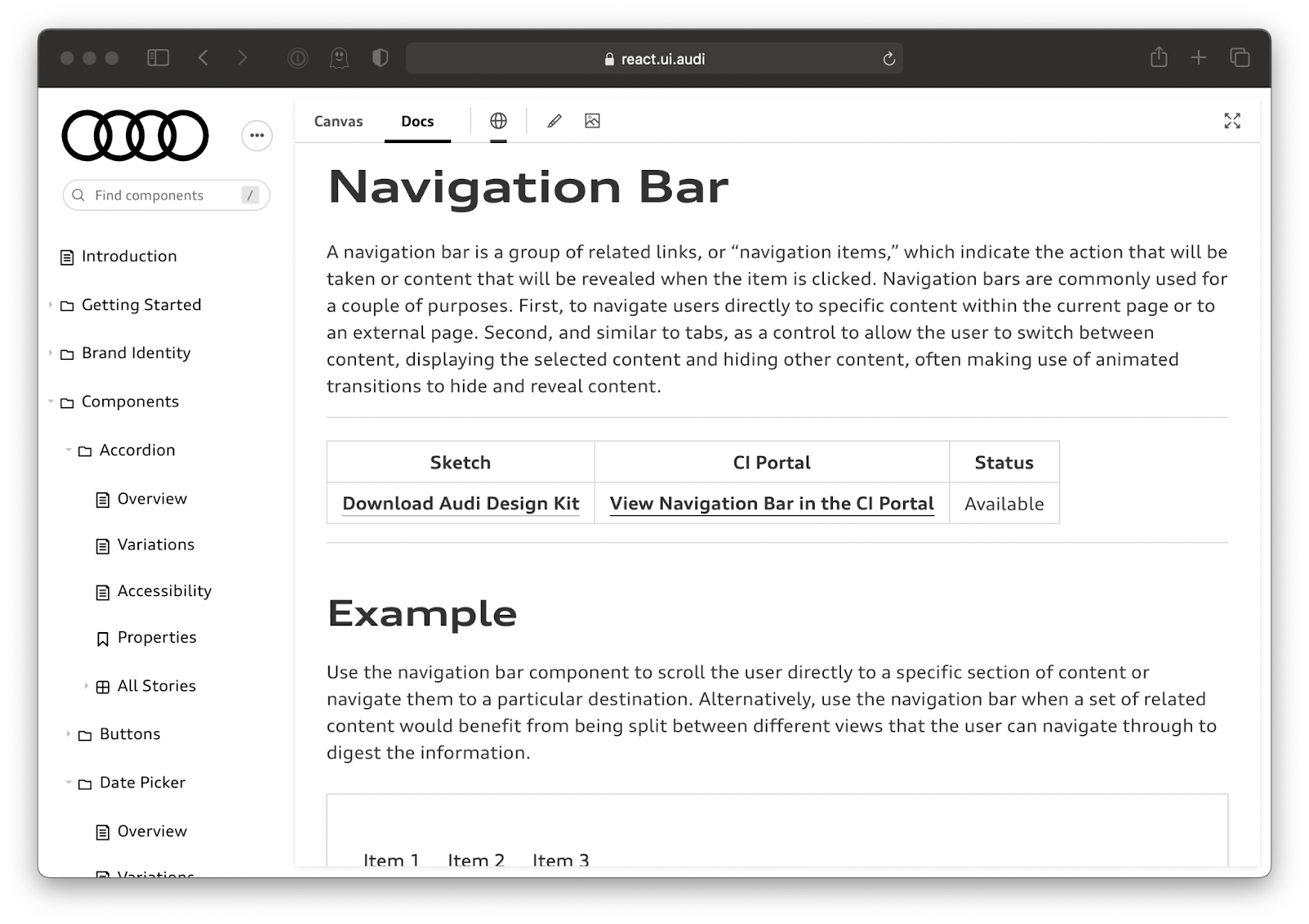
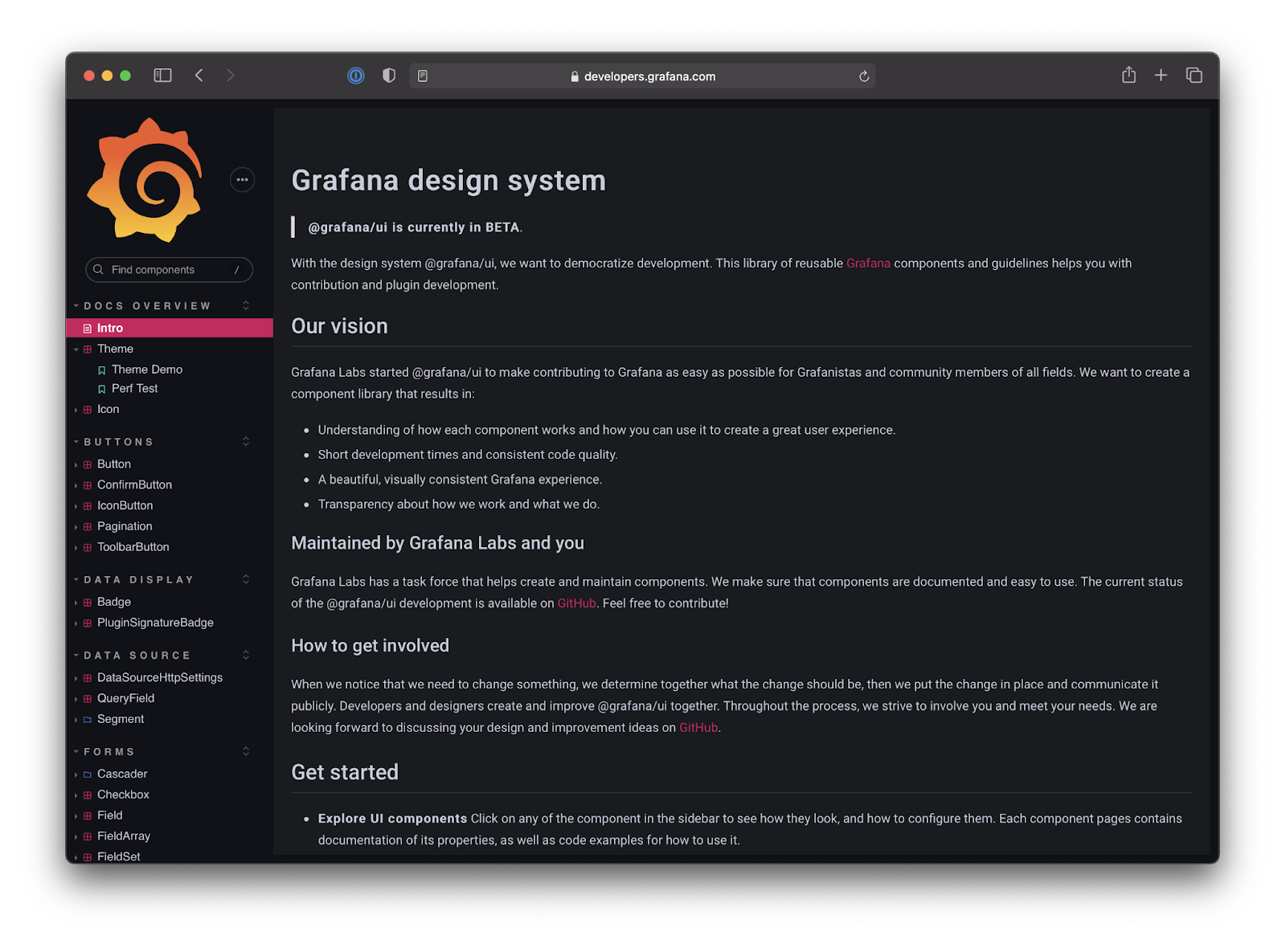
Embed stories on a custom docs site
Some teams build a custom docs site to tweak the experience to match the specific needs of their users. Shopify's Polaris and IBM's Carbon Design System are two great examples.
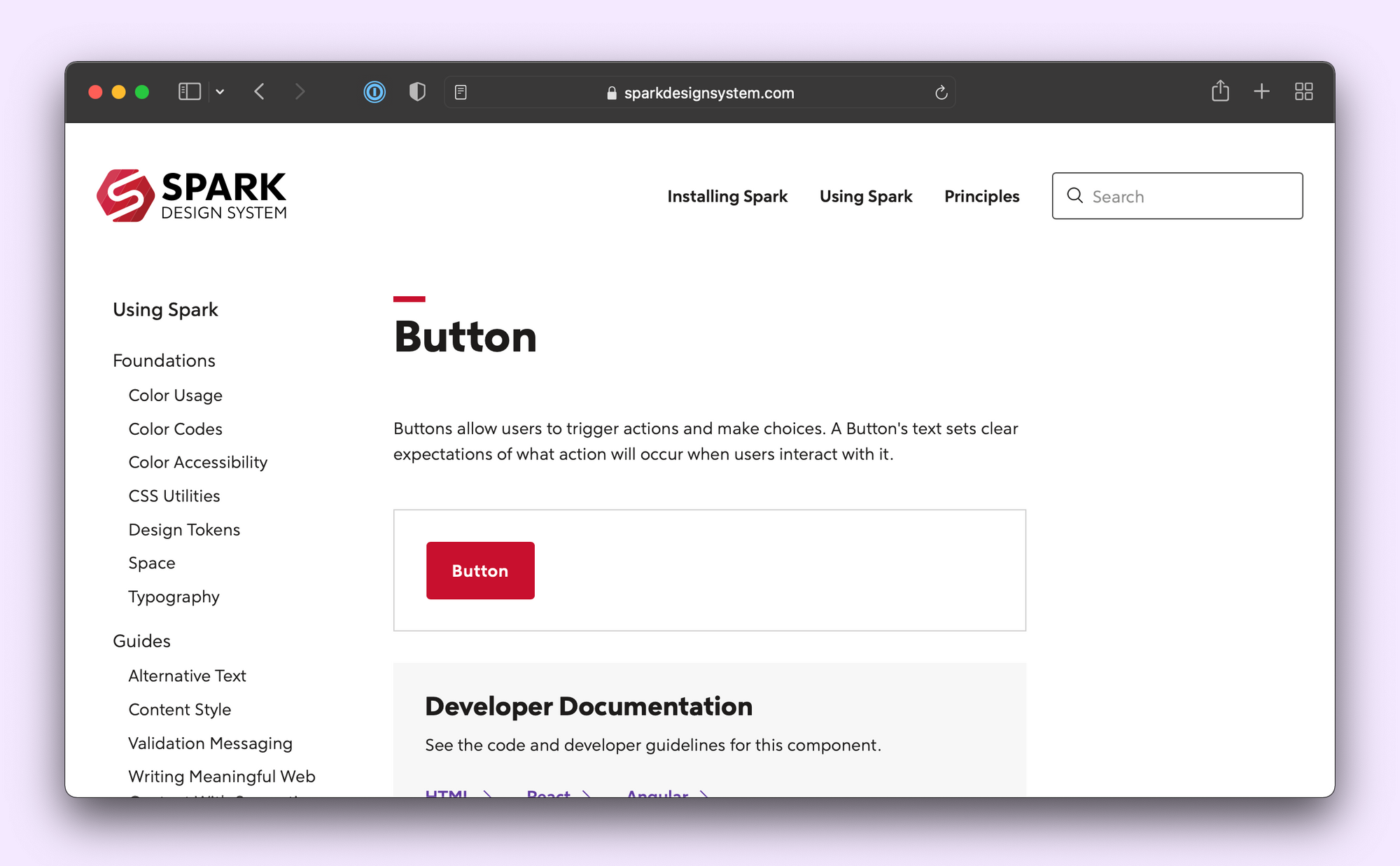
These sites still display component use cases by rendering code. You can build your own tooling for that or reduce overhead by leveraging Storybook. Workday's Canvas and Rocket Mortgage's Spark design systems embed story iframes directly on the documentation pages.
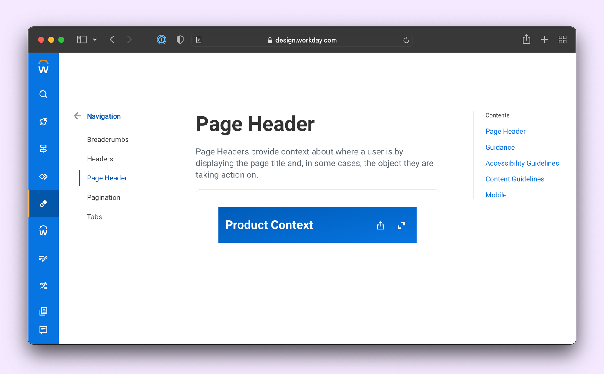
Custom sites require a substantial investment that not every company can afford. Off-the-shelf tools offer a good compromise between customization and maintenance.
Embed stories in a workspace
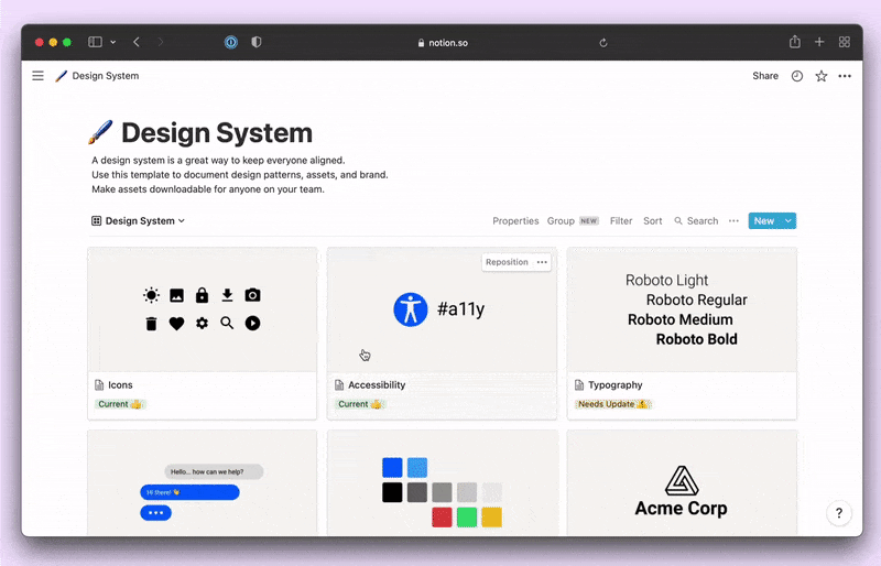
Notion and Confluence are general-purpose documentation tools with a WYSIWYG editing interface. That helps you involve non-technical contributors and embed assets alongside prose. Notion even provides a design system starter template.
You can embed stories into any tool that supports the oEmbed standard using Chromatic, a free service to publish Storybook online (made by the Storybook team). Embedding is as simple as pasting the story URL.
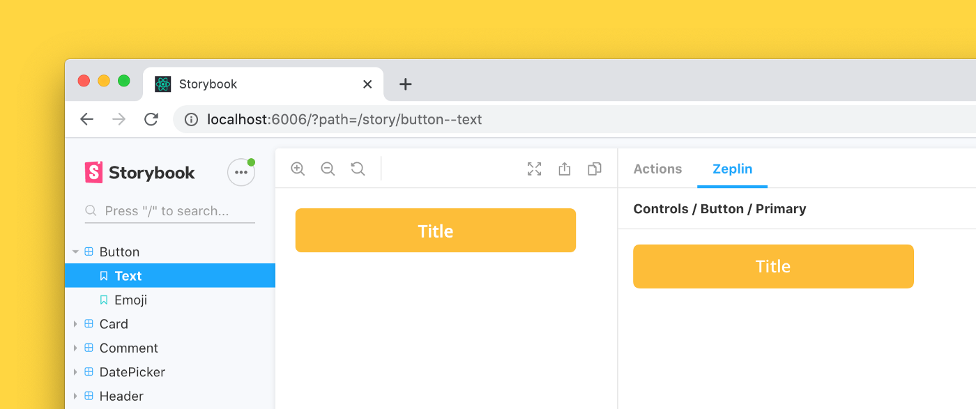
Connect stories in a design system manager
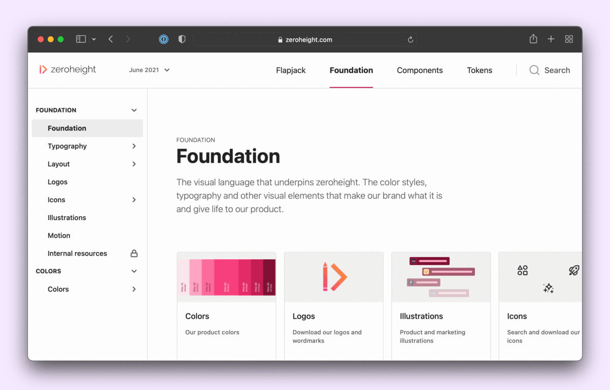
InVision DSM, Zeroheight and Supernova are purpose-built tools to document design systems. They allow you to track design tokens and create component pages where you can add code snippets, embed stories and link with design tools.
DSM only supports Sketch while Supernova is made for Figma. Zeroheight is compatible with most design tools—making it a popular choice for teams like Intuit, Instacart and the Guardian.
Conclusion
Adoption is the biggest challenge for any design system. Good documentation accelerates adoption by serving as a centralized source of truth for all your users. Covering guidelines on how to use the design system and detailed documentation for each component.
When you write stories during development, you also create basic documentation. The Storybook Docs addon generates a static site with live code examples, API docs and usage guidelines. You can use that as a launching point to customize the workflow to suit your needs. Embed stories within documentation tools or on a custom site.
Design systems make it easier to ship consistent UIs.
— Storybook (@storybookjs) November 17, 2021
But only if you have good docs!
That means showcasing each component and its API, live examples, design specs & guidelines.
This article covers 4 four proven workflows for documenting design systems: https://t.co/yAppF9s07a pic.twitter.com/N9NZt4nyfc