7.0 design alpha
Test drive the new layout, icons, and performance

Storybook supports every major view layer, countless workflows, and legions of frontend developers. Despite giant leaps in functionality over the last few years, the core user experience hasn’t changed since version 5.0. Till now.
Last month, I shared a sneak peek of Storybook 7.0’s design that streamlines core UI patterns that devs use every day. I’m thrilled to announce that these updates are now available in alpha (instructions below).
- 📐 Layout edge-to-edge
- 🛠 Toolbar reorganized
- ✍️ 200 redrawn icons
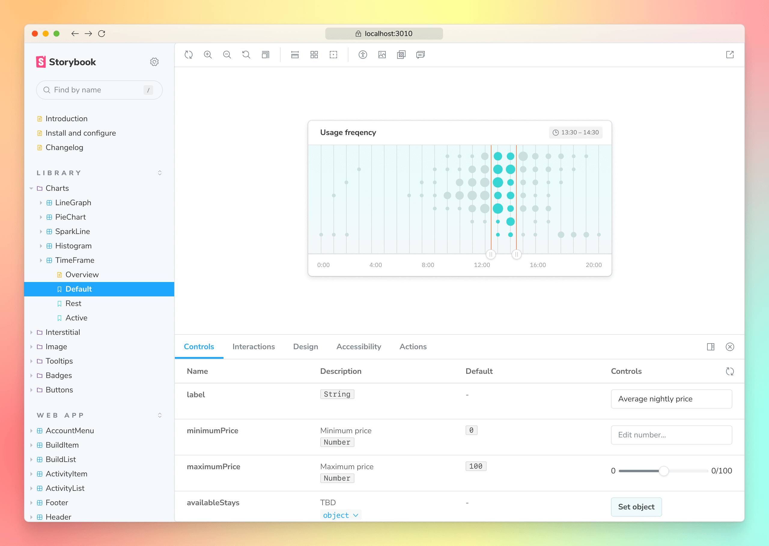
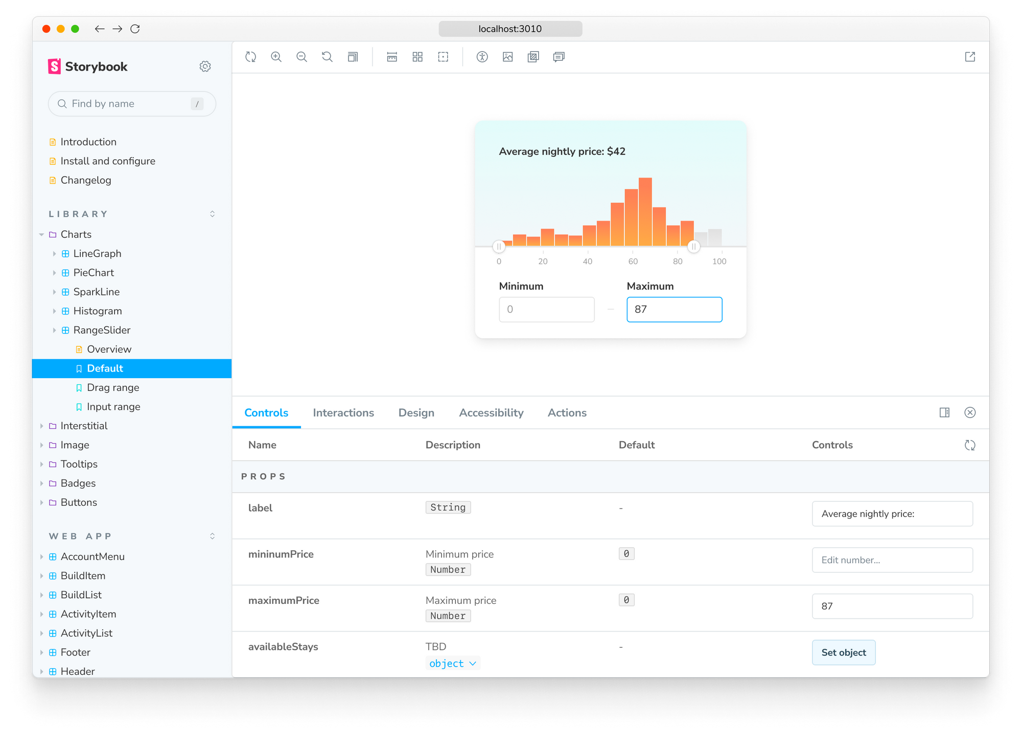
- 🔢 Form elements refined
- ⚡️ Pre-bundled app for speed
Huh, why?
We believe small ergonomic improvements add up to big productivity boosts over time. Thousands of teams use Storybook to ship UIs around the world. From global companies like Shopify and Microsoft to government services in the Netherlands, UK, and Italy.
In the last 3 years, our features expanded to meet the needs of a growing community. Storybook is now used for UI development along with testing and documentation. 7.0 revamps Storybook’s ergonomics to integrate these workflows into one seamless experience.
Rest assured, we’re updating the design in parallel with work on performance, stability, and bundle size that befits a major version bump. Sign up to the mailing list to get early access to these features.
Layout updates
7.0 alpha expands Canvas size edge-to-edge. That gives you more room to build and document your UI. Every pixel dedicated to development makes Storybook more convenient to use.
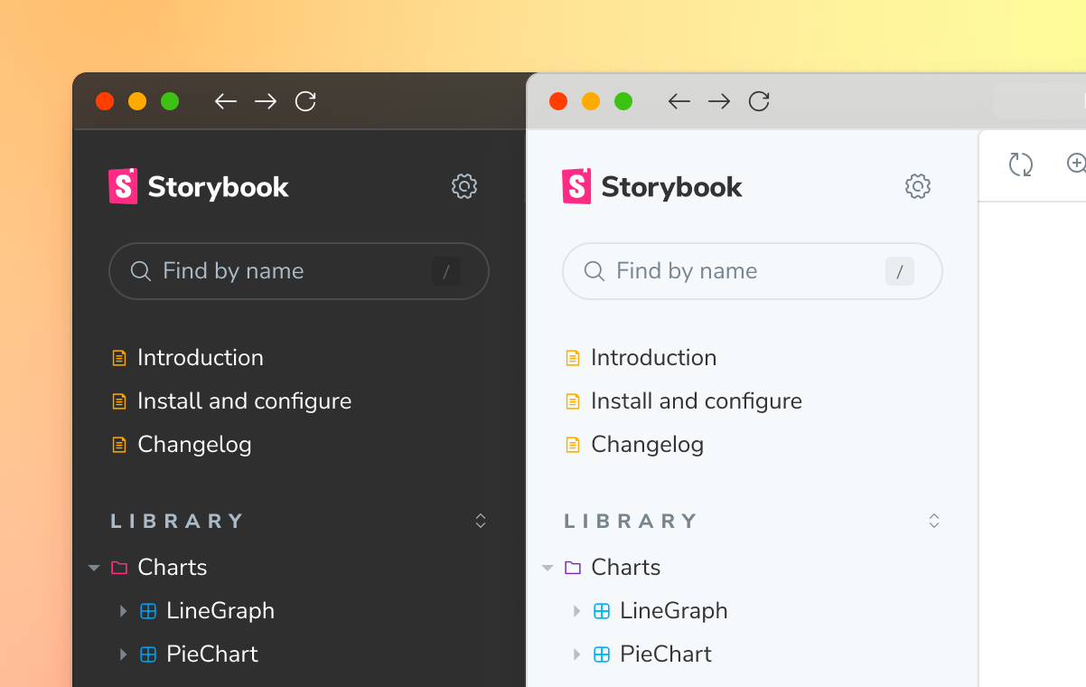
The sidebar was also refreshed. You’ll find a new, more subtle menu along with spacing refinements to increase the search bar’s clickable area. All of this while preserving the information density you’d expect from a developer tool.
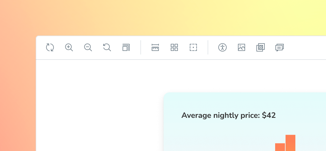
Toolbar for debugging CSS & alignment
Storybook comes with a set of tools that help you debug UI appearance and layout. 7.0 reorganizes the tools to reduce how much you have to move the mouse (or tab for keyboard users).
- 🔄 Remount: Remount the currently selected story.
- 🔍 Zoom: Zoom in and out to inspect each pixel.
- 🪟 Viewports: Cycle through preset viewport dimensions (also customizable)
- 📏 Measure: Measure dimensions and spacing in pixels
- ⌧ Grid: Show a grid in the canvas iframe for alignment
- ⤴ Outline: Outline DOM elements for alignment
- 🖼 Background: Change the background of the canvas iframe
Where's the "Docs" tab?
The “Docs” tab is moving to the sidebar for greater discoverability. If you have Docs or DocsPage enabled, you’ll find a customizable “Docs” item next to your component’s stories.
Docs is getting overhauled in 7.0 thanks to community feedback. There's not enough space in this post to cover all the improvements. Sign up to the mailing list to get a sneak peek when it's announced (MDX2, embed, and much more).
200+ new icons for sharpness
Storybook has a custom set of 200 icons that are used across the open source project. We redrew each icon path from the ground up to increase visual acuity, then optimized it to reduce weight. That means icons are sharper to the human eye and load much faster.
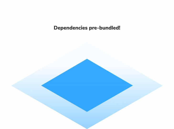
Pre-bundled for speed & no dependency conflicts
In 7.0, we reevaluated the fundamental architecture of Storybook. In earlier versions, running Storybook involved two steps: bundling the Storybook application and building your component code.
The Storybook application was bundled on-demand every time you ran it on your local machine. That gave folks more control and insight into the bundling process and the dependencies therein. But there were tradeoffs: running both steps takes more time, especially as you build more UI components to Storybook.
Storybook 7.0 pre-bundles the Storybook application. It ships as a compiled code base instead of a set of instructions that you then have to compile yourself.
The benefits are immense: instant application start times. Yes, you’ll still have to build your component code as normal, but even that can be sped up using the latest Vite and Webpack 5 integrations (currently getting updated to 7.0).
Moreover, pre-bundling sidesteps dependency conflicts altogether by eliminating the need to install Storybook's dependencies in your codebase. For example, Vue and Angular apps don’t need to install React (which Storybook uses under the hood).
Try the 7.0 alpha
The new design is now available in 7.0 alpha. Run the following command at the root of your project:
npx storybook@future upgrade --prereleaseNote: 7.0 is an alpha for a major version release, which means there may be breaking changes. More sophisticated integrations like the Vite-builder aren't supported yet (soon!). I’d suggest trying it on a demo project to start off.
Sign up for early access
7.0 design is in active development – what's in the alpha is only the first brush stroke. We plan to overhaul core UI patterns like tabs, menus, forms, and colors. Over the next few months we’ll deliver more design improvements via alpha releases. Sign up to Storybook’s mailing list below for updates.
Want to help with Storybook’s user interface? Join us in Storybook’s Discord chat #design. We welcome contributions from new developers and veterans alike.
Storybook 7.0 design is developed by Michael Arestad and Dominic Nguyen (me!) with feedback from the entire Storybook community.
7.0 design is now in alpha!
— Storybook (@storybookjs) August 18, 2022
Small improvements add up to big productivity boosts over time. Try it out now!
📐 Layout edge-to-edge
🛠 Toolbar reorganized
✍️ 200 redrawn icons
🔢 Form elements refined
⚡️ Pre-bundled app for speed
Read » https://t.co/UXNV4TPviC
1/🧵 pic.twitter.com/rFwVBHL9MQ