Accessibility testing with Storybook
Fast feedback with integrated tooling

26% of adults in the US have at least one disability. When you improve accessibility, it has an outsized impact on your current and future customers. It’s also a legal requirement.
The most accurate way to check accessibility is manually on real devices. But that requires specialized expertise and a lot of time. Both of which are scarce on frontend teams.
Teams at Twilio, Adobe and Shopify use a combination of automated and manual testing. Automation catches common accessibility issues with low effort from developers. Manual QA is reserved for the trickier issues that require human attention.
There are plenty of resources that deep dive into accessibility principles, so we won’t get into that here. This article shows you how to automate accessibility testing with Storybook. It’s a pragmatic way to find and fix the majority of issues you’re likely to encounter.
Why automation?
Before we begin, let’s examine common types of disabilities: visual, hearing, mobility, cognition, speech, and neurological. These user disabilities yield app requirements like:
- ⌨ Keyboard navigation
- 🗣 Screen reader support
- 👆 Touch-friendly
- 🎨 High enough colour contrast
- ⚡️ Reduced motion
- 🔍 Zoom
In the past, you’d verify each of these requirements by checking every component across a combination of browsers, devices, and screen readers. But that’s impractical to do by hand because apps have dozens of components and are constantly updating the UI.
Automation speeds up your workflow
Automated tools audit the rendered DOM against a set of heuristics based on WCAG rules and other industry-accepted best practices. They act as the first line of QA to catch blatant accessibility violations.
For example, Axe, on average, finds 57% of WCAG issues automatically. That allows teams to focus their expert resources on the more complex issues that require manual review.
Many teams use the Axe library because it integrates with most existing test environments. For example, the Twilio Paste team uses the jest-axe integration. Whereas the Shopify Polaris & Adobe Spectrum teams use the Storybook addon version.
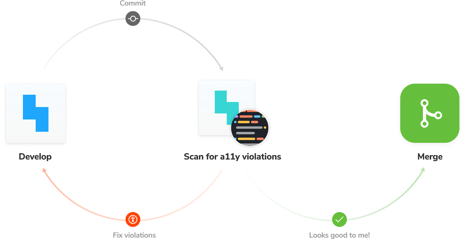
By running these checks throughout the development process, you shorten the feedback loop and fix issues faster. Here’s what the workflow looks like:
- 👨🏽💻 During development: use Storybook to focus on one component at a time. Use the A11y addon to simulate vision defects and run an accessibility audit at the component level.
- ✅ For QA: integrate the Axe audit into your functional testing pipeline. Run checks on all components to catch regressions.
Tutorial
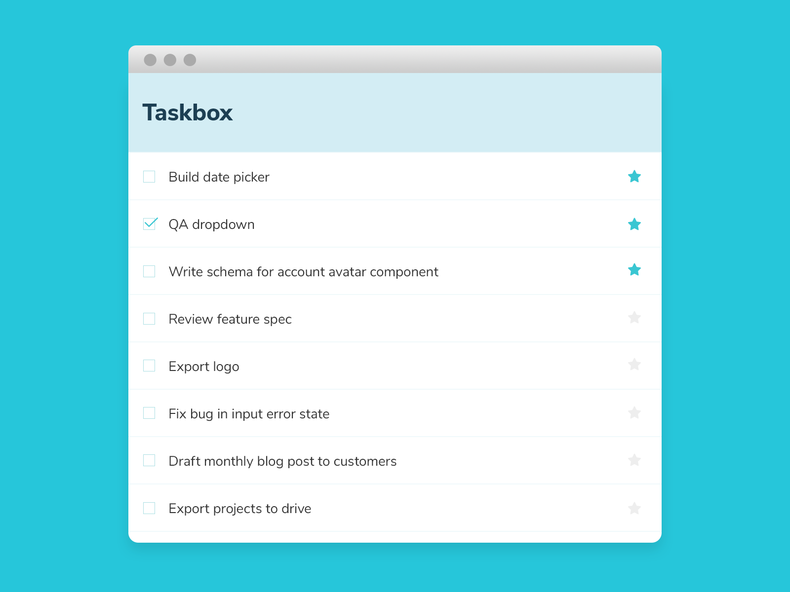
Let’s see this workflow in action. We’ll be using the Taskbox app I introduced in an earlier post. Grab the code and follow along.
Install the accessibility addon
Storybook’s Accessibility runs Axe on the active story. It visualizes the test results in a panel and outlines all DOM nodes that have a violation.
To install the addon, run: yarn add -D @storybook/addon-a11y. Then, add '@storybook/addon-a11y' to the addons array in your .storybook/main.js:
// .storybook/main.js
const path = require('path');

const toPath = (_path) => path.join(process.cwd(), _path);

module.exports = {
 stories: ['../src/**/*.stories.mdx', '../src/**/*.stories.@(js|jsx|ts|tsx)'],
 addons: [
   '@storybook/addon-links',
   '@storybook/addon-essentials',
   '@storybook/preset-create-react-app',
   '@storybook/addon-a11y',
 ],
 webpackFinal: async (config) => {...},
};
Testing accessibility as you code
In previous blog posts, we learnt how to isolate a component and capture all its use cases as stories. For example, below are all the stories for the Task component. During the development phase, you can cycle through each story to verify the component’s appearance and spot any accessibility issues.
// src/components/Task.stories.js
import React from 'react';
import { Task } from './Task';

export default {
 component: Task,
 title: 'Task',
 argTypes: {
   onArchiveTask: { action: 'onArchiveTask' },
   onTogglePinTask: { action: 'onTogglePinTask' },
   onEditTitle: { action: 'onEditTitle' },
 },
};

const Template = (args) => <Task {...args} />;

export const Default = Template.bind({});
Default.args = {
 task: {
   id: '1',
   title: 'Buy milk',
   state: 'TASK_INBOX',
 },
};

export const Pinned = Template.bind({});
Pinned.args = {
 task: {
   id: '2',
   title: 'QA dropdown',
   state: 'TASK_PINNED',
 },
};

export const Archived = Template.bind({});
Archived.args = {
 task: {
   id: '3',
   title: 'Write schema for account menu',
   state: 'TASK_ARCHIVED',
 },
};

const longTitleString = `This task's name is absurdly large. In fact, I think if I keep going I might end up with content overflow. What will happen? The star that represents a pinned task could have text overlapping. The text could cut-off abruptly when it reaches the star. I hope not!`;

export const LongTitle = Template.bind({});
LongTitle.args = {
 task: {
   id: '4',
   title: longTitleString,
   state: 'TASK_INBOX',
 },
};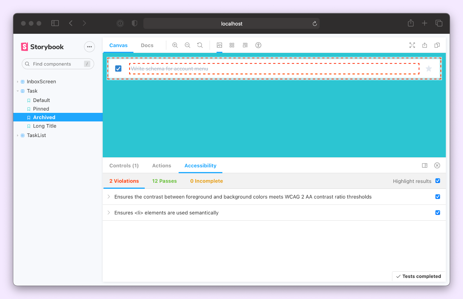
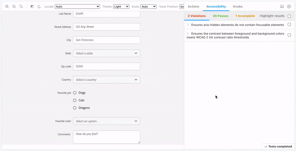
Notice how the addon found two violations. The first, “Ensures the contrast between foreground and background colors meets WCAG 2 AA contrast ratio thresholds,” is specific to the archived state. Essentially what it means is that there isn’t enough contrast between the text and the background. We can fix that by changing the text color to a slightly darker gray—from gray.400 to gray.600.
// src/components/Task.js
import React from 'react';
import PropTypes from 'prop-types';
import {
 Checkbox,
 Flex,
 IconButton,
 Input,
 Box,
 VisuallyHidden,
} from '@chakra-ui/react';
import { StarIcon } from '@chakra-ui/icons';

export const Task = ({
 task: { id, title, state },
 onArchiveTask,
 onTogglePinTask,
 onEditTitle,
 ...props
}) => (

 // code omitted for brevity

   <Box width="full" as="label">
     <VisuallyHidden>Edit</VisuallyHidden>
     <Input
       variant="unstyled"
       flex="1 1 auto"
       color={state === 'TASK_ARCHIVED' ? 'gray.600' : 'gray.700'}
       textDecoration={state === 'TASK_ARCHIVED' ? 'line-through' : 'none'}
       fontSize="sm"
       isTruncated
       value={title}
       onChange={(e) => onEditTitle(e.target.value, id)}
     />
   </Box>

   // code omitted for brevity
 </Flex>
);

Task.propTypes = {
 task: PropTypes.shape({
   id: PropTypes.string.isRequired,
   title: PropTypes.string.isRequired,
   state: PropTypes.string.isRequired,
 }),
 onArchiveTask: PropTypes.func.isRequired,
 onTogglePinTask: PropTypes.func.isRequired,
 onEditTitle: PropTypes.func.isRequired,
};
The second violation, “Ensures <li> elements are used semantically,” indicates that the DOM structure is incorrect. The Task component renders an <li> element. However, it's not wrapped with a <ul> in its stories. Which makes sense. These stories are for the Task component. The <ul> is actually provided by the TaskList. So the DOM structure gets validated in the TaskList stories. Therefore, it's safe to ignore this error. In fact, we can go ahead and disable this rule for all the Task stories.
// src/components/Task.stories.js
import React from 'react';
import { Task } from './Task';

export default {
 component: Task,
 title: 'Task',
 argTypes: {
   onArchiveTask: { action: 'onArchiveTask' },
   onTogglePinTask: { action: 'onTogglePinTask' },
   onEditTitle: { action: 'onEditTitle' },
 },
 parameters: {
   a11y: {
     config: {
       rules: [{ id: 'listitem', enabled: false }],
     },
   },
 },
};

// remaining code omitted for brevity
You can now repeat this process for all other components.
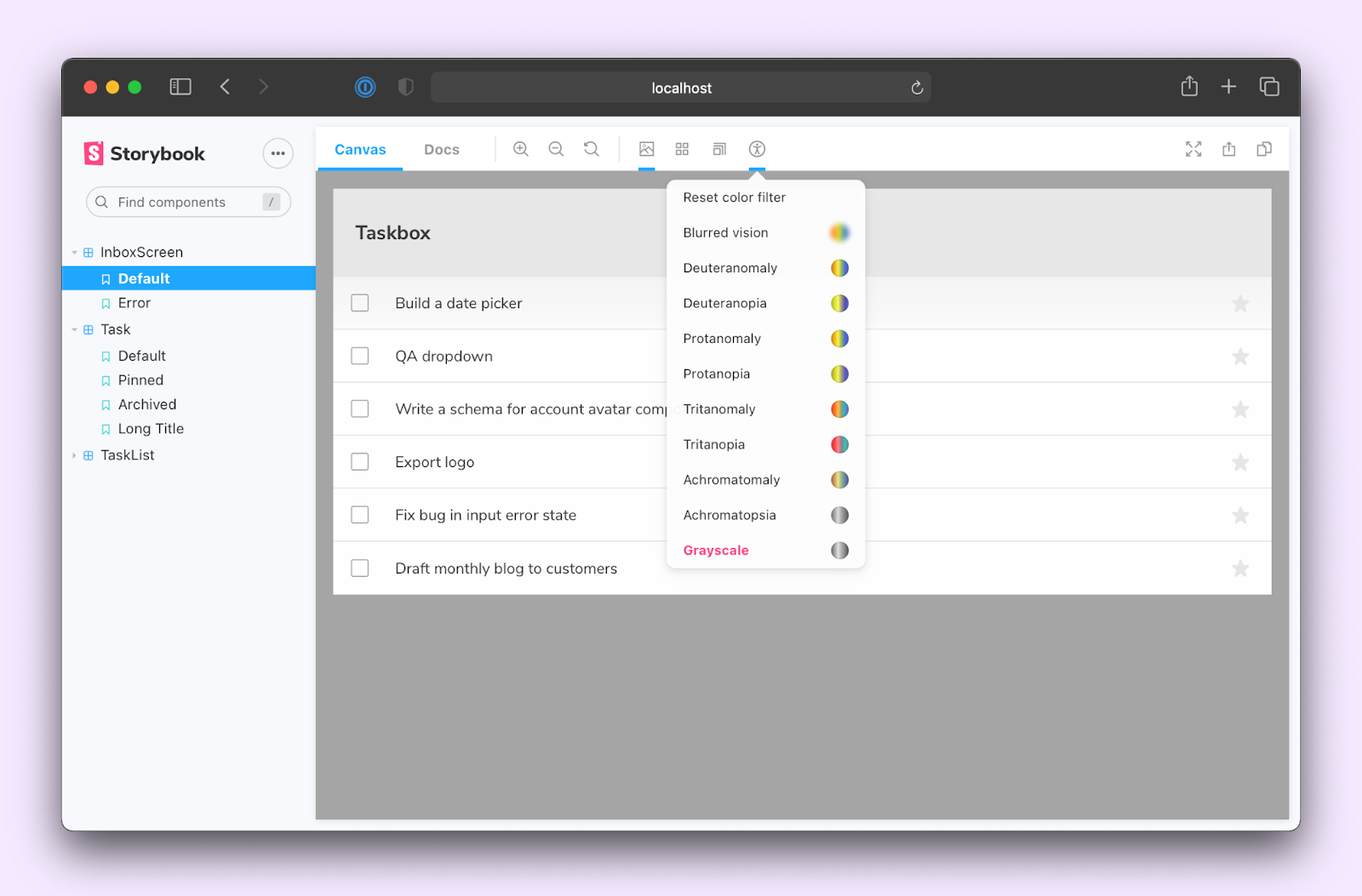
Integrating accessibility testing into Storybook streamlines your development workflow. You don’t have to jump between different tools while working on a component. Everything you need is right there in the browser. You can even simulate visual impairments such as deuteranomaly, protanomaly or tritanopia.
Preventing regressions
Components are interdependent – changes in one component could break others by accident. To ensure that accessibility violations aren’t introduced, we need to run Axe on all our components before merging changes.
Stories are written in a format based on ES6 modules, allowing you to reuse them with other testing frameworks. In the last post, we looked at importing stories into Jest and verifying interactions with Testing Library. Here’s what the test file for the InboxScreen looks like.
// src/InboxScreen.test.js
import React from 'react';
import '@testing-library/jest-dom/extend-expect';
import {
 render,
 waitFor,
 cleanup,
 within,
 fireEvent,
} from '@testing-library/react';
import { composeStories } from '@storybook/testing-react';
import { getWorker } from 'msw-storybook-addon';
import * as stories from './InboxScreen.stories';

describe('InboxScreen', () => {
 afterEach(() => {
   cleanup();
 });

 // Clean up after all tests are done, preventing this
 // interception layer from affecting irrelevant tests
 afterAll(() => getWorker().close());

 const { Default } = composeStories(stories);

 it('should pin a task', async () => {
   const { queryByText, getByRole } = render(<Default />);

   await waitFor(() => {
     expect(queryByText('You have no tasks')).not.toBeInTheDocument();
   });

   const getTask = () => getByRole('listitem', { name: 'Export logo' });

   const pinButton = within(getTask()).getByRole('button', { name: 'pin' });

   fireEvent.click(pinButton);

   const unpinButton = within(getTask()).getByRole('button', {
     name: 'unpin',
   });

   expect(unpinButton).toBeInTheDocument();
 });

 // More interaction tests
 it('should archive a task', async () => {...});
 it('should edit a task', async () => {...});
});
Similarly, we can use the Jest Axe integration to run accessibility tests on the component. Let’s start by installing it: yarn add -D jest-axe
Next, add in an it block that runs Axe and checks for violations. Jest-axe also gives you a handy assertion, toHaveNoViolations, to verify this with one function call.
// src/InboxScreen.test.js
import React from 'react';
import '@testing-library/jest-dom/extend-expect';
import {
render,
waitFor,
cleanup,
within,
fireEvent,
} from '@testing-library/react';
import { axe, toHaveNoViolations } from 'jest-axe';
import { composeStories } from '@storybook/testing-react';
import { getWorker } from 'msw-storybook-addon';
import * as stories from './InboxScreen.stories';
expect.extend(toHaveNoViolations);
describe('InboxScreen', () => {
afterEach(() => {
cleanup();
});
// Clean up after all tests are done, preventing this
// interception layer from affecting irrelevant tests
afterAll(() => getWorker().close());
const { Default } = composeStories(stories);
// Run axe
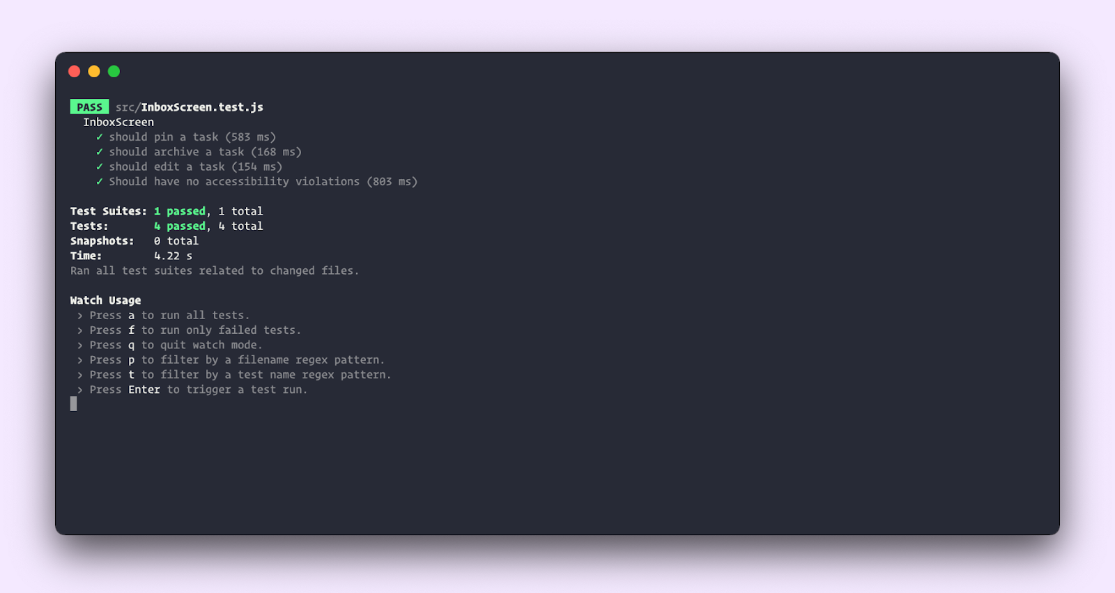
it('Should have no accessibility violations', async () => {
const { container, queryByText } = render(<Default />);
await waitFor(() => {
expect(queryByText('You have no tasks')).not.toBeInTheDocument();
});
const results = await axe(container);
expect(results).toHaveNoViolations();
});
it('should pin a task', async () => {...});
it('should archive a task', async () => {...});
it('should edit a task', async () => {...});
});
Run yarn test to start up Jest. It'll execute all the interaction tests and run the accessibility audit too. You can now run this entire test suite any time you modify the code. Allowing you to catch regressions.
We’ve looked at how to layer automated accessibility testing into the UI development workflow. This does not make your app fully accessible. You still do need to test the interface with assistive technologies such as VoiceOver or NVDA. Automation does, however, save you time and catch issues early.
Conclusion
Web accessibility is not easy – it can be overwhelming to balance accessibility with impending deadlines, business goals, and tech debt.
Tools like Axe and the Storybook Accessibility addon integrate into your existing development workflow and provide a fast feedback loop. You save time by finding and fixing issues as you build UIs. What's more, making the interface accessible leads to a much better experience for all your users!
Writing test cases as stories means that we can reuse them for all kinds of testing. The stories file becomes a single source of truth for everything that a component does. Next up, we'll look at yet another example of this—user flow testing. We'll look at how to use Cypress to verify tasks performed across multiple components. Join the mailing list to get notified as more UI testing articles are published.
Find and fix issues as you build UIs 🤔
— Storybook (@storybookjs) August 4, 2021
Building accessible UIs requires a lot of testing. By combining manual & automated testing, you save time and catch issues early.
New tutorial on integrating the Storybook a11y addon and Axe into your dev workflow: https://t.co/DL7xycwTdC pic.twitter.com/GpPbBQXRf0