Announcing Storybook 3.0
webpack2, create-react-native-app, snapshot testing++, & more!

Welcome to Storybook 3.0, a huge step forward for the world’s favorite UI component development environment.
Functionally, 3.0 brings long-anticipated webpack2 support, create-react-native-app support, flexible snapshot testing, and a host of bugfixes and enhancements.
Under the hood, Storybook 3.0 is a major overhaul of the Storybook project both organizationally and structurally. Organizationally, it is the first community-driven release of Storybook. Structurally, we have cleaned up the package structure and consolidated the code into a monorepo for better testing and maintenance.
How to upgrade
Storybook packages have all moved from the @kadira NPM org to@storybook, and we’ve taken the opportunity to clean up the package names as well.
First-time installation remains easy:
npm i -g @storybook/cli
cd my-react-or-react-native-project
getstorybook
But what if you’ve already built a project using Storybook 2?
Surprise, it’s just as easy:
npm i -g @storybook/cli
cd my-storybook2-project
getstorybook
Magic! This will not only upgrade the storybook dependencies in your package.json, but will also apply a codemod to update your JS source to make sure you’re using the new @storybookpackages across your project. It may still need a few manual steps if you’ve customized Storybook’s webpack config, but we’ve documented it all in the Storybook 3.0 migration guide.
Community-driven release
For anybody involved in Storybook, the defining “feature” of the release is not a feature at all, but rather a change in organization: Storybook 3.0 marks the transition from Storybook as the open-source project of a startup (Kadira) to Storybook as community-driven open collective.
The change in structure and personnel explains the lag between the 2.3.5 release in January, the overhaul of its package structure, and the team’s excitement to complete the transition. In short, it’s been a great transition and we’re thrilled to continue blazing trails in component-driven design, development, and testing.

Webpack 2
Like the rest of the JS world, Storybook users are a fast-moving bunch. So when Webpack2 support was slow to arrive, we could see the community gathering its pitchforks and torches on Github. With Storybook 3.0 we are happy to finally support webpack2 and we can all go back to endlessly tweaking our webpack configs with the latest version. :)
We’ve documented the Storybook-specifics aspects of this in the Storybook 3 migration guide, and the Webpack team has also documented Webpack migration in their own migration guide.
Create-React-Native-App
One of the marquee features of Storybook 2 was getstorybook, a drop-dead simple way to install Storybook in a variety of project types. create-react-app contributed to the rise of React as the dominant UI framework, and getstorybook helped Storybook become the preferred tool for React component development.
Now create-react-native-app is poised to do the same thing for React Native. And storybook is right behind. Now setting up Storybook for React Native is as easy as:
yarn create react-native-app myapp
cd myapp
getstorybook
For additional options to integrate it with your RN app, see the storybook/react-native README.
Snapshot testing++
With storyshots, Storybook 2.o was the first component development tool to support Jest’s powerful snapshot testing out of the box. Simply write your stories and get snapshot testing for free in just two lines of code.
In Storybook 3.0, snapshot testing has taken a step up with a configurable Snapshot function. This means you can literally do anything in the test function: mock components, take screenshots, test rendering performance, and so on. We’ll take advantage of this in upcoming enhancements. Until then, here’s a simple example of mocking in action:
import initStoryshots, { snapshotWithOptions } from '@storybook/addon-storyshots';

initStoryshots({
  test: snapshotWithOptions({
    createNodeMock: (elt) => (
      elt.type === 'div' ? { scrollWidth: 123 } : null
    )
  })
});
Additional fixes
In addition to the features above, Storybook 3.0 contains hundreds of contributions from the community, addressing a variety of issues, big and small. To see a blow-by-blow of all these improvements, see our release notes:
What’s next?
With the smooth transition to a community-managed Storybook and a clean monorepo development structure, we’ve already started forging ahead on a host of 3.1 improvements, especially around the UI, hierarchical stories, responsive behavior testing, theming, and support for other UI frameworks. We’ve created an initial roadmap, and with the release is out the door, we’ll be soliciting input from the community soon.
Come along for the ride!
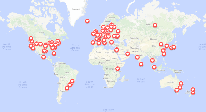
Storybook 3.0 would not be possible without hundreds of contributions from our community. We are a friendly, open group and we’d love to have you involved, as a user, contributor, or maintainer.

Try out Storybook 3.0 today using the instructions above. Add Storybook to your project in just seconds, and get started with the best way to develop React and React Native component UI’s.
And if you have questions, problems, encouragements, or simply exclamations of joy for the new release, please give us a holler on Twitter, Slack, Github, or in the comments below!
Finally, to stay up to date with Storybook-related news, hit “follow” below, or check us out on Twitter. And if you love Storybook, please tap the 👏 button below to help more people discover it.
With ❤️, storybook team.
Special thanks: Norbert de Langen, Tom Coleman, Aaron McAdam, Oleg Proskurin, @mnmtanish, Arunoda Susiripala, Sacha Greif; issues, problems, feedback, suggestions, encouragement from the Storybook community, and code contributions from these github users: @aaronmcadam @ajhyndman @apexskier @arunoda @benediktvaldez @chrvadala @cnandreu @danielduan @danny-andrews@elisherer @enjoylife @fabien0102 @floriangosse @gongreg @greenkeeper[bot] @gvaldambrini @joscha @kiwka @konsumer @marcfallows @matt-oakes @methyl @mkamakura@mnmtanish @mthuret @nayucolony @ndelangen @null @olistic @raciat @rixth @sachag @she-dev @shilman @stereodenis @stupidism @subpopular @theatlasroom @theinterned@tmeasday @usulpro @wcastand @xavcz @xdamman @z4o4z @zjeraar
