Component Test with Storybook and Vitest
Best-in-class Component Testing at your fingertips

You already use Storybook to build UI states. With Storybook 9, we evolved our testing workflows using the latest generation of tools. We partnered with Vitest, which ships the fastest test runner available, to build the ultimate component testing workflow. It includes:
👆 Interaction tests
♿️ Accessibility tests
🖼️ Visual tests
🛡️ Coverage reports
🚥 Test widget to run tests automatically
Why component tests?
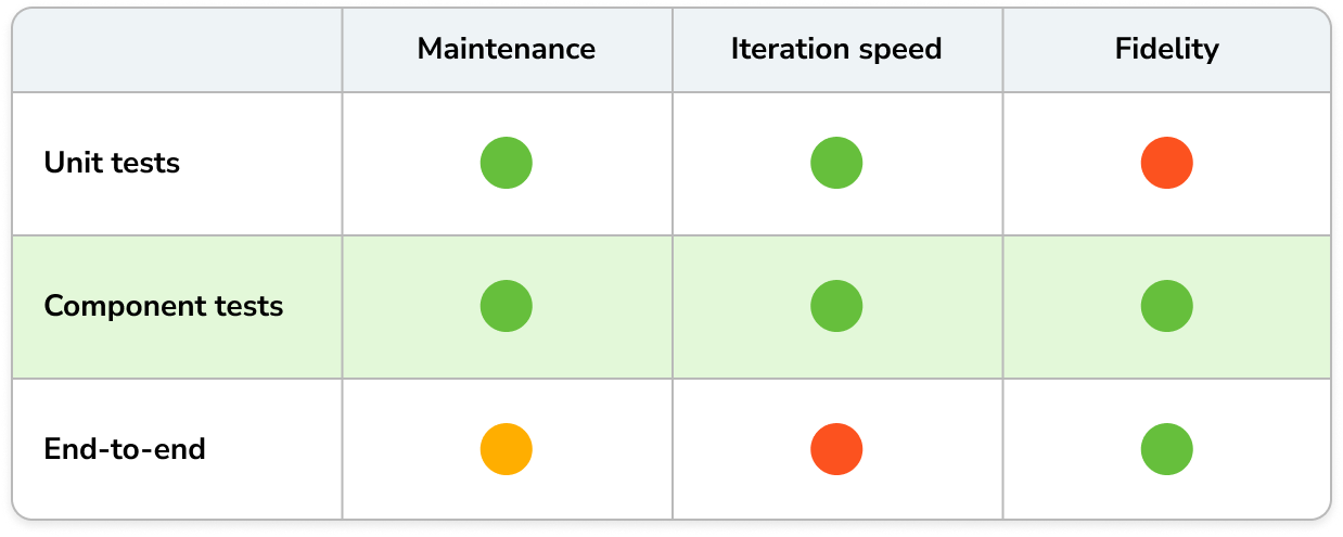
Component tests hit the sweet spot between the speed of unit tests and the in-browser fidelity of end-to-end (E2E) tests with none of the downsides.
Component tests scale to thousands of UI states with minimal maintenance. Unit tests validate logic; E2E tests are best for a few key flows. Storybook Test covers the middle: your components.
Storybook is perfect for component testing because stories already express every component variation so adding tests to those variations is easy.
The 3 types of component tests
In frontend development, there are three core dimensions to test. Storybook supports these tests out-of-the-box in local development and in CI.
- Does it work? Interaction tests
- Can everyone use it? Accessibility tests
- Does it look right? Visual tests
Interaction tests
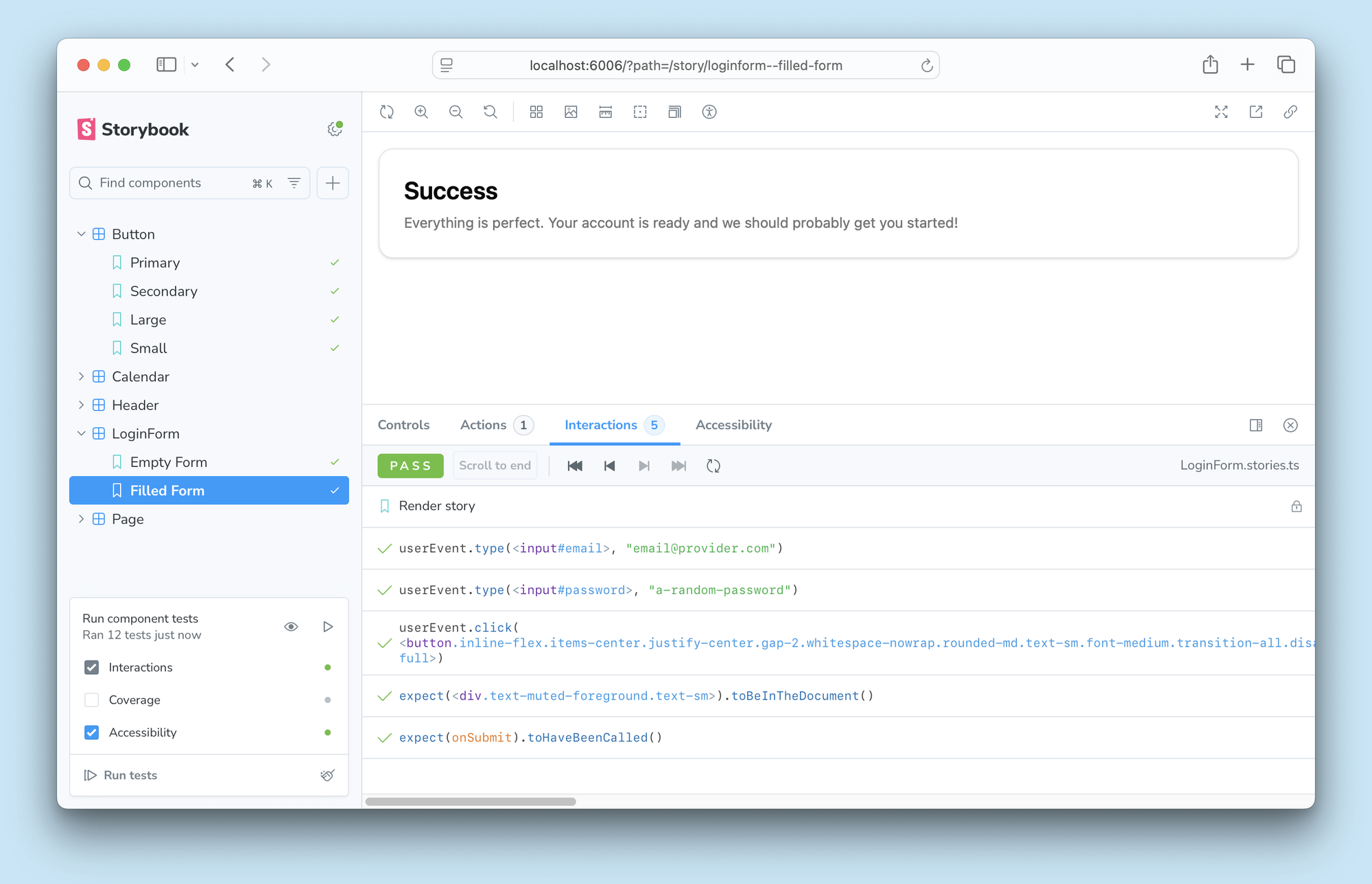
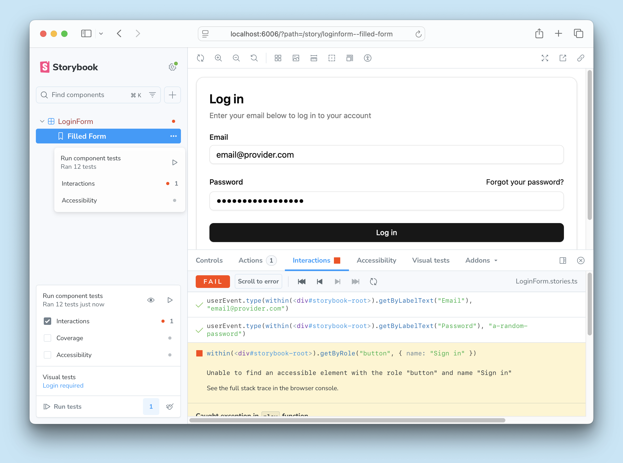
Interaction tests simulate user behavior and assert that the component functions as expected. Storybook has supported this test type for years via the play function, but you could only run these tests when you navigated to the story. Now you can run all interaction tests across all your stories with a single click and report test statuses in the sidebar thanks to Vitest.
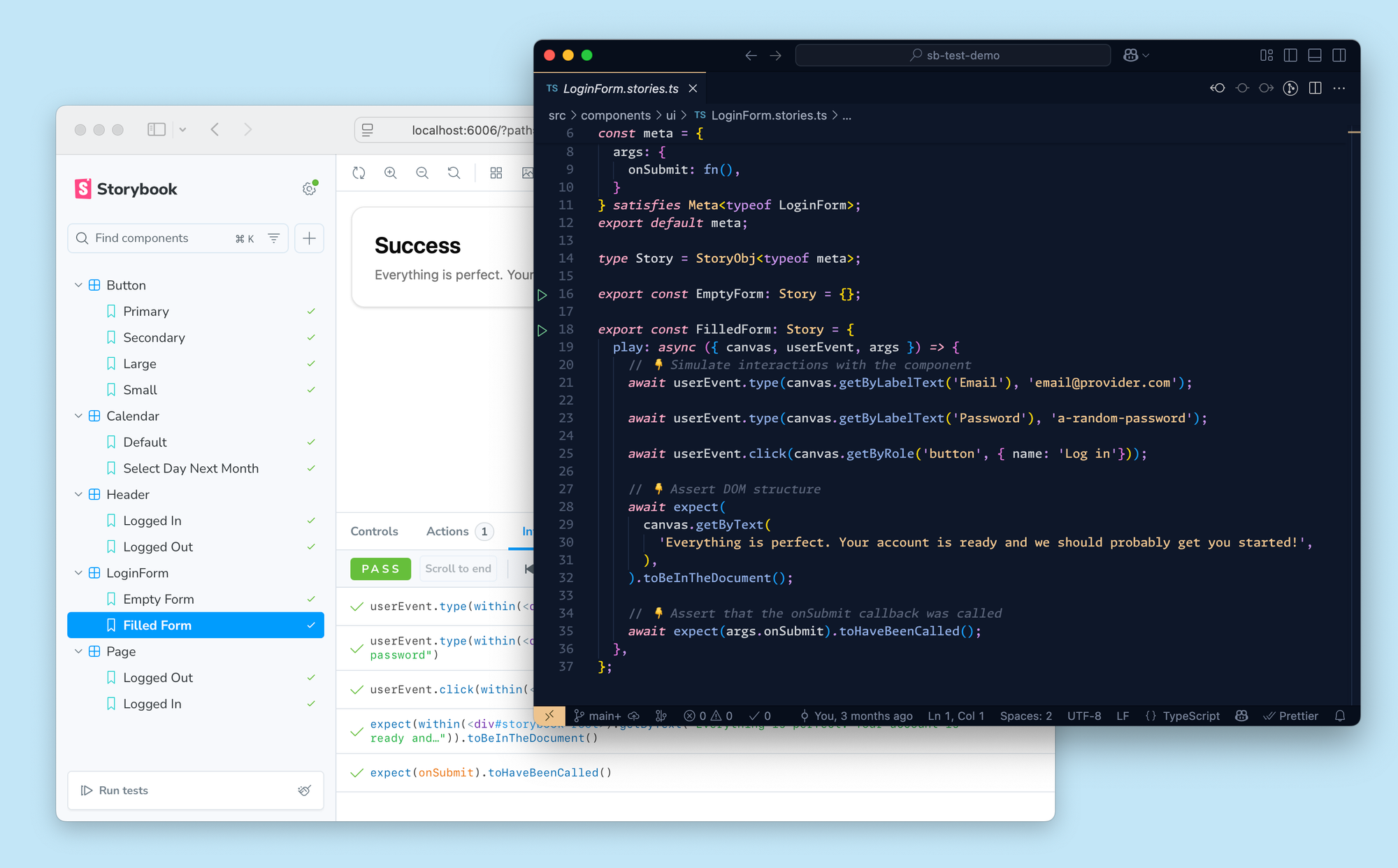
Clicking on an interaction test failure in the sidebar takes you to the Interactions panel. It allows you to step forwards and backwards through the play function and inspect the story at every step along the way.
Accessibility tests
Accessibility tests scan the rendered DOM to verify that it meets the Web Content Accessibility Guidelines (WCAG). These checks are implemented by axe-core, the industry standard tool.
9.0 introduces a redesigned A11y panel, improved violation highlighting, and deep linking to streamline debugging.
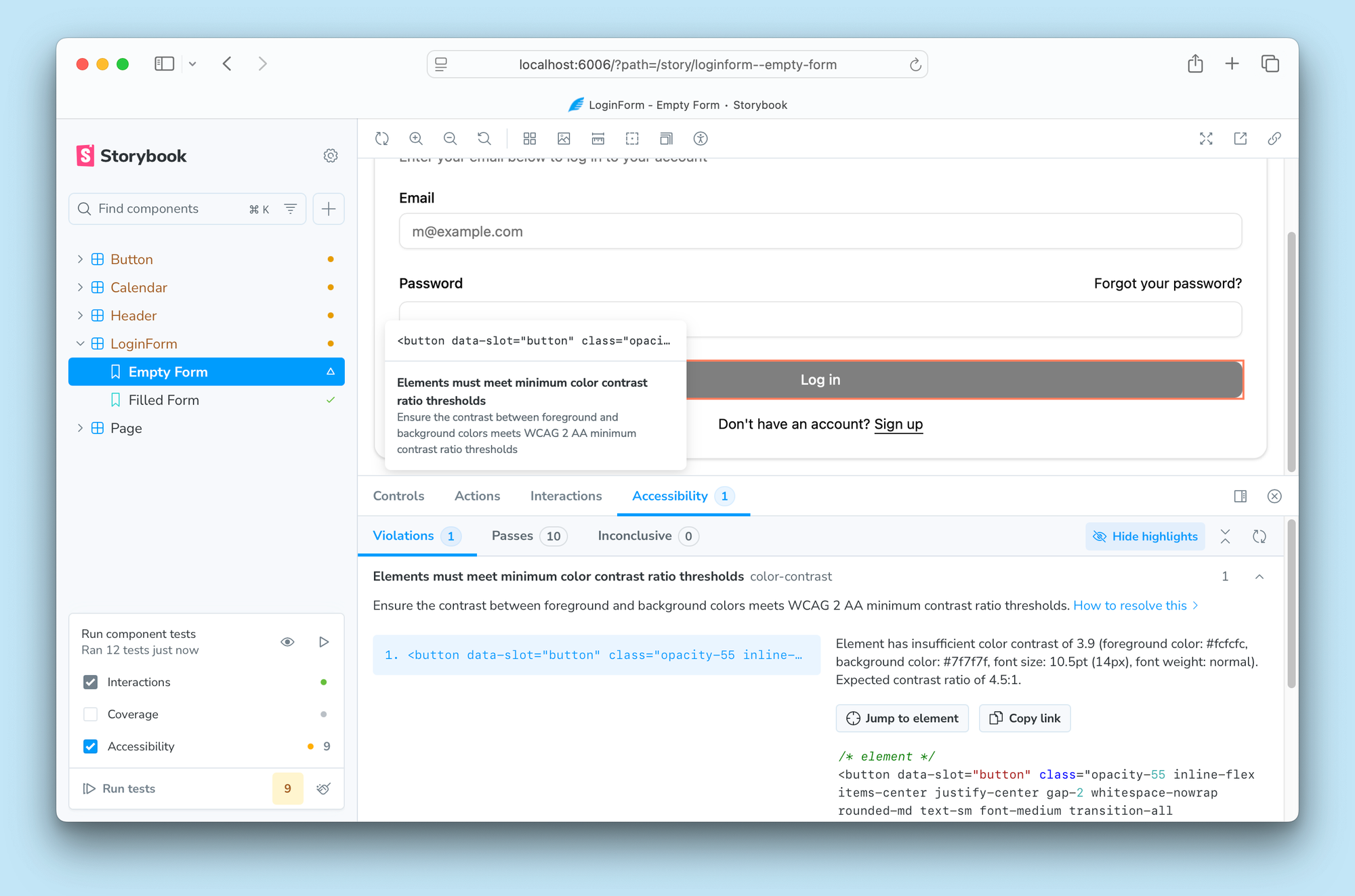
The panel has been overhauled to group violations by type, and allows you to debug each failure by highlighting it in the story and providing useful info on how to fix it.
Our sister tool, Chromatic, just introduced Accessibility Regression Testing (ART) in the cloud. Most teams have preexisting accessibility debt and can’t drop everything to fix every violation. ART sets a baseline for preexisting violations and stops new WCAG bugs from being introduced. That way you can continue shipping and prioritize debt at your own pace.
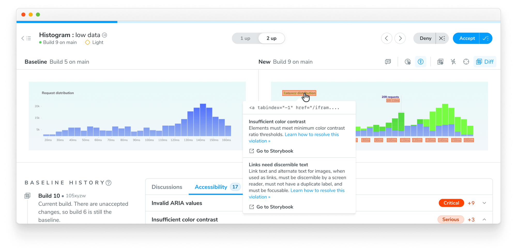
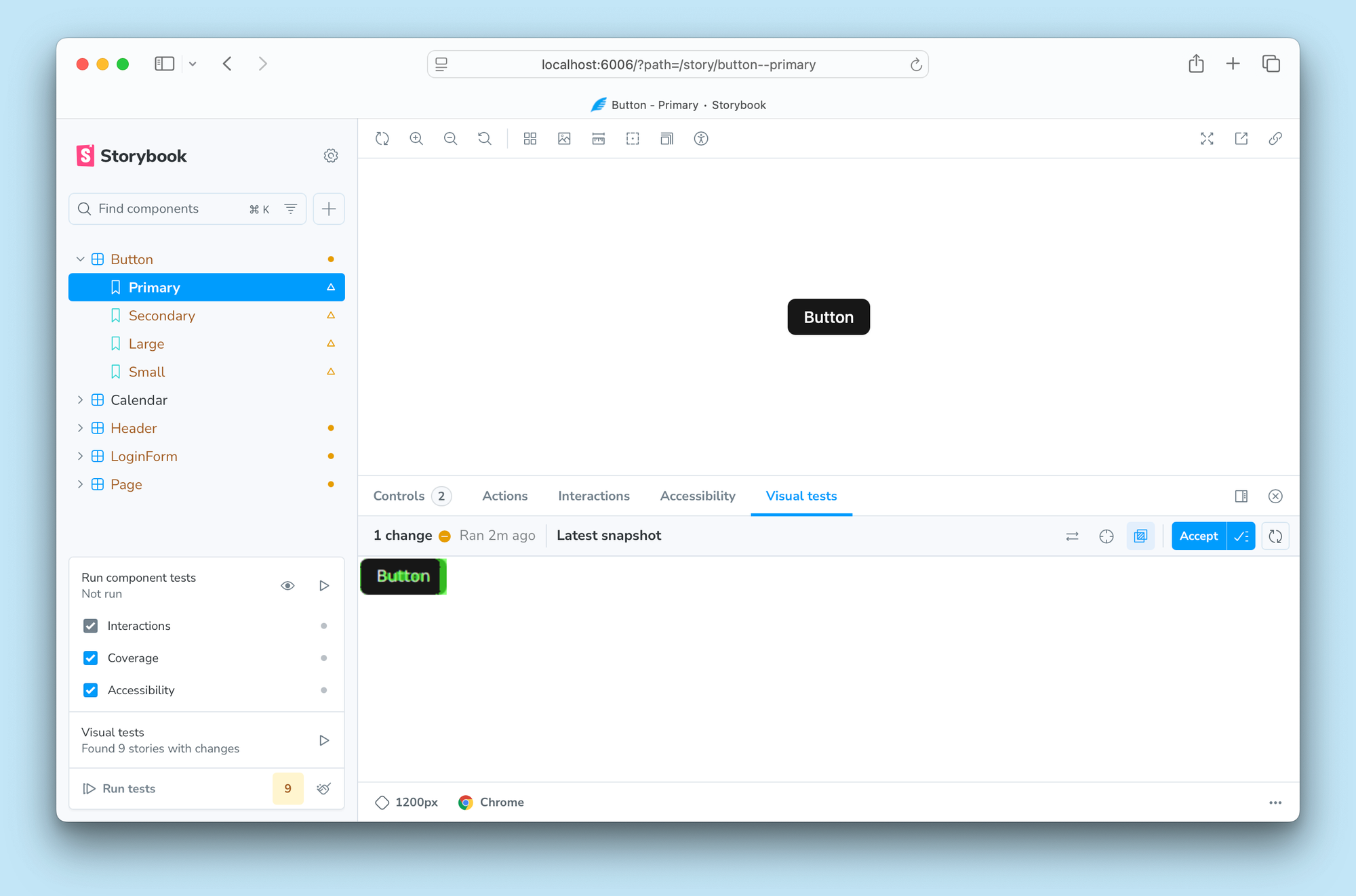
Visual tests
Visual tests compare the appearance of your UI before and after a code change to prevent visual bugs. The best part about visual testing is that you don't need to write any new test code.
Storybook visual tests use Chromatic, a cloud service developed by Storybook maintainers which offers parallelization and consistency across thousands of tests.
When it detects a visual difference, It shows up as a warning in the sidebar. Clicking on that warning takes you to the Visual tests panel, which shows the image difference of the before and after states.
Test widget: Test everything in one click
The Test widget anchors Storybook Test. One click runs all tests across all stories—or configure which types to run. Enable watch mode to instantly rerun only the affected tests when you save.
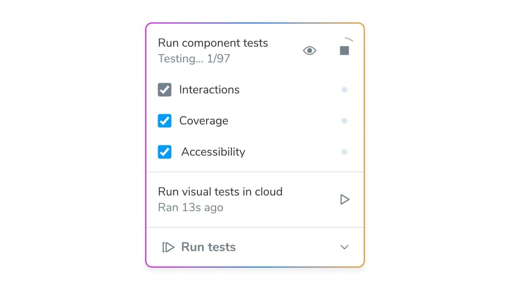
You can then filter the sidebar to only show stories with warnings or errors. Each test type has its own debug panel. Since Storybook runs in your own browser, you can also debug using browser dev tools.
Batch testing
Batch test a single story, component, or folder to speed up feedback. Perfect for large Storybooks with thousands of stories.
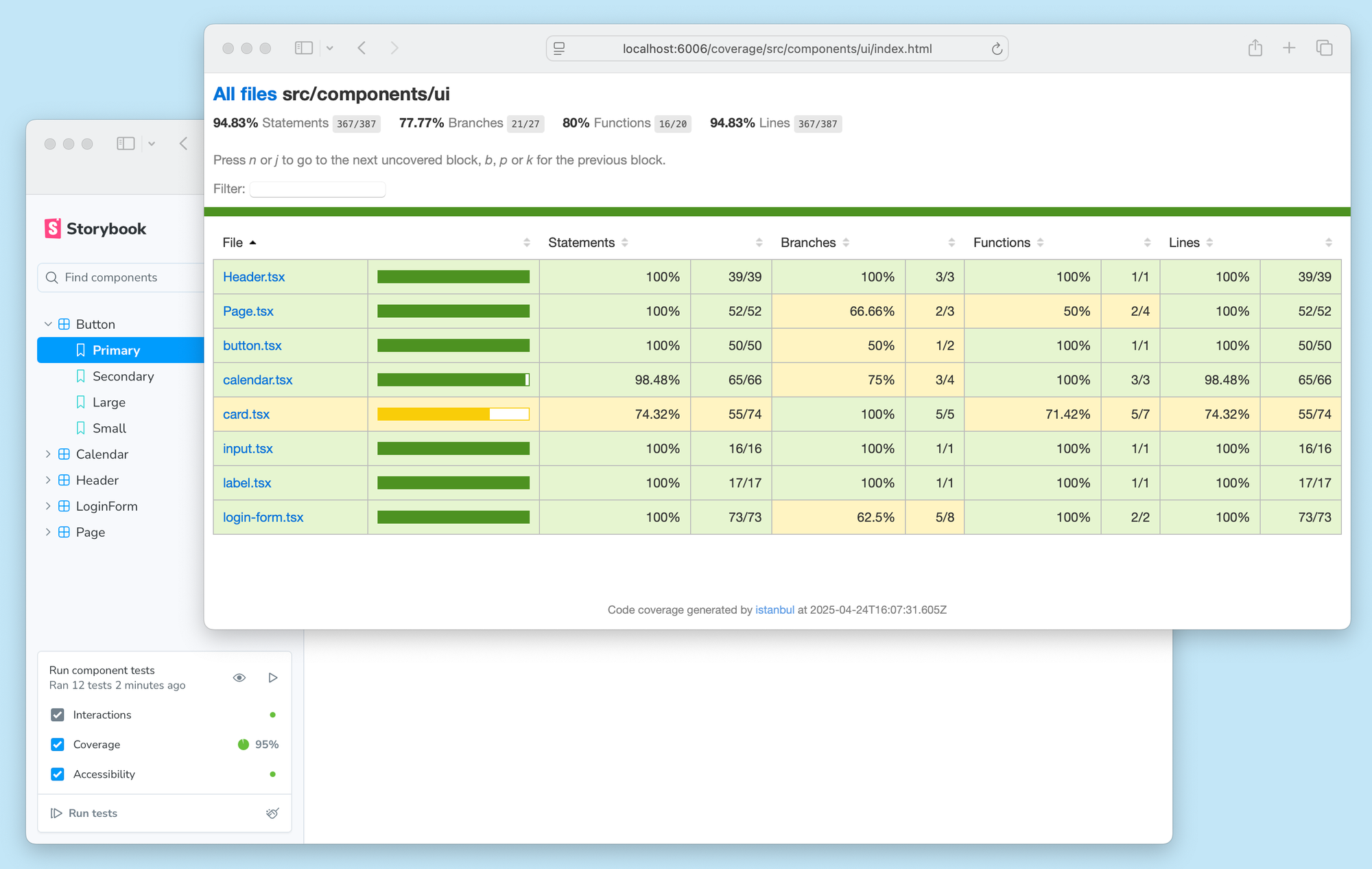
Test coverage
Code coverage compares component code with story code to surface which lines of code & branches are executed by tests. Coverage is built into Storybook to help you ensure that your test suite covers every key UI variation.
Powered by Vitest
We chose Vitest because it’s the defacto successor to Jest with better performance and developer experience. Vitest’s test runner powers Storybook Test in our sidebar and enables you to run in the CLI/CI without needing Storybook at all.
Vitest will treat all your stories as tests and outputs results alongside Vitest unit tests.
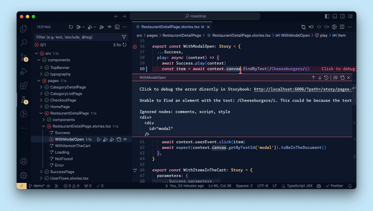
What’s more, adopting Vitest unlocks a whole ecosystem of integrations for you. For instance, you can run all your Vitest tests from within Visual Studio Code and see the results inline as you edit your code. Since Storybook stories are Vitest tests, you get the same seamless workflow across component and unit tests.
Try it today
Storybook Test is part of the recommended install in new Storybook 9 projects.
npm create storybook@latest
If you have an existing Storybook project, first upgrade it to Storybook 9. Use our automated migration wizard to help you along the way:
npx storybook@latest upgrade
Then add the Vitest addon to get the core component testing experience. You can also add the Accessibility addon and Visual Test addons.
npx storybook add @storybook/addon-vitest
npx storybook add @storybook/addon-a11y
npx storybook add @chromatic-com/storybook
Get full docs and examples in the Storybook Test docs.
What’s next?
Storybook 9 is the culmination of a year's worth of work building Storybook Test. Our vision is to create the most ergonomic batteries-included UI testing tool. To that end, we're considering the following improvements:
- First class MSW data mocking.
- Automatic multi-viewport / theme / locale testing
- Syntactic sugar for multiple test steps per story
We want your feedback to help prioritize Storybook’s direction. Join the discussion on GitHub →
Have you tried component testing in Storybook yet? We partnered with @vitest.dev to build the *best* tool for testing your components in the ways that matter. 👆 Interaction tests ♿️ Accessibility tests 🖼️ Visual tests 🛡️ Coverage reports 🚥 Test widget to run tests automatically
— Storybook (@storybook.js.org) 2025-07-29T19:17:01.646Z