Figma plugin beta
Connect stories to design components
Over time, implementation and design tend to drift apart. As apps get more complex, teams lose track of what’s been developed in Storybook and what’s been designed in Figma. This ambiguity slows you down.
I’m thrilled to announce that Storybook Connect for Figma is now in beta. It’s a Figma plugin which brings your stories into the design workspace. That streamlines design handoff and UI review because teams can reference code components alongside their designs.
- 🔗 Link stories to designs
- 🕹 Interact with stories in Figma
- 📌 Pinpoint components during design handoff
- 📐 Compare design specs to implementation
- 🔐 Private projects and access control

The problem
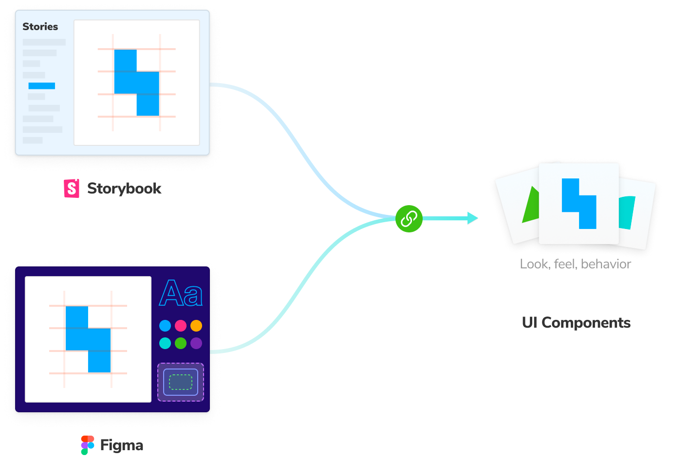
Developers and designers are converging on components, but each discipline takes a different approach. Developers build components in Storybook while designers draw the components in Figma.
Every component is expressed twice, in separate tools. Naturally, this duplication causes confusion around the source of truth for UI. You end up asking “does the component already exist?” and “why doesn’t the component look like the design?”
So even though developers and designers start with components, in practice, there’s a distinct disconnect. At Storybook, our mission is to connect component-driven tools.
Join the beta now!
We’re launching Storybook Connect for Figma to link stories to their corresponding variants. Teams work smarter because they can debug inconsistencies earlier in the design process and discover existing components to reuse.
Before we begin, your project needs to be published to Chromatic, a free service by Storybook maintainers. Chromatic handles access control, security, embedding, and the database that backs the plugin. Once your project is on Chromatic, follow the steps below.
- Join our Discord #figma-plugin channel
- Install the plugin and ❤️ it
The #figma-plugin gives you access to maintainers and hands-on support.
Link stories to designs
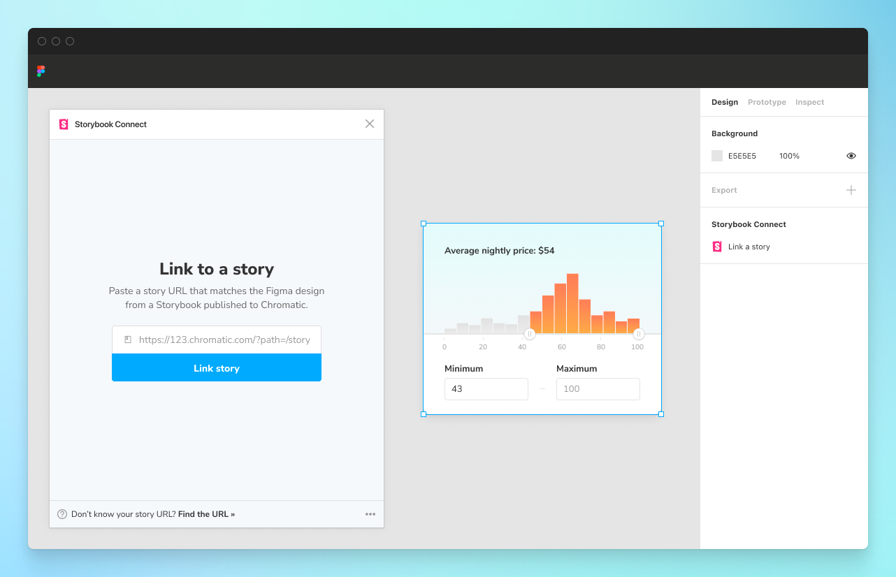
Link stories to corresponding Figma components or variants. Click on the component in Figma then paste the story URL that matches the design. This creates a persistent connection between code and design that propagates to every component instance across Figma files. When you link once, you never have to do it again.
Play with interactive stories to confirm behavior
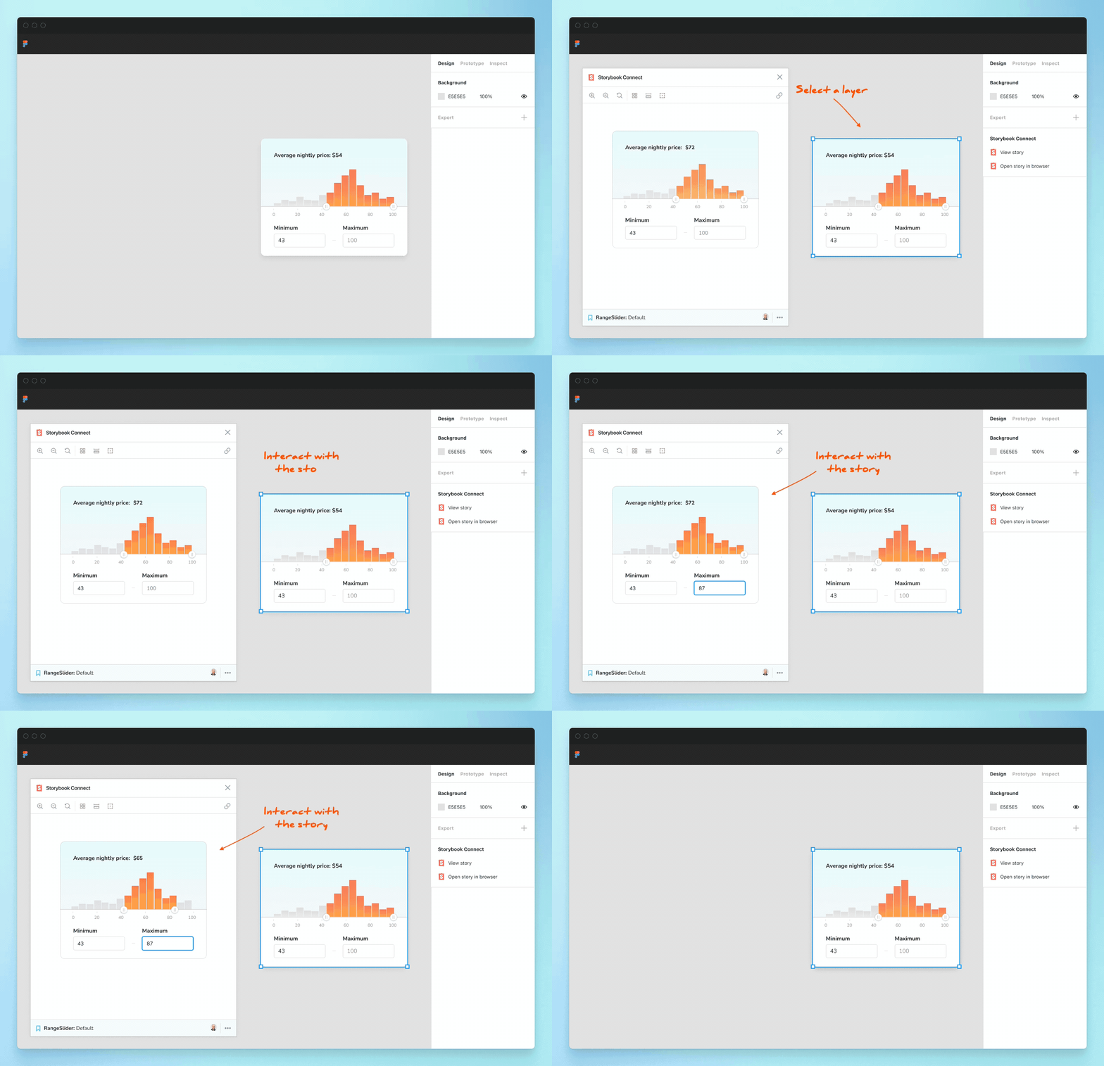
Open the Storybook Connect window to quickly reference the real component implementation that you’ve built in Storybook. This helps designers confirm the nuances of how a component is expected to behave before committing to using it. During handoff, developers can quickly reference an implementation without tabbing between windows.
Open the full Storybook in one click
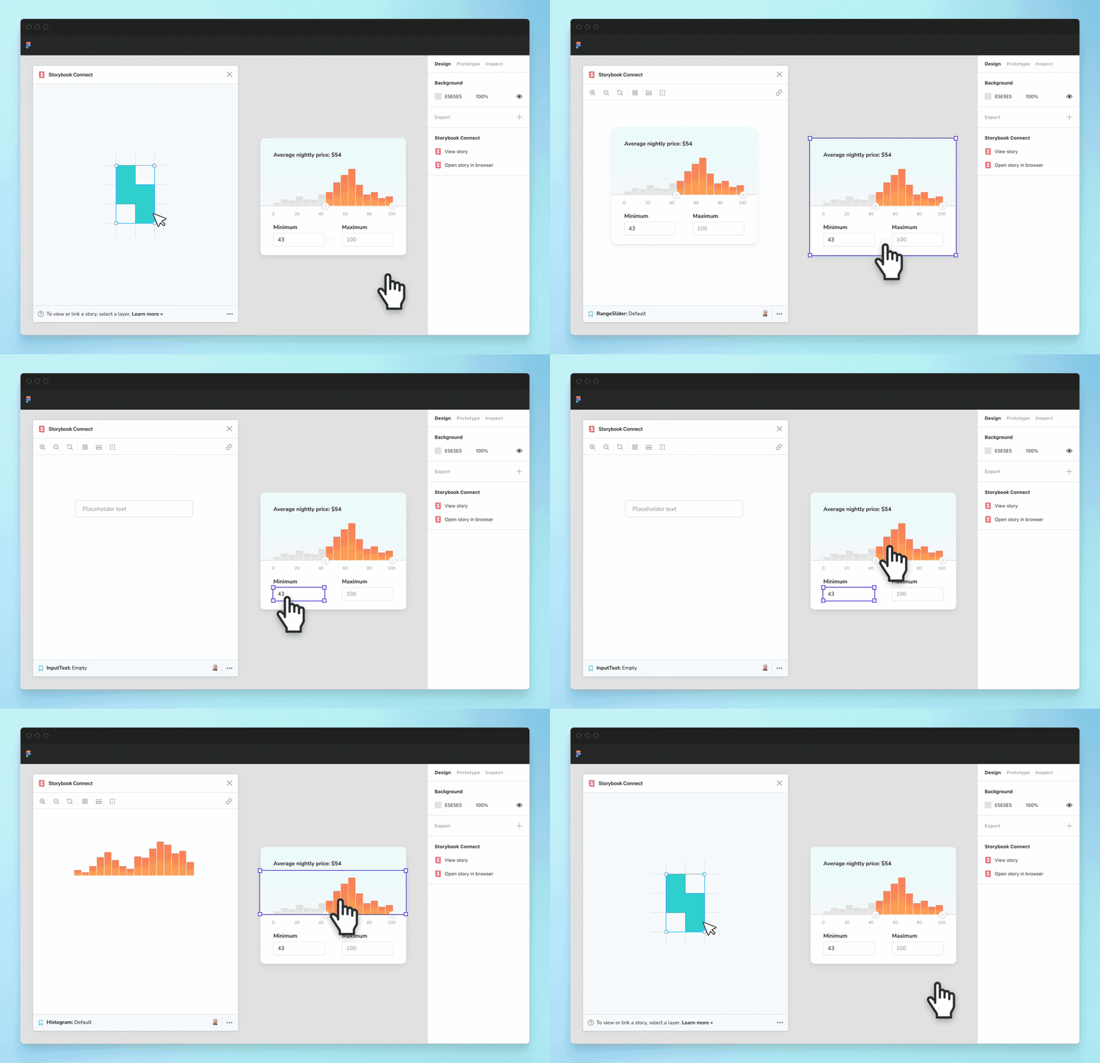
Jump to the complete Storybook with addons, tests, and auto-generated docs. Every connected component has a handy link to “Open story in browser”.
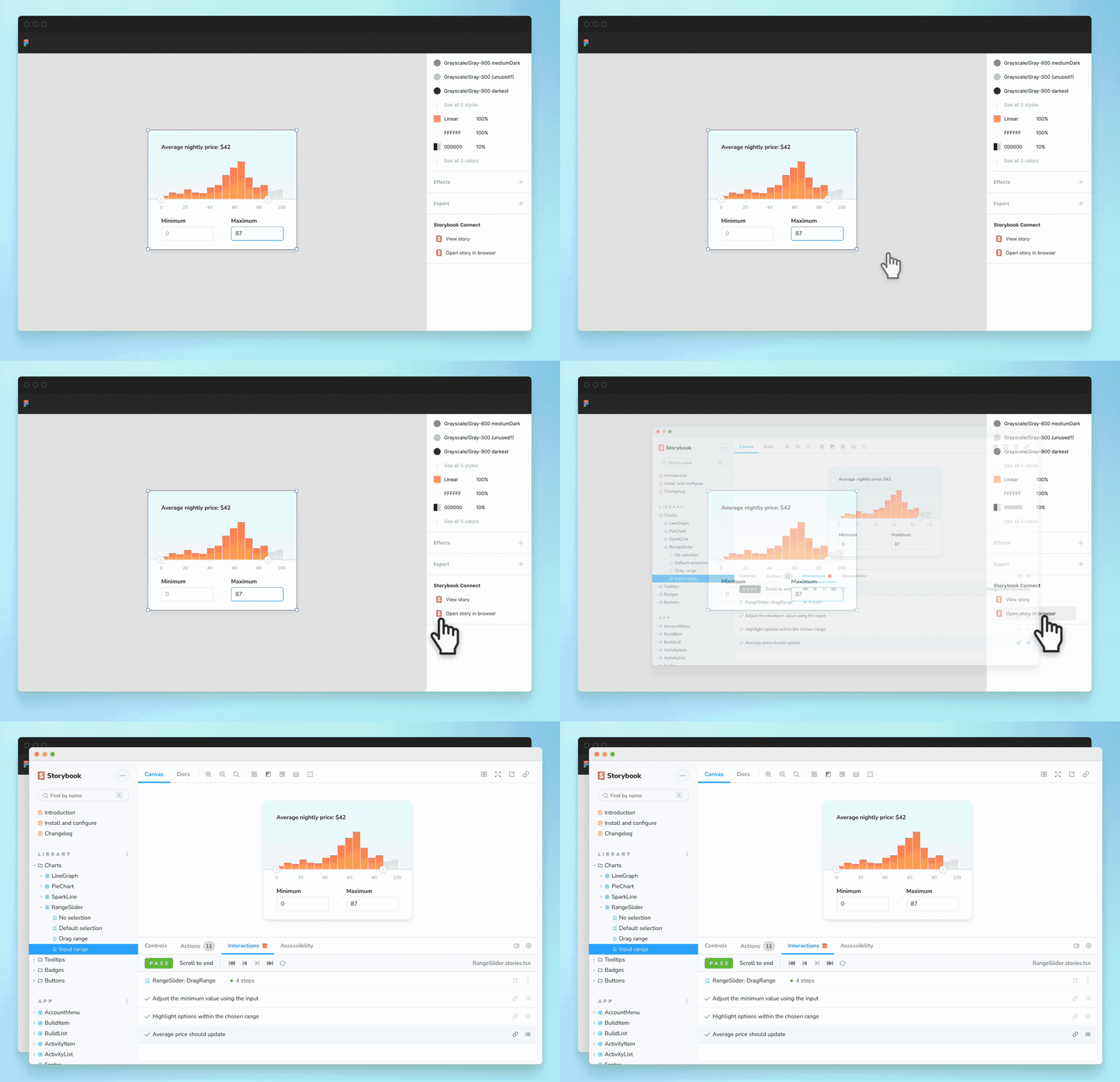
Pinpoint components during design handoff
Components with links to stories are called out in the Figma sidebar. That helps you identify which component you can reuse and which components you need to build anew. That saves teams from accidentally creating multiple versions of the same component.
Compare implementation to design specs
During UI implementation review, check that the rendered UI matches the design with Storybook addons. The Measure addon shows the dimensions and spacing of DOM elements. That helps you confirm design details down to the pixel.
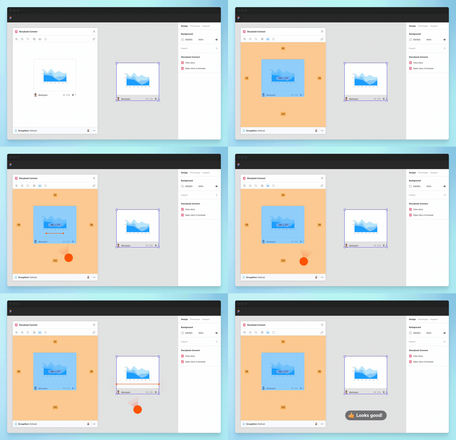
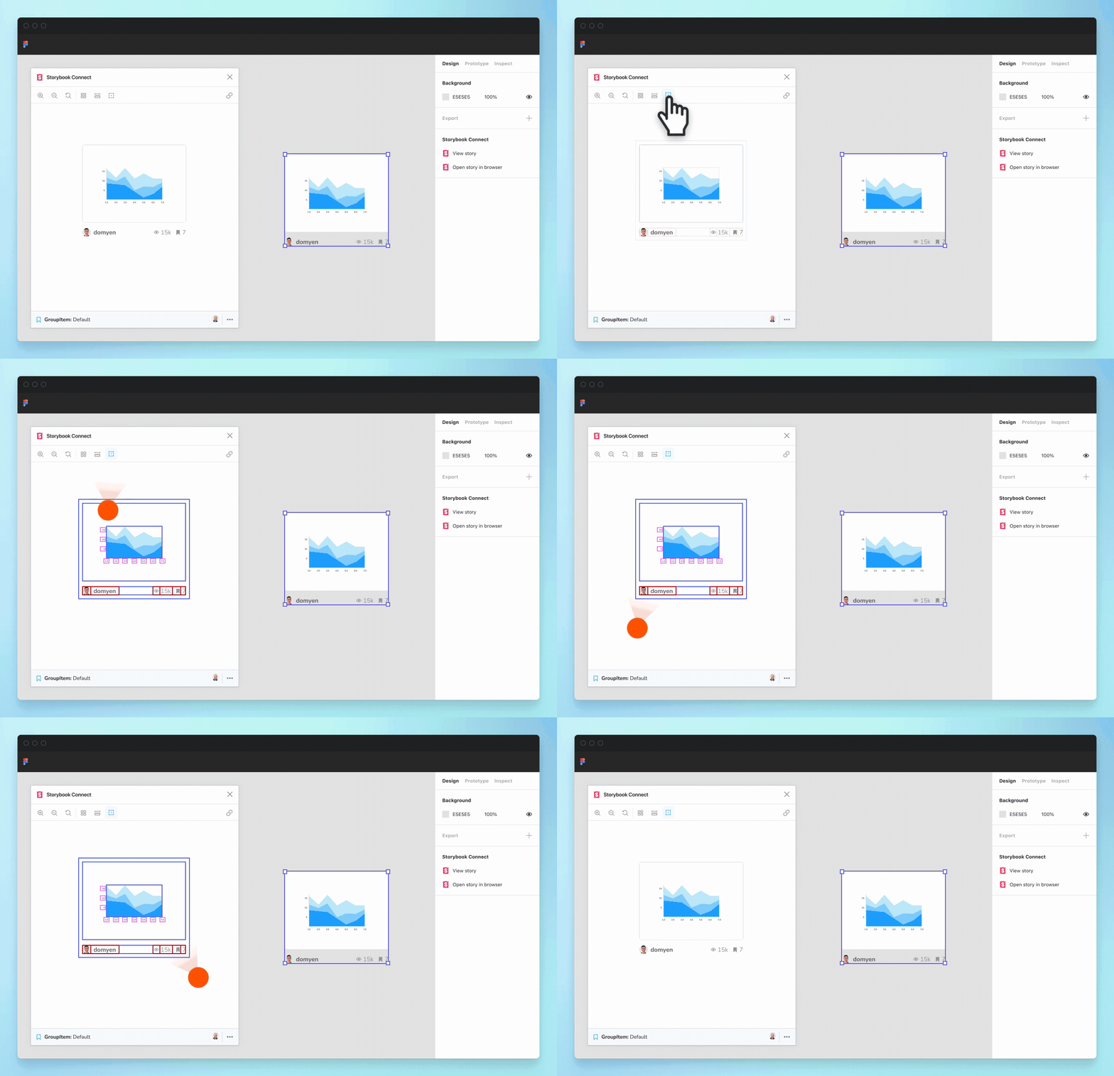
Align CSS layouts in a glance
Use the Outline addon to visualize the boundaries of each DOM element. This helps you debug CSS alignment.
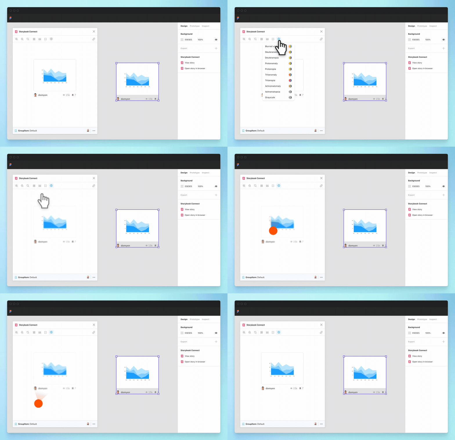
Check color accessibility
Accessibility addon provides filters that simulate different forms of colorblindness. This helps you verify whether a component’s color palette is palatable to users with disabilities.
Already have an invite?
Check out the full setup guide in our Figma community file.
Get involved
Storybook Connect for Figma is in active development. We need your help to find edge cases and improve the workflow. Chat with us on Discord #figma-plugin.
The plugin was developed by Jono Kolnik, Michael Arestad, Gert Hengeveld, Zoltan Olah, and Dominic Nguyen (me!).
If Storybook makes your UI development workflow easier, join our community to make Storybook better. You can contribute a new feature, fix a bug, or improve the docs. To get project updates and early access to features, sign up to Storybook’s mailing list below.
Figma plugin beta is here!
— Storybook (@storybookjs) March 31, 2022
It streamlines design handoff & review by connecting stories to variants.
🔗 Link stories to designs
🕹 Interact w stories in Figma
📐 Compare design to implementation
🔐 Private projects + access control
Try it now » https://t.co/eN62PltceQ
🧵1/ pic.twitter.com/7QUrAyHLtW