First-class Vue support with Volar and Storybook 8
Significantly improved docs and controls for Vue Storybooks using Vite

Thanks to the great work of our Vue maintainers (Chakir, Lars, and Kasper), Storybook 8 significantly improves how we generate controls and documentation in Vue projects. We're using a package from Vue's official language framework, vue-component-meta. This package is built on top of Volar, the community library that powers Vue's VSCode extension!
In this post, we'll share why we're introducing vue-component-meta, the many advantages it brings to Storybook Vite Vue projects, and how you can try it today.
Volar-powered Storybooks
Back in 2020 at the release of Storybook 6.0, Storybook started auto-generating descriptions, types, and controls for Vue components and props using a package named vue-docgen-api.
Since then, Vue has grown to support more complex and imported types and added new features like defineSlots and defineExpose. vue-docgen-api hasn't kept up with all these changes, while Volar and Vue Language Tools have.
By upgrading from vue-docgen-api to Vue’s official vue-component-meta package, we’re able to bridge the gap between Storybook and Vue and bring a much improved experience to Vue developers.
Features
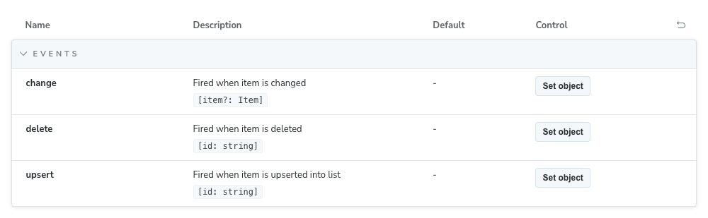
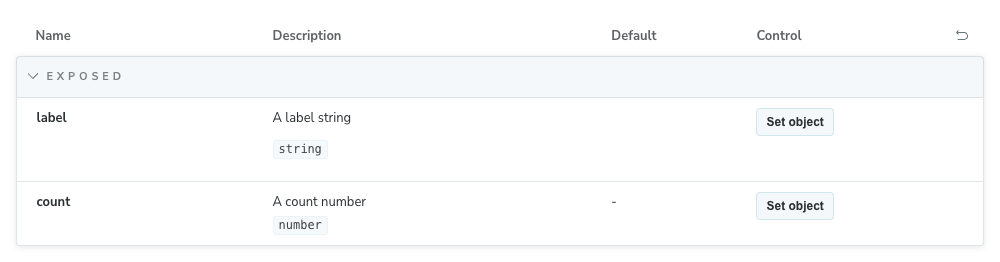
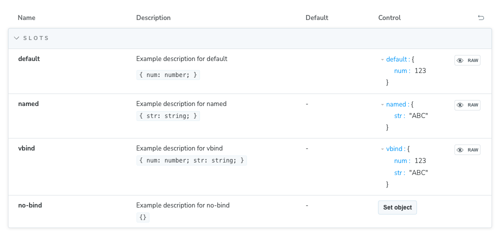
Improved metadata extraction
Storybook’s UI now shows much more information about your Vue components, including event data, slot bindings and props, plus exposed variables and functions.
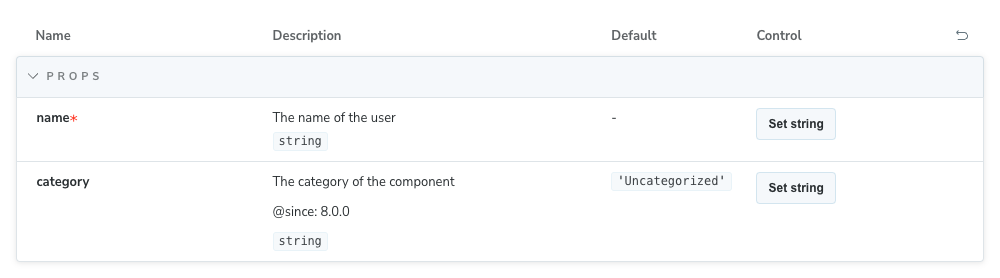
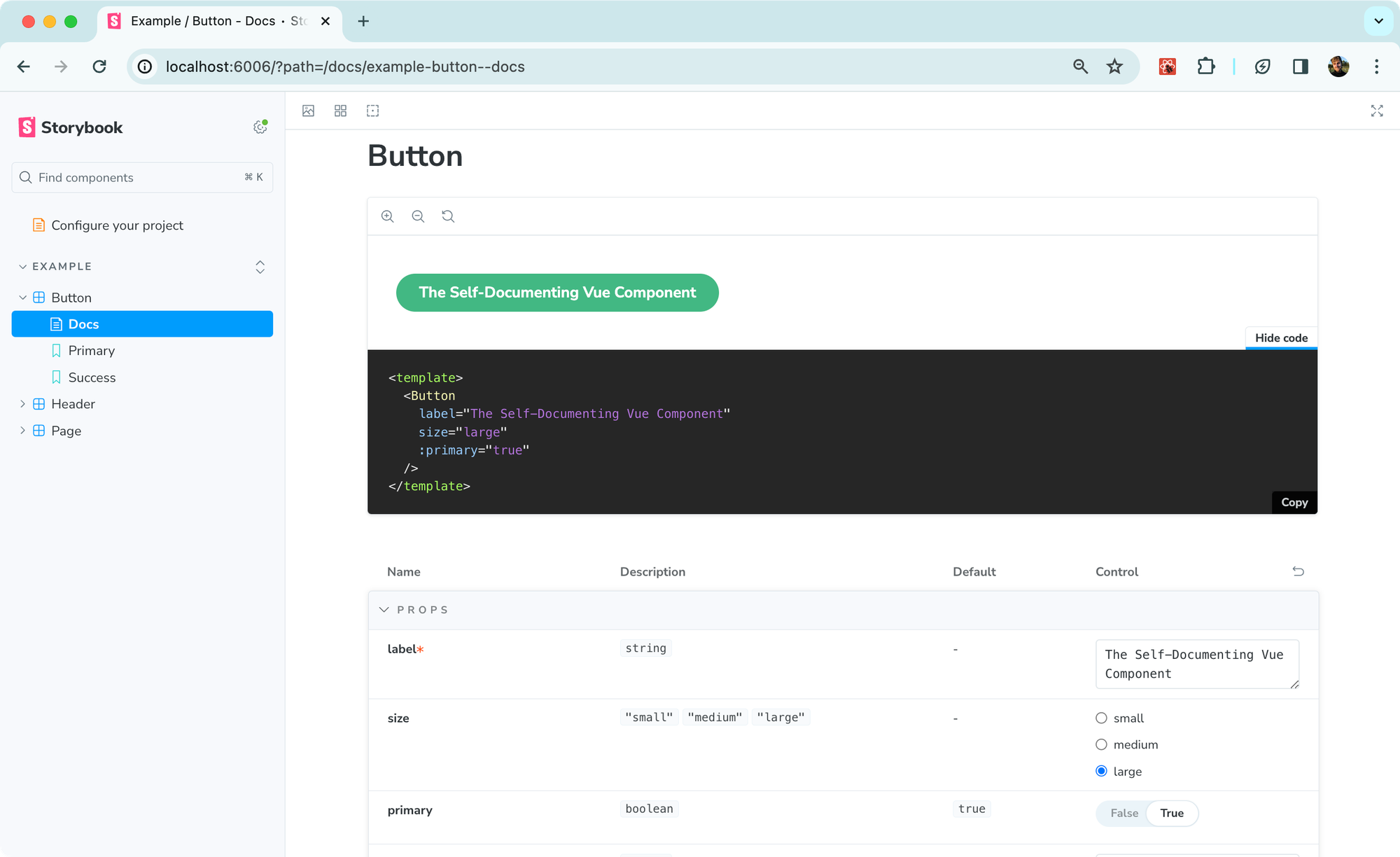
Stronger types support
Storybook now auto-generates controls for Vue components that use complex types, like intersection, union, nested types, and enums. Plus, Storybook will render array types accordingly (e.g. as string[] rather than 'Array') and automatically render union and enum types as radio/select controls.
Wider import compatibility
In the past, Vue Storybook only worked with .vue files. Now, it’s compatible with many more file types, including .vue, .js, .ts, .jsx, and .tsx components (across default and named exports).
Get started
First, upgrade to Storybook 8 with our upgrade command:
npx storybook@next upgrade
Then, add vue-component-meta as the docgen framework option in your .storybook/main.js|ts configuration, as shown below:
// .storybook/main.ts
import type { StorybookConfig } from "@storybook/vue3-vite";

const config: StorybookConfig = {
  framework: {
    name: "@storybook/vue3-vite",
    options: {
      docgen: "vue-component-meta",
    },
  },
};

export default config;
Find out more about how to configure Volar with Storybook in Storybook’s Vue docs!
What’s happening to vue-docgen-api?
In a future version of Storybook, vue-component-meta will likely become the default library for Vue control generation. vue-docgen-api is still usable, and Storybook 8 also brings improvements to that integration!
More Vue goodness in Storybook 8
One of Storybook 8's goals is to significantly improve Storybook's compatibility with the frontend ecosystem. In addition to integrating vue-component-meta, we’ve also removed the need to install React as a peer dependency in Vue projects, a frustrating limitation of Storybook 7.
The release also packs tons of new features, workflows, and UI/UX improvements. You can learn about all those changes in our Storybook 8 announcement.
Thanks again to our Vue team--Chakir, Lars, and Kasper--for bringing this feature to life. If you have any feedback, be sure to let us know via social media or Discord!
Storybook 8 strengthens our @vuejs support by integrating Vue’s official language tools (built on Volar)! ⚡️
— Storybook (@storybookjs) March 7, 2024
Learn how this improves your Storybook’s controls and component documentation in our new Storybook 8 sneak peek:https://t.co/mqn5UHztuy