How Storybook helps designers & developers stay in sync
Connect components to design specs, documentation, and feedback

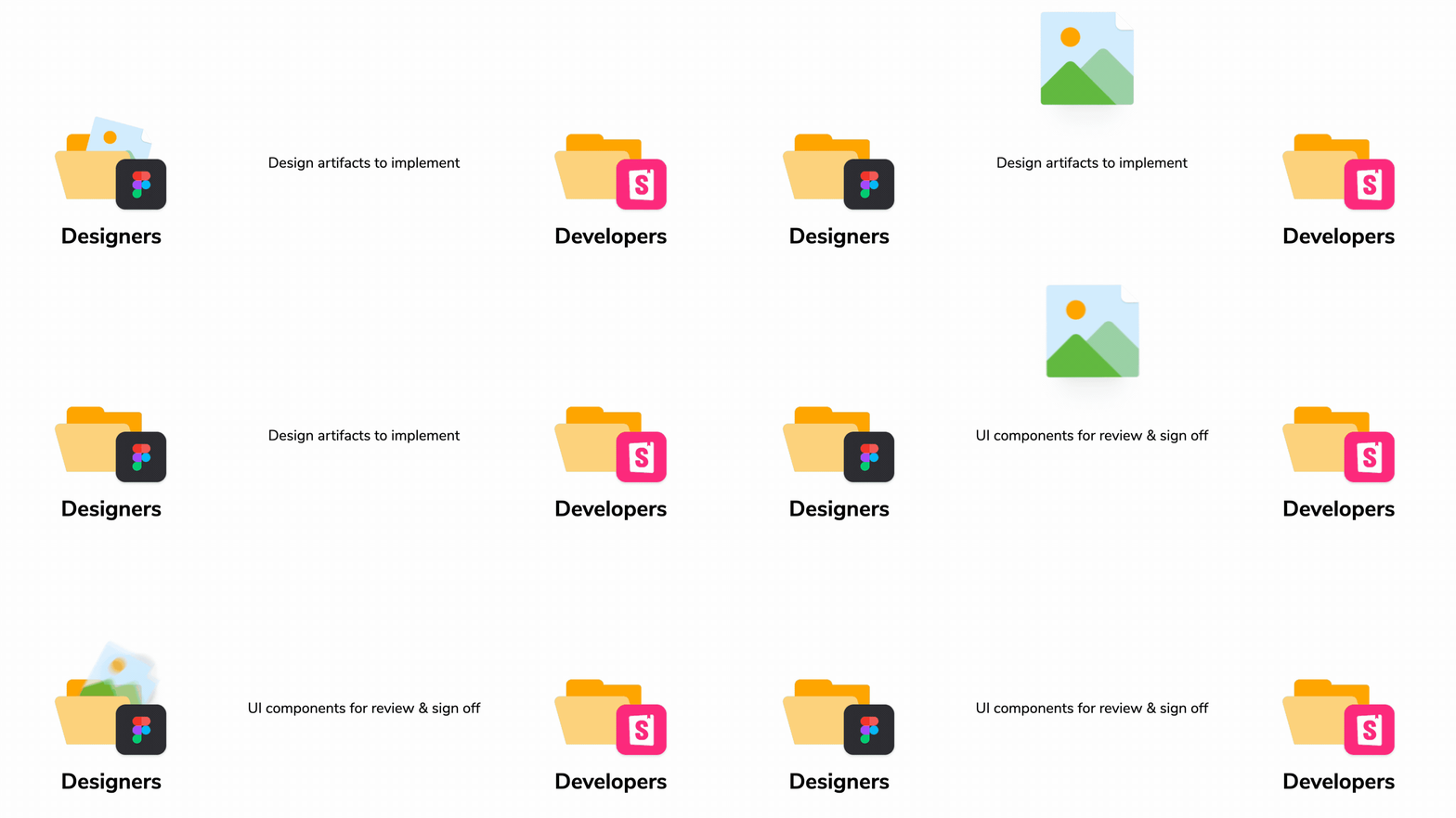
Shipping UIs is lossy. It requires constant back and forth between design and development.
Designs help you get an overview of the UX, but are often limited to the happy path. It’s up to developers to hunt for all the un-specced edge cases.
Meanwhile, development is never perfect the first time around. It’s up to designers to give feedback and sign off on the implementation before it ships.
We researched teams at Wave, Optimizely, Artsy and more to figure out how they ship refined UIs with low communication overhead. This article showcases their favorite tools and techniques for you to consider for your team.
- 🔍 Collocate code and Figma components for smoother handoff
- 🧳 Embed code components into Figma for quick reference
- ✍️ How to automate getting feedback and sign-off
What’s the big deal about developer + designer collaboration?
Designers and developers have shipped websites together for decades. In the past, teams started by gathering requirements. Designers specced out a handful of pages then developers implemented those designs.
But it’s 2022, and apps are more complex, multi-state, and personalized than ever. That means there are thousands of UI permutations to design, build, and review. The traditional collaboration methods are cumbersome with the expansive breadth of modern UIs.
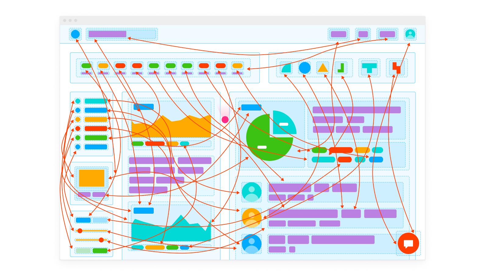
There are two issues at the source of most miscommunication between design and development.
No design survives first contact with code
UI engineering is tough to predict. Once developers start building the UI they often encounter poorly formatted or missing data, awkward breakpoints, cross-browser issues and other edge cases that weren’t accounted for in the design.
New requirements lead to re-designs which means the source of truth constantly shifts between design files and code. Ultimately, this causes the implementation and specs to drift apart.
You need to chase people to get sign-off
To close off the feedback loop between disciplines, you have to share the live UI with designers to get the answer to "does this look right?".
Getting feedback on code is straightforward. You assign a teammate to a Pull Request on Github to leave comments or approve the changes. With UI, there's no central location to capture feedback. You end up constantly reminding folks to review and sign off on the UI changes.
Storybook connects design to code
The crux of the problem is that designers and developers use different tools. You end up having to manually passing information back and forth.
A component workbench such as Storybook connects components coded in JavaScript frameworks such as React to design tools such as Figma. That allows you to spot inconsistencies earlier in the process and ensure that designs and code mirror each other. What’s more, you can then publish your Storybook to facilitate UI review and consolidate feedback in a centralized location.
Side-by-side comparison makes handoff easier
With components, developers and designers have a shared construct. Teams decompose a page into its constituent elements and create variations of each component to accommodate different UI states.
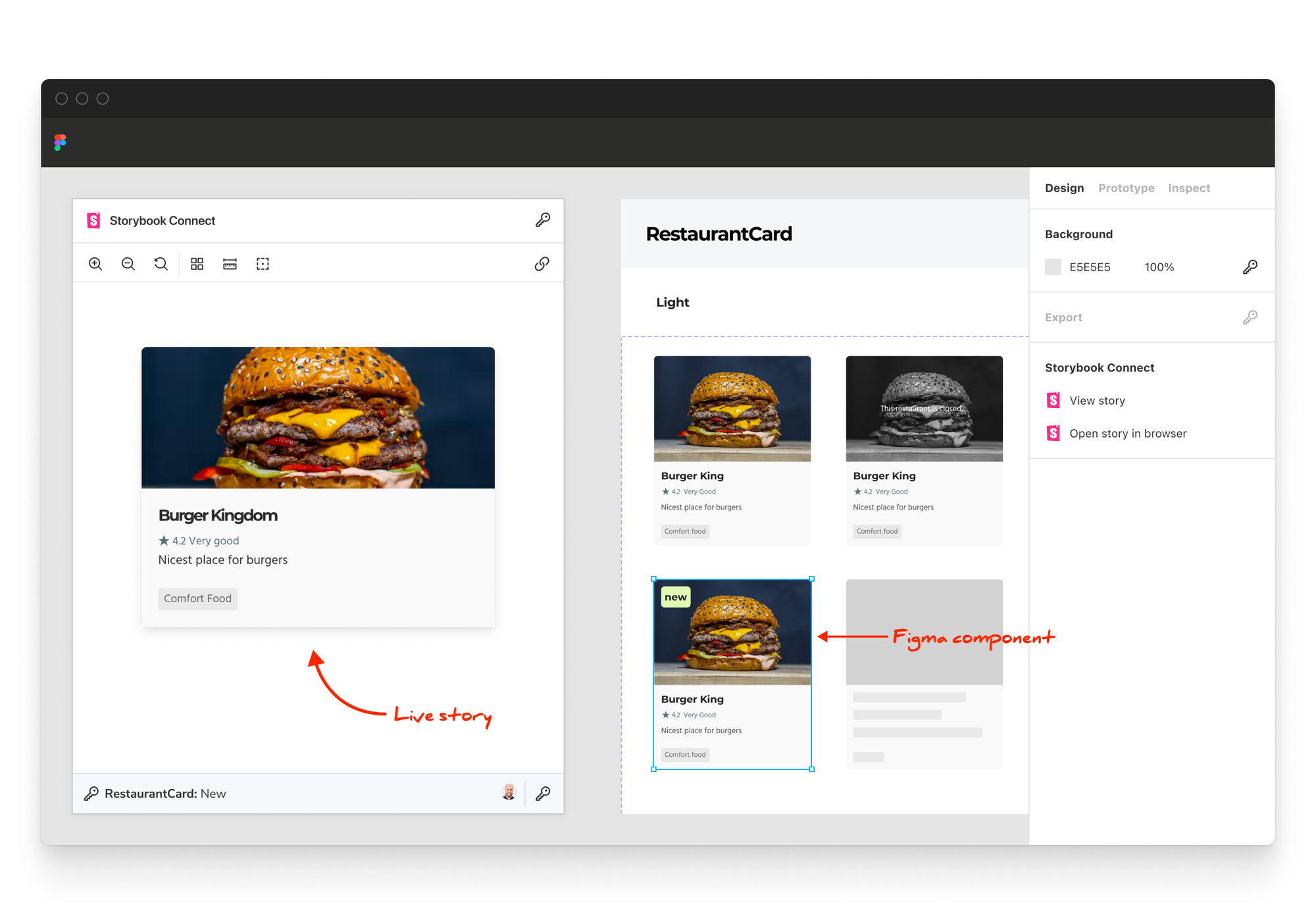
Developers use Storybook to develop UI components and capture their states as stories. While designers model these states as component variants in Figma. Storybook connects the two making hand-offs much smoother.
The process starts with designers assembling a grid of variants, often referred to as a sticker sheet.
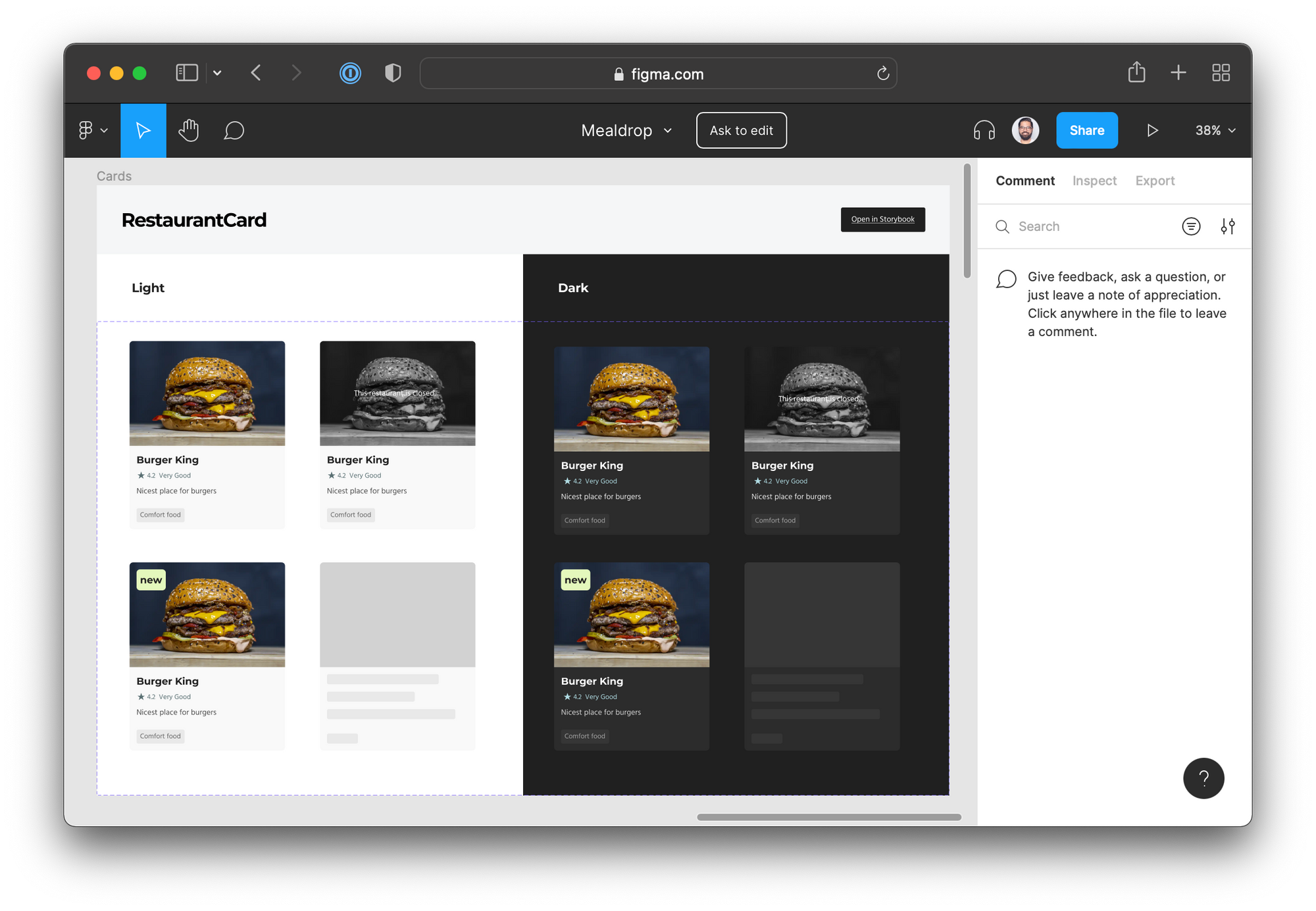
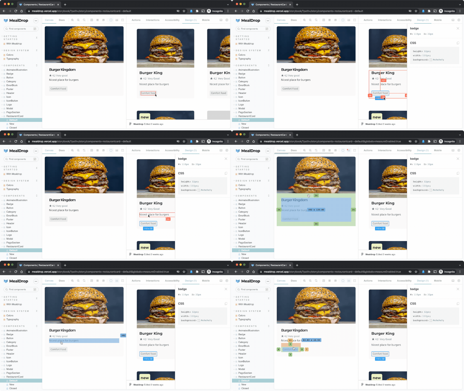
As a developer your goal is to ensure that the coded UI matches the original design. Having designs and live UI side-by-side makes it much easier to build to spec. Storybook’s Design Addon enables you to embed Figma files right into Storybook itself.
These are live files that you can inspect. If the designer pushes any changes you’ll see them right away.
Similarly, the upcoming Storybook Connect plugin will allow designers to embed live stories within Figma. This makes it easier for them to update the designs to match what’s live in production.
Publish Storybook to a shared workspace for sign-off
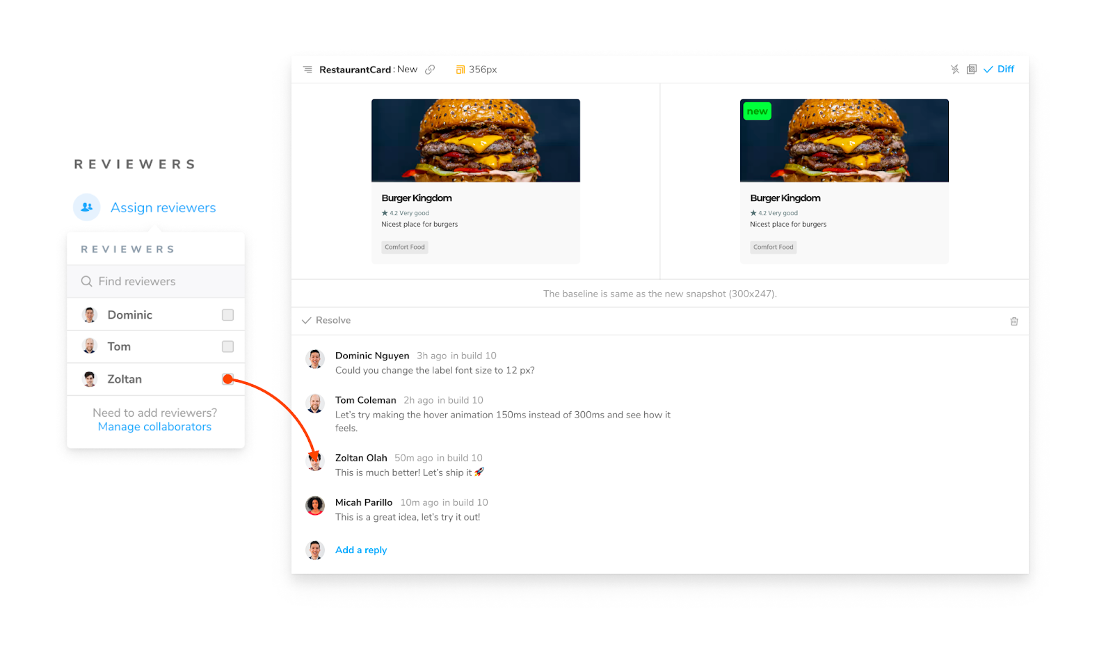
Before you ship, you’ll want to invite designers to review the UI to ensure it’s correct and get that sweet "LGTM—Ship it!" comment. Github acts as a cloud-based workspace where assigned reviewers can leave comments and approve Pull Requests for your code. Chromatic, by the Storybook team, offers a similar service but for your UI. It helps you gather UI feedback by publishing your Storybook.

Chromatic integrates into your CI pipeline. It automatically publishes your Storybook when a Pull Request is created. You can then assign reviewers who can comment and request tweaks on changes that aren’t quite right. Think of it as a code review, but for your UI.
Conclusion
Developers and designers use different workflows that often makes working together tricky. The most productive teams create a well-defined time and place for collaboration to happen.
When handing off designs to development, collocate the designs alongside the implementation. In Storybook, use the Design Addon. In Figma, use the upcoming Storybook Connect plugin.
When reviewing development with designers, publish your Storybook to a shared workspace like Chromatic. That gives your team an up-to-date reference point where they can leave comments, get feedback, and assign reviewers.
This article covered the latest techniques for navigating the squishy space between design and development. I hope that it can serve as a starting point for your interdisciplinary team.
Shipping UIs is lossy—it requires constant back & forth
— Storybook (@storybookjs) March 10, 2022
🔍 Developers hunt for all the un-specced edge cases
🧐 Designers have to review & sign off on the implementation before it ships
Storybook connects design to code to make this collaboration easierhttps://t.co/qk7ljiyqXe pic.twitter.com/zvKELOeV18