How to actually test UIs
Testing techniques used by leading engineering teams

Testing UIs is awkward. Users expect frequent releases packed with features. But every new feature introduces more UI and new states that you then have to test. Every testing tool promises “easy, not flaky, fast”, but has trade-offs in the fine print.
How do leading front-end teams keep up? What's their testing strategy, and what methods do they use? I researched ten teams from the Storybook community to learn what works — Twilio, Adobe, Peloton, Shopify and more.
This post highlights UI testing techniques used by scaled engineering teams. That way, you can create a pragmatic testing strategy that balances coverage, setup, and maintenance. Along the way, we'll point out pitfalls to avoid.
What are we testing?
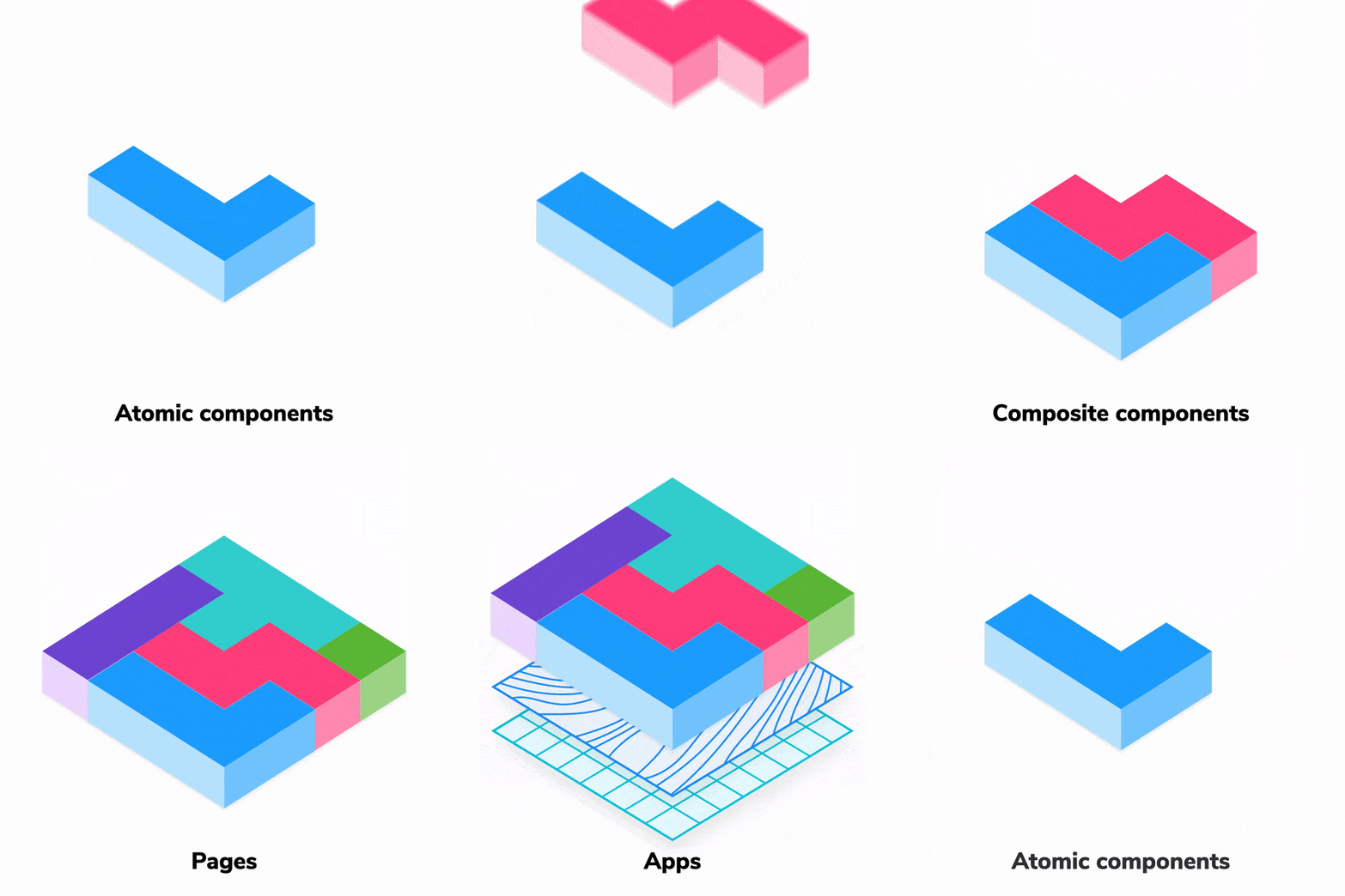
All major JavaScript frameworks are component-driven. That means UIs are built from the “bottom-up”, starting with atomic components and progressively composed into pages.
Remember, every piece of UI is now a component. Yup, that includes pages. The only difference between a page and a button is how they consume data.
Therefore, testing UI is now synonymous with testing components.
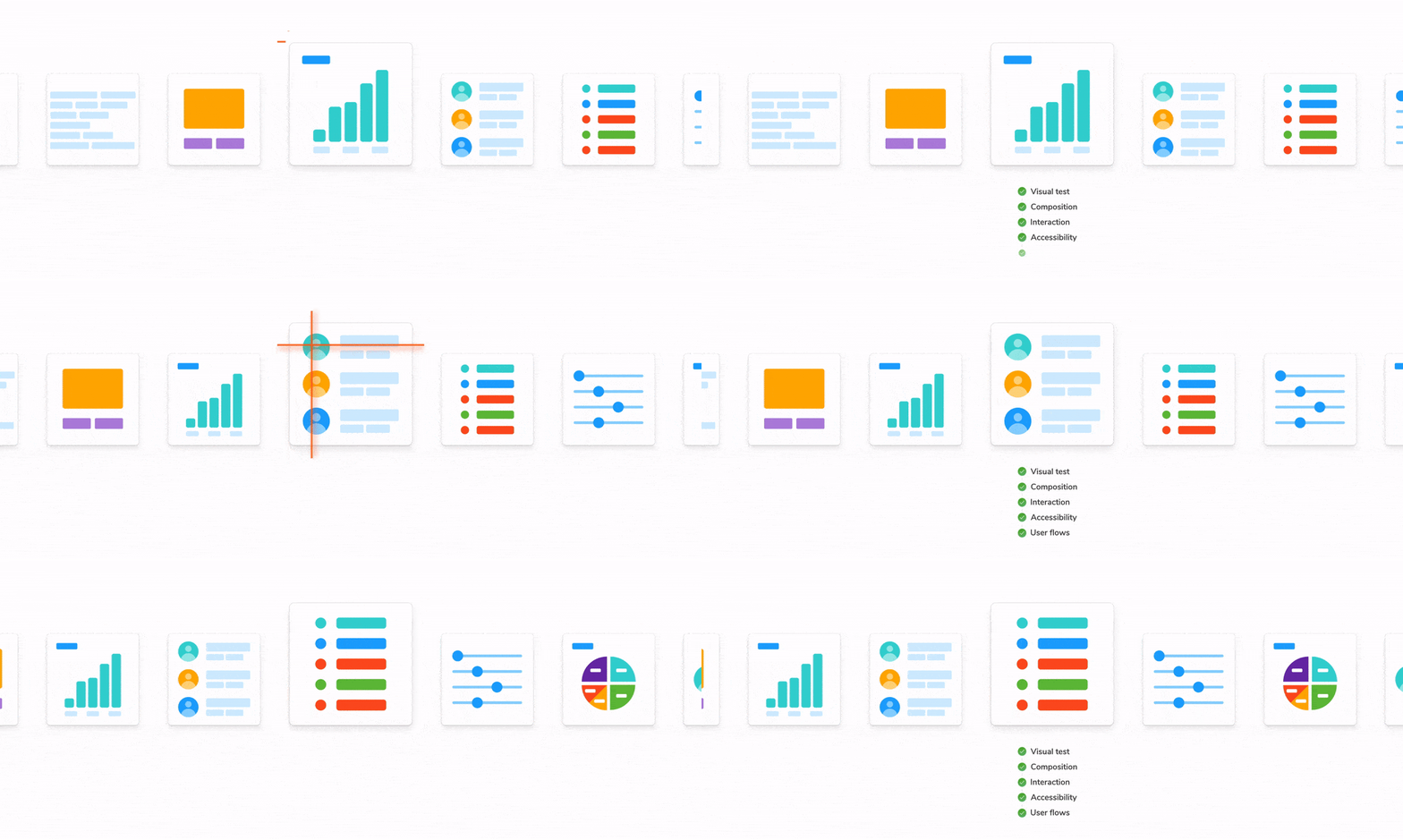
When it comes to components, the distinction between different testing methods can be blurry. Instead of focusing on terminology, let’s consider what characteristics of UIs warrant testing.
- Visual: does a component render correctly given a set of props or state?
- Composition: do multiple components work together?
- Interaction: are events handled as intended?
- Accessibility: is the UI accessible?
- User flows: do complex interactions across various components work?
Where should you focus?
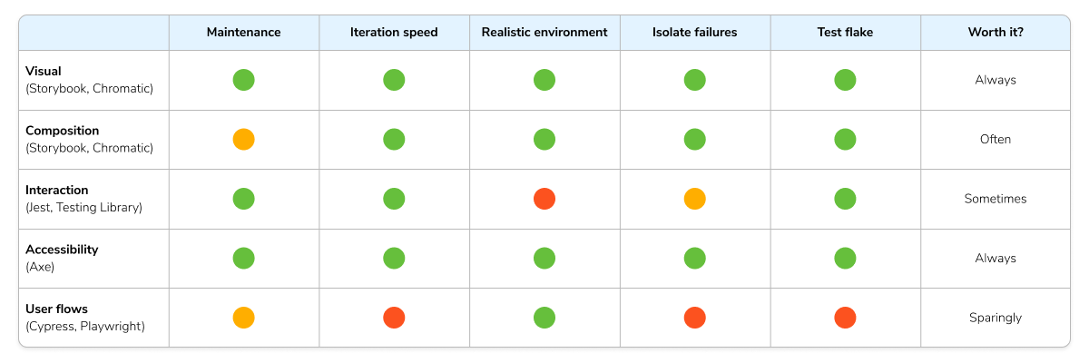
A comprehensive UI testing strategy balances effort and value. But there are so many ways to test that it can be overwhelming to figure out what’s right for any given situation. That’s why many teams evaluate different testing techniques using the criteria below.
- 💰 Maintenance cost: time and effort required to write and maintain the tests.
- ⏱️ Iteration speed: how fast is the feedback loop between making a change and seeing the result.
- 🖼 Realistic environment: where the tests are executed—in a real browser or a simulated environment like JSDOM.
- 🔍 Isolate failures: a test fails, how quickly can you identify the source of the failure.
- 🤒 Test Flake: false positives/negatives defeat the purpose of testing.
For example, end-to-end testing simulates “real” user flows but isn’t practical to apply everywhere. The key advantage of testing in a web browser is also a disadvantage. Tests take longer to run, and there are more points of failure (flake!).
Now that we’ve covered the UI characteristics to test and the criteria to evaluate each testing method, let’s see how teams design their test strategy.
"Testing gives me full confidence for automated dependency updates. If tests pass, we merge them in."
— Simon Taggart, Principal Engineer at Twilio
Visual testing: does this look right?
Modern interfaces have countless variations. The more you have, the tougher it is to confirm that they all render correctly in users' devices and browsers.
In the past, you’d have to spin up the app, navigate to a page, and do all kinds of contortions to get the UI into the right state.
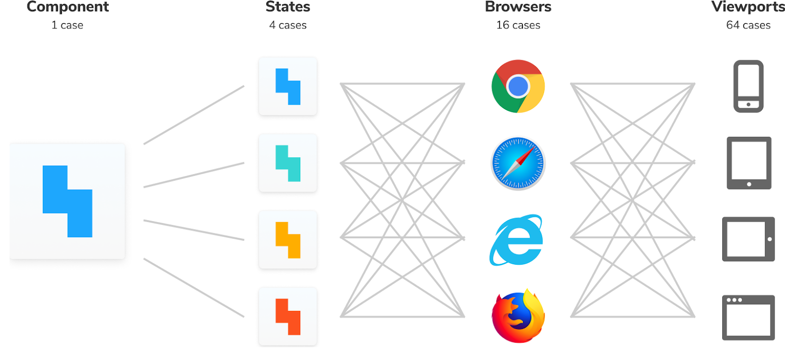
The component construct allows you to render a specific variation as a function of props and state. You don’t need to spin up the whole app just to see how a component renders, instead pass in props and state to view it in isolation.
Twilio and Shopify use Storybook to isolate components, mock their variations, and record the supported test cases as “stories”. That allows developers to spot-check component appearance during initial development and again in QA.
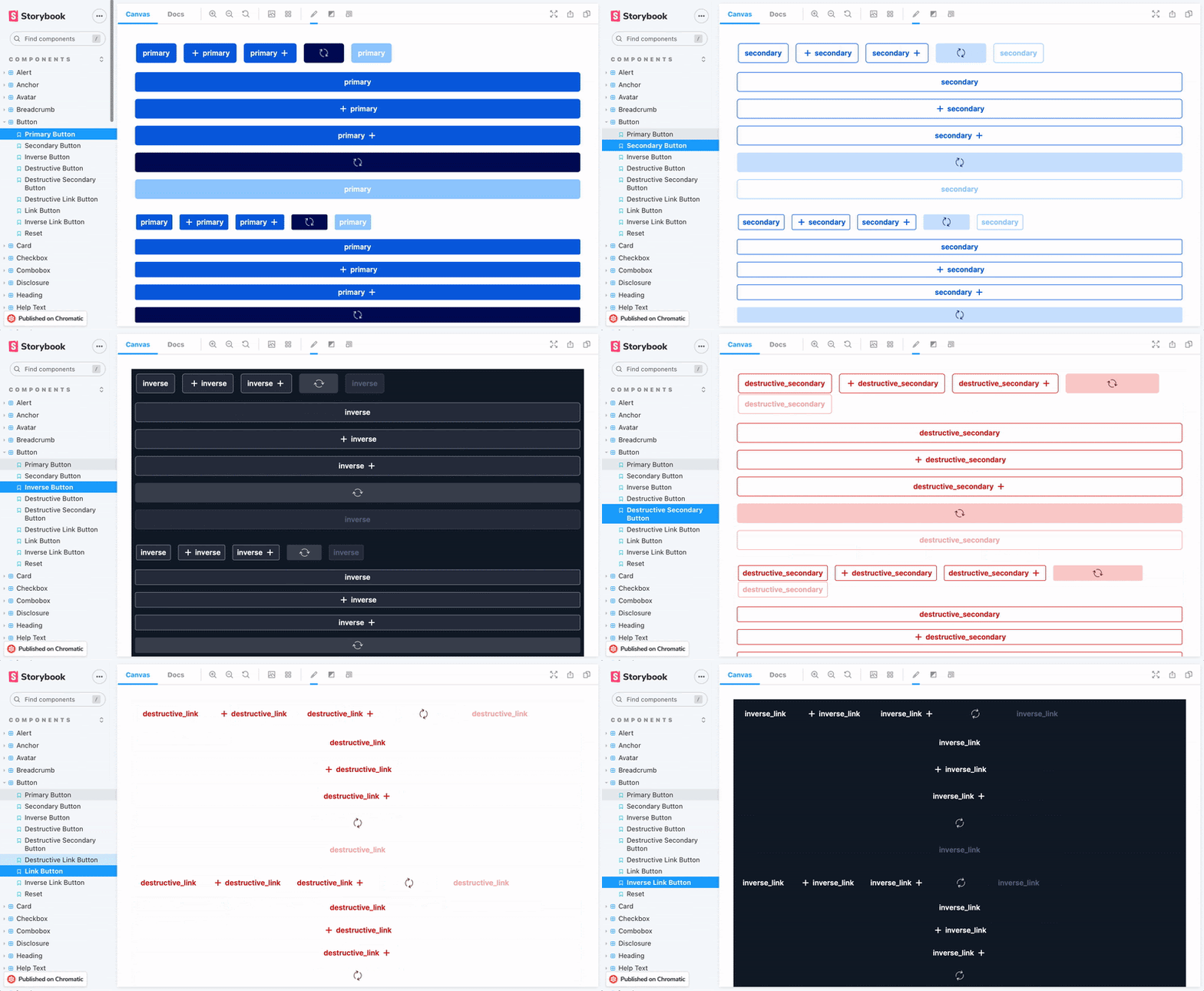
Still, given the scale of applications, it's impractical to test UI appearance by hand. You’d have to check each component's variations across every breakpoint and browser any time you tweak the UI. That’s a lot of work!
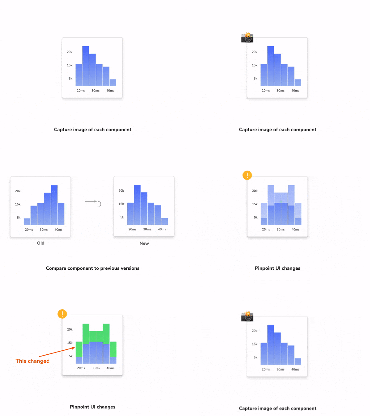
Auth0 and Radix UI automate the UI verification process. They use visual tests to capture a screenshot of every UI component, complete with markup, styling, and other assets, in a consistent browser environment. That way, they’re testing what the user actually sees.
Each commit, new screenshots are automatically compared to previously accepted baseline screenshots. When the machine detects visual differences, the developer gets notified to approve the intentional change or fix the accidental bug.
But what about DOM snapshot testing? The downsides of evaluating a blob of HTML have been well documented.
Is it worth it?
Always. Visual tests are high value for low effort. They require minimal effort to maintain, are executed in real browsers, and have low flake.
Composition testing: does this work together?
When components are combined, strange things tend to happen. UIs are composed of many simple components. Verifying how these components integrate ensures that the system works as a whole.
But testing composition is tricky because complex features are often wired up to data and application state. That requires you to mock or simulate your app’s business logic.

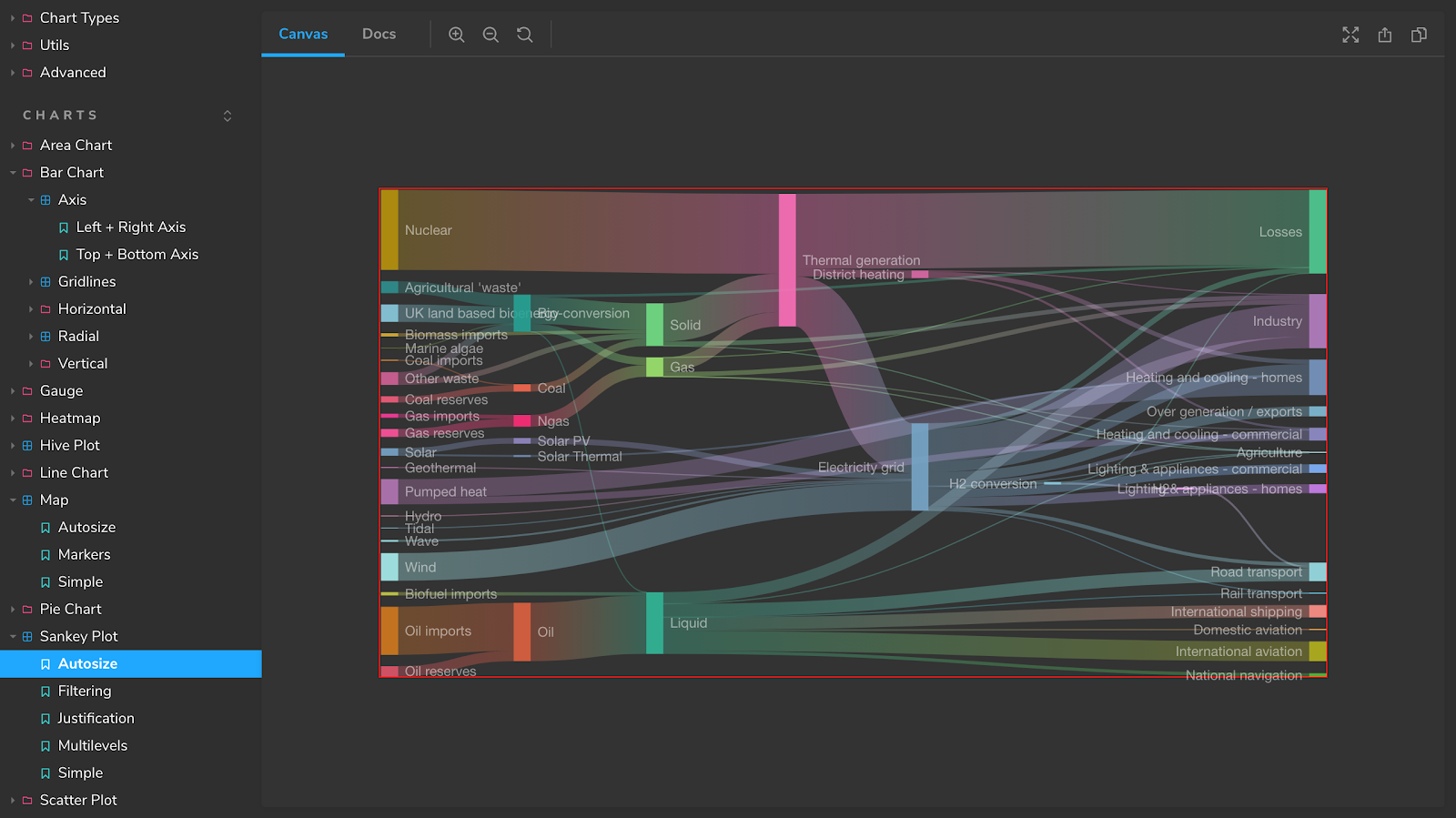
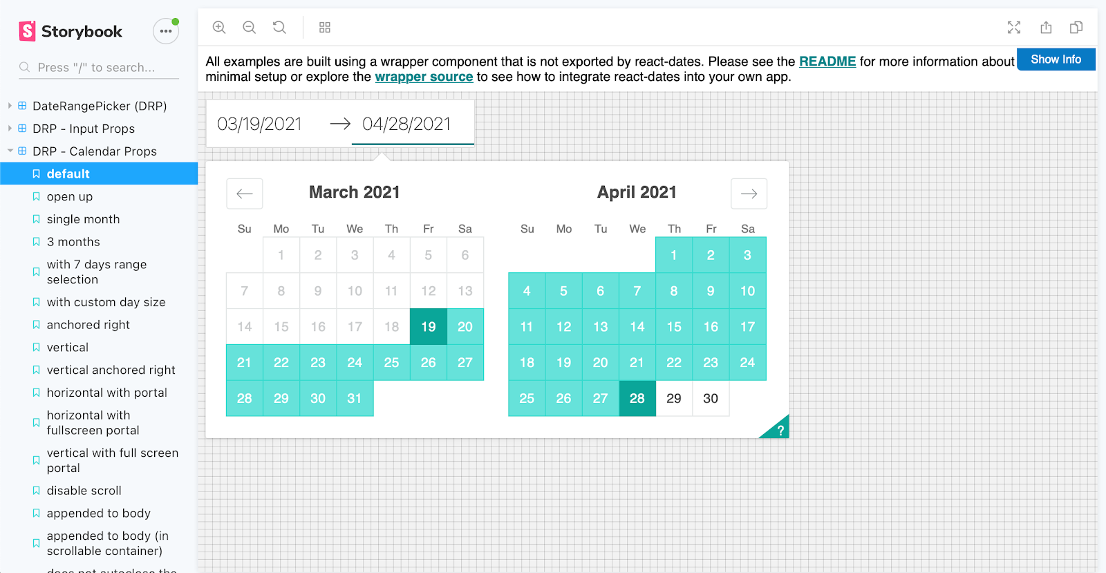
BBC and Sidewalk Labs (Google) use Storybook to build composite components in isolation. Storybook's addons simplify mocking data, events and API responses. Once your UI is isolated in Storybook, you can visual test to verify component integration all the way up to pages.

Is it worth it?
Often. These tests require some investment, but they surface non-obvious integration issues that are hard to track down otherwise.
Interaction testing: What happens when I push this button?
Interfaces aren't static. The user can interact with the UI, fill out form fields and trigger events.
How do you ensure that the UI is responding to interactions correctly? We can use a computer to simulate and verify user interactions!
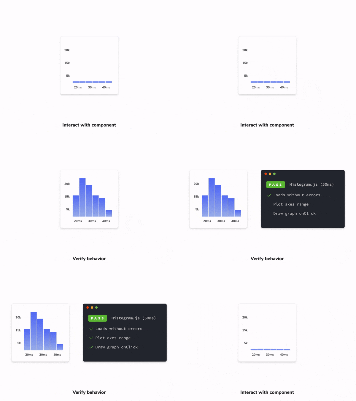
One approach is to use tools like Enzyme to access the components' internal methods. Then trigger state changes and check the result. It works, but you end up testing the inner workings instead of interacting with the UI in the way a user would.
That’s why most teams now use Testing-Library because it evaluates the component output instead. It works by rendering the entire component tree in a virtual browser (JSDOM). And it provides utilities that mimic real-world usage.
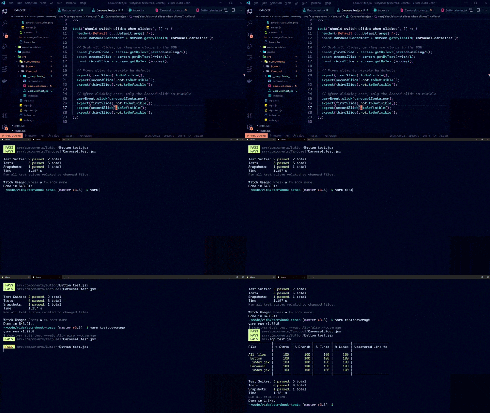
Adobe aims to take this one step further by writing component use-cases as stories. Then reuse them in Jest to run interaction tests. This is enabled by Component Story Format—a portable format based on JavaScript ES6 modules. Therefore, allowing you to use the same story during development and then again in visual, composition, and interaction testing.
Is it worth it?
Sometimes. Interaction tests ensure that the connection between the components is working. Events are flowing, and the state is being updated. In practice, this means you get moderate coverage by writing relatively low maintenance tests.
Accessibility testing – does the app work for all users?
Your users interact with the UI in diverse ways. For example, with a mouse, touch screen, keyboard and screen reader. Accessibility is the practice of making websites usable to all people.
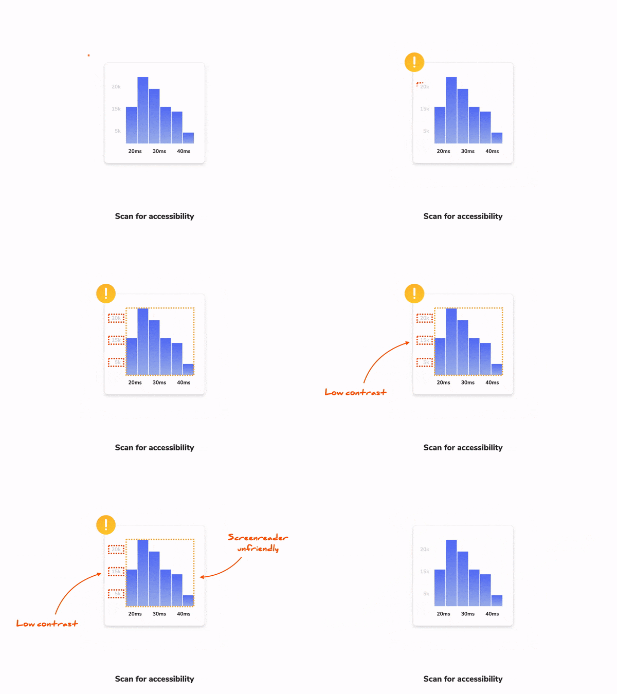
The most accurate way to test accessibility is to manually check it across a combination of browsers, devices, and screen readers. Companies often hire external consultants or train someone in-house. But this can be impractical because manually testing every UI change is time-consuming. That's why teams use a hybrid approach that combines manual testing and automation.
As the first line of QA, use a machine to catch obvious accessibility violations. This works by auditing rendered DOM against a set of best-practice heuristics (for example, using a library like Axe). After the automated checks complete, manually spot-check the UI to find subtle issues.
Combining automated and manual ends up being a pragmatic balance of coverage and effort. You get a fast feedback loop where you can find and fix accessibility issues before they hit production. Most teams use Axe to run automated checks on components. This also allows them to perform targeted testing to uncover bugs faster. For example:
- Atomic components: evaluate keyboard awareness, poor colour contrast or missing aria attributes.
- Compositions: verify that composed components don't impede each other's behaviour.
- Pages: ensure that all the headings and various sections appear in the correct order.
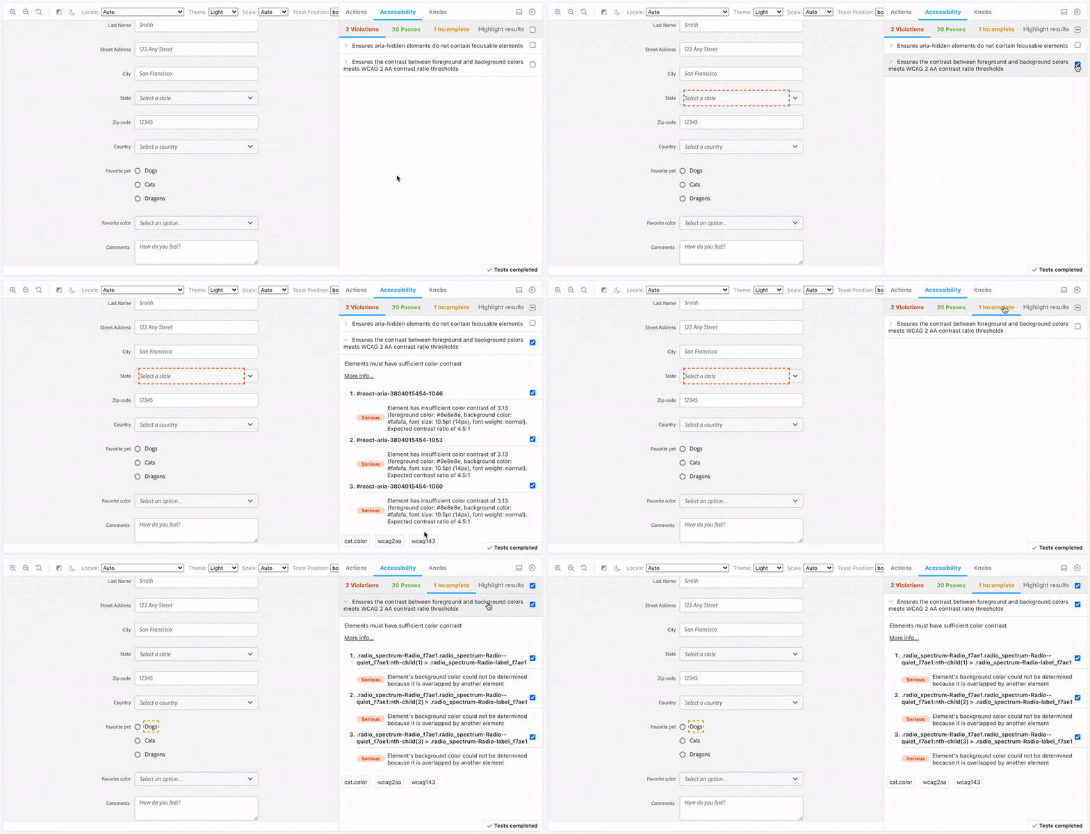
The Twilio Paste team uses jest-axe integration to run an automated accessibility audit on components. Axe is also available as a plugin for Storybook.
Is it worth it?
Always. Not only is it great for your users, it's also a legal requirement. Axe is a low investment tool. Using it doesn't automatically make your app accessible, but it catches lots of issues early.
User flow testing – does your app work end-to-end?
Even the most basic task requires a user to complete a sequence of steps across multiple components. This is yet another potential point of failure. Tools like Cypress and Playwright allow you to run end-to-end (E2E) tests against the complete application to verify such interactions.
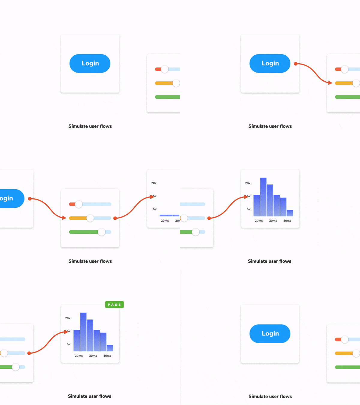
Testing the complete application requires substantial infrastructure work. You have to create a test environment that deploys all parts of your system in tandem—front-end, back-end, and other services. Seed test data. And then connect to a cloud browser to actually run the tests.
Given these trade-offs, most teams choose to forego comprehensive E2E tests for their UIs, instead favouring interaction and composition testing. Or they limit themselves to a small set of E2E tests to ensure that the app continues to work after being deployed to production.
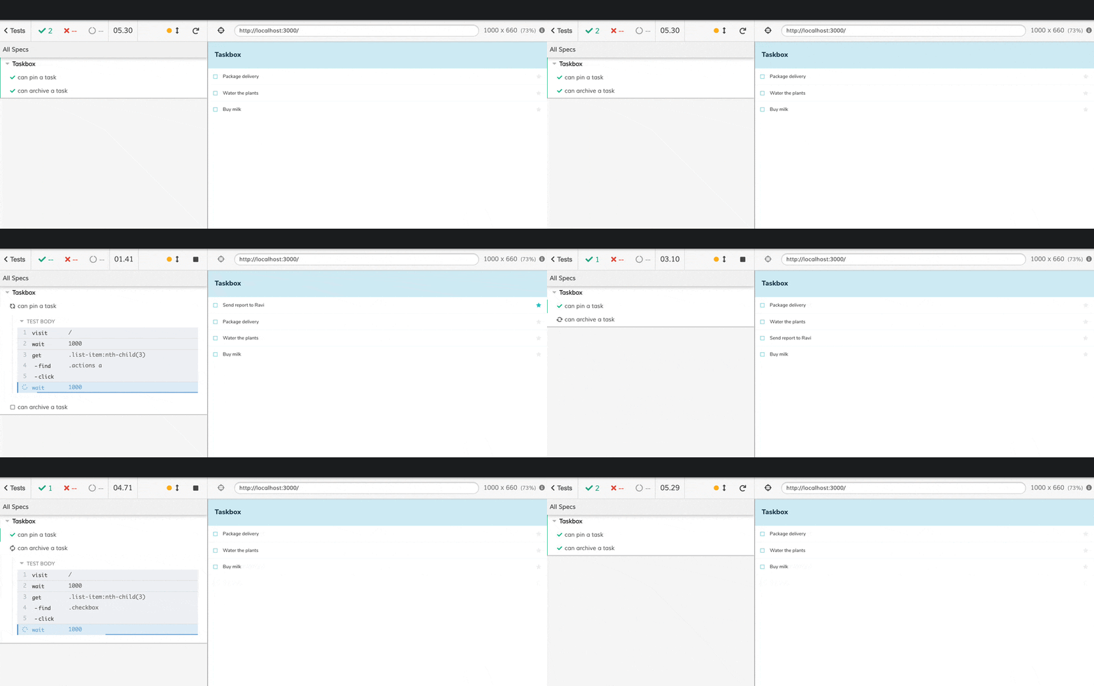
However, for some teams, that trade-off is worth it. For example, O'Reilly uses Docker to spin up their entire infrastructure. And then run E2E tests using Cypress to verify user journeys.
Is it worth it?
Sparingly. E2E tests require a significant trade-off. They offer a high level of confidence but take time/effort to spin up and test the entire system. Therefore, limit E2E tests to just the critical user flows, e.g., sign up → add to cart → buy.
Automate the boring parts
If you’re a developer like me, building UIs is more fun than testing every state. So how do you test every feature and still have time to code?
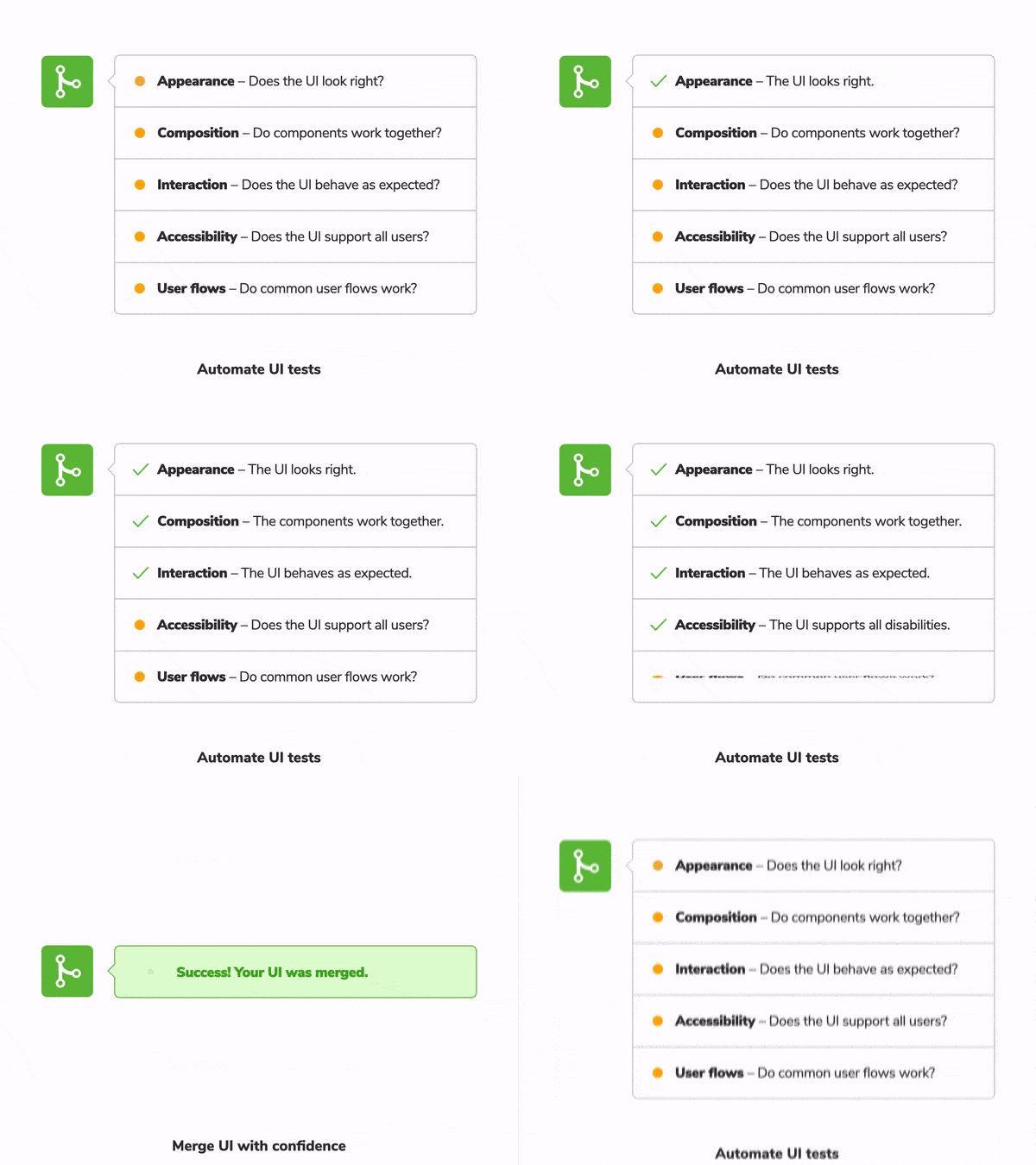
Every team I interviewed uses a Continuous Integration (CI) server to reduce manual effort. Every time you push code, the CI automatically triggers your testing suite. The tests execute in the background, and the results are reported to the pull request for everyone to review.
Automated CI checks detect UI bugs automatically to give you confidence in the UI "look and feel" before deploying to production.
Your UI testing strategy
UI testing is integral to delivering high-quality experiences. It can be confusing to figure out a pragmatic testing strategy because an application’s surface area is expansive, and there are plenty of ways to test it.
You end up balancing trade-offs. Some tests are easy to maintain but offer false assurance. Others evaluate the system as a whole but are slow.
After interviewing ten teams to determine which UI testing methods actually worked, I compiled a shortlist of tools they recommend.
- 📚 Storybook for isolating components from their context to simplify testing.
- ✅ Chromatic to catch visual bugs in atomic components and verify component composition/integration.
- 🐙 Testing Library to verify interactions and underlying logic.
- ♿️ Axe to audit accessibility
- 🔄 Cypress to verify user flows across multiple components
- 🚥 GitHub Actions for continuous integration
The table below summarizes each UI testing method’s pros and cons and how often it’s used.
So far, this article scratches the surface of UI testing. In upcoming articles, I'll dig deeper into each layer of the test stack and get into the mechanics of how to implement a UI testing strategy. Join the mailing list to get notified when more testing articles are published.
