
How to add a theme switcher to Storybook
Learn to control how a story renders by wiring it to a decorator and toolbar items

Themes control the visual characteristics of UI—color palette, typography, white space, border styles, shadows, radii, etc. Themes are growing in popularity because apps need to support multiple color modes and branding requirements.
But theme development can be tedious. You have to keep track of the countless states in your app, then multiply that by the number of themes you support. All while continually swapping back and forth between themes to check that UI looks right.
With Storybook, you can control which theme is applied to your components and click to toggle between different themes via the toolbar. This article shows you how.
- 🎁 Use a decorator to pass the theme object to your components
- 🎛 Switch the theme dynamically from the toolbar or using story parameters
- 🖍 Auto update the story background to match the theme
- 🍱 Render multiple themes side-by-side in one story
What are we building?
Unlike data which is passed in as inputs to a component, the theme is provided via context or configured globally as CSS variables.
We're going to build a theme switching tool that'll allow you to provide the theme object to all your components within Storybook. You'll be able to control which theme is active via parameters or a button in the toolbar.
We'll demo it using this Badge component—from the Mealdrop app—built using React and styled-components.

It uses variables from the theme object to set the border radius, background, and color values. The theme object is passed into the component using the context API.
// src/components/Badge/Badge.tsx
import styled, { css } from 'styled-components'

import { Body } from '../typography'

const Container = styled.div(
  ({ theme }) => css`
    padding: 3px 8px;
    background: ${theme.color.badgeBackground};
    border-radius: ${theme.borderRadius.xs};
    display: inline-block;
    text-transform: capitalize;
    span {
      color: ${theme.color.badgeText};
    }
  `
)

type BadgeProps = {
  text: string
  className?: string
}

export const Badge = ({ text, className }: BadgeProps) => (
  <Container className={className}>
    <Body type="span" size="S">
      {text}
    </Body>
  </Container>
)
Clone the repo
Let's get started! Clone the repo, install dependencies, and follow along.
# Clone the template
npx degit yannbf/mealdrop#theme-switcher-base mealdrop

cd mealdrop

# Install dependencies
yarn
Use a decorator to provide the theme to your components
The first step is to provide the theme to our components. We'll do so using a decorator, which will wrap each story with the ThemeProvider and pass in the lightTheme object.
Decorators are a Storybook mechanism that allow you to augment stories with extra rendering functionality. For example, you can provide context or other global configs that a component relies on.
Let's add the withTheme decorator to the .storybook/preview.tsx file.
// .storybook/preview.tsx
import { ThemeProvider } from 'styled-components'
import { DecoratorFn } from '@storybook/react'

import { GlobalStyle } from '../src/styles/GlobalStyle'
import { lightTheme } from '../src/styles/theme'

const withTheme: DecoratorFn = (StoryFn) => {
  return (
    <ThemeProvider theme={lightTheme}>
      <GlobalStyle />
      <StoryFn />
    </ThemeProvider>
  )
}

// export all decorators that should be globally applied in an array
export const decorators = [withTheme]
Decorators defined within the .storybook/preview.js|tsx file are global. That is, they'll be applied to all your stories. Therefore, it's also the perfect spot to load GlobalStyle used by these components.
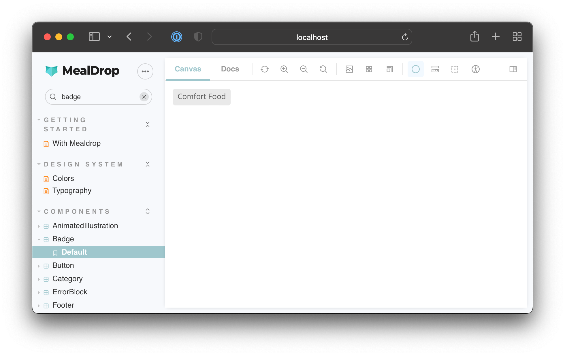
Run yarn storybook to boot up Storybook, and you should see the Badge component rendering correctly with the light theme applied.
Set the active theme via parameters
Right now, our withTheme decorator only provides the light theme to the components. To test both light and dark modes, we need to switch between them dynamically. We can use parameters to specify which theme to enable.
Parameters are metadata that you can attach to a story or a component. The withTheme decorator can then access them from the story context object and apply the appropriate theme.
Update your decorator to read the theme parameter:
// .storybook/preview.tsx
import { ThemeProvider } from 'styled-components'
import { DecoratorFn } from '@storybook/react'

import { GlobalStyle } from '../src/styles/GlobalStyle'
import { darkTheme, lightTheme } from '../src/styles/theme'

const withTheme: DecoratorFn = (StoryFn, context) => {
  // Get the active theme value from the story parameter
  const { theme } = context.parameters
  const storyTheme = theme === 'dark' ? darkTheme : lightTheme
  return (
    <ThemeProvider theme={storyTheme}>
      <GlobalStyle />
      <StoryFn />
    </ThemeProvider>
  )
}

export const decorators = [withTheme]
When writing stories for a component, you can choose which theme to apply using parameters. Like so:
// src/components/Badge/Badge.stories.tsx
import { ComponentStory, ComponentMeta } from '@storybook/react'
import { Badge } from './Badge'

export default {
  title: 'Components/Badge',
  component: Badge,
} as ComponentMeta<typeof Badge>

const Template: ComponentStory<typeof Badge> = (args) => <Badge {...args} />

export const Default = Template.bind({})
Default.args = {
  text: 'Comfort food',
}

export const LightTheme = Template.bind({})
LightTheme.args = Default.args
LightTheme.parameters = {
  theme: 'light',
}

export const DarkTheme = Template.bind({})
DarkTheme.args = Default.args
DarkTheme.parameters = {
  theme: 'dark',
}
Switch back to your Storybook, and you’ll notice that the theme updates when you navigate between those two stories.
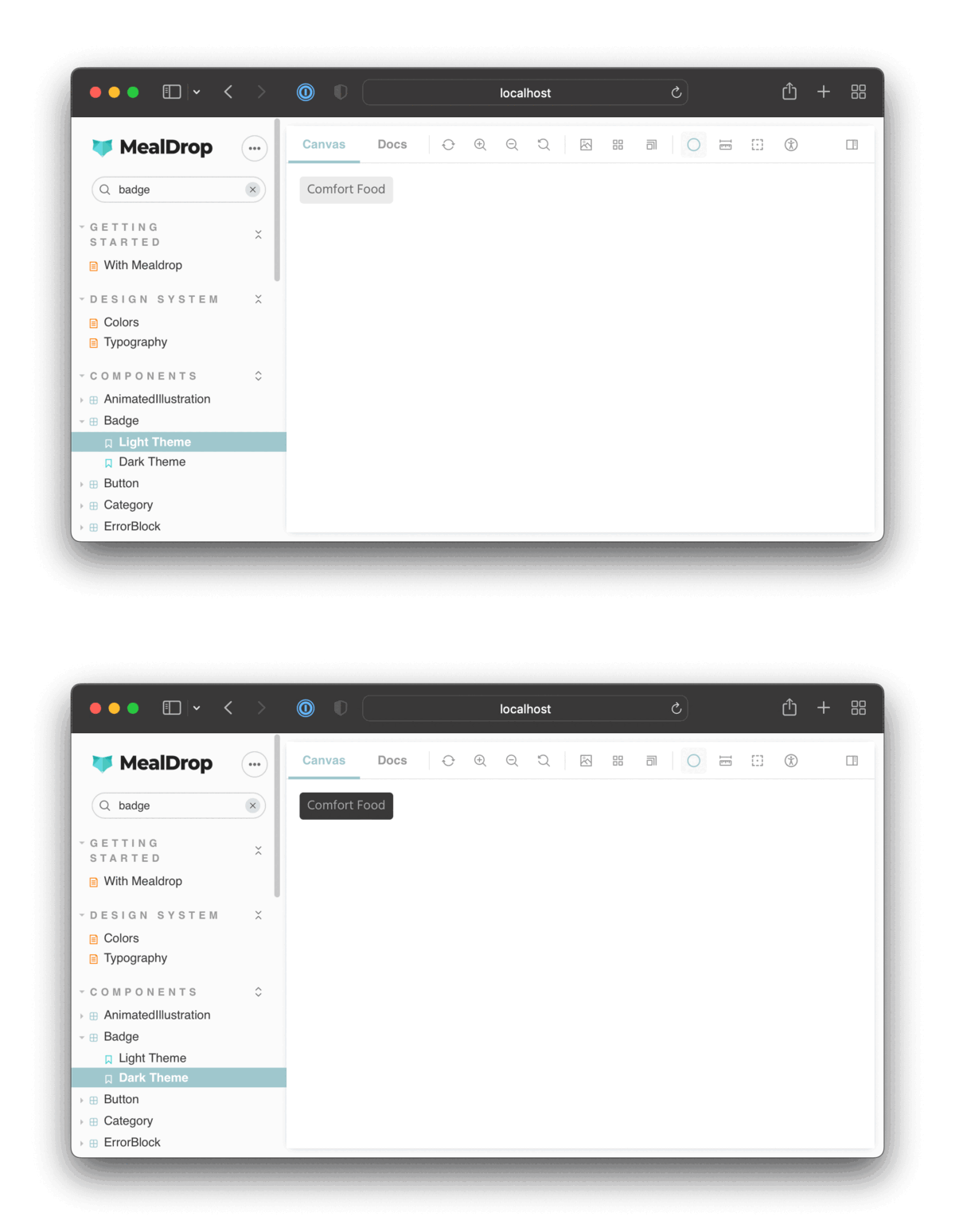
Great! This gives us the flexibility of setting themes per story.
Toggle the background color to match the theme
That's a great start. We have the flexibility of controlling the theme for every story. However, the background remains the same. Let's update our decorator so that the story's background color matches the active theme.
We’re now wrapping each story with a ThemeBlock component which controls the background color based on the active theme.
// .storybook/preview.tsx
import React from 'react'
import styled, { css, ThemeProvider } from 'styled-components'
import { DecoratorFn } from '@storybook/react'

import { GlobalStyle } from '../src/styles/GlobalStyle'
import { darkTheme, lightTheme } from '../src/styles/theme'
import { breakpoints } from '../src/styles/breakpoints'

const ThemeBlock = styled.div<{ left?: boolean; fill?: boolean }>(
  ({ left, fill, theme }) =>
    css`
      position: absolute;
      top: 0;
      left: ${left || fill ? 0 : '50vw'};
      border-right: ${left ? '1px solid #202020' : 'none'};
      right: ${left ? '50vw' : 0};
      width: ${fill ? '100vw' : '50vw'};
      height: 100vh;
      bottom: 0;
      overflow: auto;
      padding: 1rem;
      background: ${theme.color.screenBackground};
      ${breakpoints.S} {
        left: ${left ? 0 : '50vw'};
        right: ${left ? '50vw' : 0};
        padding: 0 !important;
      }
    `
)

export const withTheme: DecoratorFn = (StoryFn, context) => {
  // Get values from story parameter first
  const { theme } = context.parameters
  const storyTheme = theme === 'dark' ? darkTheme : lightTheme
  return (
    <ThemeProvider theme={storyTheme}>
      <GlobalStyle />
      <ThemeBlock fill>
        <StoryFn />
      </ThemeBlock>
    </ThemeProvider>
  )
}

export const decorators = [withTheme]
Now, as you switch between those stories, both the theme and the background colors update.

Switch themes from the toolbar
Hardcoding the theme via parameters is just one option. We can also customize the Storybook UI to add a dropdown that allows us to switch which theme is active.
Storybook ships with the toolbars addon, enabling you to define a global value and wire it up to a menu in the toolbar.
To create a toolbar item to control the active theme we need add in a globalTypes object to our .storybook/preview.tsx file:
// .storybook/preview.tsx

// ...code ommited for brevity...

export const withTheme: DecoratorFn = (StoryFn, context) => {
  // Get values from story parameter first, else fallback to globals
  const theme = context.parameters.theme || context.globals.theme
  const storyTheme = theme === 'dark' ? darkTheme : lightTheme
  return (
    <ThemeProvider theme={storyTheme}>
      <GlobalStyle />
      <ThemeBlock fill>
        <StoryFn />
      </ThemeBlock>
    </ThemeProvider>
  )
}

export const globalTypes = {
  theme: {
    name: 'Theme',
    description: 'Global theme for components',
    defaultValue: 'light',
    toolbar: {
      // The icon for the toolbar item
      icon: 'circlehollow',
      // Array of options
      items: [
        { value: 'light', icon: 'circlehollow', title: 'light' },
        { value: 'dark', icon: 'circle', title: 'dark' },
      ],
      // Property that specifies if the name of the item will be displayed
      showName: true,
    },
  },
}

export const decorators = [withTheme]
We’ve also updated the withTheme decorator to get the theme value from parameters first, and if it’s undefined, then fall back to the global value.
You should now see a toolbar item to switch the theme.
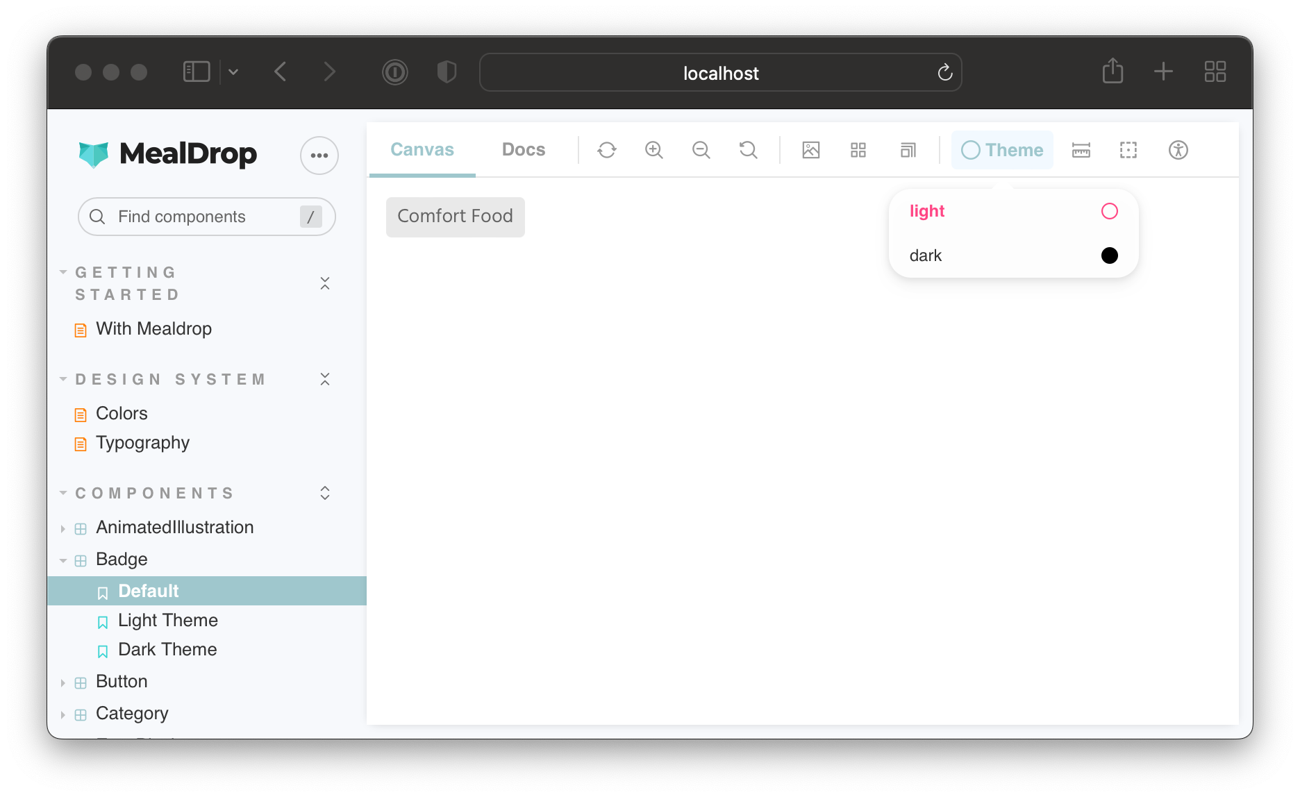
For the Default story, which doesn't specify a theme parameter, you can switch the theme using the toolbar. However, the LightTheme and DarkTheme stories will always enforce the value set via the theme parameter.
Render themes side-by-side
Sometimes it's just easier to work on a component if you see all its theme variants at once. Guess what? You can render a story multiple times within a decorator and provide different theme objects to each instance.
Update the withTheme decorator and globalTypes to add in a “side-by-side” mode:
// .storybook/preview.tsx

// ...code ommited for brevity...

export const withTheme: DecoratorFn = (StoryFn, context) => {
  // Get values from story parameter first, else fallback to globals
  const theme = context.parameters.theme || context.globals.theme
  const storyTheme = theme === 'light' ? lightTheme : darkTheme

  switch (theme) {
    case 'side-by-side': {
      return (
        <>
          <ThemeProvider theme={lightTheme}>
            <GlobalStyle />
            <ThemeBlock left>
              <StoryFn />
            </ThemeBlock>
          </ThemeProvider>
          <ThemeProvider theme={darkTheme}>
            <GlobalStyle />
            <ThemeBlock>
              <StoryFn />
            </ThemeBlock>
          </ThemeProvider>
        </>
      )
    }
    default: {
      return (
        <ThemeProvider theme={storyTheme}>
          <GlobalStyle />
          <ThemeBlock fill>
            <StoryFn />
          </ThemeBlock>
        </ThemeProvider>
      )
    }
  }
}

export const globalTypes = {
  theme: {
    name: 'Theme',
    description: 'Theme for the components',
    defaultValue: 'light',
    toolbar: {
      // The icon for the toolbar item
      icon: 'circlehollow',
      // Array of options
      items: [
        { value: 'light', icon: 'circlehollow', title: 'light' },
        { value: 'dark', icon: 'circle', title: 'dark' },
        { value: 'side-by-side', icon: 'sidebar', title: 'side by side' },
      ],
      // Property that specifies if the name of the item will be displayed
      showName: true,
    },
  },
}

export const decorators = [withTheme]
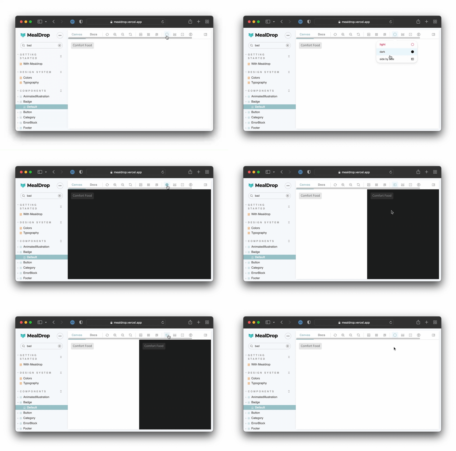
And here’s the final result:
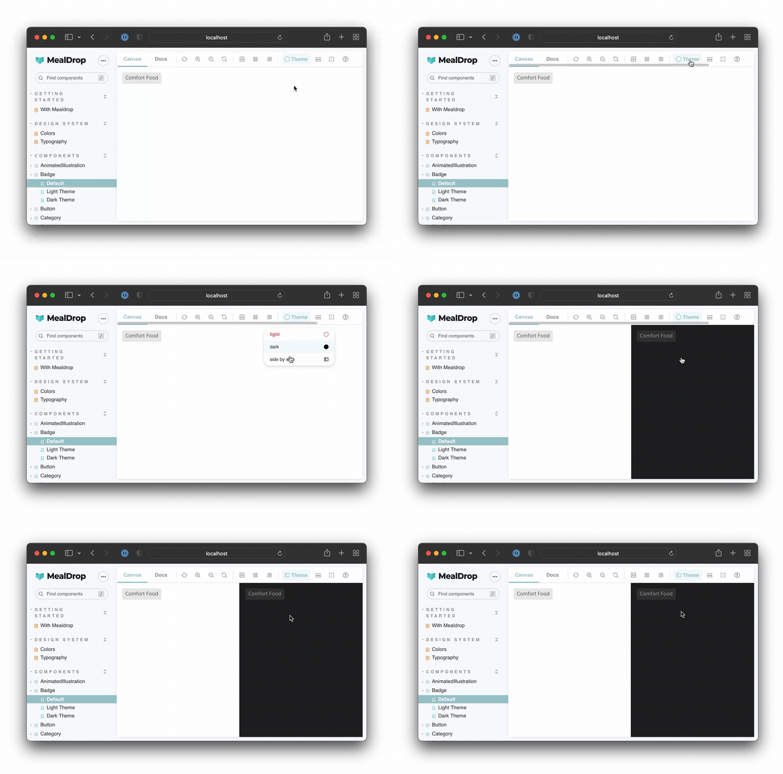
The side-by-side mode is also super convenient for visual regression testing with tools like Chromatic. You can enable it via parameters and test all theme-based variants of a component in one go.
Conclusion
When building UIs, you have to account for countless permutations of app state, locales, viewport sizes, themes, etc. Storybook makes it easy to test UI variations. You can use one of the hundreds of addons or customize Storybook to fit your needs.

Decorators give you complete control over story rendering and enable you to set up providers and control their behavior using parameters or by wiring them up to a toolbar item. Switching themes is just one application of this technique. You can use it to add a language switcher or a menu to manage multi-tenant configurations.
You can see the theme switcher in action in the Mealdrop Storybook and browse its source code on Github.

This tutorial was originally written as a chapter for my course, Storybook for React Apps. It covers everything from core Storybook concepts to more advanced workflows such as adding pages into Storybook, mocking API requests, connecting stories to Figma, testing accessibility, and much more.
Develop themes with Storybook? Learn how to add a handy powerful theme switcher.
— Storybook (@storybookjs) June 22, 2022
⚡️ Hot swap themes in a click
🎁 Control the active theme via params
🎛 Toggle themes dynamically using the toolbar
🍱 Render multiple themes side-by-sidehttps://t.co/erZMx0Na4P pic.twitter.com/oiN2WjBLz8