
Improved type safety in Storybook 7
CSF3 syntax combined with TypeScript satisfies gives you stricter types and an improved developer experience

Writing in TypeScript makes you more productive and your code more robust. You get type check warnings, autocomplete, and Storybook infers types to generate an ArgsTable automatically. It also helps detect bugs and edge cases while coding.
Storybook has provided built-in zero config TypeScript support since 6.0. That gives a great autocomplete experience, but sadly it didn’t warn you about missing required args.
I'm thrilled to share that Storybook 7 provides enhanced type safety for stories. This was made possible with the combination of Component Story Format(CSF) 3 and the new TypeScript (4.9+) satisfies operator.
- 💪 Stricter story types
- ⌨️ Better in-editor type checking
- 🌐 Meta and Story objects are linked to infer component level args
- 🎮 Action args are automatically detected
- 🤖 Codemod for easy upgrades
Why new types?
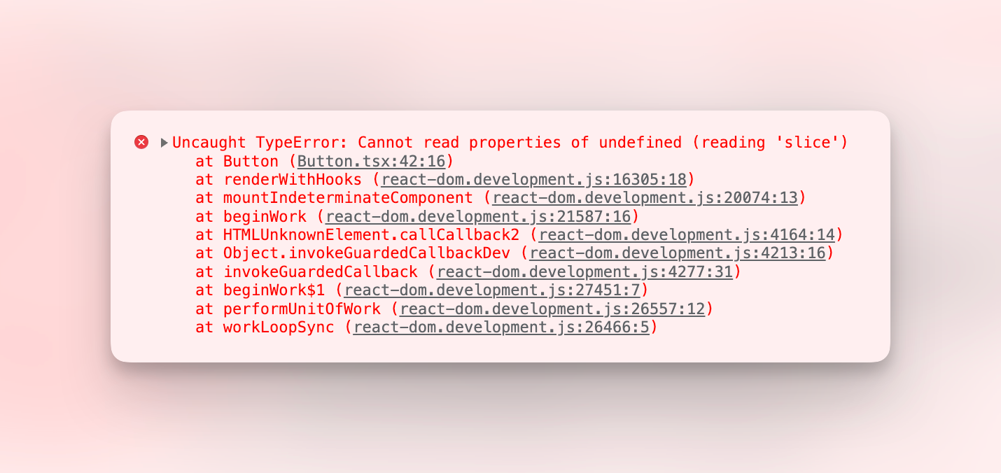
The TypeScript types in Storybook 6 work well for autocompletion. However, they are not completely type-safe. If you forget to provide a prop, TypeScript should alert you in your editor; unfortunately, you only got the TypeError at runtime.
Folks who prefer type safety (like me!), have been circumventing this issue by not using the Storybook args convention altogether, like so:
const Primary: Story<ButtonProps> = () => (
  <Button disabled label="Label" />
);
It works, but if you want to use controls, you must use args as Storybook needs the initial value to display it in the control panel and then dynamically override it based on user input. Additionally, this syntax requires more duplication, as you have to repeat the template across stories.
Introducing the StoryObj type
CSF3 enables you to manipulate stories as objects. To facilitate this, we have also created a StoryObj type, which automatically infers the type of component props.
Provide the component type (e.g., typeof Button) as a generic parameter. Alternatively, if your renderer is class-based—such as Svelte, Angular, or Web Components—you can just use the component itself (e.g., Button).
Here’s a side-by-side comparison:
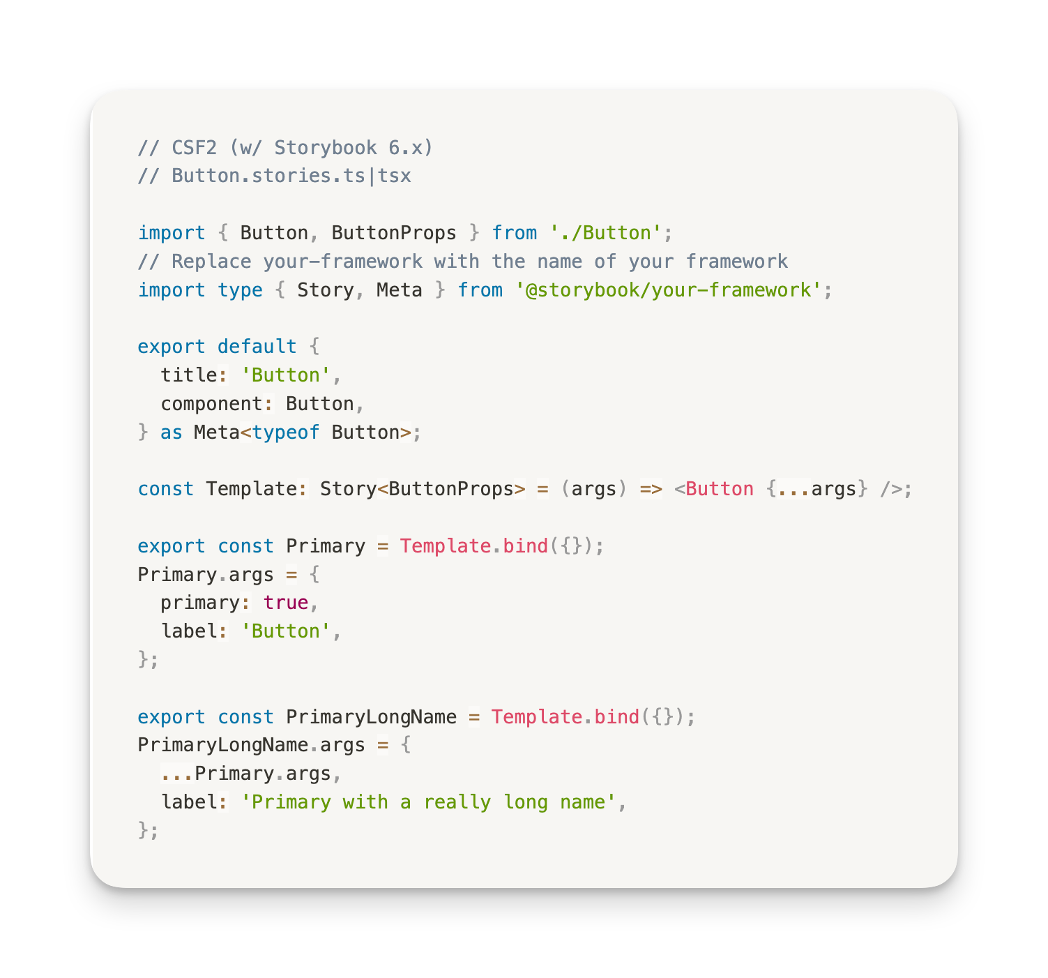
The previous Story type wasn't powerful enough to automatically infer prop types, so you had to manually specify them. Additionally, React components often don't export a type for their props, so you had to rely on the React-specific ComponentStory type.
However, this new syntax works for React, Vue, Svelte, Angular, and Web Components! Therefore, we're deprecating the React-specific ComponentMeta and ComponentStory utilities in Storybook 7.
Pair it with satisfies for better type safety
If you are using TypeScript 4.9+, you can take advantage of the new satisfies operator to get stricter type checking. To illustrate this, let's look at an example.
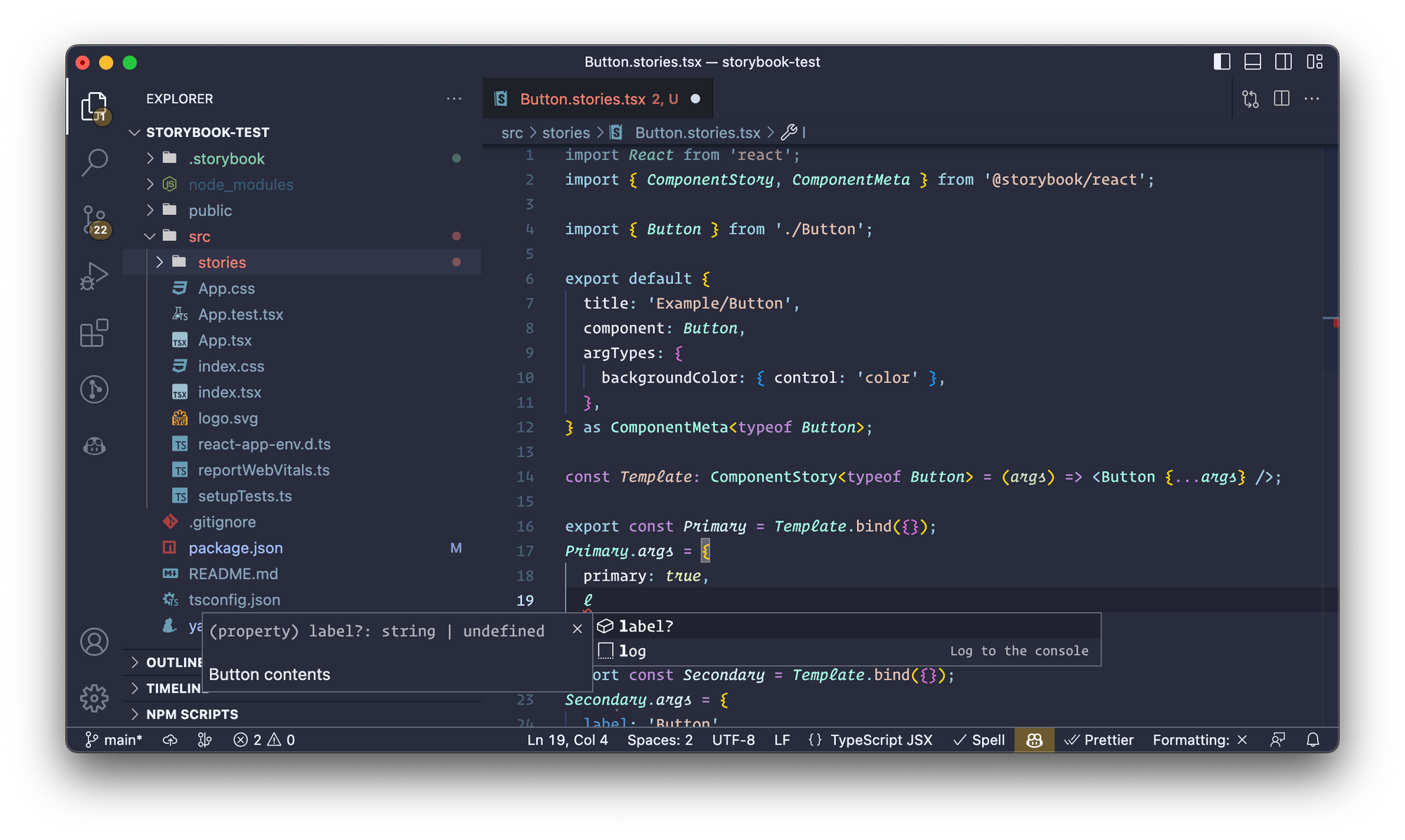
Consider this Button component. You'll notice, in the Primary story (on the left), that we haven't specified the required label arg. TypeScript should be raising an error about that, but it isn't.
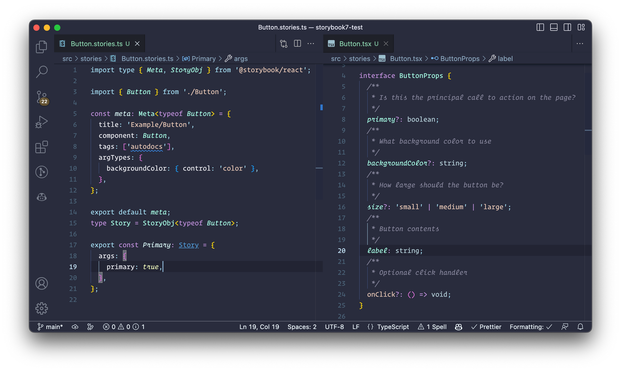
Let's use satisfies operator to fix this issue.
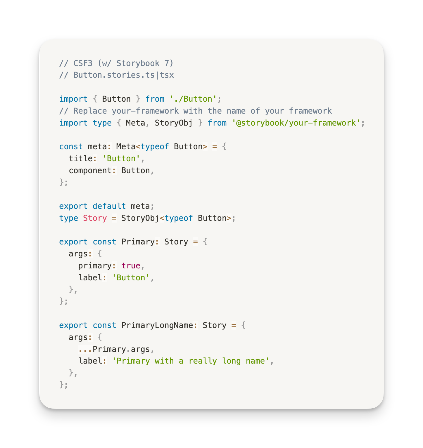
// Button.stories.tsx

import type { Meta, StoryObj } from '@storybook/react';
import { Button } from './Button';

const meta = {
  title: 'Example/Button',
  component: Button,
} satisfies Meta<typeof Button>;

export default meta;
type Story = StoryObj<typeof meta>;

export const Primary: Story = {
  args: {
    primary: true,
  },
};
Now if you forget to provide a required arg, you‘ll get a TypeScript error:
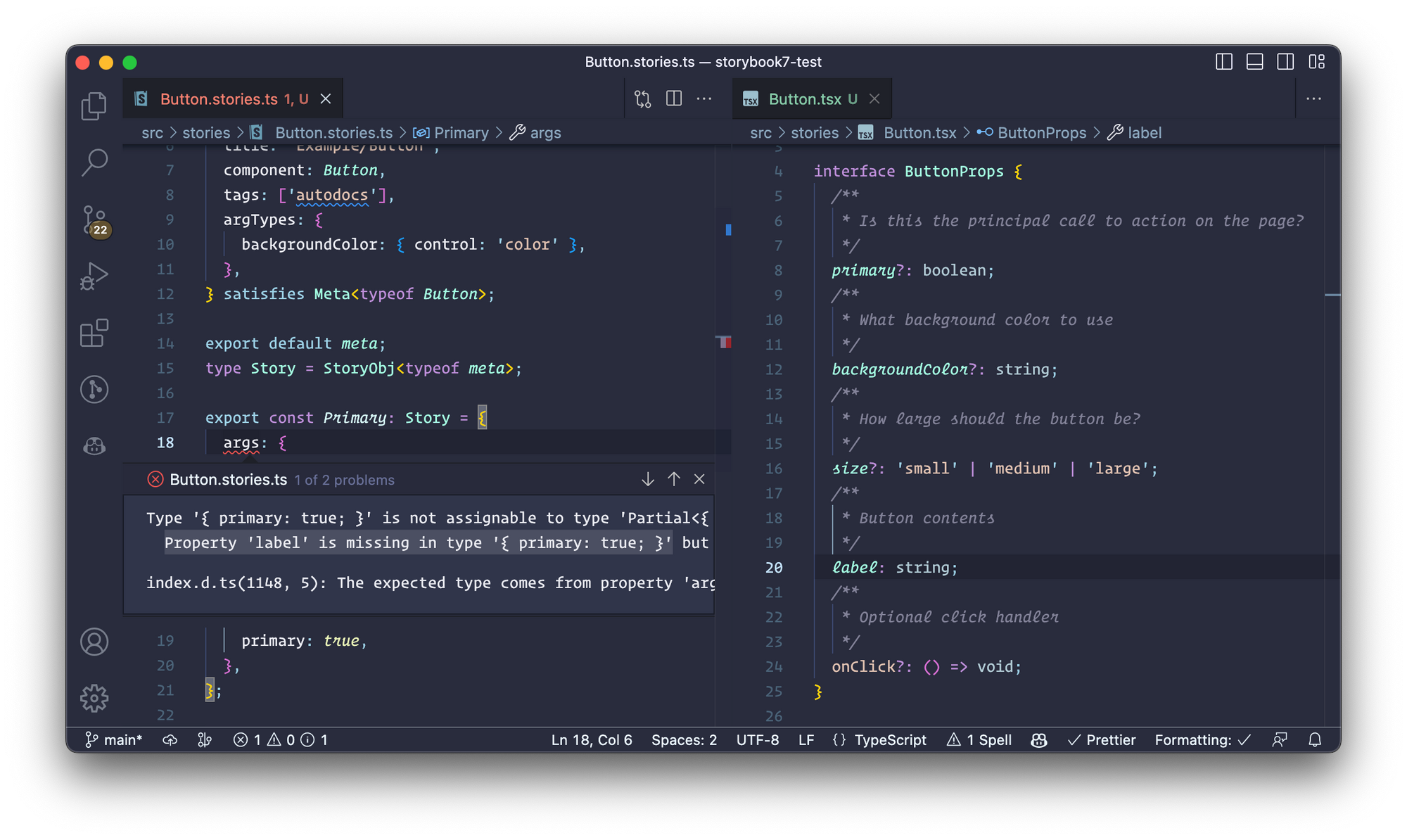
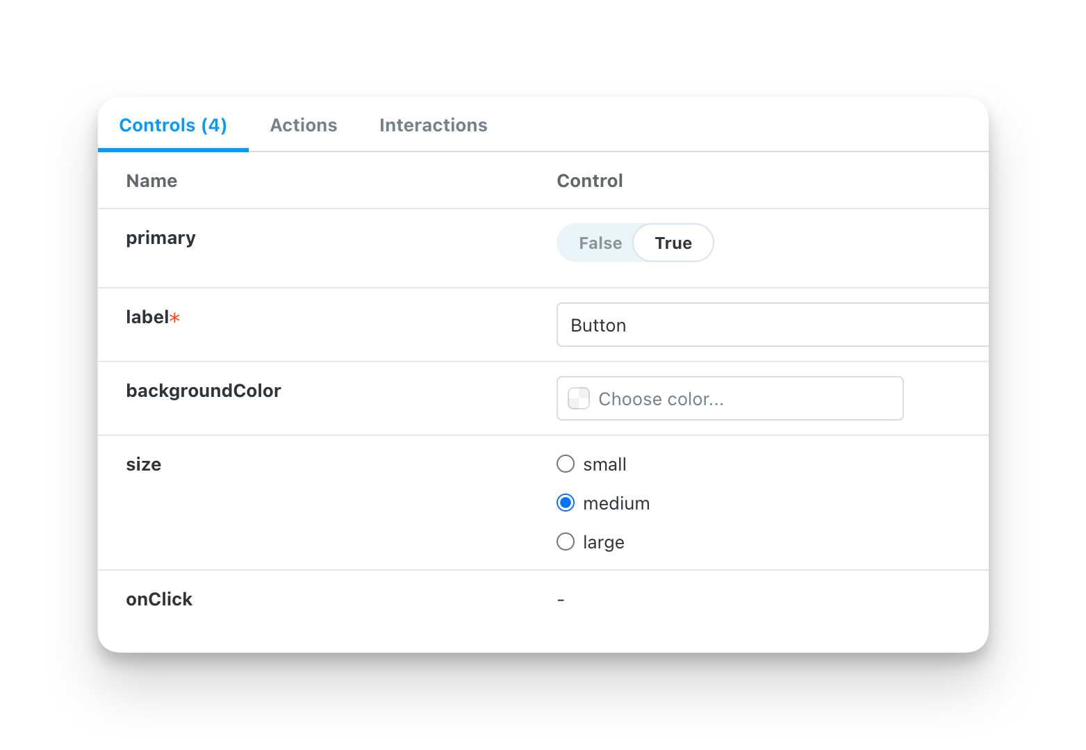
Auto-infer component level args
Even with label provided in our meta-level args, TypeScript was showing errors on our stories. That’s because TypeScript doesn’t know about CSF’s connection between them. So let’s tell it! Pass typeof meta to StoryObj so that TypeScript understands the args can be defined both at the story and meta level, and the errors are go away.
// Button.stories.tsx

import type { Meta, StoryObj } from '@storybook/react';
import { Button } from './Button';

const meta = {
  title: 'Example/Button',
  component: Button,
  args: {
    label: 'Default',
  },
} satisfies Meta<typeof Button>;

export default meta;
type Story = StoryObj<typeof meta>;

// 👇 TS won't complain about "label" missing
export const Primary: Story = {
  args: {
    primary: true,
  },
};

const Secondary: Story = {
  args: { disabled: false }
};

const Disabled: Story = {
  args: { disabled: true }
};
We also recommend that you extract StoryObj<typeof meta> to a type, so that you can reuse it across all stories in a file. For example, we use it to type the Primary, Secondary and Disabled stories above.
Putting it all together
Here's a complete example. Notice that we're using the satisfies pattern for both the meta and story levels. This helps us maintain type safety when sharing a play function across stories.
When sharing a play function across stories, TypeScript will throw an error by default, as the play function may be undefined. However, the satisfies operator enables TypeScript to infer whether the play is defined or not.
import type { Meta, StoryObj } from '@storybook/react';
import { screen, userEvent } from '@storybook/testing-library';
import { AccountForm } from './AccountForm';

const meta = {
  component: AccountForm,
} satisfies Meta<typeof AccountForm>;

export default meta;
type Story = StoryObj<typeof meta>;

export const Standard = {
  args: {
    passwordVerification: false,
  },
} satisfies Story;

export const StandardEmailFilled = {
  ...Standard,
  play: async () => {
    await userEvent.type(
      await screen.findByLabelText('Email'),
      'marcus@acme.com'
    );
  },
} satisfies Story;

export const VerificationSuccess = {
  args: {
    passwordVerification: true,
  },
  play: async () => {
    // 👇 Reuse play function from previous story
    await StandardEmailFilled.play();

    await userEvent.type(
      await screen.findByLabelText('Password'),
      'j129ks#82p23o'
    );
    await userEvent.type(
      await screen.findByLabelText('Verify Password'),
      'j129ks#82p23o'
    );
    await userEvent.click(
      await screen.findByRole('button', { name: /submit/i })
    );
  },
} satisfies Story;
Framework specific tips
Template-based frameworks such as Vue and Svelte typically require editor extensions to enable syntax highlighting, autocomplete, and type checking. Here are a few tips to help you set up the ideal environment for them.
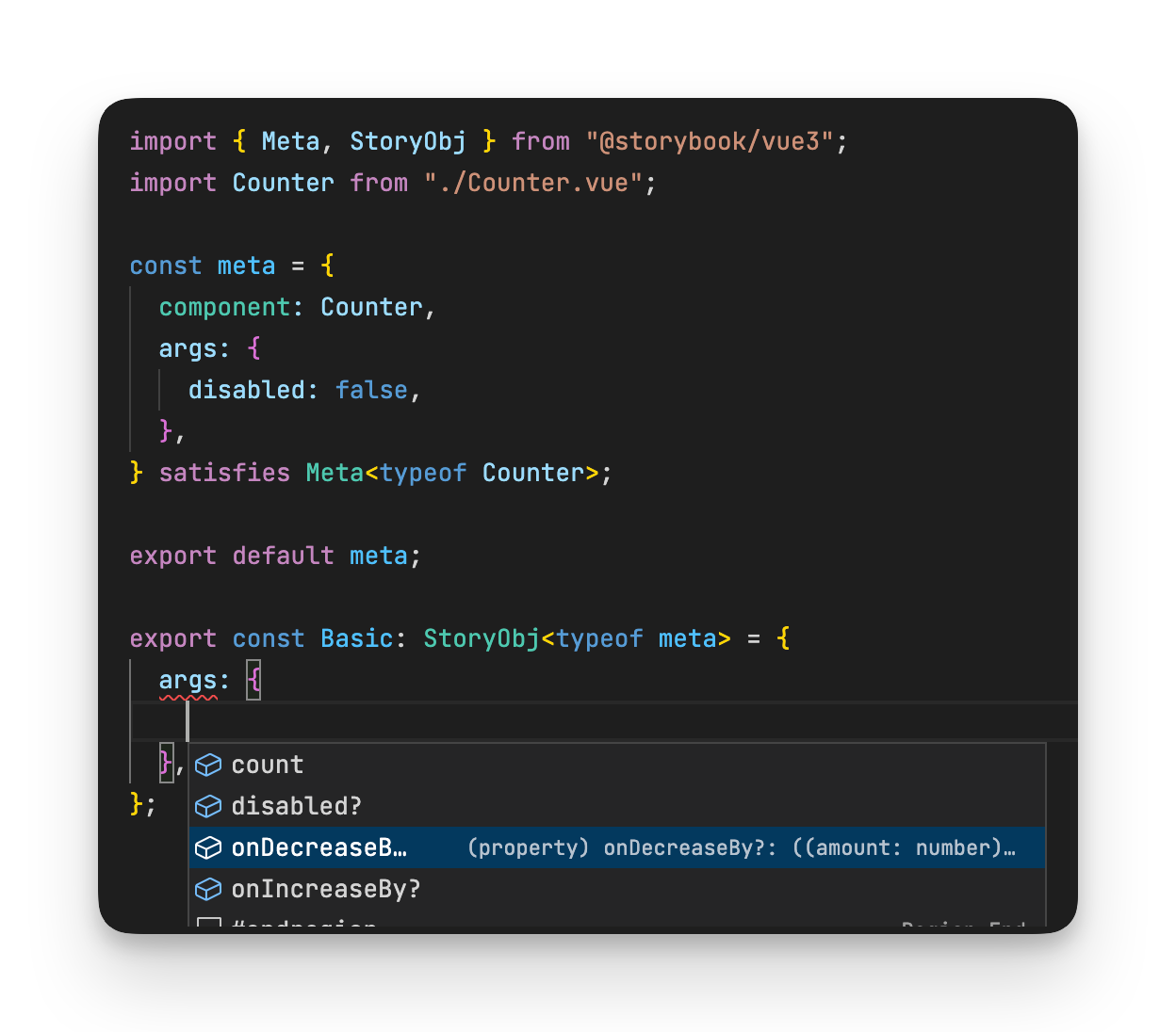
Vue
Vue has excellent support for TypeScript, and we have done our utmost to take advantage of that in the stories files. For example, consider the following strongly typed Vue3 single file component (SFC):
<script setup lang="ts">
defineProps<{ count: number, disabled: boolean }>()

const emit = defineEmits<{
  (e: 'increaseBy', amount: number): void;
  (e: 'decreaseBy', amount: number): void;
}>();
</script>

<template>
  <div class="card">
    {{ count }}
    <button @click="emit('increaseBy', 1)" :disabled='disabled'>
        Increase by 1
    </button>
    <button @click="$emit('decreaseBy', 1)" :disabled='disabled'>
        Decrease by 1
    </button>
  </div>
</template>
You can type check SFC files with vue-tsc and get editor support in VSCode by installing the Vue Language Features (Volar) and TypeScript Vue Plugin extensions.
This setup will add type support for *.vue imports to your .stories.ts files, providing the same type safety and autocomplete features.
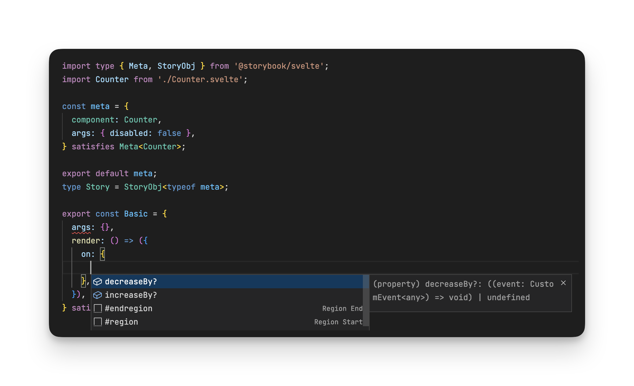
Svelte
Svelte also offers excellent TypeScript support for .svelte files. For example, consider the following component. You can run type checks using svelte-check and add VSCode editor support with the Svelte for VSCode extension.
<script lang="ts">
  import { createEventDispatcher } from 'svelte';

  export let count: number;
  export let disabled: boolean;

  const dispatch = createEventDispatcher();
</script>

<div class="card">
  {count}
  <button on:click={() => dispatch('increaseBy', 1)} {disabled}> Increase by 1 </button>
  <button on:click={() => dispatch('decreaseBy', 1)} {disabled}> Decrease by 1 </button>
</div>
The same setup works with Svelte stories files too, providing both type safety and autocompletion.
Angular and Web Components
We are not yet able to provide additional type safety using the satisfies operator with Angular and Web components. They both utilize a class plus decorator approach. The decorators provide runtime metadata, but do not offer metadata at compile time.
As a result, it appears impossible to determine if a property in the class is a required property or an optional property (but non-nullable due to a default value) or a non-nullable internal state variable.
For more information, please refer to the following discussion: github.com/storybookjs/storybook/discussions/20988
Try it today
The new Meta and StoryObj types are now available in the Storybook 7 beta; see our SB7 migration guide. After your project is upgraded, you can run a migration using:
npx storybook migrate upgrade-deprecated-types --glob="**/*.stories.@(js|jsx|ts|tsx)"Note, this codemod does not add the satisfies operator automatically. We plan to release a second codemod soon, which will enable users of TypeScript 4.9+ to migrate to the new types and add in the satisfies operator. Look out for that update in the coming weeks.
What's next?
We are delighted that the TypeScript 4.9 update finally resolves the long-standing issue of not receiving warnings about missing required arguments. The satisfies operator in combination with the StoryObj type enables TypeScript to understand the connection between component and story level arguments. As a result, it is now better at displaying these warnings.
We hope to ship more improvements soon. For instance, we are exploring ways to improve the typing of story parameters based on the addons installed. Additionally, we are looking to improve the type definitions of argTypes.
Storybook has long offered built-in TypeScript support. However, stories were not strongly typed.
— Storybook (@storybookjs) February 8, 2023
You got great autocomplete features in story files, but no warnings about missing args.
Storybook 7 fixes that by combining CSF3 & TS satisfies operator » https://t.co/eF1NJER00o pic.twitter.com/Qc5sJRFWDF