Portable stories for Playwright Component Tests
Test your stories in Playwright CT with minimal setup.

Storybook is the industry standard workshop for building, documenting, and testing UI components. It’s used by leading development teams at organizations like Shopify, Gov.UK, and NASA.
One of the biggest benefits of developing in Storybook is that you get tests for free. Each isolated component example—or “story”—is a UI test. And if you want to test data fetching and user interactions, Storybook has tools for that too!
To execute your stories as tests, Storybook includes a Playwright-based Test Runner. And while thousands of teams happily use that to functionally test their components, there are other teams who want to reuse their stories in other testing tools and environments, such as Playwright CT (Component testing).
That’s why I’m excited to announce a new, experimental Portable Stories API:
- ✍️ Write stories in Component Story Format (CSF), tailor-made for component development
- 🧪 Test those stories in Playwright CT, reusing props/styling/component setup
- 🥳 Available in Storybook 8.1 for React 18+ and Vue 3
Read on to learn more about how to use portable stories with Playwright CT in your project.
Portable stories
To render a component in isolation (outside of your app) you need to supply it with the necessary context, including props, providers, wrappers, and mocks. This is a challenge for testing components in tools like Vitest, Cypress CT, and Playwright CT.
Storybook has created a format for developing UI components in isolation, which is optimized for providing these inputs. Component Story Format (CSF) is the best way to quickly catalog all the key variants of your components.
Portable stories is an API that converts this story context into an appropriately renderable component. For example, a React story becomes a React component, a Vue story becomes a Vue component, and so forth.
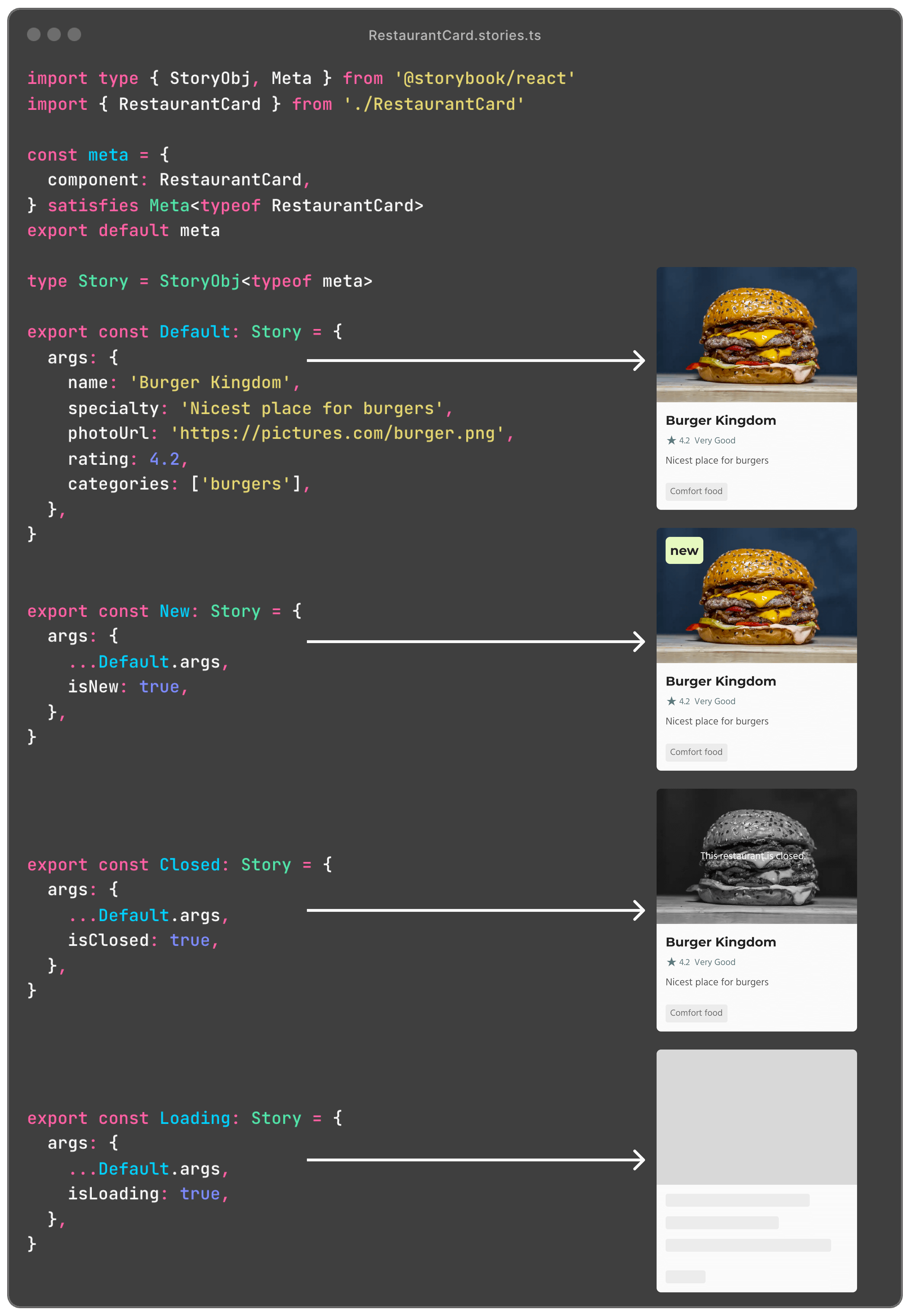
import { composeStories } from '@storybook/react'  // or @storybook/vue3
import * as stories from './RestaurantCard.stories'

// Each of these components can be rendered in other environments
const { Default, New, Closed, Loading } = composeStories(stories)
This is useful because you can reuse all of that setup (props, styling, routing, etc.) in any tool that consumes components. In the case of component testing, this can typically replace the “arrange” step of “arrange / act / assert.”
Storybook interaction tests vs Playwright CT
Storybook provides built-in testing capabilities through the play function and its own Playwright-based test-runner. This enables you to verify how a component reacts to user interactions such as clicks, typing, and mouse inputs. This is our recommended stack for testing components.
However, there are plenty of reasons why you might consider Playwright CT instead. It is fast, has an incredible VSCode integration, and other cool features like a test generator and a trace viewer.
Playwright CT for Storybook users
If you're a Storybook user who prefers to use Playwright CT, we want to make your experience as seamless as can be. Starting in Storybook 8.1, it is now possible to reuse your React and Vue3 Storybook stories in Playwright CT. Doing so is a three-step process:
1 - Import global annotations
In Storybook, you import global styles and define global annotations (args, decorators, etc.) in a .storybook/preview.ts file. Playwright CT has a similar concept, under playwright/index.tsx.
The first step is to use the setProjectAnnotations API from Storybook as part of your Playwright setup file. This will ensure that your portable stories take the global configuration into account as well.
// playwright/index.tsx
import { setProjectAnnotations } from '@storybook/react' // or @storybook/vue3
import previewAnnotations from '../.storybook/preview'

setProjectAnnotations(previewAnnotations)
2 - Create a portable stories file
Playwright CT expects a “test story” file to be used in tests. For each component you want to test, create a new *.stories.portable.ts file alongside its stories file. This file will use the portable stories composeStories API which will convert every story in the file to a portable component:
// RestaurantDetailPage.stories.portable.ts
import { composeStories } from '@storybook/react'

import * as stories from './RestaurantDetailPage.stories'

// Output an object that maps 1:1 to your stories, now in portable components
export default composeStories(stories)3 - Use the portable stories experimental API for Playwright CT
In your test file, import the portable stories from the file that was just created, and use the createTest API from Storybook, which extends the base test API from Playwright. Upon mounting a story, all of its decorators, loaders, and play function will execute correctly.
// RestaurantDetailPage.spec.tsx
// For Vue3, import from '@storybook/vue3/experimental-playwright'
import { createTest } from '@storybook/react/experimental-playwright'
// For Vue3, import from '@playwright/experimental-ct-vue'
import { test as base, expect } from '@playwright/experimental-ct-react'

import stories from './RestaurantDetailPage.stories.portable'

const test = createTest(base)

test('Default', async ({ mount }) => {
  // The mount function will execute all the necessary steps in the story,
  // such as loaders, render, and play function
  await mount(<stories.Default />)
})

test('WithItemsInTheCart', async ({ mount, page }) => {
  await mount(<stories.Success />)
  await page.getByLabel('menu item').first().click()
  await page.getByLabel('increase quantity by one').click()
  await page.getByLabel('confirm').click()
  await expect(page.getByLabel('food cart')).toContainText('€25.50')
})
And that's it! Now, whenever you make changes to your stories, these changes will automatically be part of your Playwright tests as well.
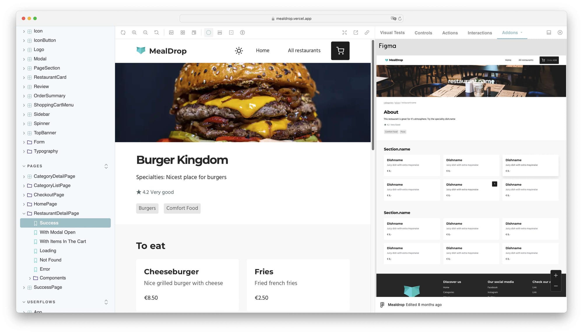
Here's an example in Mealdrop, where stories for a complex page (styling, state management, routing, data fetching, etc.) are reused in Playwright CT. This example showcases Playwright's VSCode extension and its test generator:
Storybook for Playwright CT Users
Storybook can also complement your existing Playwright CT tests, which will bring superpowers to your testing suite:
- Isolated development environment: Storybook provides a sandbox-like environment where you can build and test UI components in isolation from the rest of your application. It provides features that facilitate the authoring of new variants (stories) for your components, making it easier to increase your test coverage.
- Handoff and collaboration: Storybook generates a static app that can be deployed and hosted anywhere, allowing team members to see and discuss modifications without having to deploy their entire app. This helps collaboration between developers and designers or stakeholders.
- Documentation and component catalog: Storybook automatically generates a living document of your UI components. As a result, you have a single source of truth for your team, ensuring everyone understands the available components and how they should be used.
- Extensive addon ecosystem: Storybook supports a wide range of integrations and addons that enhance its functionality, from accessibility testing to design tool integrations, making it a handy tool for various development needs.
- Visual regression testing: Storybook provides a Visual Tests addon, which ensures that your UI looks as intended across different devices and browsers before it reaches production.
What’s right for me?
Playwright CT is a great tool for browser testing components in isolation. So is Storybook’s own Test Runner, Cypress CT, and Vitest.
In a future post, we’ll look more critically at these options and share our opinions on component testing best practices. In the meantime, not only do each of these tools have their own strengths and weaknesses, but they are also moving targets. Today’s best choice can easily be eclipsed by a different option tomorrow.
Portable stories avoids tool lock-in by making it possible to take your isolated components wherever makes the most sense for your project and your personal preferences. We encourage you to give it a spin as a way to streamline and future-proof your component development and testing.
Try it today
Portable stories for Playwright CT is available in Storybook 8.1. Try it in a new project:
npx storybook@latest initOr upgrade an existing project:
npx storybook@latest upgradeYou can follow the documentation for more details on getting started and the full API.
What's next
We currently support React 18+ and Vue3 experimentally in Playwright CT, but plan to follow this up with more renderers and integrations. We also hope to collaborate with the Playwright team to make portable stories easier to set up in future versions.
Test your components with stories in @playwrightweb Component Tests!
— Storybook (@storybookjs) May 16, 2024
🧳 Introducing the portable stories API
✍️ Write stories in Component Story Format
♻️ Re-use those stories in Playwright CT
🤝 Storybook & Playwright work well together
Available for React 18+ and Vue 3.
👇 pic.twitter.com/HzHOhDofoC