Storybook 10
ESM-only, 29% lighter, module automocking, and more

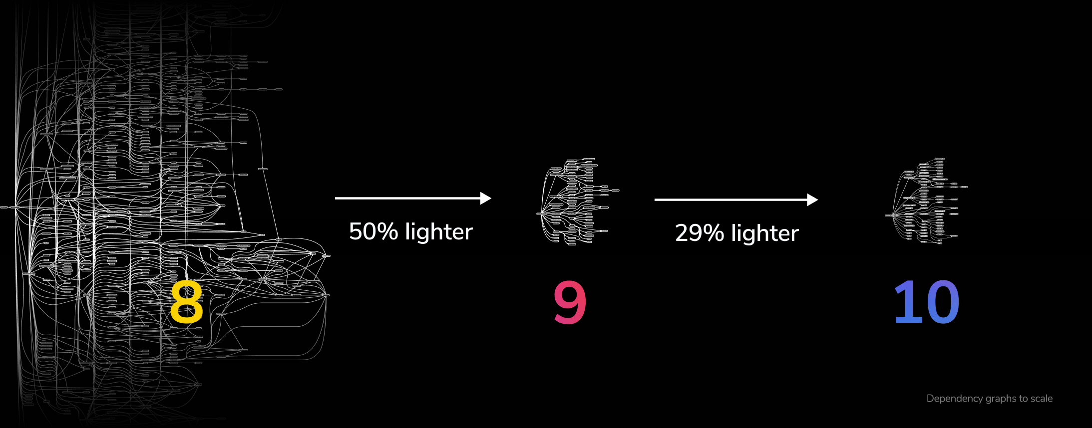
Storybook 10 contains one breaking change: it’s ESM-only. By removing CommonJS from published code, we’ve simplified Storybook and reduced its install size by 29% while simultaneously un-minifying our distribution for easier debugging.
Storybook 10 also includes key improvements to level up your UI development, documentation, and testing workflows:
- 🧩 Module automocking for easier testing
- 🏭 Typesafe CSF factories Preview for React
- 💫 UI editing and sharing optimizations
- 🏷️ Tag filtering exclusion for sidebar management
- 🔀 Svelte async components, Next 16, Vitest 4, and more
And finally, while you’re here, we’re also excited to share some experimental work for feedback:
- 🧪 Test syntax for familiarity and reduced sidebar clutter
- ⚛️ Component testing RSCs
ESM-only
ESM-only is the main breaking change in Storybook 10. It reduces install size by 29% on top of the 50% savings we released in Storybook 9.
More importantly, it helps push the Javascript community forward towards a cleaner, simpler future. The ecosystem is healing. We are so excited about this change, we think it deserves its own post.
ESM-only requires a modern Node that supports ESM require (20.16+, 22.19+, or 24+).

Module automocking
In Storybook 9, we teamed up with Vitest to create the best way to test UI components. Users tell us the combination of Storybook’s interactive UI and Vitest’s blazing fast test runner is a match made in heaven.
But they had less kind things to say about our approach to module mocking, which apparently came from another place. 👿 Undeterred, we went back to the drawing board and collaborated with Vitest to create a next-generation module mocking solution.
Storybook’s new sb.mock is inspired by vi.mock, but it’s simpler, compatible with both Vite and Webpack builders, and available in both development and static production builds. Read all about it in our feature announcement post.
Typesafe CSF Factories
Component Story Format (CSF) is how to write component examples and tests in Storybook. We created it in 2019, back when JavaScript ruled the roost and Flow was still a thing. Fast forward to today, and TypeScript is the norm, making up 80+% of Storybook projects.
To keep up, we’re introducing CSF Factories, the next major iteration of CSF. Factories provide better type safety, ergonomics, and autocompletion.
// CSF 3
import type { Meta, StoryObj } from '@storybook/nextjs-vite';
import Button from './Button';

const meta = { component: Button } satisfies Meta<typeof Button>;
export default meta;

type Story = StoryObj<typeof meta>;

export const Primary: Story = {
  args: { label: 'Button', primary: true }
};

// CSF Factories - Less boilerplate and no type assignments! 🎉
import preview from '../.storybook/preview';
import Button from './Button';

const meta = preview.meta({ component: Button });

export const Primary = meta.story({
  args: { label: 'Button', primary: true }
});
With Storybook 10 we are promoting CSF Factories from Experimental to Preview status, which means we don’t anticipate any significant changes when we make Factories the default in Storybook 11 next Spring. There are codemods to automatically upgrade your existing stories, but you are not obligated to upgrade. Older versions of CSF are still supported and will be for the foreseeable future.
CSF Factories are available for React only, and we expect to release Vue, Angular, and Web Components factory support in 10.x.
UI editing and sharing optimizations
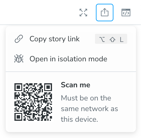
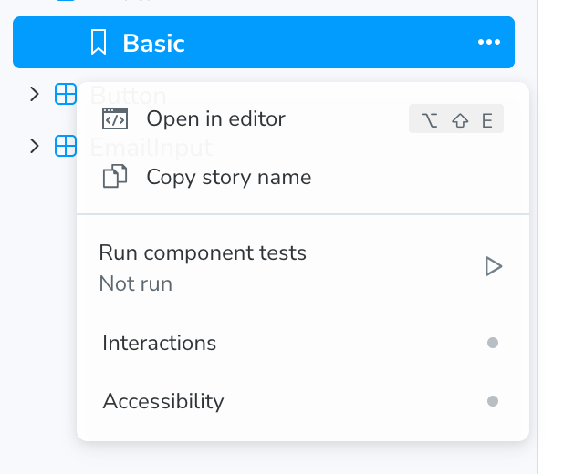
At Storybook, we sweat the details, continuously refining our UI to make you more productive. Storybook 10 includes another round of optimizations for easier story editing and sharing.
Want to see how that component looks on your mobile phone? The sharing menu now has a QR code for easy access:
Want to edit that failing story in your favorite editor? That’s now a click away too:
Got suggestions for more UI improvements? Feature requests are always welcome.
Tag filtering exclusion and configuration
Storybook CSF makes it easy to capture every state of your UI. But stories can pile up quickly, with the largest Storybooks containing thousands of stories spanning use cases of both documentation and testing, capturing components in different stages of maturity, owned by different teams, and so on.
To make large Storybooks easier to manage, we added tags to stories:
// Button.stories.ts

export const GlassMode: Story = {
  args: { glass: true },
  tags: ['experimental'],
};
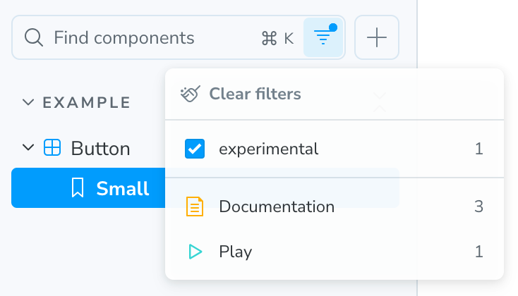
In Storybook 8.5, we added a filtering UI to filter the the sidebar down to tags matching a particular tag. For example, if you wanted to only show stories with the experimental tag, you could select the experimental tag in the UI:
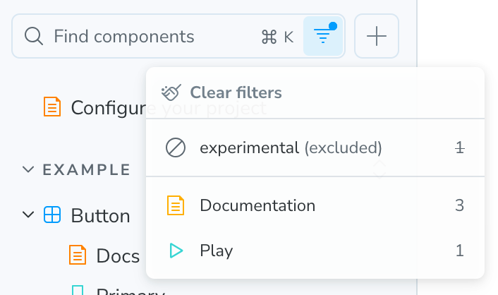
A good start, but users immediately wanted more. So in Storybook 10 we’ve beefed up tags with two new features: exclusion and configuration.
Exclusion makes it possible to exclude stories based on selected tags. So if you want to hide stories with the experimental tag, you can do that too:
Not only that, but you can configure the default UI state in the configuration file.
// .storybook/main.ts

const config: StorybookConfig = {
  tags: {
    experimental: { defaultFilterSelection: 'exclude' },
  },
};
To learn all about Storybook tags, please see the documentation.
Svelte async components and state mocking
Thanks to our vibrant collaboration with the Svelte community, Storybook for Svelte keeps getting better. In Storybook 10, we’ve added support for async components, Svelte’s latest innovation. We’ve also added mocking support forapp/state, closing a long-standing gap in our SvelteKit integration. If you’re a Svelte user and haven’t tried Storybook in awhile, we highly recommend giving it another try!
Next 16, Vitest 4, and more!
Every Storybook release is a chance to upgrade with ecosystem. Storybook 10 adds support for Next 16 and Vitest 4, two of the biggest releases this Fall. We've done this while preserving support for older versions.
Try Storybook 10 today
Try Storybook 10 in a new project:
npm create storybook@latest
In an existing Storybook project, use our automated migration wizard to help you upgrade:
npx storybook@latest upgrade
We also provide a migration guide to help fill in the gaps.
What’s next? Test syntax, RSC testing
Every release we announce what’s next and point at our roadmap. This time we’re doing things a little different and we have a bunch of stuff cooking that you can try today and help us shape the future of UI development together.
Experimental test syntax
Building on the CSF Factories syntax and Tag exclusion filtering exclusion described above, we’ve made it possible to write tests in a familiar syntax and then easily exclude them from the sidebar to remove clutter for non-technical collaborators:
// Button.stories.ts
import preview from '../.storybook/preview';

import { Button } from './Button';

const meta = preview.meta({ component: Button });

export const Disabled = meta.story({ args: { disabled: true } });

// 🆕 .test method: Attach tests to a story!
//    The test function can run the same code as the play function
Disabled.test('should be disabled', async ({ canvas, userEvent, args }) => {
  const button = await canvas.findByRole('button');
  await userEvent.click(button);

  await expect(button).toBeDisabled();
  await expect(args.onClick).not.toHaveBeenCalled();
});
For more information, see our RFC and join our early access program to discuss potential improvements.
Experimental RSC component testing
Finally, we are collaborating with the entire React ecosystem (React core, Next, Testing Library, Vite, and Vitest) to solve component testing for React Server Components (RSCs).
Until now, RSCs have been exclusively tested end-to-end (E2E), since they span both the client and server. However, it is challenging to scale E2E to a large number of tests due to performance and flake. Comparatively, component tests are fast, highly controlled, and low-flake.
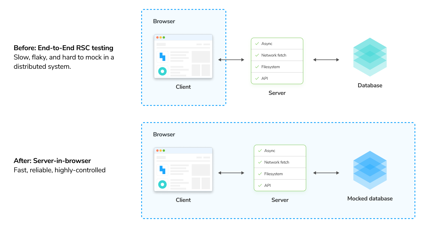
We’ve released experimental RSC component testing for Storybook and have opened an early access program to stabilize it with users. If you don’t use Storybook, and want to component test your RSCs directly in Vitest, we’ve also got you covered. Read more about how it in our RFC.
Credits
Core team
Michael Arestad, Yann Braga, João Cardoso, Tom Coleman, Norbert de Langen, Steve Dodier-Lazaro, Kyle Gach, Gert Hengeveld, Dom Nguyen, Valentin Palkovic, Kasper Peulen, Jeppe Reinhold, Lars Rickert, Kai Röder, Michael Shilman (me!), Varun Vachhar, Ian Van Schooten, Daniel Williams, Josh Wooding, and Vanessa Yuen
Contributors
@404dealer @43081j @adamscybot @alcpereira @alexey-kozlenkov @avitalhass @ayuhito @beeequeue @benmccann @brandonroberts @cabbiepete @candrepa1 @copilot @dannyhw @diagramatics @dmarcisovska @dschungelabenteuer @ghengeveld @gingeekrishna @grantralls @guysenpai @hpohlmeyer @ia319 @imgbotapp @jakeii @jatinmehta007 @joe-moran @jonniebigodes @jreinhold @jsmike @julioj11 @k35o @kachurun @kasperpeulen @kroeder @kylegach @matmilbury @mehm8128 @messenjer @mihkeleidast @morfey13 @mrginglymus @natainakata @ndelangen @nischit-ekbote @nozomikasajima @ryomaejii @selenehyun @shahabhilash @shilman @sidnioulz @silverwind @sk-pub @steciuk @synar @takashi-kasajima @terrymun @tijmenb @tmeasday @usrrname @valentinpalkovic @vanessayuenn @vinay-d07 @vivekkavala @walkerburgin @xlecunff-pass @y-hsgw @yannbf @yatishgoel @zenocross
Storybook 10 is here! ✂️ ESM-only (the only breaking change!) 🧩 Module automocking for easier testing 🏭 Typesafe CSF factories Preview for React 💫 UI editing and sharing optimizations 🏷️ Tag filtering exclusion for sidebar management 🔀 Svelte async component support
— Storybook (@storybook.js.org) 2025-11-04T19:02:28.200Z