Storybook 10.4
Automatic setup with agents, review filters, TanStack React, and more

With Storybook 10.4, AI agents can now configure Storybook automatically in complex applications, the sidebar can focus review on stories affected by a code change, and a new sharing flow lets teammates inspect work in progress without waiting for a PR or CI.
It also expands Storybook’s framework support with first-class TanStack React support, a cleaner React Native setup, and experimental React Component Meta for richer MCP metadata.
Automated setup
Starting in 10.4, AI agents can automatically set up Storybook in complex apps.
Isolated component development is powerful because you can see every UI state in your application. The cost is the complexity and upfront effort of setting up mocks to mimic your application context. Now with Storybook 10.4 we've reduced that cost dramatically by helping agents do the setup.
Simply prompt:
Set up Storybook for me with npm create storybook@latest and follow its instructions preciselyYour agent will analyze your project structure, generate the Storybook config, generate mocks (e.g. MSW), write stories and interaction tests for up to 10 of your components, automatically test that the results render with styles, and then iterate as necessary until the setup is complete.
![Terminal window displaying: Summary: - Ran `storybook init` (Storybook 10.4.0 + React/Vite framework, addons: vitest, a11y, docs, chromatic-com, mcp) - Ran `storybook ai setup` and followed its playbook - Installed MSW deps: `msw`, `msw-storybook-addon`, `mockdate`; ran `msw init ./public` - Configured `.storybook/main.ts` with staticDirs: `['../public']` - Built shared `.storybook/preview.tsx` with the real provider tree (MemoryRouter + Redux store + styled-components ThemeProvider + GlobalStyle), MSW loader, MockDate, and a #modal portal-root decorator - Wrote MSW handlers for mealdrop.netlify.app/.netlify/functions/restaurants (list + by-id) - Created 10 colocated `*.stories.tsx` files (Button, Badge, Heading, Body, Review, Logo, Spinner, TopBanner, ErrorBlock, RestaurantCard) — 37 stories total, plus matching names (Default, Disabled, New, Closed, Loading) that the pre-existing `.test.tsx` files compose - Included one CssCheck story on Button asserting `backgroundColor === 'rgb(32, 32, 32)'` (theme's `grey.dark6`) — proves the ThemeProvider chain actually loaded - All 37 stories pass `npx vitest --project storybook run`; `'needs-work'` tag stripped from every file - Deleted the boilerplate `src/stories/` generated by init](https://storage.ghost.io/c/f9/d7/f9d78a80-56f8-4adc-8ba1-0e2d6ee72b16/content/images/2026/05/agent-setup-summary-1.jpg)
We've successfully evaluated agentic setup on a wide range of projects from component libraries like Radix Themes, React Spectrum, and ECharts to complex apps like Excalidraw and Bluesky.
To learn more about the setup process, see our AI setup docs.
Change detection
We've also added sidebar filters to help you review stories that have been newly added or possibly affected by a code change.
A major challenge in software development is understanding the impacts of a code change. This gets harder in UI where automated tests typically can't answer the question "does this look right?". And harder still in agentic development where, as a developer, you are less connected to the code.
As a first attempt to address this, we've added new / modified / related filters to Storybook's sidebar. This makes it easy to zoom in on the stories that are most likely to need review.

To learn more about the workflow, see the change detection docs.
Quick sharing
Have a UI question for your designer or PM as you're developing? Now it's easier than ever to share your Storybook for feedback with the click of a button.
One of Storybook's superpowers is collaboration. No other tool gives your team a well-documented, well-tested collection of UI components that can be browsed by non-technical teammates. In Storybook 10.4 we've leveled up this workflow with a familiar share button.
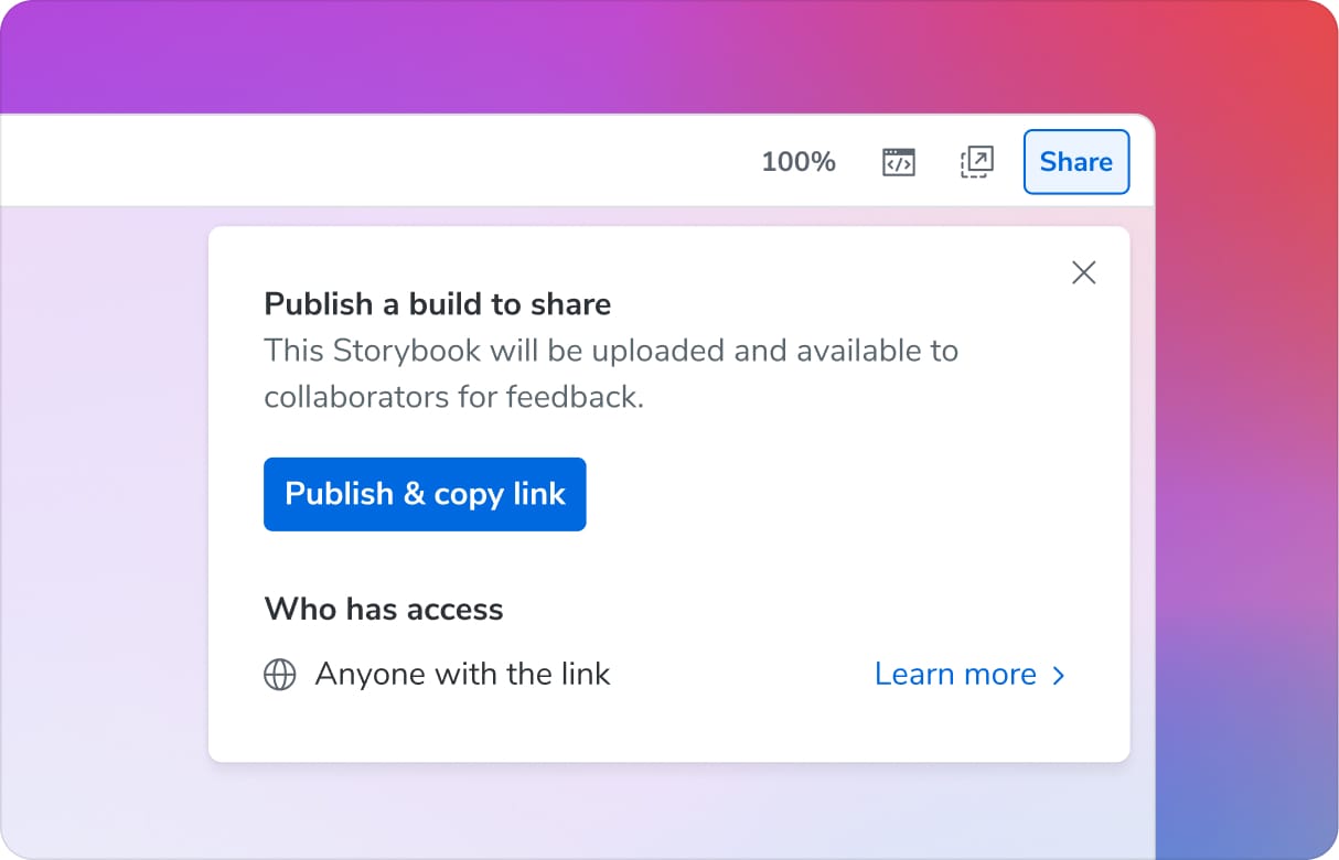
It publishes your Storybook to the cloud so that your teammates can easily access. Notably, you don't need to commit your changes, create a PR, or wait for CI. Just click, share, and go. The assets are hosted for free on Chromatic, the cloud service built by Storybook maintainers.
To learn more about the workflow, please see the sharing docs.
TanStack React framework
Storybook 10.4 introduces @storybook/tanstack-react. We built this in collaboration with the TanStack core team to provide first-class framework support in Storybook.
With its flexibility, high performance, and rapid evolution, TanStack is Storybook's fastest growing application framework. To better support these new users, we've added TanStack support out of the box. The framework provides zero-config for core features including type-safe routing and server functions, and documentation on optional features such as React Query.
// Page.stories.ts

import type { Meta, StoryObj } from '@storybook/tanstack-react';

import { Route } from './Page';

const meta = {
  parameters: {
    layout: 'fullscreen',
    tanstack: {
      router: {
        route: Route, // 👈 Supply the Route here
        // 👇 Rest of these properties are type-safe
        params: { id: '42' },
        query: { tab: 'details' },
      },
    },
  },
} satisfies Meta<typeof Route>;

export default meta;
To learn more, please see the TanStack React framework docs.
Opinionated React Native setup and isolation
Storybook for React Native (SBRN) is the only tool that provides isolated RN component development directly on your mobile device or simulator. In 10.4 we've added a new setup that better isolates your Storybook from your mobile app.
We've achieved this by creating a new standalone SBRN app entry point. When you run your app with STORYBOOK_ENABLED=true, it swaps out your normal app entry point and replaces it with Storybook. This setup guarantees that your Storybook code is well-separated from app code and also provides a zero-config installation to get you started faster in new projects.
The change is backwards compatible, so if you've already integrated using a different approach, you don't need to change anything. However, we've also provided a migration path for users who want to use the recommended approach. For more information, see the Storybook for React Native docs.
React Component Meta for MCP (experimental)
Earlier in 10.3 we introduced Storybook MCP for React to give AI agents the context they need to reuse your existing components rather than making up their own. Now in 10.4 we've improved it with faster, higher-quality component metadata based on Volar and the TypeScript Language Server.
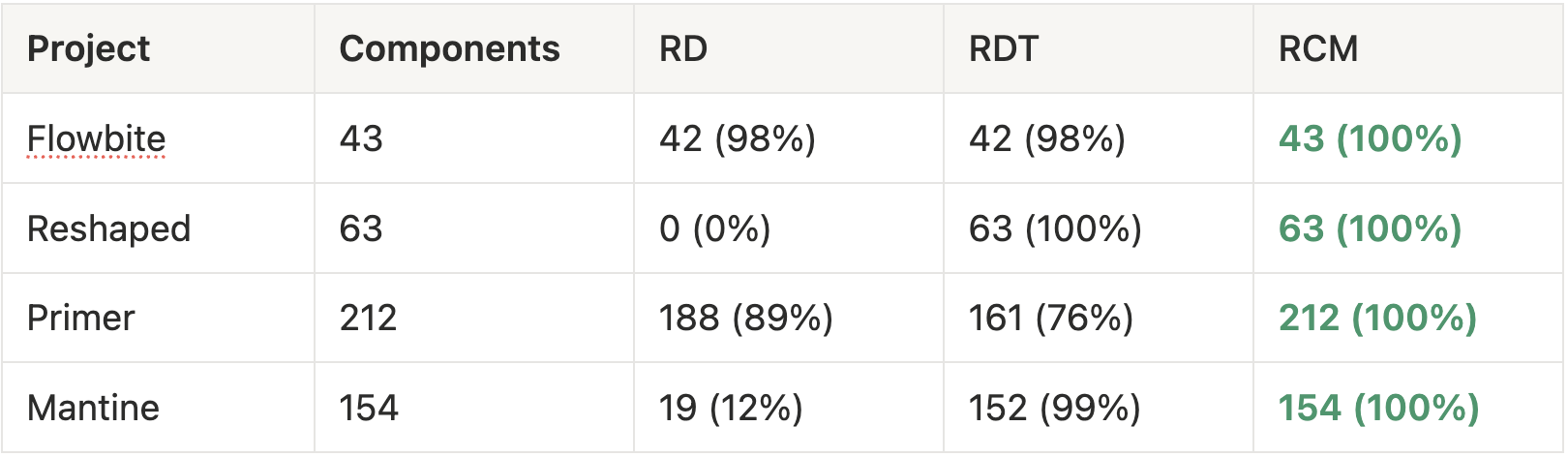
The new docgen analyzer, react-component-meta (RCM), is intended to replace the two existing docgen options react-docgen (RD) and react-docgen-typescript (RDT). Here’s how the solutions compare on a few popular design systems.
Component detection (higher is better):
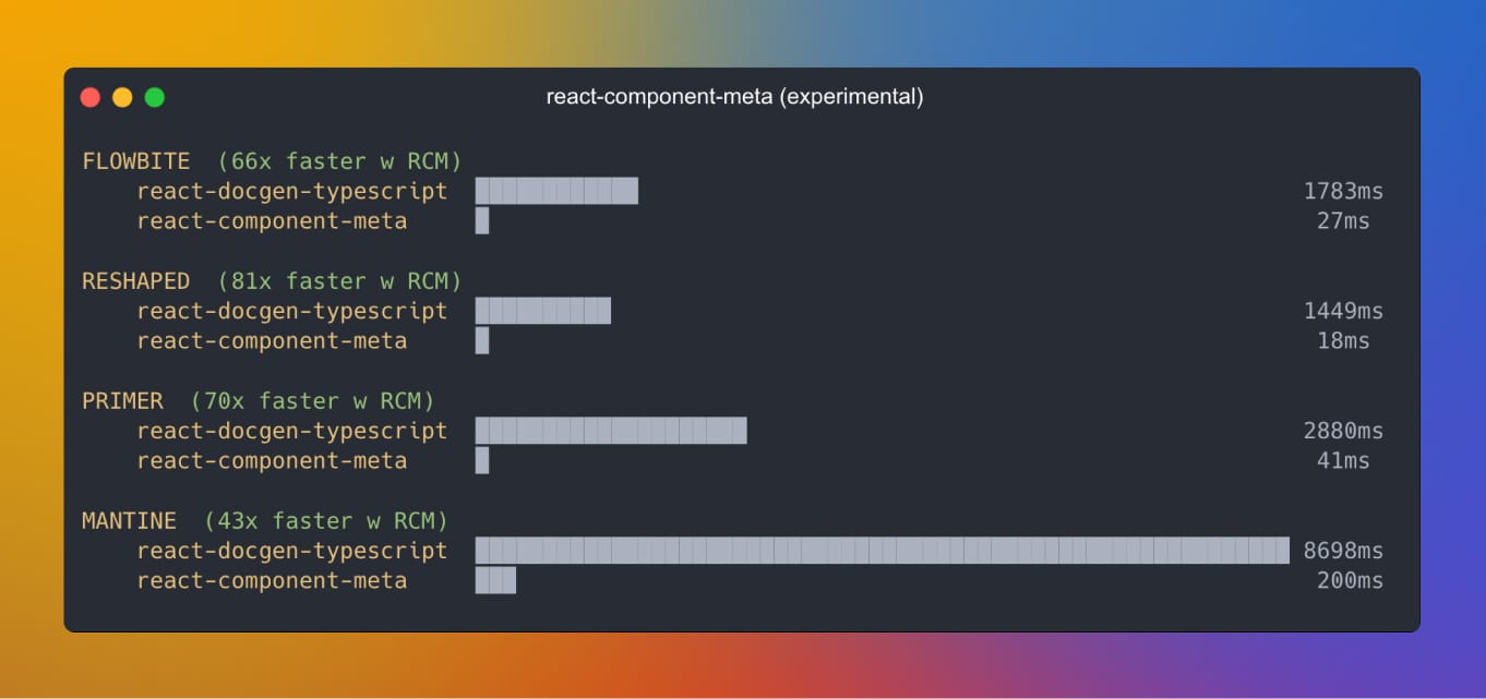
Speed of file edit update in dev mode (lower is better):
In 10.4, it is available experimentally in MCP. Once it’s stabilized we plan to standardize on RCM for both MCP and Storybook Docs.
// .storybook/main.ts
export default {
  features: {
    experimentalReactComponentMeta: true,
  }
};
To learn more about React Component Meta and all of the cases that it fixes, please see the React Component Meta PR.
How to upgrade to Storybook 10.4
New to Storybook? Create a project:
npm create storybook@latest🤖 Or have an agent do it by copy/pasting this prompt:
Set up Storybook for me with npm create storybook@latest and follow its instructions preciselyAlready using Storybook? Upgrade now with our automated migration wizard:
npx storybook@latest upgradeWe also provide a migration guide to help upgrading from previous majors.
What's next?
As our users continue to adopt AI tooling, Storybook is evolving to support the new stack.
Storybook MCP for React gives agents high quality context to reuse existing UI components and rapidly test generated UI. We’re now in the process of making it much easier to integrate into your agent harness or agentic editor. We're also reworking the guts so that your human and agent documentation pulls from the same source.
The other area that we're focused on is making it easier to review agentic work. 10.4's change detection feature is a step in the right direction, but we are working on streamlining the process, both by providing a higher signal diff, as well as a better review UI.
Stay tuned for these improvements and more coming to Storybook 10.5!
Contributors
@6810779s @alex-js-ltd @anchmelev @axadali @beeswhacks @calebhyatt @chida09 @cjeonguk @dannyhw @dev-profil @frjcomp @ghengeveld @huang-julien @ia319 @jonniebigodes @jreinhold @k35o @kasperpeulen @kylegach @louis-bompart @majiayu000 @mixelburg @nathanjessen @ndelangen @programer1804 @qadir1020 @rohanadepu @seojcarlos @shilman @sidnioulz @stof @theseydicharyyev @valentinpalkovic @venkat22022202 @viditkbhatnagar @whdjh @yannbf @yatishgoel
 Storybook