Storybook 7.0 design sneak peek
Visual updates, UX tweaks, and faster performance

Every morning thousands of developers spin up Storybook to start the work day. Storybook underpins the frontend workflow of Netflix, Adobe, and the European Union.
But with growing usage, comes more exposure to UX edge cases and inconsistencies. For the past 3 years, we’ve researched usability and collected UX feedback.
I’m thrilled to share a sneak peek of Storybook 7.0’s design. It refreshes the core UI patterns so that you can build more with fewer clicks, shorter mouse travel, and less waiting.
- 📐 Layout expanded to increase usable real estate
- 🛠 Toolbar organized for discovery
- ✍️ Icon set redrawn and lighter weight
- 🔢 Form elements refined
- ⚡️ Performance overhaul
Why now?
Before we begin, it’s worth mentioning that 7.0 doesn’t redesign the wheel. Storybook’s popularity is a testament to the current battle-tested developer experience. The team wouldn’t do anything to mess that up.
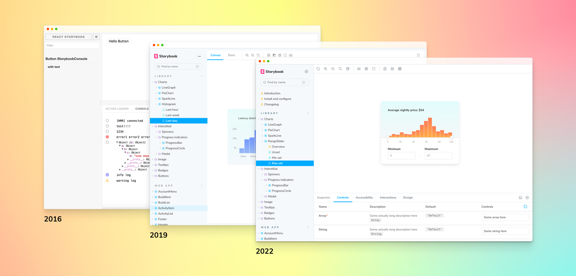
Storybook’s design was last revamped in 2019 by me and Norbert de Langen. Back then, it was only a tool for building UI components in isolation. As the community blossomed, so too did Storybook’s capabilities in UI documentation and testing.
These days, countless teams like Microsoft, Shopify, and Monday.com rely on Storybook to ship durable UIs around the world.
But with Storybook’s expanded features, it was inevitable for the community to stumble on visual inconsistencies and subtle bugs over the years. 7.0’s design addresses this accumulated feedback and lays the foundational UI patterns for Storybook’s future.
As a user, you’ll get a polished new UX atop a familiar workflow.
Meet the new look in 7.0
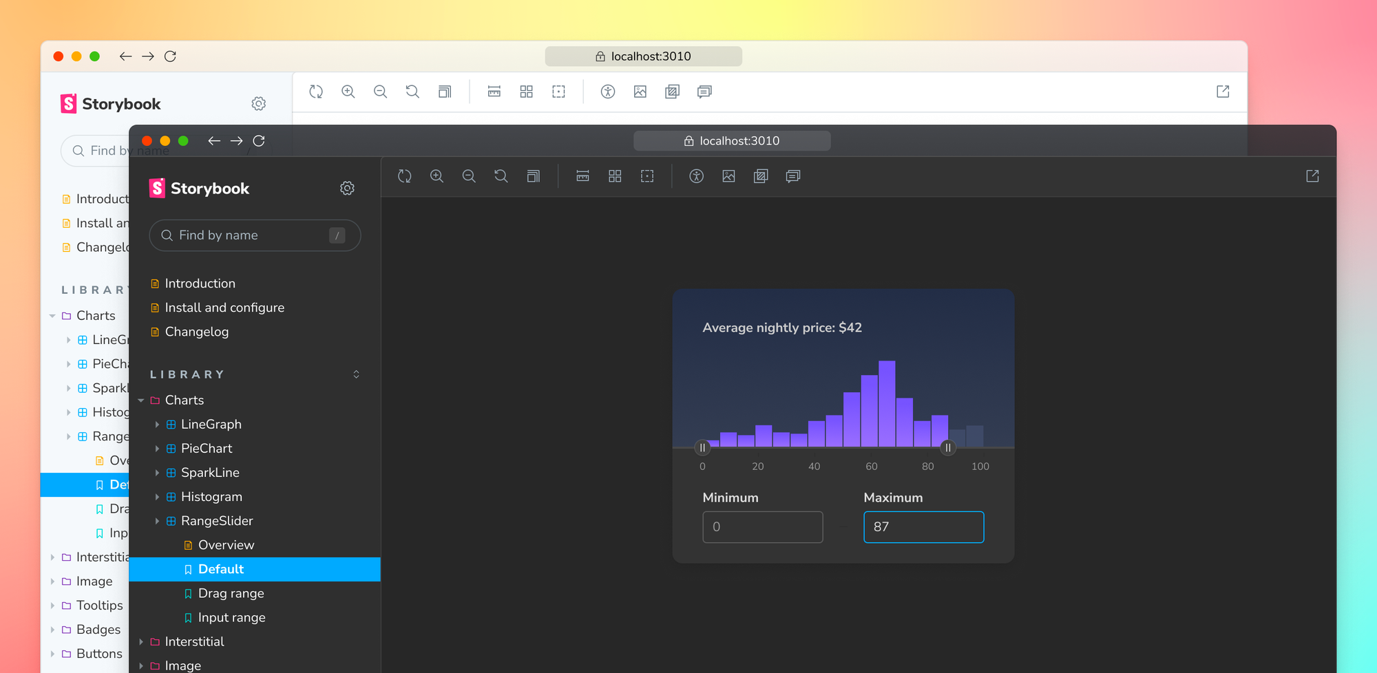
7.0 dedicates more screen space to Canvas – the iframe where components are developed in isolation. Canvas size was increased by 3.5% to give you more freedom to express all the dimensions of your UI.
When you spend hours in Storybook like I do, the more pixels dedicated to development, the more efficient it is to do your job.
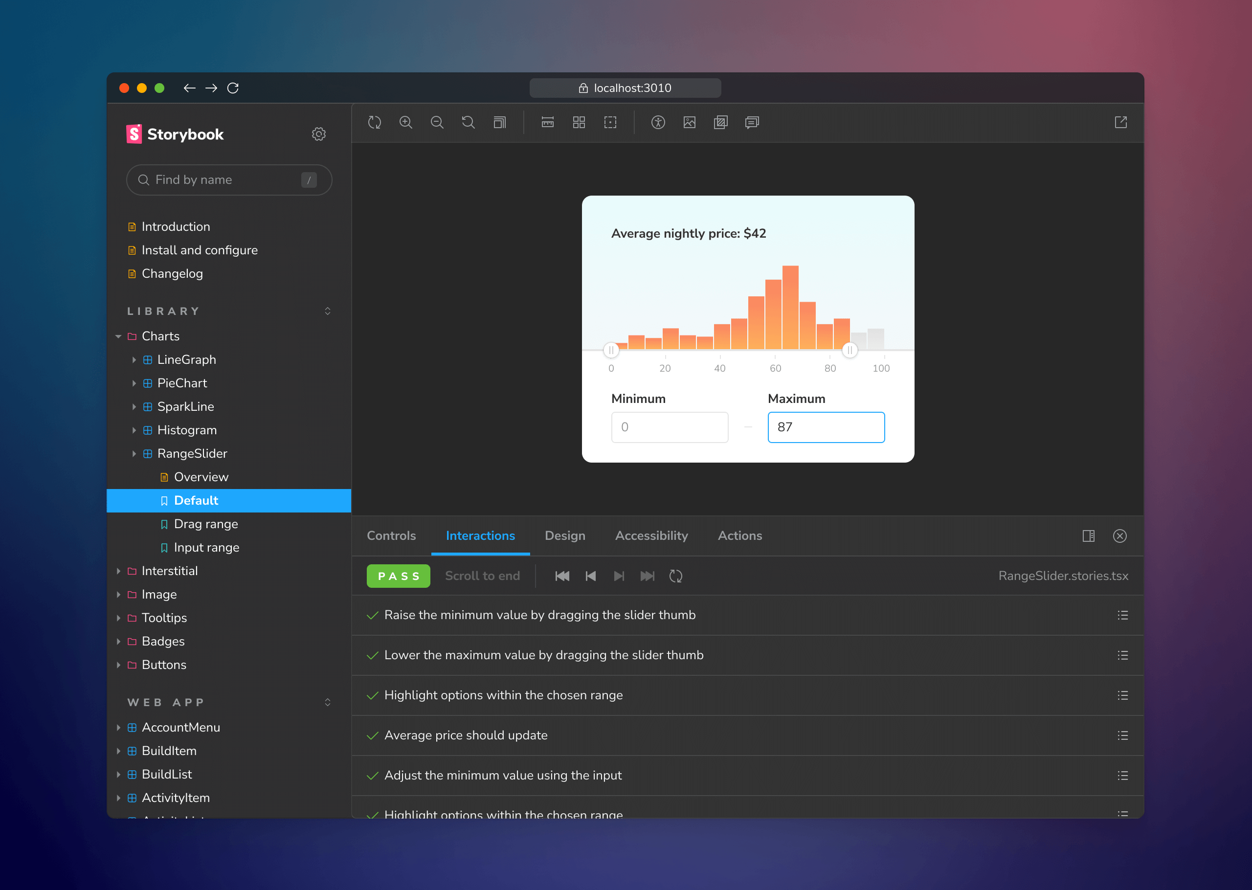
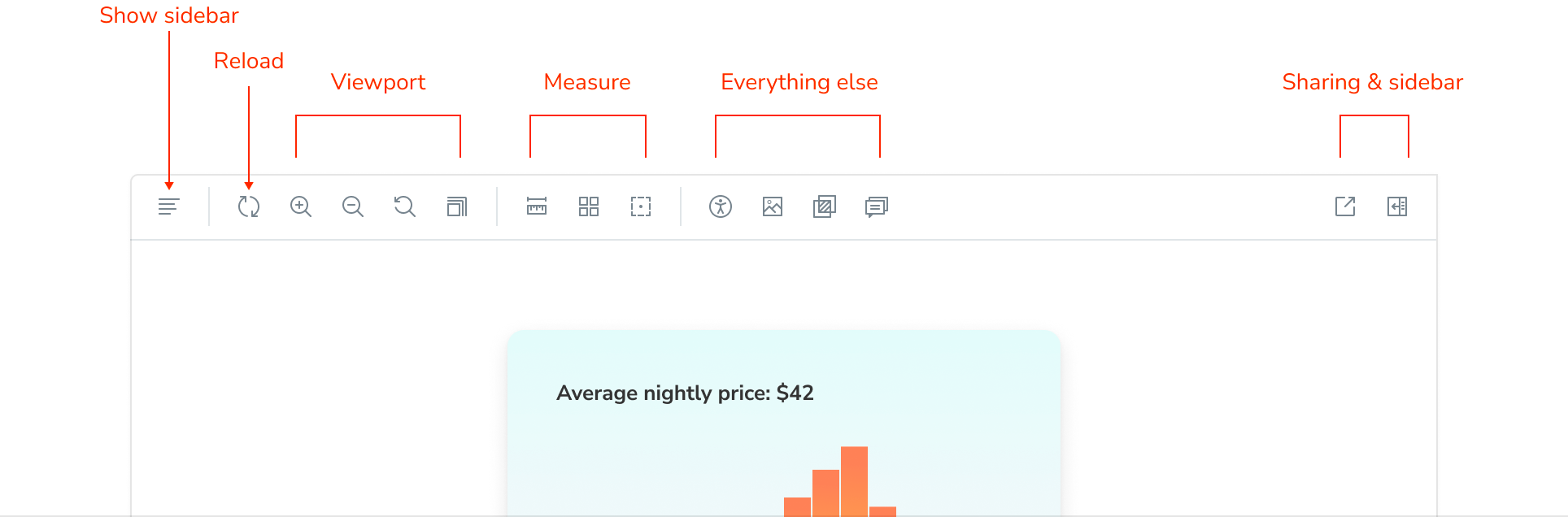
The Canvas toolbar includes tools that help you spot check the UI implementation. The tools are now organized to group similar actions together which ends up reducing how much you have to move the mouse (or tab for keyboard users).
We also added a “Reload” tool that reloads the currently selected story. This is useful when you want to reload the component without refreshing the entire browser.
Storybook 7.0 comes with both a light and dark theme. Our theming API remains the same so any tweaks to theme variables from 6.X are also portable to 7.0.
Made for you to reuse
Customization is one of the top reasons for Storybook’s popularity. There are over 400 addons in the community. In 7.0, integrators will get more access to the design patterns we use to develop Storybook itself.
7.0 includes 196 icons for you to reuse in your own projects. Each icon was redrawn from the ground up to improve sharpness and recognizability. The set was also expanded by 20 icons to capture emerging functionality from the community. The complete set is 46% lighter.
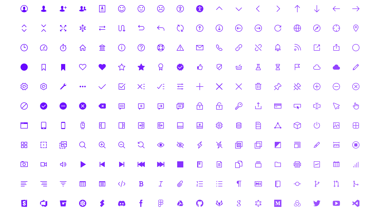
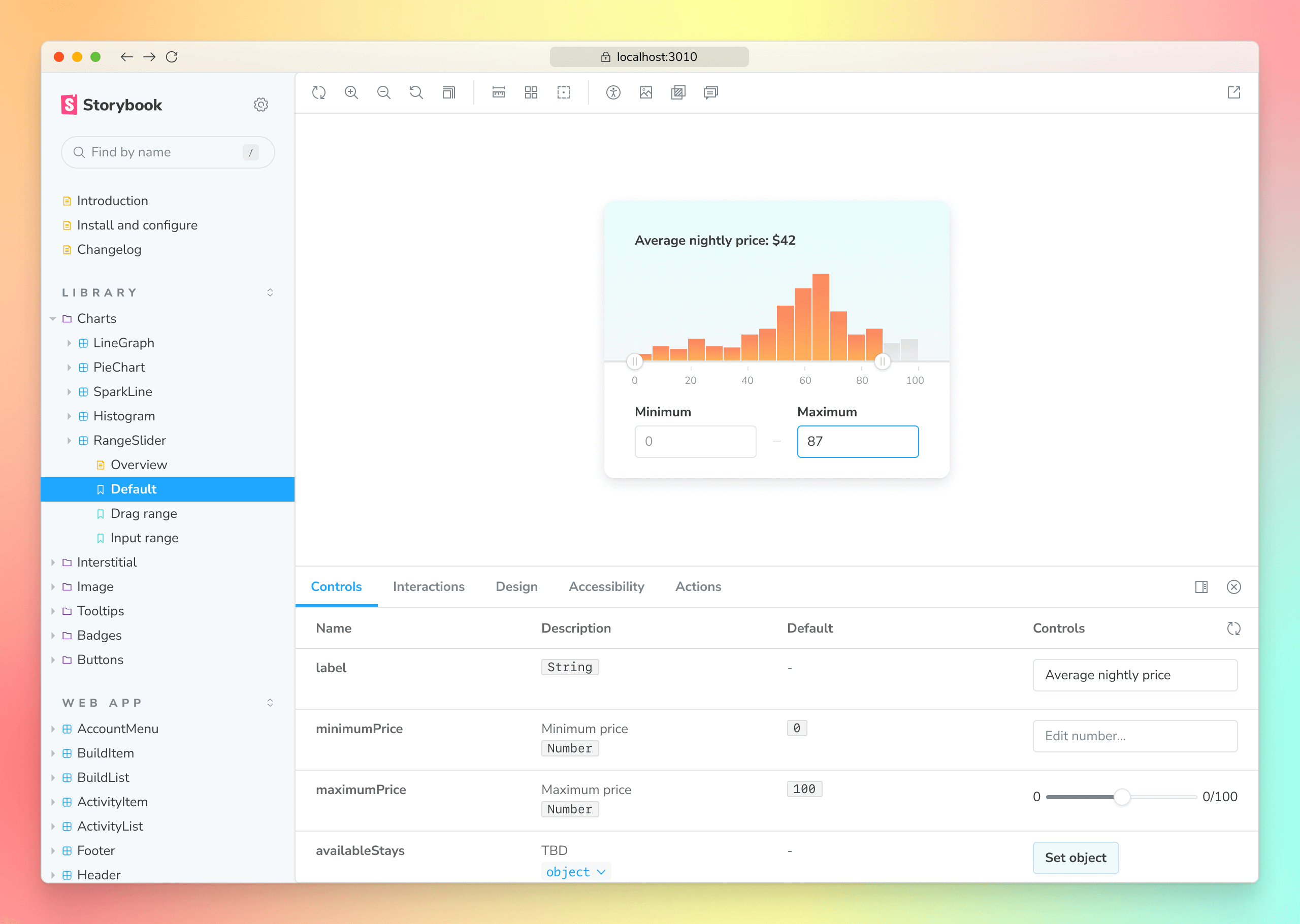
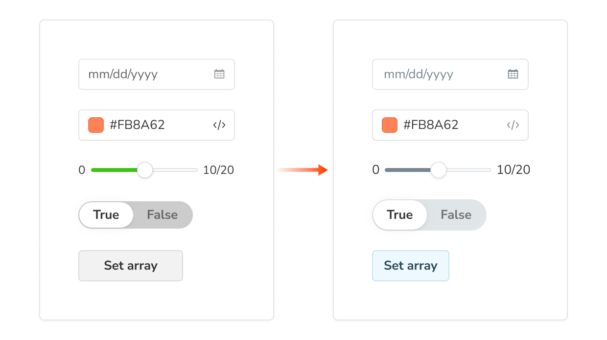
Form components like Toggle and Slider adhere to the updated design language. You’ll notice this most in the Controls addon. Reuse these components in your own addons by importing them from @storybook/components.
Performance drives design
Storybook 7.0 doesn’t just look new, it feels new. The most efficient way to speed up dev workflows is to supercharge Storybook itself.
7.0 pre-bundles Storybook to give you instant start times and sidestep dependency conflicts. Each dependency was audited to further reduce bundle size.
When combined with the performance improvements in 6.X releases (below), 7.0 starts fast and stays fast – even as teams write thousands of stories.
- 7.0 Instant start: Pre-bundle the manager & optimize dependencies
- 6.5 Faster module reload: Webpack 5 Lazy Compilation & official Vite builder
- 6.4 Faster load times: Code splitting for published Storybooks
- 6.3 Future-proof: ESM support and Webpack 5 stable
- 6.2 Extensible: re-architected Storybook to support modern builders such as Webpack 5 and Vite
- 6.1 Faster startup: dropped Webpack DLLs and started pre-building & caching the manager
Sign up for early access
7.0 design is in active development – what's in the sneak peek here is only the first stroke. We need your help and feedback to bring the designs to life, especially during the early access period. Sign up to Storybook’s mailing list below to get notified of project updates.
Have ideas for Storybook’s user interface? Join us in Storybook’s Discord chat #design. We welcome contributions from new developers and veterans alike.
The 7.0 design is developed by Michael Arestad and Dominic Nguyen (me!) with feedback from the entire Storybook community.
Sneak peek of Storybook 7.0 new design!
— Storybook (@storybookjs) July 21, 2022
Refreshed UI patterns so you can build more with fewer clicks, shorter mouse travel, and less waiting
📐 Increase canvas size
🛠 Toolbar organization
✍️ Icon overhaul
🔢 Form elements
⚡️ Performance
Read »» https://t.co/5Kjwv4E6XK
1/🧵 pic.twitter.com/TTRtu4JXcI