
Storybook 8.3
Blazing fast component tests

Storybook is the industry standard workshop for building, testing, and documenting UI components. Hundreds of thousands of developers use it daily, including teams at Microsoft, Spotify, and Ferrari.
We recently announced our big bet on the future of UI testing. Component tests are the perfect companion to E2E tests, bringing coverage, control, speed, and reliability to complement E2E’s black box “whole system” fidelity.
Now I’m excited to announce Storybook 8.3.
Storybook, the best component development tool, has partnered with Vitest, the world’s fastest and most configurable test runner, to bring you an unrivaled component testing experience.
Storybook 8.3 brings:
- ⚡️ First-class Vitest integration to run stories as component tests
- 🔼 Next.js-Vite framework for Vitest compatibility and better DX
- 🗜️ Reduced bundle size for a smaller install footprint
- 🌐 Story globals API to standardize stories for themes, viewports, and locales
- 💯 Hundreds more improvements
First-class Vitest integration
A story is a snippet of JavaScript that captures an example of a UI component; Storybook is a browsable catalog of stories that maps out all your key UI states.
In addition to a catalog, Storybook is also an executable test suite. Basic stories are smoke tests that render components with their inputs. Complex stories can mock application state and network requests, interact with the UI like a user, and assert things about the DOM or the execution — all the things you’d do in a full-featured component test.
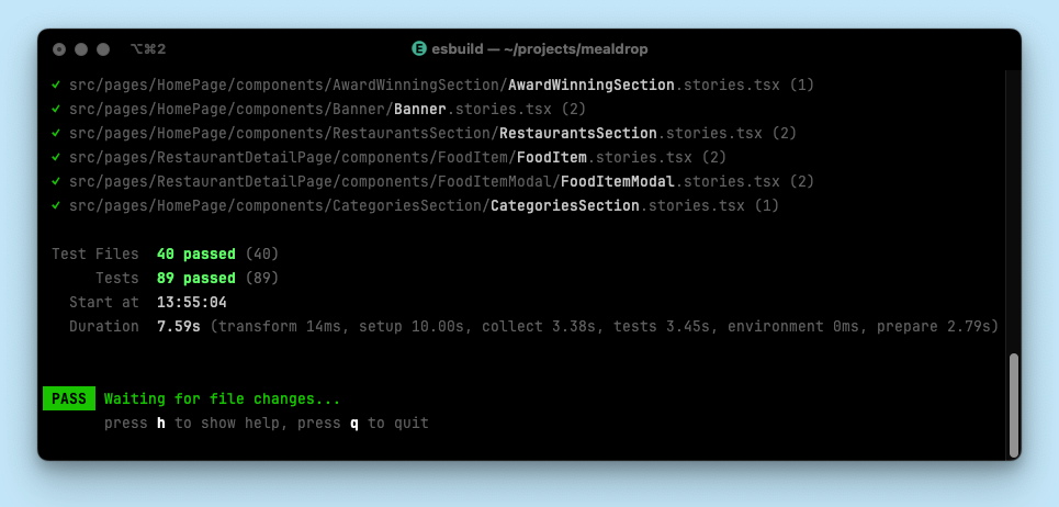
And now, in Storybook 8.3, thanks to Storybook’s Vitest integration, it’s possible to run all those stories as tests, in a headless browser, and at ridiculous speed.
Storybook’s been in the testing game since day one, so we know a great test runner when we see one. When we tried Vitest’s browser mode for the first time, we knew it was special. The same day we got on a call with the Vitest core team to see how we might collaborate on the future of component testing.
Today the first fruits of this partnership are available to use in the form of @storybook/experimental-addon-test. With minimal configuration, you can now run your stories as Vitest tests.
This means:
- Unmatched test execution speed,
- Vitest CLI’s excellent DX,
- Test coverage metrics out of the box,
- Compatibility with Vitest VSCode extension,
- Flexibility to run tests in the browser or JSDom,
- Inline/file snapshot testing for stories,
- And much more.
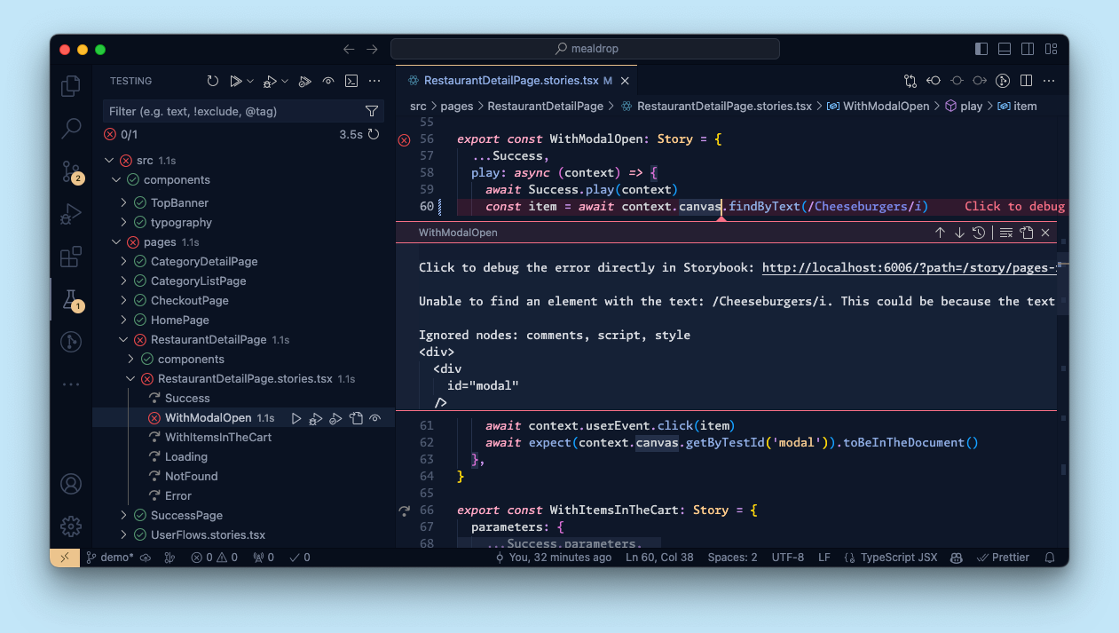
We’ve also brought Storybook’s signature click-to-debug workflow to Vitest: when a test fails, a single click will bring up a time traveling debugger in your browser to inspect exactly what went wrong.
We’ll be sharing a lot more about this integration in the coming weeks, but in the meantime you can get started by referring to the official documentation.
Next.js Vite framework
A big question with our Vitest integration is how to support Webpack projects.
We don’t have a general answer, but for Next.js projects (which make up around ~20% of Storybook usage) we created a Vite plugin to emulate the Next.js environment. The plugin includes support for things like Next’s optimized images/fonts, SWC configuration, and out-of-box support for a standard set of styling systems.
When you install Storybook Test into a Next.js project, it automatically adds the plugin so you can test your client and server application components in Vitest.
We’ve also used the plugin to create a Next.js Vite framework. This means you can also develop your components using Storybook’s Vite builder, which has dramatically faster startup and HMR than the default Webpack builder. This is something that many users were manually configuring already because the Vite DX is so much better. But a manual configuration is typically a poor approximation of the Next.js environment (unless you jump through a lot of hoops). Now we’ve jumped through those hoops for you and we think it’s a huge improvement.
The result is available in @storybook/experimental-nextjs-vite and you can try it out by installing the package and updating your .storybook/main.ts:
// .storybook/main.ts

export default {
-  framework: '@storybook/nextjs',
+  framework: '@storybook/experimental-nextjs-vite',
};
To learn more about the plugin and the framework, please see the Next.js Vite documentation.
Reduced bundle size
With 20k+ devs surveyed, the State of JS survey is the pulse of the JS ecosystem. After a drop in 2022, our hard work to improve Storybook paid off with amazing results in 2023. The biggest gripe was poor dependency management: bloat, install footprint, and version conflicts.
In 8.2, we consolidated 18 Storybook packages into a single core package, storybook, which was a major structural change for a more coherent package structure. It also had the nice side effect of reducing install size/time by ~20% and lockfile lines added by ~30%.
In 8.3, we’ve spent some time deduplicating dependencies and shaved off an additional ~30% of install size and ~35% of lockfile lines added.
This puts us at a 50% overall install size reduction and 65% lockfile reduction on a Vite React-TS project compared to Storybook 8.1. We plan yet another round of cleanup in 8.4, and then some small breaking changes to take things even further in 9.0.
Experimental story globals
Each Storybook story captures a key state of your UI components. We’ve worked hard over the years to optimize the story syntax so that it’s easy to capture all the UI states by systematically varying its inputs (typically props).
But UI states can also be determined by component context. For example, the viewport, theme, background, or internationalization locale are all environmental settings that also affect how a component renders.
Despite the importance of these environmental settings, there has not been a simple, standard way to set these context variables at a story or component level.
Enter “Story globals” a new construct in 8.3 to address this gap:
// RestaurantCard.stories.ts
import type { Meta, StoryObj } from '@storybook/react'
import { RestaurantCard } from './RestaurantCard'

const meta = {
  component: RestaurantCard,
} satisfies Meta<typeof RestaurantCard>

export default meta
type Story = StoryObj<typeof meta>

export const Default: Story = {
  args: {
    id: '1',
    name: 'Burger Kingdom',
    rating: 4.2,
  }
}

export const Dark: Story = {
  ...Default,
  globals: { theme: 'dark' }
}
Notice how navigating to the Dark story disables the theme toolbar menu
For more information, see the documentation for experimental story globals.
Hundreds more improvements
In addition to the features above, every Storybook release contains hundreds of improvements and bug fixes at every level. Some highlights:
✅ Rsbuild. The Rspack team has been quietly improving support for Rsbuild, adding it as a new builder to Storybook’s CLI. #28694 Check out the Rsbuild 1.0 release, hot off the press!
✅ Angular+Vite support. Check out the new Analog integration!
✅ Disable save parameter. Interactive story generation can create new stories from Storybook’s UI using control values. Based on community feedback we’ve added a parameter to disable this feature. #28734
✅ Vue snippet and memory management improvements. We’ve made a bunch of improvements to Vue’s source code snippets for documentation. #27194
✅ Vue memory management. We’ve also fixed some memory management issues in vue-component-meta for automatic control inference. #28589
Try it today!
Storybook 8.3 is available today. Try it in a new project:
npx storybook@latest init
Or upgrade an existing project:
npx storybook@latest upgrade
If you’re upgrading from 7.x, we have a guide to help you. We also have a guide for migrating from older versions.
What’s next
We’re got more exciting improvements coming your way in 8.4:
- A UI for running tests and visualizing results in Storybook
- A workflow for interactively debugging test failures and warnings
- A further reduction in install size (we’re on a roll!)
- Interactive tags-based sidebar filtering UI
For an up-to-date view on what we’re working on and considering, please check out Storybook’s roadmap.
Credits
Huge shoutout to the 31 contributors whose PRs feature in Storybook 8.3!
@0916dhkim @43081j @abcdmku @aberllin @ahayes91 @aminghs @andrejilderda @averethel @bbboy01 @booc0mtaco @chakas3 @fi3ework @filipemelo2002 @ghengeveld @jonniebigodes @jreinhold @kasperpeulen @kylegach @kyletsang @larsrickert @marklb @ndelangen @shilman @skred @tmeasday @tobiasdiez @valentinpalkovic @vanessayuenn @vincentdevreede @yannbf
Storybook 8.3!
— Storybook (@storybookjs) September 24, 2024
⚡️ First-class Vitest integration to run stories as component tests
🔼 Next.js-Vite framework for Vitest compatibility & better DX
🗜️ Reduced bundle size for a 30% smaller install
🌐 Story globals API to standardize stories for themes, viewports, and locales
👇 pic.twitter.com/6Yctgg8IzH