
Storybook 8.4
Component Test in your browser in 1 click

Storybook is the industry standard workshop for building, testing, and documenting UI components. Hundreds of thousands of developers use it every week, including teams at Volvo, Netflix, and Chewy.
In Storybook 8.4, we’ve created the best DX for testing, and debugging frontend tests in the browser. It builds on our work in component testing in partnership with Vitest.
- ▶️ 1-click Component Testing in browser
- 🫧 50% smaller bundle size & 75% smaller lockfile
- 5️⃣ Svelte 5 and Svelte CSF
- ⚛️ React Native Storybook 8
- 🏷️ Tagging and filtering stories
- 💯 Hundreds more improvements
Component Test in 1 click
Storybook Test is our vision for frontend testing. By testing components rather than a full app, we can balance the fidelity of end-to-end (E2E) with the speed and reliability of unit tests.
The core of this experience is a UI in Storybook that can run tests and display results in realtime. And that’s exactly what we’ve delivered in Storybook 8.4.
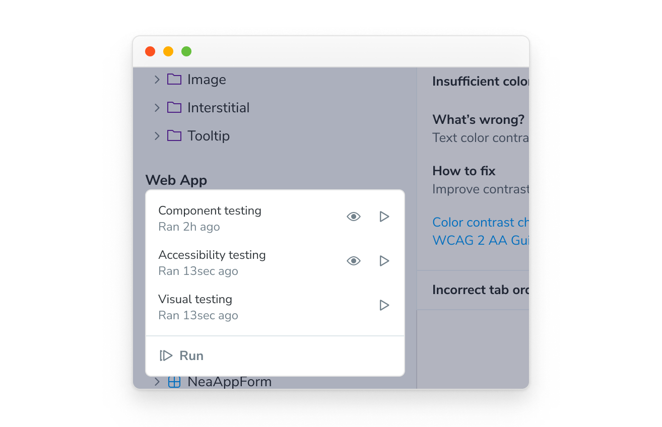
With the click of a button, it is now possible to run component tests in Vitest for all of your stories:
When tests fail, you can go through the failures and debug them one-by-one in Storybook’s time-traveling debugger:
It also supports watch mode, so you can get notified when something breaks:
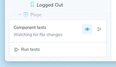
Finally, the test bar is extensible, so other test runners like Chromatic’s Visual Test addon can also run. To learn more about our new test UI, please see the official documentation.
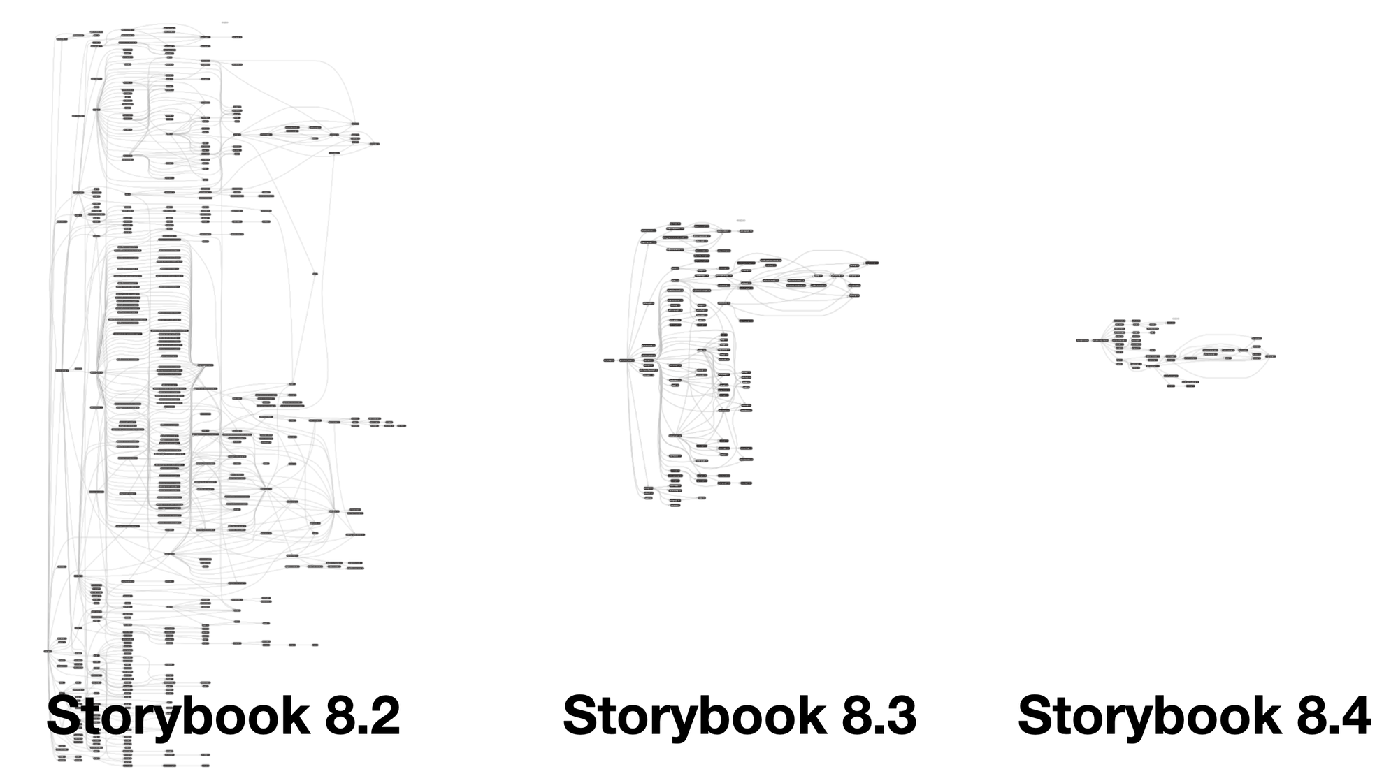
We cut bundle size in half
8.4 cuts Storybook’s overall install size by 50+% and the lockfile additions by 75+% compared to 8.0. Although we had a strong showing in State of JavaScript 2023 survey, one of the top requests was to slim down.
For the last 4 releases, we’ve made Storybook smaller and faster in collaboration with the Ecosystem Performance (e18e) project. Our goal is to deliver a hyper responsive developer experience in an efficient size.
How did we do it?
- Removed:
fs-extra#29126,handlebars#29208,file-system-cache#29256 - Replaced:
lodash⇒es-toolkit#28981,express⇒polka#29230,chalk⇒picocolors#28262,qs⇒picoquery#28315 - Optimized: Use production-mode
react#29197, Optionalprettier#29223 - Prebundled: Vite builder #29302, React renderer #29298, Addon-docs #29301
In addition to all this, we prototyped an ESM-only migration towards an even smaller and tighter Storybook 9.
Svelte 5 support
Svelte 5 is finally here, and Storybook support is here with it.
- ✅ Runes support
- ✅ Write your stories in Svelte CSF
- ✅ Insane, next-level Svelte TypeScript support
- ✅ Zero-config setup from the Svelte CLI
Storybook for Svelte was born in 2018, not long after Svelte itself. It was the product of a single contributor. Over the years, it’s been shepherded along by a series of community contributions, but without a clear owner. That changed in 2023, when Jeppe Reinhold joined the core team and made it his mission to improve Svelte integration.
The biggest change is a new Svelte story syntax that comes in new Svelte 5 installs, thanks to maintainer Mateusz Kadlubowski. Here’s what that looks like:
<!-- Button.stories.svelte -->
<script module>
  import { defineMeta } from '@storybook/addon-svelte-csf';
  import { fn } from '@storybook/test';
  import Button from './Button.svelte';

  const { Story } = defineMeta({
    component: Button,
    tags: ['autodocs'],
    args: {
      label: 'Click me',
      onclick: fn(),
    },
  });
</script>

<Story name="Primary" args={{ primary: true }} />

<Story name="Secondary" />

<Story name="Large" args={{ size: 'large' }} />
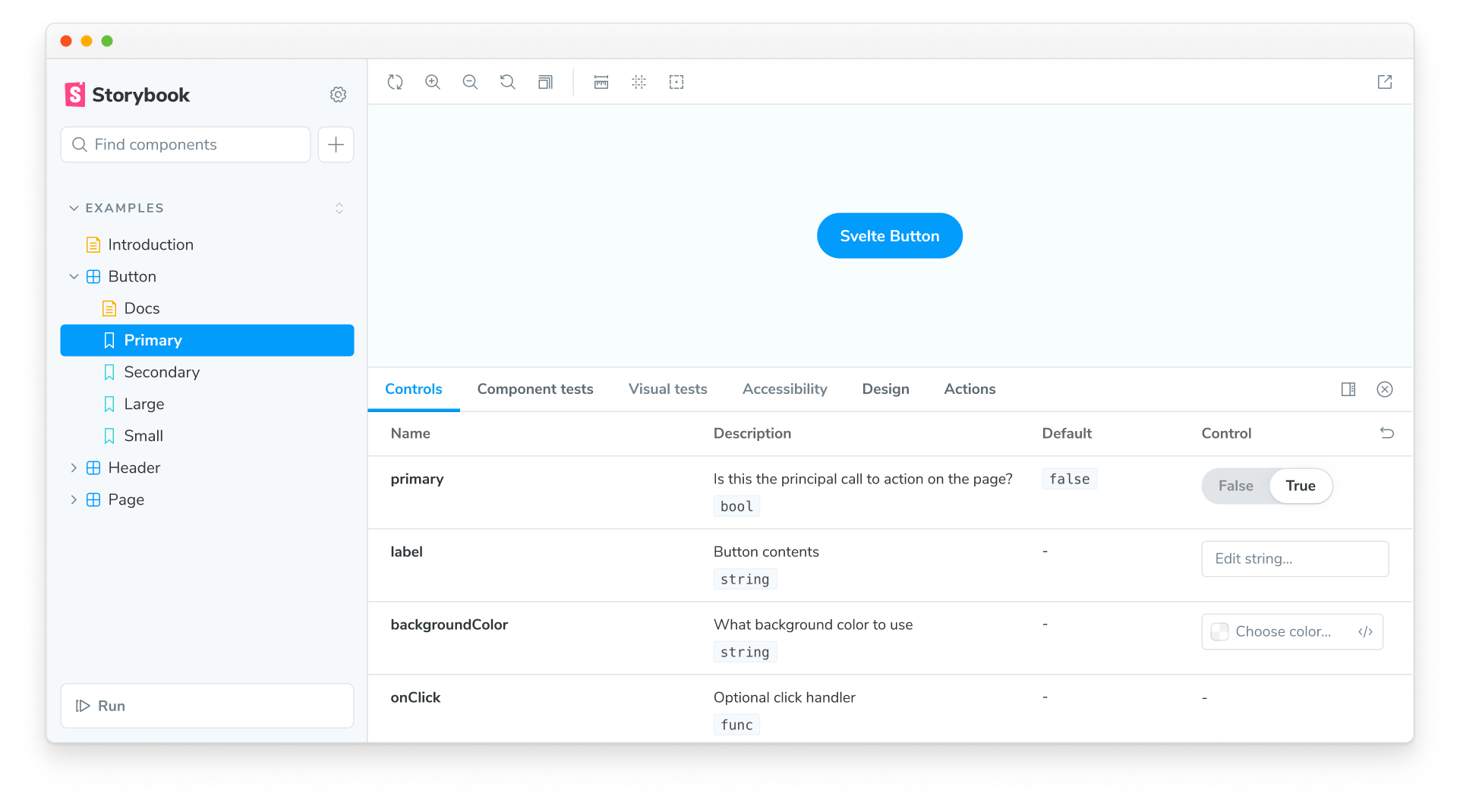
In addition to a more familiar way to write stories in Svelte, Storybook 8.4 comes with excellent TypeScript and JSDoc support to auto-generate high quality UI controls for your Svelte components thanks to an incredible contribution from Taku Fukada:
The icing on the cake is that Storybook is now part of Svelte CLI’s onboarding experience thanks to Svelte maintainer Ben McCann who shepherded the entire project:
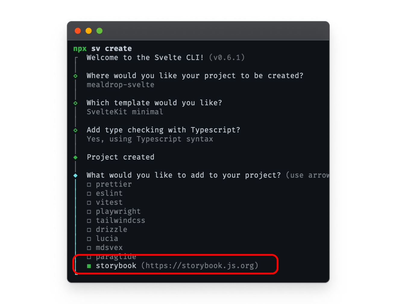
This means it’s easier than ever to get Storybook running in your SvelteKit app. Not only that, but with more Svelte users, we are excited to take Svelte support to the next level.
React Native Storybook 8
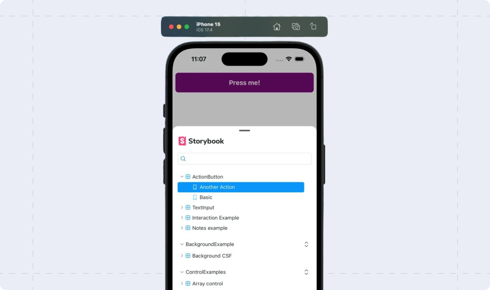
If you use Storybook for React Native (RN), it’s painful to be stuck on 7.x with all these 8.x improvements being released. That’s why we’ve released React Native Storybook 8. Its defining feature is an overhauled responsive UI that’s optimized for phone and tablet, since that’s where RN developers spend the most time. What’s more, RN and Web Storybooks now share enough code that we’re planning to keep RN up to date in the future.
For all the details, see the React Native Storybook 8 release post.
Tagging and filtering stories
If you’re serious about documenting and testing your components, your Storybook can have hundreds or even thousands of stories. Storybook’s sidebar hierarchy and text search helps manage complexity, but even so, large Storybooks can be unwieldy.
That’s why we’ve created a flexible tag mechanism for filtering stories, now available in Storybook 8.4:
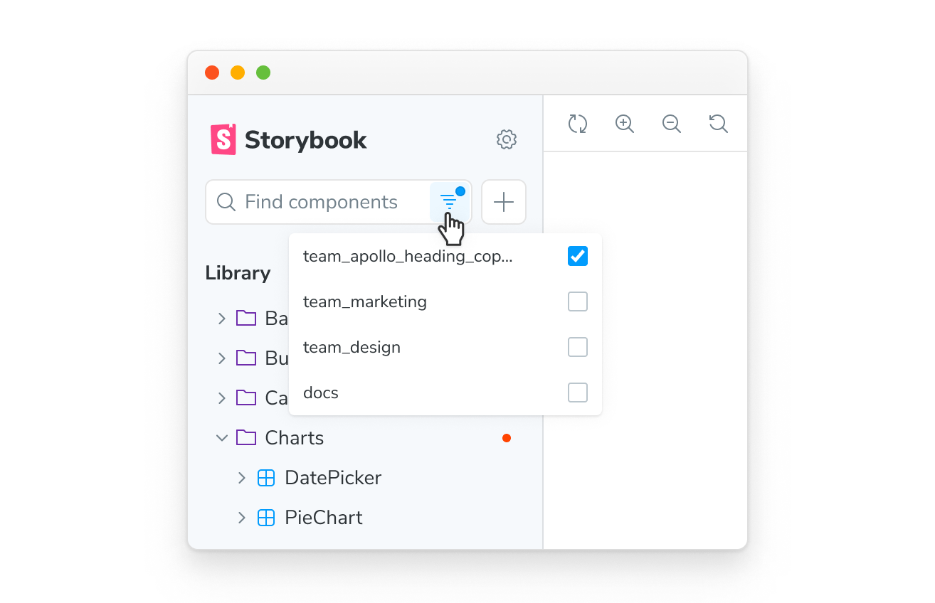
To complement this new feature, community member Steve Dodier-Lazaro has created a new addon, storybook-addon-tag-badges, to display tag information in Storybook’s sidebar.
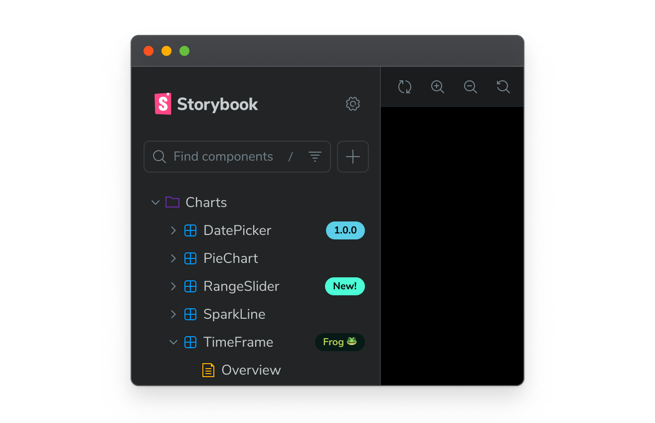
For more details, please see Storybook's tags documentation.
Hundreds more improvements
In addition to the features above, every Storybook release contains hundreds of improvements and bug fixes at every level. Some highlights:
- ✅ Next.js v15 support! #29587
- ✅ Storybook for Solid updated to v8! #10
- ✅ Storybook ESLint plugin now supports v9 and flat file config #156
- ✅ Big improvements to Angular source snippets #29069
Try it today!
Storybook 8.4 is available today. Try it in a new project:
npx storybook@latest init
Or upgrade an existing project:
npx storybook@latest upgrade
If you’re upgrading from 7.x, we have a guide to help you. We also have a guide for migrating from older versions.
What’s next
More improvements are coming your way in 8.5:
- Better controls for running tests on a subset of your stories
- Run A11y checks across all your stories from the UI
- React Server Components (RSC) mocking and testing
- An
afterEachhook for post-test assertions (RFC available)
For an up-to-date view on what we’re working on and considering, please check out Storybook’s roadmap.
Credits
Huge shoutout to the 38 contributors whose PRs feature in Storybook 8.4!
@3w36zj6 @43081j @andrasczeh @chudesnov @dannyhw @flexbox @ghengeveld @honcharenkozhenya @hyeongrok7874 @infinitexyy @javanpoirier @jonniebigodes @jreinhold @jsmike @k35o @kasperpeulen @kazuyainoue0124 @kylegach @mahdi-hazrati @ndelangen @pedrosousa13 @sentience @shilman @shreysinha02 @sidnioulz @stephenjason89 @strozw @tobiasdiez @valentinpalkovic @vanessayuenn @vctqs1 @webpro @yannbf @ziebam
Storybook 8.4 is here!
— Storybook (@storybookjs) November 12, 2024
▶️ 1-click Component Testing in browser
🫧 50% smaller bundle size & 75% smaller lockfile
5️⃣ Svelte 5 and Svelte CSF
⚛️ React Native Storybook 8
🏷️ Tagging and filtering stories
💯 Hundreds more improvements
🧵 pic.twitter.com/R7FStL67A4