Storybook for Angular 12
Supporting the next-gen rendering pipeline

Storybook, the most popular component workshop, is getting its biggest Angular upgrade ever. Storybook for Angular has been completely reworked and improves every facet of the experience from the rendering engine to the auto-documentation support.
The new release, available in Storybook 6.3, includes:
🖼 Ivy rendering support
🎛 Auto-generated controls, documentation, dynamic source snippets
🎁 Zero-config setup w/ built-in TypeScript support
📚 Updated tutorials and documentation
📦 Webpack5 support
This is all in addition to the large ecosystem of development, testing, and documentation addons already available to Angular users. Read on for a full tour of the new features!

Betting on Angular
Angular holds a special place in the Storybook ecosystem. It was one of the earliest communities we integrated with back in 2017. It also introduced TypeScript to Storybook; we’ve since migrated our entire codebase to TS as a consequence of this work.
Since then, usage of @storybook/angular has grown to over 500,000 npm downloads a month. The Angular ecosystem has adopted us too with a first-class nx integration.
Zero-config setup
To get started, run the following in the root of an existing Angular project:
npx sb@next initThis detects the project type, installs @storybook/angular, and adds some sample files to demonstrate the basics of Storybook. Running yarn storybook gives you the following zero-config setup:
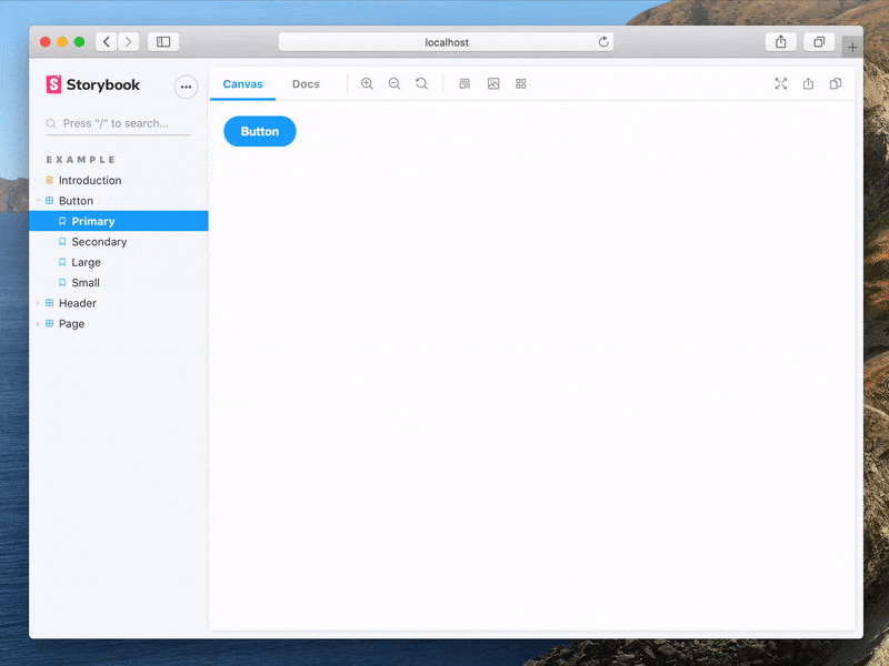
When you navigate to Storybook locally, you’ll see examples of how to write Angular stories, links to common configurations, as well as the “essential” addons that ship with Storybook.
TypeScript support is built-in. Webpack 5 support—a major under-the-hood upgrade in Angular 12—is also built in. If you're upgrading an existing Storybook/Angular project, follow the migration instructions to upgrade. Learn more in the official documentation.
Ivy rendering support
Storybook for Angular now supports the Ivy rendering pipeline.
Ivy compiles components ahead-of-time (AoT), leading to smaller, simpler, and faster apps. First introduced in 2018 as a “next generation” technology, it has been the default since Angular 9.
Supporting it has been a hard-fought battle, with over a year’s worth of experimentation. Maintainers Kai Röder and Thibaud Avenier worked with Minko Gechev (Angular Core Team), and finally in Storybook 6.3 we are proud to release experimental Ivy rendering. Fresh Storybook installations and upgrades to the latest release come with Ivy enabled out of the box.
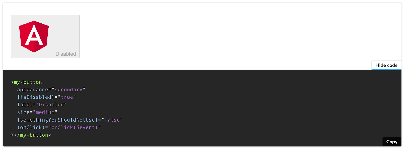
Auto-generated controls and documentation
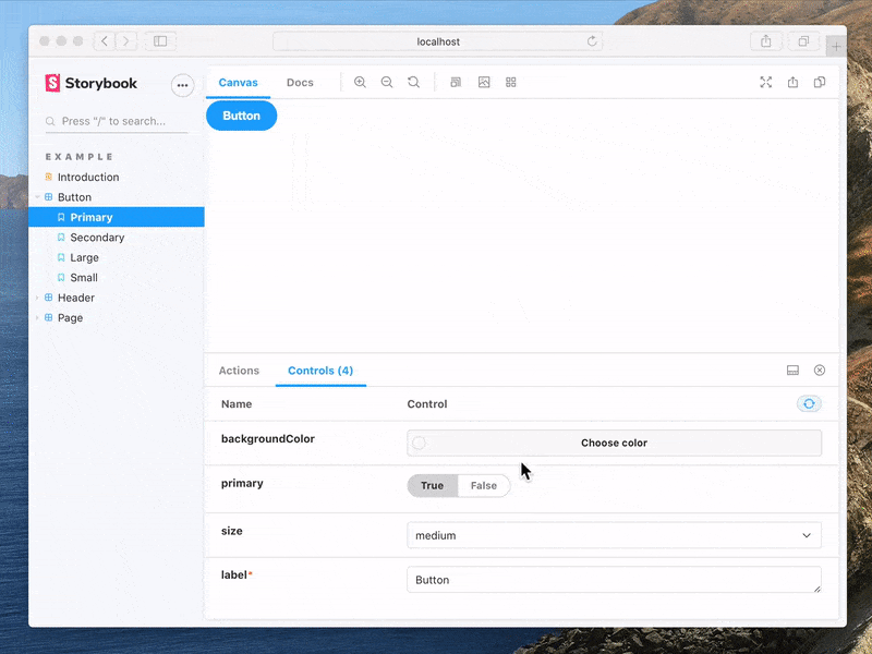
Storybook reads the docgen information from compodoc to automatically generate controls and documentation based on your stories and components.
The example from the previous section will generate the following UI for interactively exploring your component states:
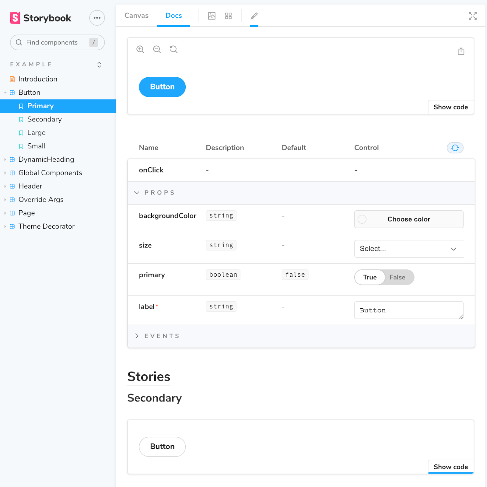
It also results in component documentation with no extra work, which includes all of the key states laid out with props extracted from the component source:
Your component's controls and docs are always up to date because they're generated automatically from the source code. You don't need to keep track of your UI documentation whenever a component's API changes, Storybook does that for you.
We sweated the details. Angular stories are rendered inline in the docs page (as opposed to in iframes as before), meaning that the pages can scale to as many stories as you need. And the documentation source snippets are now proper Angular templates, and are re-rendered dynamically when you edit the properties of your component with controls.
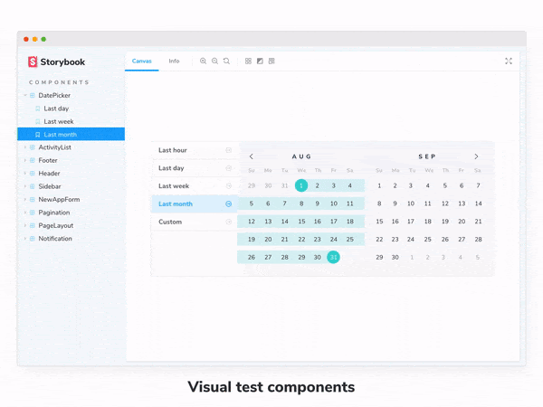
Perfect for UI testing
When you build UIs in Storybook you get testing for free. Storybook revolves around the concept of stories, these capture the supported state of your UI components.
In development, you can manually confirm your stories “look right” and use a suite of addons to test your story in other dimensions like accessibility and mobile-friendliness.
In continuous integration, you can automatically detect both structural and visual changes in your stories using snapshot and visual testing respectively.
Testing your stories is so useful that multiple commercial services integrate with Storybook to run tests in the cloud and across browsers. Notably, Chromatic, created by Storybook maintainers, integrates tightly with Storybook and provides free automated publishing and visual diffing.
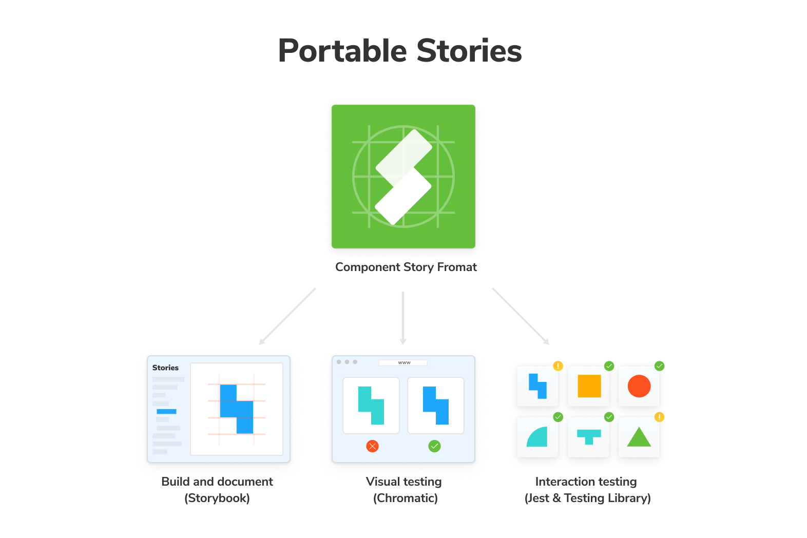
What’s more, your stories are portable across tools. Storybook pioneered the Component Story Format, an open standard for component examples based on JavaScript ES6 modules. That allows you to reuse stories for your unit and end-to-end tests – no lock-in.
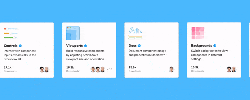
300+ addons to choose from
Storybook’s been refining its cross-framework compatibility for years. This means that nearly all of Storybook’s hundreds of addons are available for Angular users. Addons unlock superpowers like accessibility testing, design handoff integrations, styling utilities, and mocking for network requests.
Next steps
Storybook for Angular is available now in 6.3 RC. Install it by running the following command in the root of your project. Then check out the updated tutorial and reference docs.
npx sb@next initTo upgrade an existing project:
npx sb upgrade --prereleaseWebpack5 support is automatically included on fresh installations, but for upgrades you need to manually install it.
We’ve got big improvements planned for Angular, especially around tighter integration with the official Angular CLI via builders.
Get involved
Storybook is maintained by 1,300+ open source contributors and guided by a steering committee of top maintainers. Storybook for Angular is maintained by Thibaud Avenier and Kai Röder, who are responsible for most of the upgrades described in this post. Angular support was originally contributed by Carlos Vega.
If you are interested in contributing, check out Storybook on GitHub, create an issue, or submit a pull request. Donate on Open Collective. Chat with us in Discord — a maintainer is usually online. Stay up to date with Storybook news on Twitter and by signing up for our mailing list below.