
Storybook for full-stack developers
Streamline your app development workflow by building, testing and documenting components in isolation

Full-stack developers are responsible for everything from writing CSS to wiring up databases. This involves a lot of context-switching and dealing with side-effects from different parts of the stack, which can end up slowing you down.
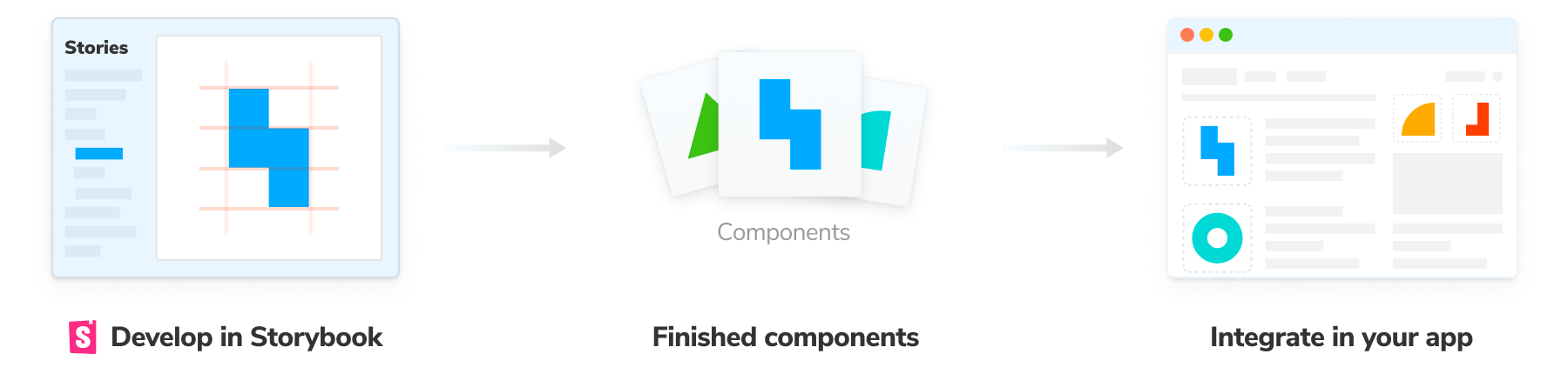
Storybook helps developers focus on the UI layer of the stack. It runs alongside your app and provides a sandboxed environment for visualizing, developing and testing UI components in isolation. That way you can develop UIs faster, without needing to start up an entire app, its services, or debug flaky 3rd party APIs.
This article shares how to use Storybook to streamline your application development workflow.
Write stories to cut out the repetitive work
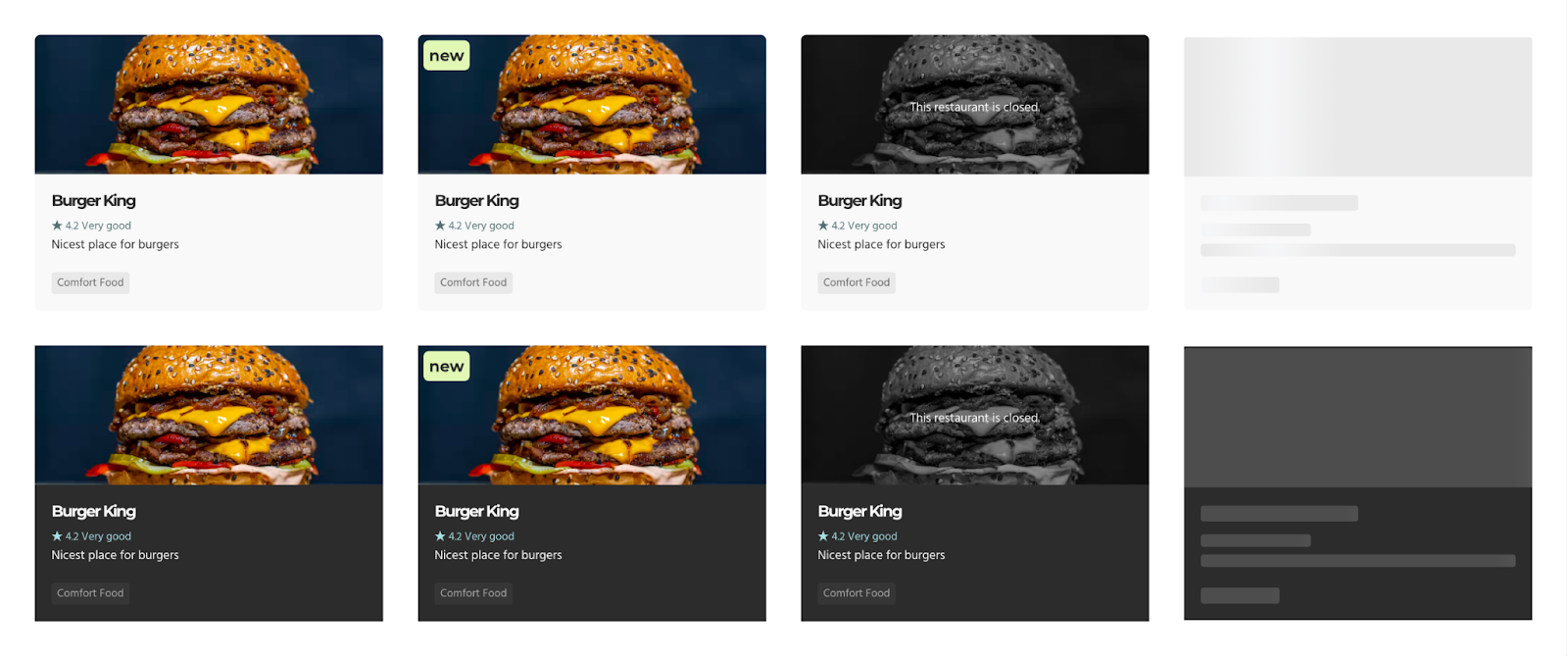
Components look different depending on the application state. You waste a massive amount of time seeding your local database, adding temporary bits of data to your code, or just clicking around to get the app in the right state so that you can verify the UI looks correct.
Instead, Storybook lets you capture all those component variations as stories and revisit them whenever you're working on a component—cutting out that repetitive grunt work.
How it works
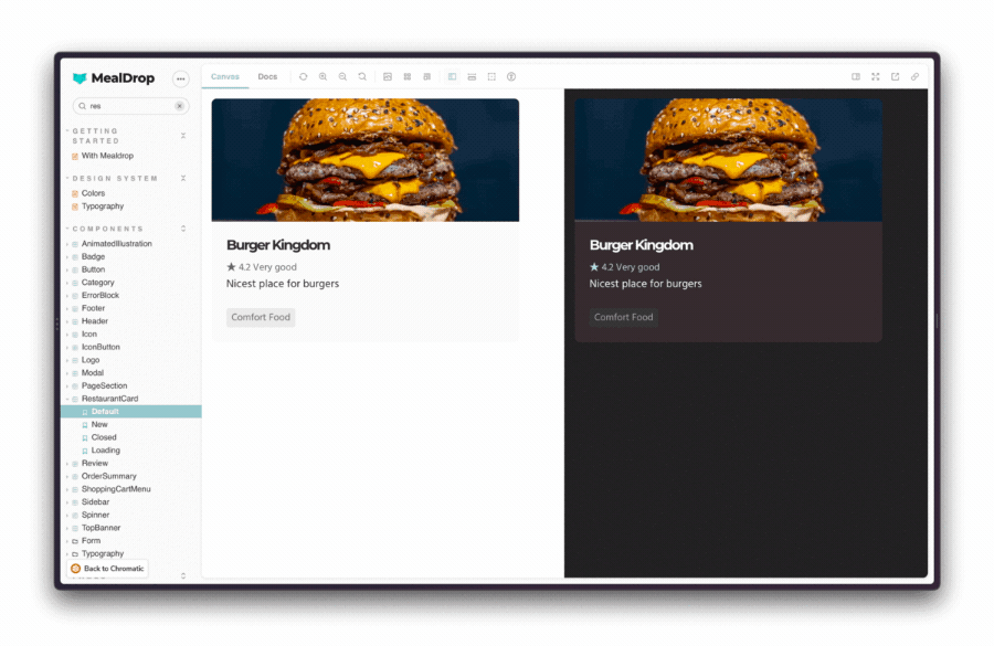
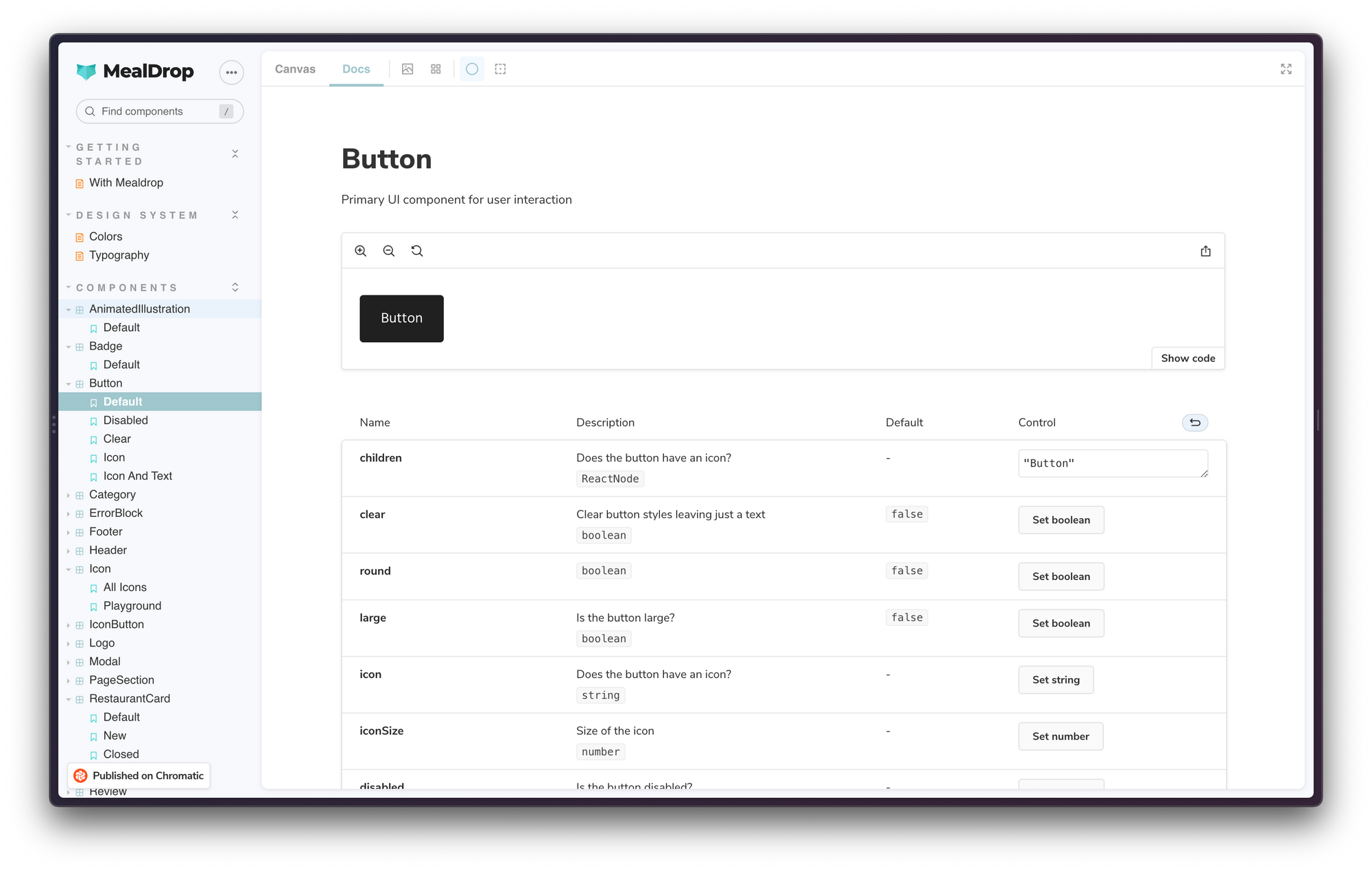
The superpower of components is that you don't need to spin up the whole app just to see how they render. You can render a specific variation in isolation by passing in props. That's what a story is.
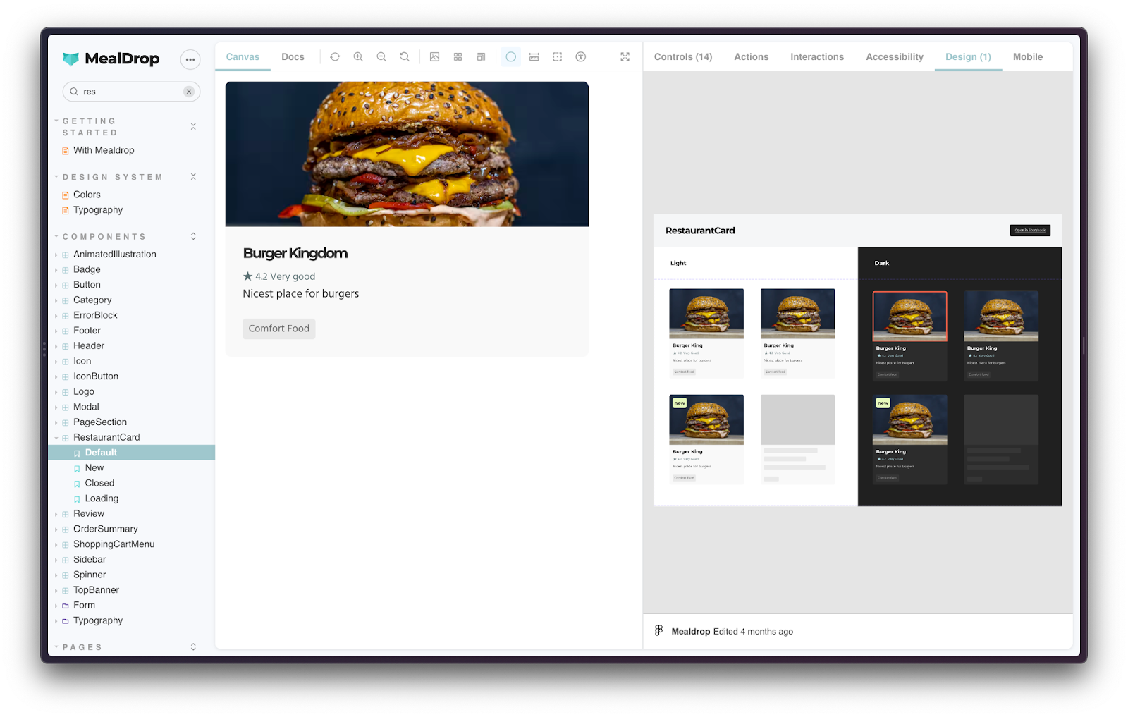
Consider this RestaurantCard component. It has four states plus light and dark variants. You'd write stories for all those cases in the RestaurantCard.stories.tsx file. This file is checked into your repository and available to your entire team.
When working on a component, open up Storybook, modify your code and quickly cycle through the stories to verify their appearance and behavior.
Use Storybook addons to mock context and APIs
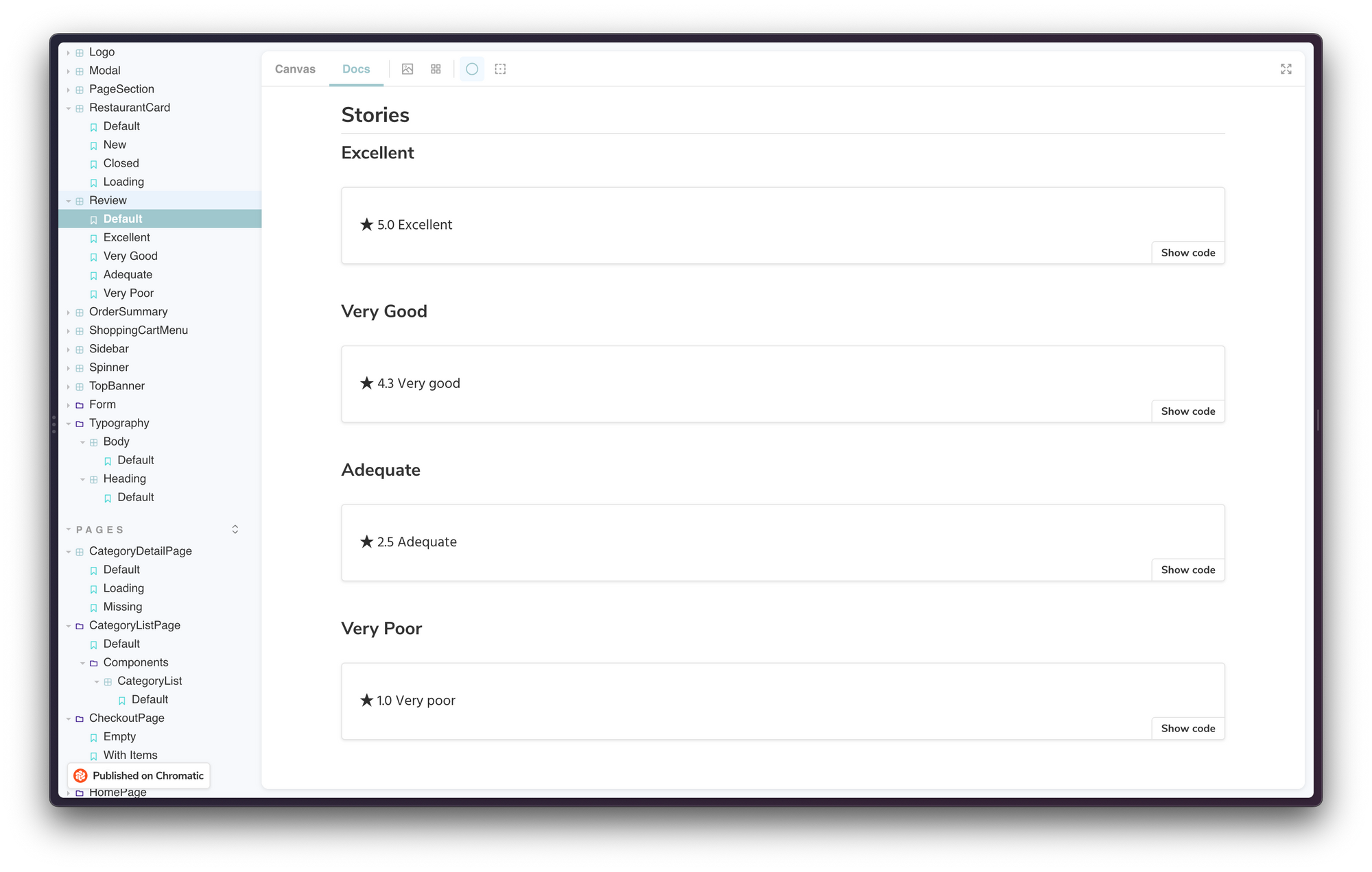
Stories demonstrate the various states of a UI element—everything from atomic components to pages. Isolating components makes it easier to verify all their variations, even hard-to-reach edge cases such as loading and error states.
As you move higher up in the application tree, it becomes harder to reproduce all UI variations because components are wired up to state and back-end APIs. Storybook enables you to mock such dependencies.
🔌 Data Providers
State management libraries such as Redux and Pinia supply data to components via context or composition APIs. You can use Storybook decorators to mock such data providers.

📡 API Requests
For components consuming data from REST or GraphQL endpoints, use the Mock Service Worker addon to mock API requests. There are also library specific addons for Apollo, URQL, GraphQL Kit, Axios, etc.

Connect design tools with Storybook for smooth handoff
Designers “hand-off” images, specs, and prototypes to developers for implementation. That requires devs to jump between design tools and code editors while juggling multiple spec versions. That makes for a cumbersome and lossy process. Design details often get lost, leading to a lot of back and forth and rework.
Hand-off addons embed design artifacts alongside stories making it much easier to cross-reference specs and coded UI. Moreover, that connection will persist for the rest of the team.
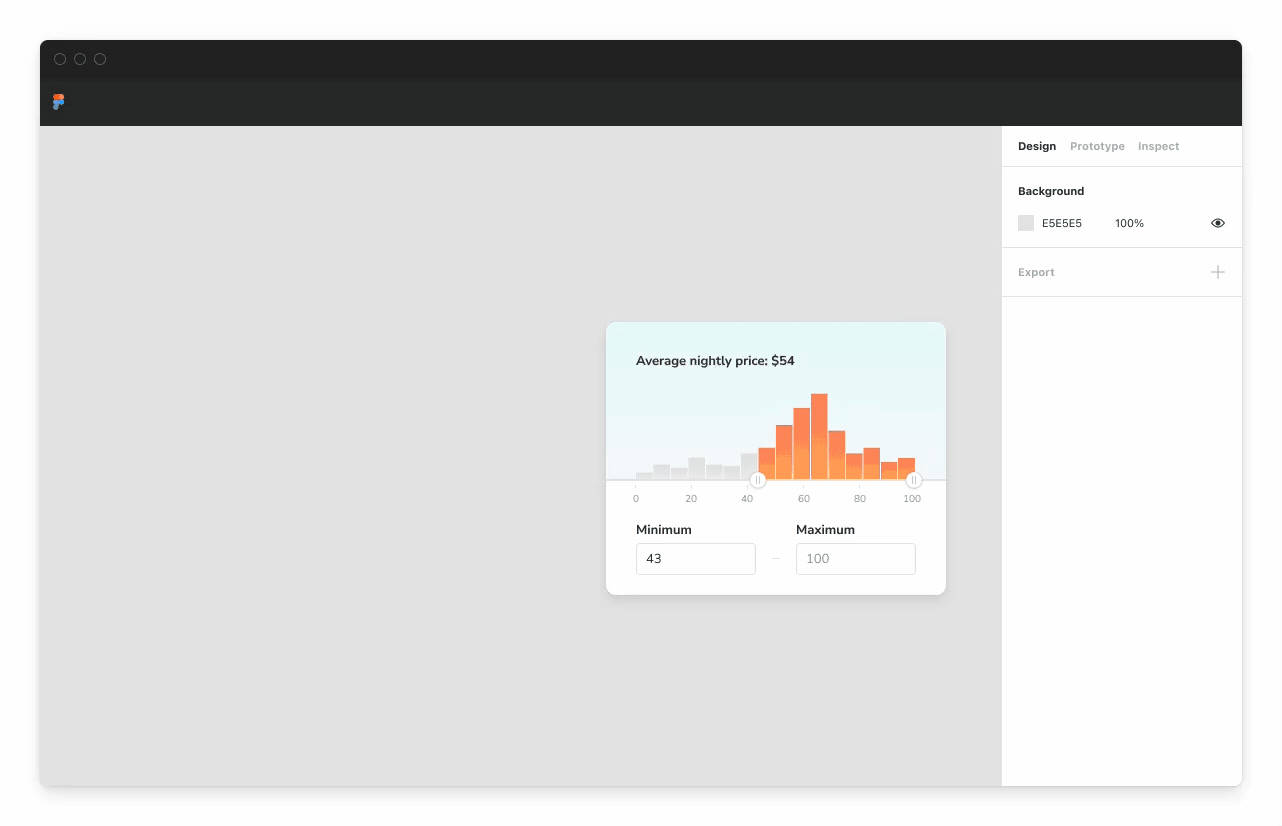
For example, the Storybook Design addon enables you to embed Figma files in the addon panel.
You can attach Figma files to a component or even individual stories.
// RestaurantCard.stories.tsx

export default {
 title: 'Components/RestaurantCard',
 component: RestaurantCard,
 parameters: {
   design: {
     type: 'figspec',
     url: 'https://www.figma.com/file/3Q1HTCalD0lJnNvcMoEw1x/Mealdrop?node-id=1126%3A3893',
   },
 },
} as ComponentMeta<typeof RestaurantCard>;
Don’t use Figma? There are similar addons available for Zeplin, Zeroheight, UXPin, InVision DSM, Adobe XD, Sketch, and more.

Embed Storybook in Figma with the plugin
You can further speed up handoff using the Storybook Connect plugin, which links stories to Figma component variants. It works by embedding live stories in Figma files.
When reviewing designs, you can view the connected story by clicking the link in the Figma sidebar. Or click "Open story in browser" to enter the Storybook environment with addons, tests, and API docs.
Use stories to power tests and catch regressions
Tests help us ship code confidently. They catch regressions and unintentional changes to the application behavior. Regardless of your approach, testing front-end applications comes down to testing components.
To test a component, you have to render it in isolation and provide mock data to set up a scenario—that's what a story is. Therefore, you can use stories as test cases to speed up writing tests and reduce maintenance burden. Let's look at an example.
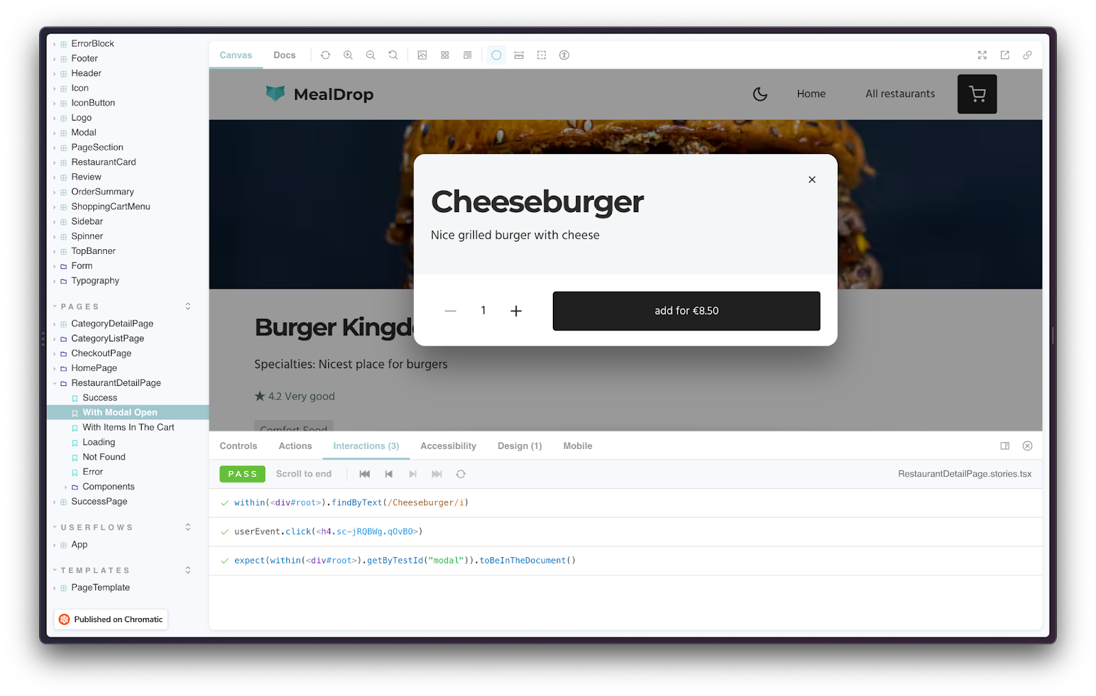
On this RestaurantDetailPage, the user can select an item from the menu to add it to the cart. To test this functionality, we describe the initial state as a story. Then attach a play function to the story to simulate user behavior (e.g., clicks and inputs) and run assertions. Finally, Storybook will execute this test in the browser.
// RestaurantDetailPage.stories.tsx

import { ComponentStory, ComponentMeta } from '@storybook/react';
import { rest } from 'msw';
import { expect } from '@storybook/jest';
import { within, userEvent } from '@storybook/testing-library';
import { BASE_URL } from '../../api';
import { restaurants } from '../../stub/restaurants';
import { RestaurantDetailPage } from './RestaurantDetailPage';

export default {
 title: 'Pages/RestaurantDetailPage',
 component: RestaurantDetailPage,
} as ComponentMeta<typeof RestaurantDetailPage>;

export const WithModalOpen: ComponentStory<typeof RestaurantDetailPage> = () => (
 <>
   <RestaurantDetailPage />
   <div id="modal" />
 </>
);
WithModalOpen.play = async ({ canvasElement }) => {
 const canvas = within(canvasElement);
 const item = await canvas.findByText(/Cheeseburger/i);
 await userEvent.click(item);
 await expect(canvas.getByTestId('modal')).toBeInTheDocument();
};
WithModalOpen.parameters = {
 msw: [rest.get(BASE_URL, (req, res, ctx) => res(ctx.json(restaurants[0])))],
};
Stories are the jumping-off point for tests
You already write stories as a natural part of development. You can combine them with other tools in a low-effort way to verify different aspects of UIs.
👀 Visual tests capture a screenshot of every story and then compare it against baselines to detect appearance and integration issues.
♿ Accessibility tests catch usability issues related to visual, hearing, mobility, cognitive, speech, or neurological disabilities. Storybook
🕹️ Interaction tests verify component functionality by firing events, and ensuring that the state is updated as expected.
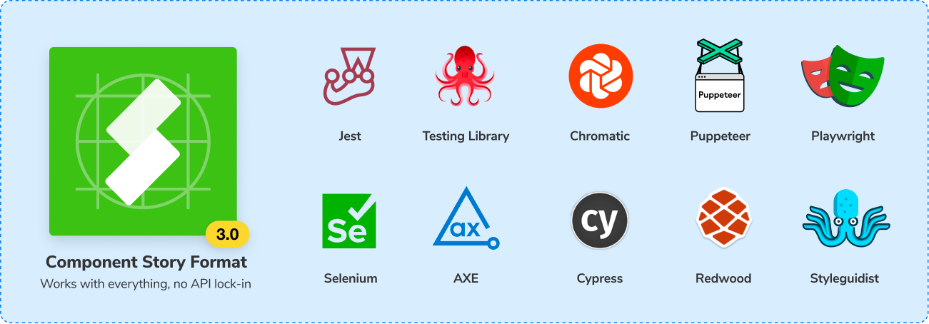
📥 Import stories into Playwright or Cypress to test user flows.
Avoid duplication by auto-generating docs
It's almost impossible to discern what a component looks like or does just by looking at its code. That often leads to confusion, and teams end up duplicating components. You can avoid this issue by documenting your components.
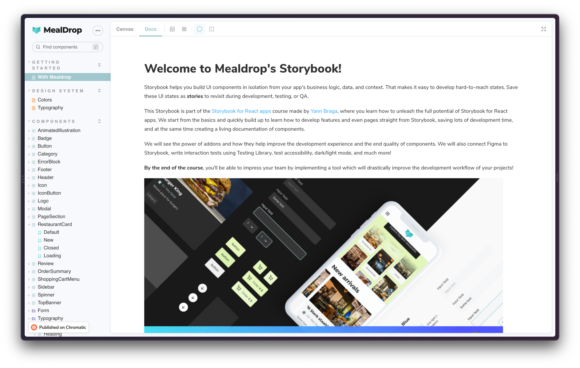
But apps are built using hundreds of components, making it challenging to maintain documentation. Storybook's Docs addon offers a leaner alternative. It uses stories to auto-generate documentation for your components.
The documentation is generated using your code so it always stays up to date. Stories turn into live examples, and the addon generates an args table using the component types and docgen comments.
You can use the Storybook CLI to build this as a static site and share it with your team.
UI development requires specialized tooling
Specialized tools help you isolate and develop individual layers of the stack. Think Docker, MongoDB Compass, Postman, and New Relic. Likewise, Storybook enables you to isolate the UI layer.
Storybook is the workshop where UI gets built, tested and documented. During development, you'll write stories to capture all states and variants of a component. Then use those stories as test cases with all your favorite tools or use them to auto-generate documentation.
This article scratches the surface of how Storybook fits into your full-stack development workflow. Check out the guides below to dive deeper into workflows using Storybook:
Why do full-stack devs use a tool known for design systems?
— Storybook (@storybookjs) November 23, 2022
Storybook provides a sandboxed environment to build & test components. So you can build UIs faster without having to start up the entire app.
Learn how to use Storybook in app dev workflow » https://t.co/m9PhXUn4Xp pic.twitter.com/pTmOETVtfD