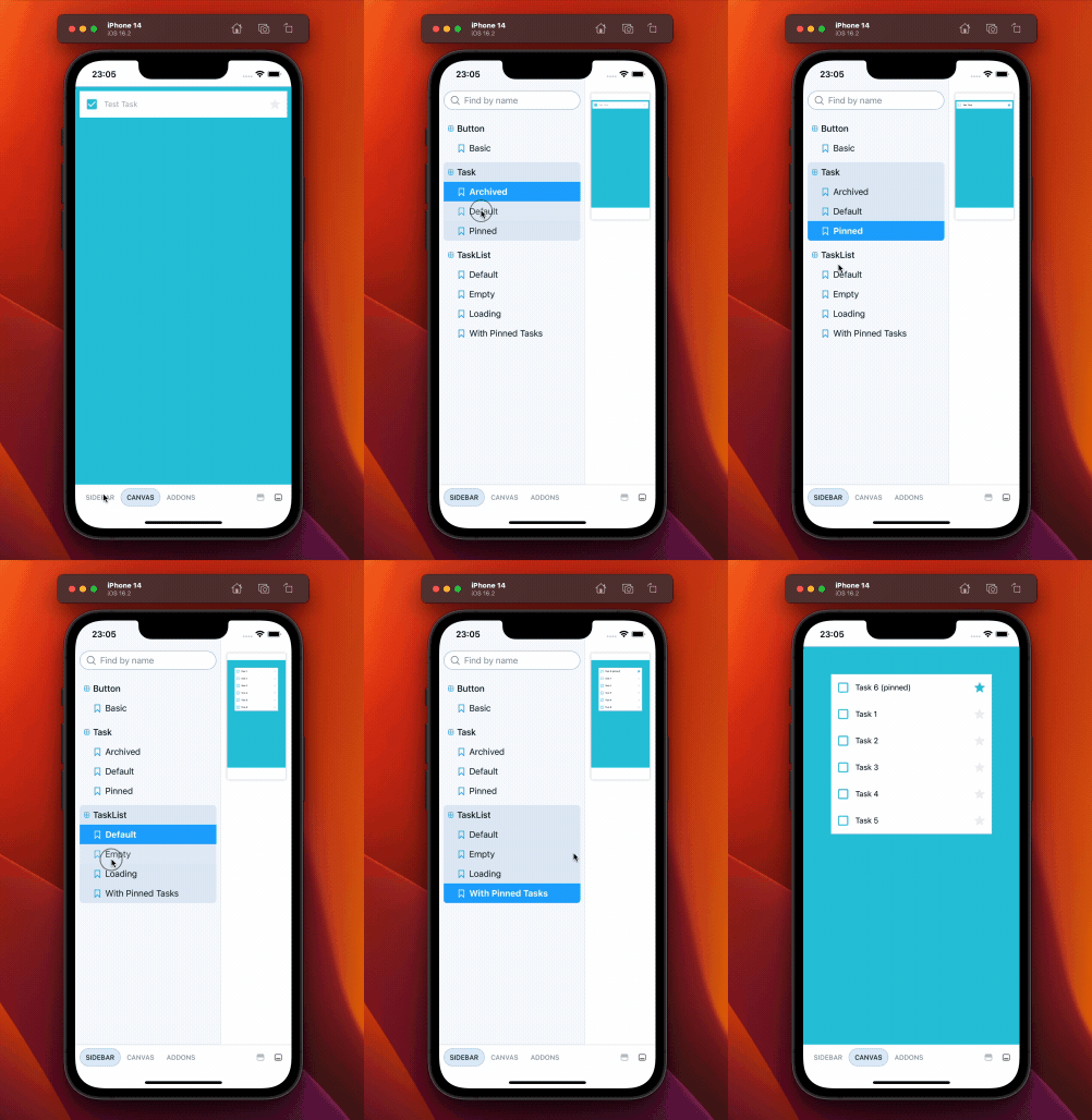
Storybook for React Native (6.5)
Perf improvements, support for Component Story Format, controls, and args. Plus new configuration files format to align with Storybook core.
React Native Storybook is a specialized version of Storybook that focuses on creating and organizing stories for components made with React Native rather than HTML and CSS. Unlike the core Storybook, React Native Storybook runs stories on a native emulator or on a physical mobile device instead of a browser. Over time, this divergence has led React Native Storybook to lag behind updates made to the browser version.
I am excited to announce a new version of React Native Storybook, now compatible with Storybook 6.5.14 and beyond. This iteration streamlines the codebase, incorporates more core Storybook packages, and offers an improved developer experience.
- 📝 Component Story Format support
- 🎛️ Controls and Args support (including experimental auto-generated controls)
- 📜 Aligned config with core format (
main.jsandpreview.jsfiles) - ⚡ Performance improvements
- 🎨 On-device UI improvements
Why version 6.5?
To make React Native Storybook work with Storybook 6.5, some changes were needed in Storybook itself. As a result, React Native Storybook is only compatible with Storybook 6.5.14 and later versions. This trade-off will make it easier to integrate React Native Storybook with future versions of Storybook, including Storybook 7.0.
This release is the result of many weekends and late nights over multiple years. It is great to finally share it with all of you. I would like to thank everyone in the community for their patience, as well as the contributors who have helped make this possible. Additionally, I extend my thanks to the many Storybook maintainers who paired with me to get through the most complicated parts of the update.
Let’s dive into the updates!

Component Story Format (CSF) support
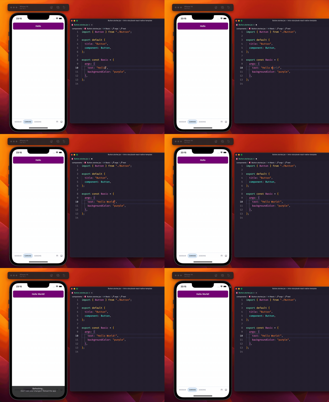
CSF is a simpler and more powerful syntax for Storybook that makes it easier to read, write and maintain stories. It's based on ES6 modules using named exports to define stories and a default export to define metadata. CSF is now supported by React Native Storybook.
With CSF, stories are written as plain JavaScript objects. Component props are specified using "Args", which is Storybook's mechanism for setting default values for props and children.
We offer a codemod to make this migration easier (see the migration guide below).
import Button from './Button';

// The default export has metadata for your component story
export default {
   title: "Button"
   component: Button
};

// An individual story with some default props
export const Base = {
  args: {
    // default value for the 'text' property of this component
    text: "Hello World"
  }
};

Use Controls to manipulate props using graphical UI
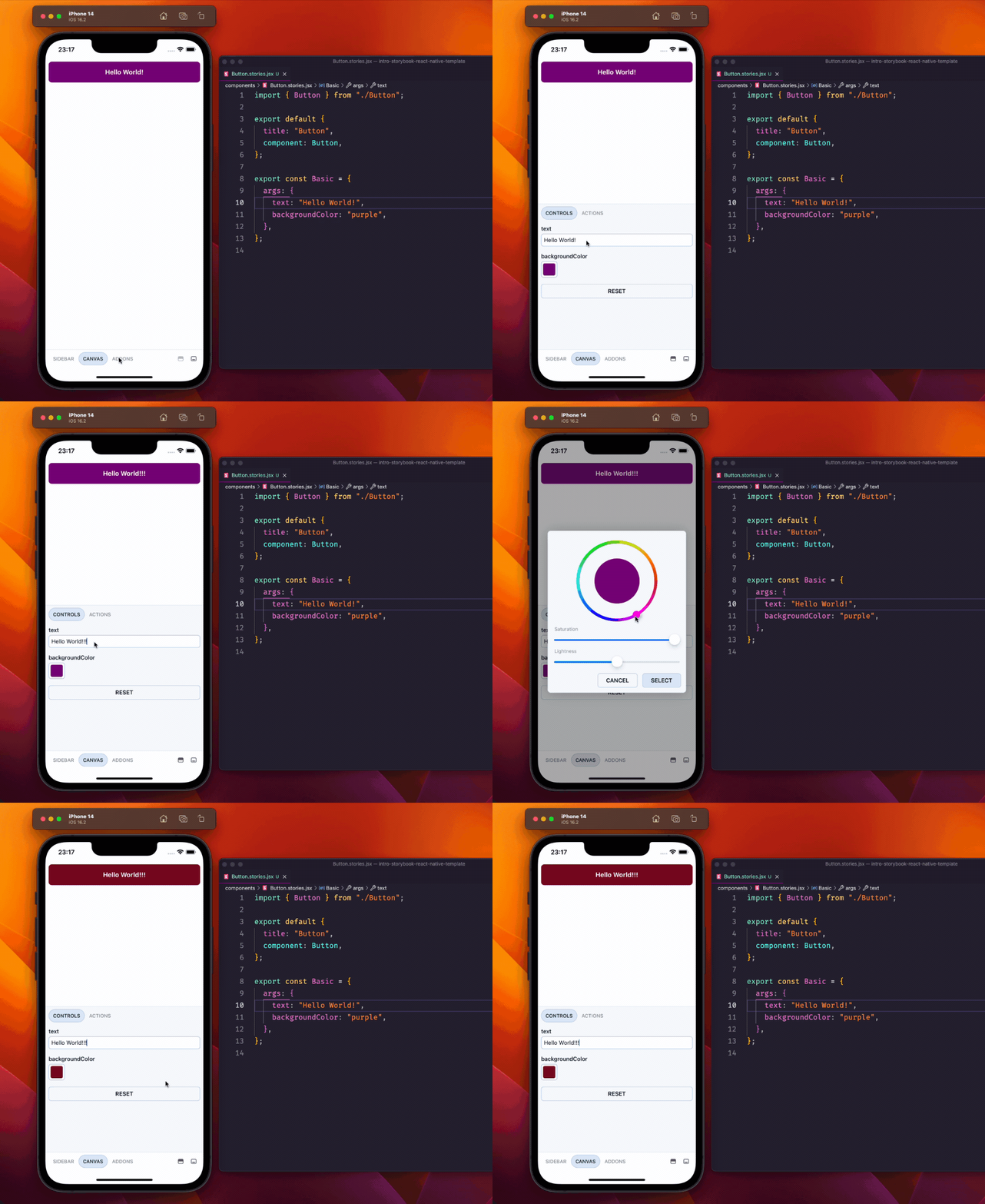
Controls allow you to interact with components' args without needing to write code. Storybook automatically generates Controls from components' PropTypes and TypeScript types. Like the old Knobs addon, you can use an addon panel to edit arguments in real time.

By default, Storybook selects input controls (such as text, radio, select, and range) based on the arg’s type. You can choose which type of control to use for each arg by configuring argTypes. Check out the Controls documentation to learn more.
import Button from "./Button";

// The default export has metadata for your component story
export default {
  title: "Button",
  component: Button,

  // You can be more specfic about the type you want by using argTypes
  argTypes: {
    variant: {
      options: ["primary", "secondary"],
      control: { type: "radio" },
    },
  },
};

// An individual story with some default props
export const Primary = {
  args: {
    // default value for the 'text' property of this component
    text: "Hello World",
    variant: "primary",
  },
};
Aligned configuration format with Storybook core
One of the biggest changes to core Storybook since React Native diverged is the switch to a more declarative configuration format using main.js and preview.js files. To align with core Storybook, React Native Storybook now also uses this format.
In the main.js file, provide a glob in the stories field and a list of addons. Storybook then handles the rest by generating a file called storybook.requires.js. The preview.js file is where you define global decorators and parameters.
More on the semantics in the upgrade guide below. Keep reading to see some examples.
Get started
If you’re starting a new project, run this in a React Native project to automatically generate the config you need.
npx sb@next init --type react_native
If you prefer, you can also use one of these templates.
# Expo
npx create-expo-app --template expo-template-storybook AwesomeStorybook

# React Native CLI
npx react-native init MyApp --template react-native-template-storybook
If you're new to React Native Storybook, check out our hands-on tutorial to learn all the basics: https://storybook.js.org/tutorials/intro-to-storybook/react-native/en/get-started/
How to upgrade
Step 1: Update your index file
Remove the configure call, story imports and addon imports from your index.js file, and reduce the file to this. The most important thing is to import the storybook.requires file.
// .storybook/index.js
import { getStorybookUI } from '@storybook/react-native';
import './storybook.requires';

const StorybookUIRoot = getStorybookUI({
  // options go here
});

export default StorybookUI
Additionally, if your Storybook folder is called storybook, you should change it to .storybook
Step 2: Add new configuration files
In your .storybook folder, add the main.js and preview.js files.
In the stories field of your main.js file, update the glob according to your project setup.
In the addons field, list the addons you want to use. These must be compatible with React Native Storybook. Addons made for React Native are usually prefixed with addon-ondevice
// .storybook/main.js
module.exports = {
  stories: [
    '../components/**/*.stories.?(ts|tsx|js|jsx)',
  ],
  addons: [
    '@storybook/addon-ondevice-controls',
    '@storybook/addon-ondevice-actions',
    '@storybook/addon-ondevice-backgrounds',
  ],
};
Move any global decorators and parameters you have to preview.js. If you don’t have any, simply export an empty array for decorators and an empty object for parameters.
// .storybook/preview.js
import { View } from 'react-native';

export const decorators = [
  // Using a decorator to apply padding for every story
  (StoryFn) => (
    <View style={{flex:1, padding:8}}>
      <StoryFn />
    </View>
  ),
];

export const parameters = {
  my_param: 'anything',
};
Step 3: Convert your stories to CSF
Whilst storiesOf will still work, it is now deprecated and we recommend that you convert your stories to CSF. There is a codemod for your convenience which should automatically migrate your files to CSF (make sure to update the glob to fit your files):
npx storybook@next migrate storiesof-to-csf --glob="src/**/*.stories.js"
Let's look at an example. We'll use this Button.stories.js file:
// Button.stories.js

// Before
storiesOf('Button', module)
  .addParameters({ myParam: "anything" })
  .addDecorator((Story)=> <Wrapper>{Story}</Wrapper>)
  .add('primary', () => <Button primary label="Button" />)
  .add('secondary', () => <Button label="Button" />);
The codemod will convert this to CSF, like so:
// Button.stories.js (CSF1)
export default {
  title: 'Button',
  decorators: [(Story) => <Wrapper>{Story}</Wrapper>],
  parameters: {
    myParam: 'anything',
  },
};

export const Primary = () => <Button primary label="Button" />;
Primary.story = {
  name: 'primary',
};

export const Secondary = () => <Button label="Button" />;
Secondary.story = {
  name: 'secondary',
};
CSF is designed to be backwards compatible, which has allowed the Storybook team to make continuous improvements. The latest story format, CSF3, includes several ergonomic improvements. Refer to the release announcement for a full list of features and benefits.
Lastly, we can manually update the file to CSF3 format, like so:
// Button.stories.js (CSF3)
export default {
  title: 'Button',
  decorators: [(Story) => <Wrapper>{Story}</Wrapper>],
  parameters: {
    myParam: 'anything',
  },
};

export const Primary = {
  args: {
    primary: true,
    label: 'Button',
  },
};

export const Secondary = {
  args: {
    label: 'Button',
  },
};
Note, if you’re using the Knobs addon, consider migrating to Controls.
Optional: Server configuration
The server is a package called @storybook/react-native-server. It’s an optional companion app that lets you control the React Native Storybook UI on your device via a web UI.
In this version, configuring the server has slightly changed. To configure the server, you need to add a .storybook_server folder with a main.js file. In this file, you should add the same stories glob that you have in your .storybook/main.js file.
module.exports = {
  stories: [
    '../components/**/*.stories.?(ts|tsx|js|jsx)',
  ],
  env: () => ({}),
  addons: ['@storybook/addon-essentials'],
};
Then, in package.json, you'll need a new script:
"start-server": "react-native-storybook-server"
For more information about this server setup, please read this blog post.
Migration questions?
For more details on this upgrade, please refer to the migration guide. If you encounter any difficulties, you can raise an issue on GitHub or visit the Storybook discord.
What’s next?
React Native Storybook 6.5 brings with it some big improvements, but we’re not done yet. Here's what you can expect from React Native Storybook.
Stabilize version 6.5: This is our top priority at the moment. To help us achieve this goal, please report any bugs and share your feedback with us on the React Native Storybook GitHub.
Support Storybook 7.0: With the release of version 6.5, much of the groundwork has already been laid for compatibility with Storybook version 7. Work on this will begin once version 6.5 is stabilized.
Improvements
There are many directions we could take for future updates, and here are some ideas I have for improvements.
- Support story categorization for more organization in the story list sidebar
- Use of metro’s experimental
require.contextto simplify story imports - Better testing support, including potentially supporting interaction tests with the play function
- Better integration with
@storybook/addon-react-native-web
There's a lot more that we could do, and we’d love to hear your thoughts on what to focus on next.
Final thoughts
React Native Storybook is maintained by me, Daniel Williams. This update brings a lot of improvements for React Native Storybook and closes the gap to the latest versions of Storybook.
There is still a lot that can be improved and version 7 is definitely on my radar. If you are interested in this project and would like to help, please reach out to me, and I will be happy to assist you in getting started. Additionally, you can visit the GitHub repository to create issues, open pull requests and start discussions.
You can find me on Twitter (@Danny_H_W) or on Github (dannyhw). If you want to support my work, please consider sponsoring me via GitHub Sponsors. Thanks for reading, I look forward to your feedback.
React Native Storybook (6.5) is here!
— Storybook (@storybookjs) March 29, 2023
What's new?
✅ SB 6.5.14+ compatible
📝 CSF, Controls & Args support
📜 Core style config format (main.js & preview.js files)
⚡ Perf improvements
🎨 On-device UI improvementshttps://t.co/1GPVVDjuY2
🧵/ pic.twitter.com/ko1eOrXnl2