Storybook for SvelteKit
Zero-config support for SvelteKit 1.0 with our new framework

Svelte is quickly becoming a major framework in the front-end ecosystem, offering lots of fantastic features for web developers. With SvelteKit, it also provides a powerful meta-framework for applications. At Storybook, we're investing in the Svelte ecosystem to create a seamless and enjoyable experience for users of Svelte and Storybook.
I am excited to announce the Storybook for SvelteKit framework. It’s powered by Storybook’s new Framework API, which makes integration between Storybook and web frameworks simpler and more performant.
Gone are the days of manually combining Svelte, Vite and custom configurations to make Storybook behave like your SvelteKit application. @storybook/sveltekit takes care of all of that.
But why SvelteKit?
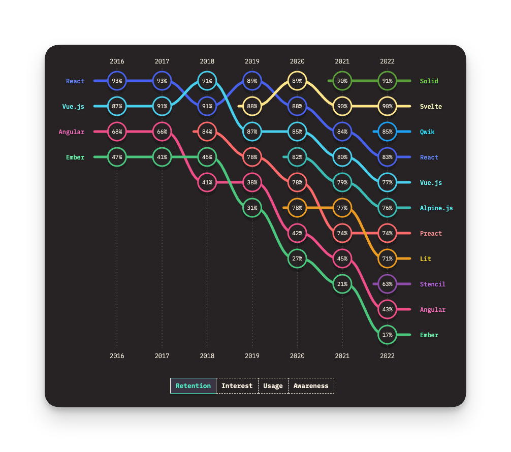
Svelte has seen tremendous growth over the past few years. The recent State of JS survey exemplifies Svelte’s popularity with 94% in overall user awareness, a stable 90% retention rate, and the highest scores of all frameworks in user interest. No matter how you interpret that, those are impressive numbers.
We’ve also seen growing interest in Svelte and SvelteKit in Storybook, with more and more Svelte developers joining the Storybook Discord and initial data from the Storybook 7.0 beta showing an ever increasing number of SvelteKit users upgrading.
Introducing the SvelteKit framework
The new SvelteKit framework enables you to develop your components and pages in Storybook the “SvelteKit way”. Project configuration is automatically used in Storybook, and many of SvelteKit’s features will work out of the box.
Firstly, Storybook 7 automatically merges the user configuration from the root Vite config into Storybook’s Vite config. This means that anything in vite.config.ts or svelte.config.ts will automatically be applied to Storybook.
You can still configure all of this by using viteFinal in your storybook/main.js file. This allows you to customize your Storybook setup separately from your app setup. For more information, see the documentation.
Use SvelteKit features in Storybook
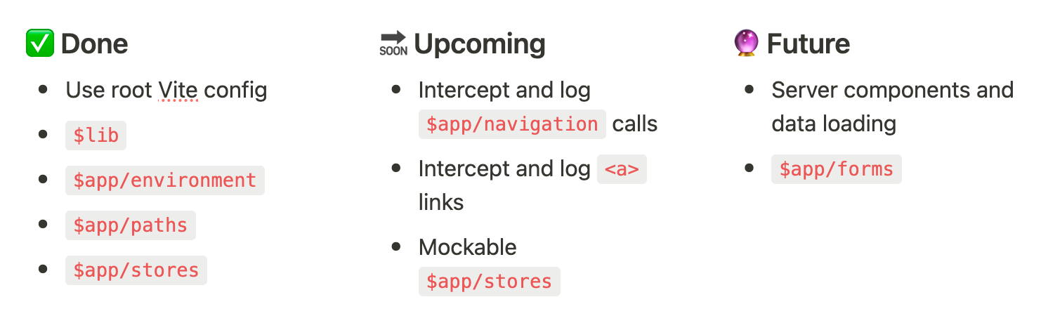
The first version of @storybook/sveltekit also adds support for some of the most-used features in a SvelteKit app:
- Supports imports that use the special
$libalias - Components can read current environment information from
$app/environment $app/pathsis supported so you can safely get paths for assets- Stores in
$app/storesare supported out of the box
We’ve focused on this set of features first because they are fundamental to most SvelteKit applications. We’ll keep working on this and are planning features that go beyond the fundamentals and brings Storybook and SvelteKit closer together.
The SvelteKit framework for Storybook was built in close collaboration with the Svelte core maintainers—specifically Ben McCann—to bring the most seamless experience possible. The integration has required changes on both the Storybook and SvelteKit sides. In fact, most of the features listed above are only possible due to changes to the SvelteKit codebase—changes that benefit the whole ecosystem of tools that integrate with SvelteKit.
Get Started
The @storybook/sveltekit framework supports Storybook 7 (currently in beta) and SvelteKit 1.0.
Getting started is easy. Check out the full documentation.
New projects
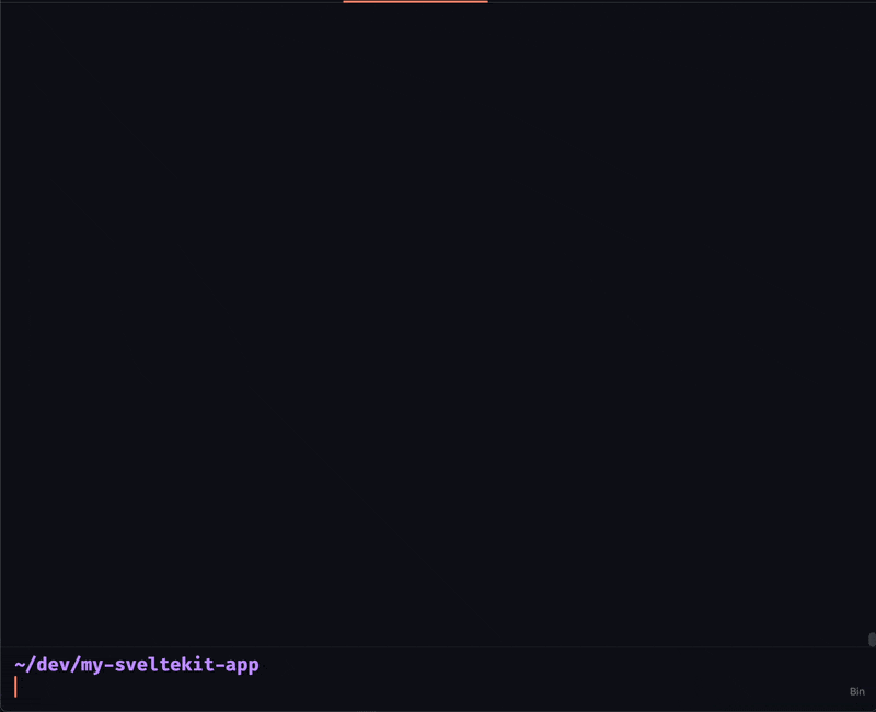
Run the following command in your SvelteKit project's root directory, and follow the prompts:
npx storybook init
Storybook will automatically detect your SvelteKit project and install the necessary packages and configurations.
Existing projects
If you’re already using Storybook prior to version 7 in a project, upgrade Storybook with this command, and follow the prompts:
npx storybook upgradeIf your existing project is configured with the Vite builder, it will prompt you to migrate your Storybook configuration and dependencies to the new @storybook/sveltekit package automatically.
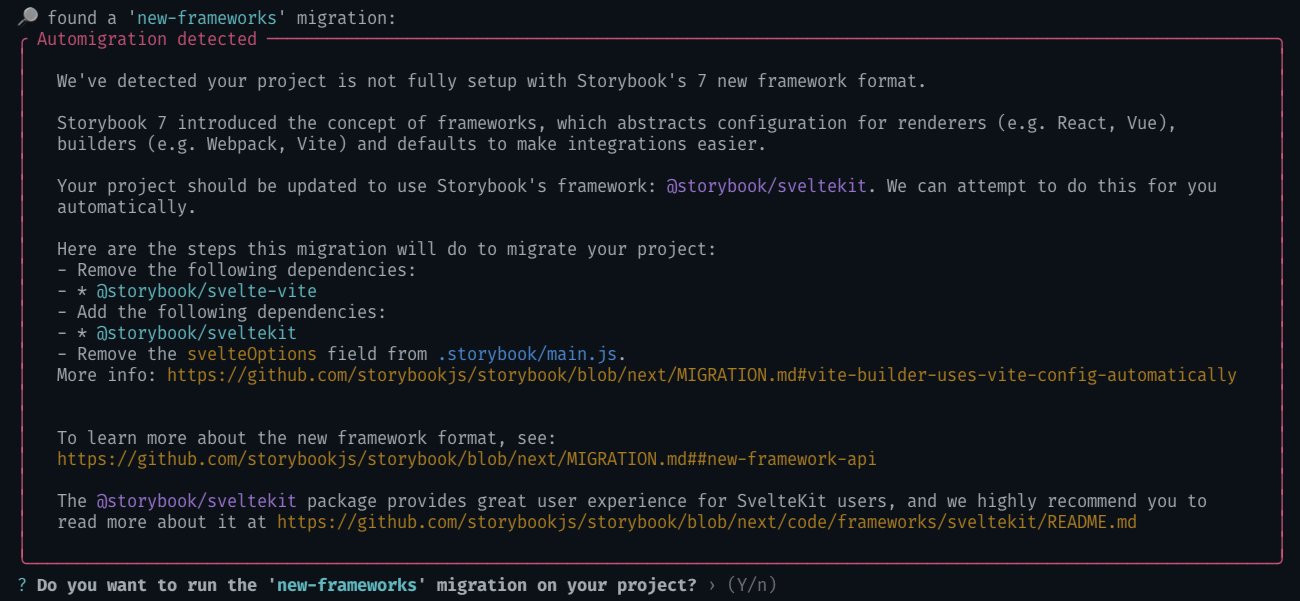
If your existing Storybook setup is using the Webpack builder, it can’t automatically migrate for you, because there’s no way to migrate your Webpack configuration to a Vite configuration. In that case, follow the manual migration steps instead.
This is just the beginning
@storybook/sveltekit makes it easier than ever to get started with Storybook in a SvelteKit project, but we’re only getting started. We’ll continue our close collaboration with the Svelte team to improve both Svelte and SvelteKit support in Storybook even further.
Here’s an overview of what the future brings:
Special thanks
The SvelteKit integration wouldn’t have been possible without the fantastic work by Ben McCann. Also, Ian Van Schooten’s tremendous progress on the Vite builder and feedback helped make the SvelteKit integration possible. Finally, we want to give a big thanks to all the users testing this in the alpha and beta stages and reporting bugs and issues. The integration wouldn’t be great without you.
🧡 Built-in Storybook support for SvelteKit!
— Storybook (@storybookjs) March 2, 2023
New framework uses @sveltejs, @vite_js, & custom config to make Storybook act like your SvelteKit app.
♻️ Re-use your vite config
📦 Lib alias for imports
🖼 Asset paths
🌳 App environment
👇 Highlights in thread; article at the end pic.twitter.com/n44Mol3K2Y