Storybook 💙 npmx
The npm browsing experience we always wanted


Today, npmx launches its alpha release. We’re thrilled to be part of the moment and want to celebrate npmx: a radically better npm browsing experience that surfaces the information you need to help choose the best packages. We're also excited to share our small contribution to the mix: adding live UI component examples so you can see what you'll get before installing.
What is npmx?
If you’ve ever tried to evaluate an npm package, you know the drill. Open npmjs.com, skim the README, then bounce to GitHub for the source, pkg-size.dev for the size, Are The Types Wrong for the TypeScript story, and maybe Socket.dev for a security check. You’re six tabs deep before you’ve even decided if the package is worth installing.
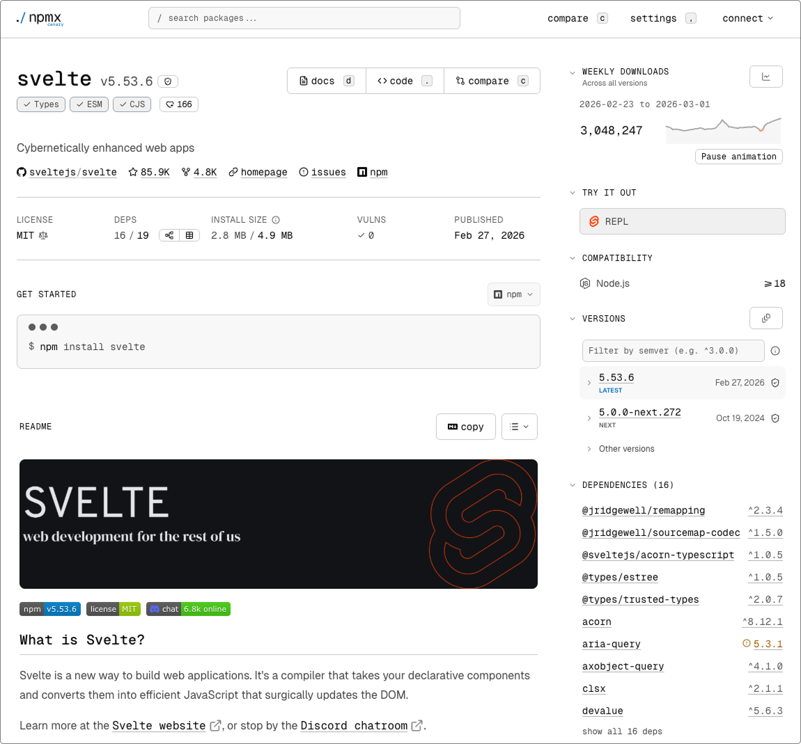
npmx.dev is changing that. It’s a fast, modern, community-built browser for the npm registry that puts everything you need in one place: install size, module format badges, outdated dependency warnings, vulnerability metadata, download trends, and more. And it does all this with dark mode, keyboard navigation, a fantastic code viewer, and much more. This is just the beginning!
We’ve been watching npmx closely. Today we’re excited to announce that Storybook and Chromatic are collaborating with npmx to bring component stories directly into the npm browsing experience. And as it turns out, the npmx team has also adopted Storybook for their own development. A natural fit for a project moving this fast.
Why we care
As maintainers of high-profile npm packages, we love the JS ecosystem. npm's package registry sits at the core of the ecosystem and has helped it thrive over the past decade.
But with this success comes lots of problems: security supply chain attacks, package bloat, a sea of stale and/or unmaintained packages, outdated dependencies, format changes, runtime compatibility, and so on.
Every package maintainer and consumer needs to contend with these issues. The community has built a variety of tools and databases to help keep your packages and dependencies healthy, but you have to go find the information for yourself. With npmx, all of this information is clearly visible in the package page.
Increased transparency helps you pick the best package for the job. It also compels package maintainers to level up, and also helps them do it. We think npmx is going to be the best thing to happen to the JS ecosystem since Vite.
Bringing stories to the package page
Many of the most popular design systems and UI libraries in the world are built and documented with Storybook. We’re bringing this information to npmx so you can easily learn about and try a UI library before you install it.
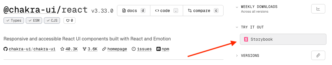
To start with, we’ve settled on a simple solution of showing a link to the package’s Storybook in the sidebar of npmx, making it easy for users to view and interact with the components.
We’re iterating with the npmx team to figure out the best way to surface stories alongside the rest of the package metadata. But the vision is clear: use live stories as an additional way to evaluate component libraries, right next to the other crucial information like install size and vulnerabilities.
To surface your library’s components in npmx, just set a storybook.url field in your package.json, pointing to your deployed Storybook. Popular UI libraries like Chakra UI and React Aria already do this, and we hope that this npmx collaboration will make the practice widespread.
npmx adopts Storybook
We’re also helping npmx adopt Storybook for their own development workflow.
The npmx community set up Storybook for their own Nuxt project, with Storybook core team members pitching in on the PR. The community response was immediate and enthusiastic.
Additionally, Chromatic is sponsoring the npmx project with free visual and accessibility snapshot testing. This means every PR to npmx is automatically checked for visual regressions and WCAG compliance — the same workflow used by the world’s top UI teams. Now available to the npmx community at no cost.
The npmx vibes
npmx was started by Daniel Roe and Matias Capeletto (patak), names you might recognize from the Nuxt and Vite ecosystems. In just a few months, it’s grown to 150+ contributors and 2,000+ GitHub stars, fully open source with a clear governance model that welcomes all kinds of contributions.
What stands out is the culture. People are opening their first-ever OSS PRs on npmx. Contributors are saying the project reignited their love for the web. The community recently took an entire week off together, closing Discord and pausing GitHub to touch grass. Anthony Fu called it out: “Simply, more OSS projects should DO THIS.”
And today, on launch day, that energy is on full display: dozens of community members, projects, and collaborators are all publishing their own announcements and celebrations of npmx at the same time. This isn’t a corporate marketing campaign. It’s a community showing up for something they genuinely believe in.
We’re huge fans of what the npmx community is building. A faster, more informative, more human npm browsing experience is something the entire JavaScript ecosystem benefits from. Today’s alpha is just the starting line, and we’re proud to be running alongside them. 💙
npmx launches today! Check out npmx.dev, join the community at chat.npmx.dev, and follow along on Bluesky. See what others are saying about the launch across the ecosystem.
To add your Storybook to your package on npmx, add a "storybook" field to your package.json:
{
  "storybook": {
    "url": "<https://your-storybook-url.com>"
  }
}