Storybook tags
Organize your components and stories to match the way you work

Clutter is caused by a failure to return things to where they belong.
— Marie Kondo
The secret to Storybook’s success is that its atomic unit—the story—is such a simple yet powerful way to develop, test, and document your components. Stories are so easy to write that many projects contain hundreds or even thousands of them.
But large Storybooks can be overwhelming: mixing components and stories from different teams, targeting different personas (e.g. developers vs designers), different states of completeness (unstable, alpha, stable, deprecated), and so forth.
With the introduction of Storybook Test, teams increasingly want to separate test-oriented stories from documentation-oriented ones.
You can organize Storybook’s sidebar with levels of hierarchy, but that only goes so far when you have many unrelated facets to consider.
That’s why I’m excited to introduce Storybook tags, a new way to organize and view your stories.
- 🏷️ Easy authoring
- 🔍 Interactive sidebar filter
- 🙈 Static tag-based filtering
- 🟢 Updated badges addon
Tag your components and stories
Tagging is simple. Tags can be defined in your project’s preview config (in .storybook/preview.js|ts) to apply to all stories, component meta (the default export of a stories file) to apply to a story file’s stories, or an individual story. To apply a tag, add a string to the array assigned to the tags property. They compose hierarchically, so in the the following example, all of Button’s stories are tagged with stable.
// Button.stories.jsx
import { Button } from './Button';

export default {
  component: Button,
  // 👇 Applies to all stories in this file
  tags: ['stable'],
}

export const Primary = {
  args: { primary: true }
}
Tags can also be negated. In the previous example, suppose I add a new icon prop that I wanted to flag as experimental, I could remove the stable tag with negation and add the experimental tag:
export const WithIcon = {
  args: { icon: <Icon /> },
  tags: ['!stable', 'experimental'],
}
Interactive sidebar filter
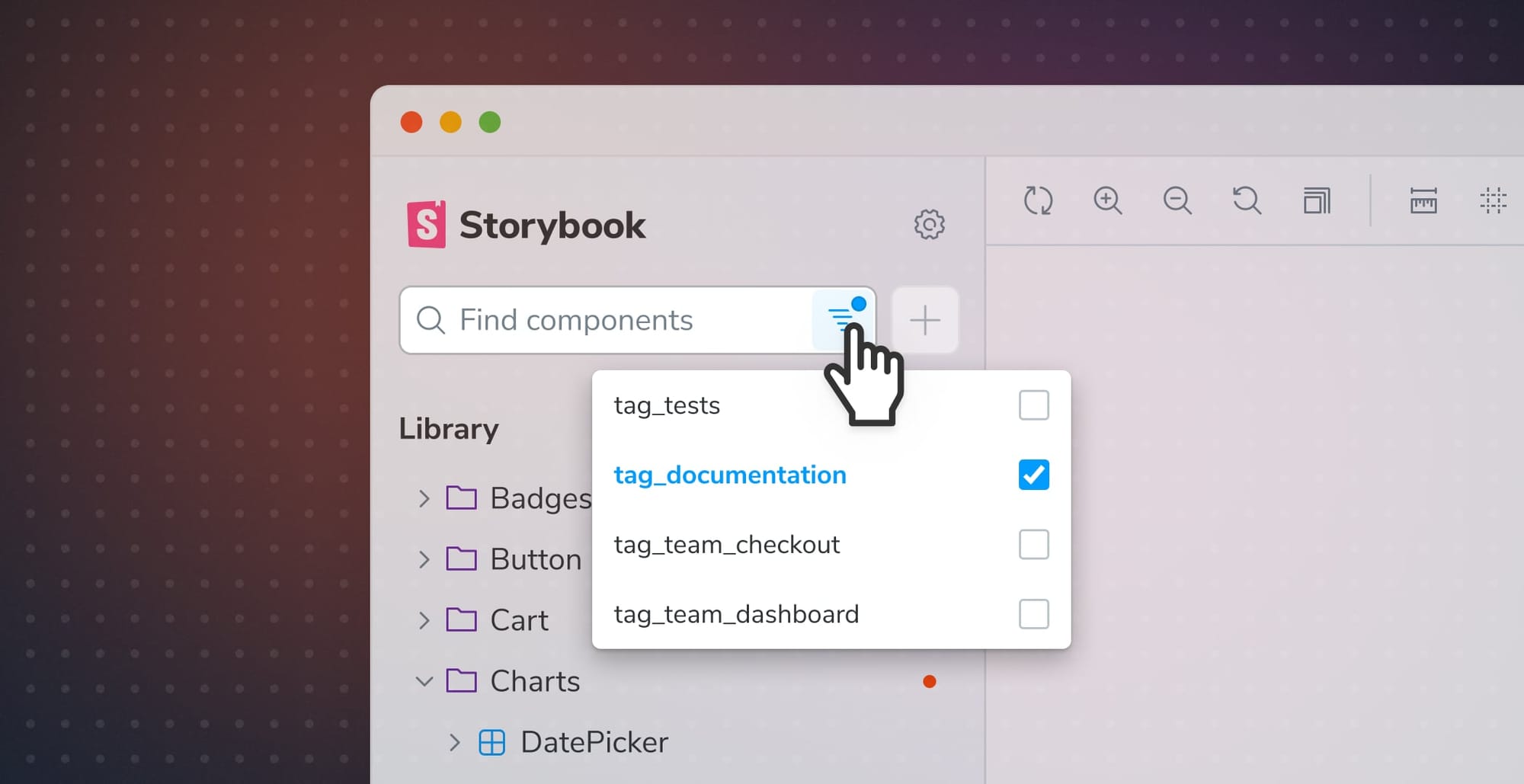
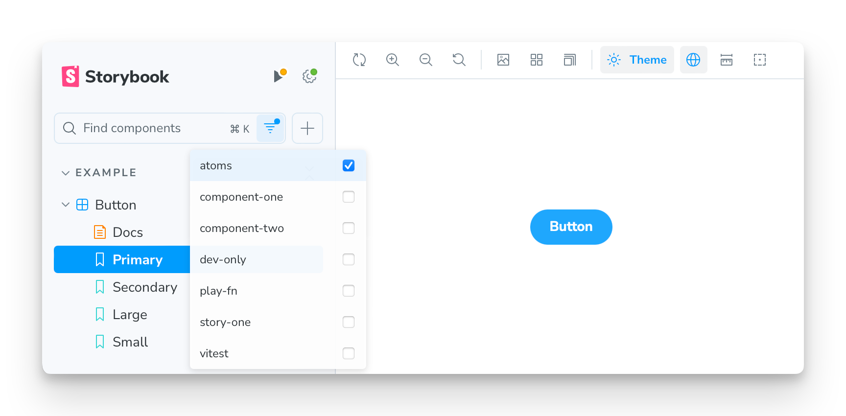
Once you’ve tagged your stories, you can filter the sidebar interactively with a new UI:

You can filter by any of the tags you’ve applied to your stories and by some built-in tags, like play-fn, which is automatically applied to any story with a play function defined.
By default, all tags are unchecked and thus all stories are shown. Checking one or more tags in the menu will filter the sidebar to only those stories with those tags, making it possible to flexibly create views of your Storybook. It is also possible to perform text-based searches within a filtered view.
Static tag-based filtering
While the interactive sidebar filtering provides a flexible way to view and search the sidebar, tags can also be used to statically include/exclude stories from the sidebar, docs, and even test runs.
Suppose you’re testing a complex component and you need a bunch of stories to cover edge cases. These edge cases provide testing value, but they clutter the sidebar. You can remove them from the sidebar by removing the dev tag, which is added to all stories by default:
export const EdgeCase = {
  args: { ... },
  tags: ['!dev'],
}
Similarly, suppose a story exists solely for documentation purposes and you don’t want it to slow down test runs (or want to skip it for any other reason). You can remove the test tag (also applied by default) from that story:
export const SkipTesting = {
  args: { ... },
  tags: ['!test'],
}
For more details, see the full list of built-in tags.
Tag Badges addon
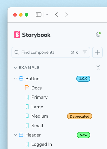
To complete the feature, Storybook community member Steve Dodier-Lazaro has created the Tag Badges addon, storybook-addon-tag-badges, which turns tags into visual badges in Storybook’s sidebar:

The addon comes preconfigured with a set of tags to render as badges. You can also configure which tags are used as badges and how and when they are rendered. For more information on the Tags Badges addon, see the addon README.
Try it today!
Tags are fully supported in Storybook 8.4. Try it in a new project:
npx storybook@latest init
Or upgrade an existing project:
npx storybook@latest upgrade
To learn more about tags, please see the Storybook documentation.
To add the community-supported Tag Badges addon to an 8.4+ project:
npx storybook@latest add storybook-addon-tag-badges
For more information see the Tags Badges README.
What’s next
Tags are a flexible mechanism and we can’t envision all of the ways they might be used.
Some ideas we’re considering:
- URL parameters for tag filters so that you can share a filtered view of your Storybook.
- Ability to group tags with a colon-separated prefix, such as
type:storyandtype:docs. - Interactive filtering currently includes stories based on tag. We’re also considering the ability to exclude stories.
We’ve created a Github discussion for tags feedback and to collect real-world use cases. If you have ideas, please share them there!
Is your Storybook getting unwieldy with component playgrounds, tests, and documentation examples? Use tags to organize and filter the components and stories in your sidebar.
— Storybook (@storybookjs) December 17, 2024
🏷️ Easy authoring
🔍 Interactive sidebar filter
🙈 Static tag-based filtering
🟢 Updated badges addon pic.twitter.com/sosW921ty3