Why Storybook in 2022?
What's all the fuss about Storybook
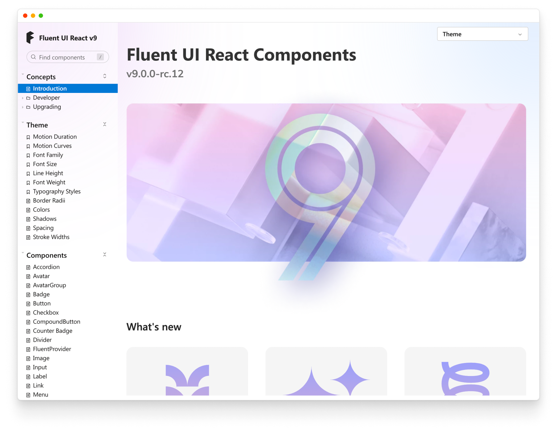
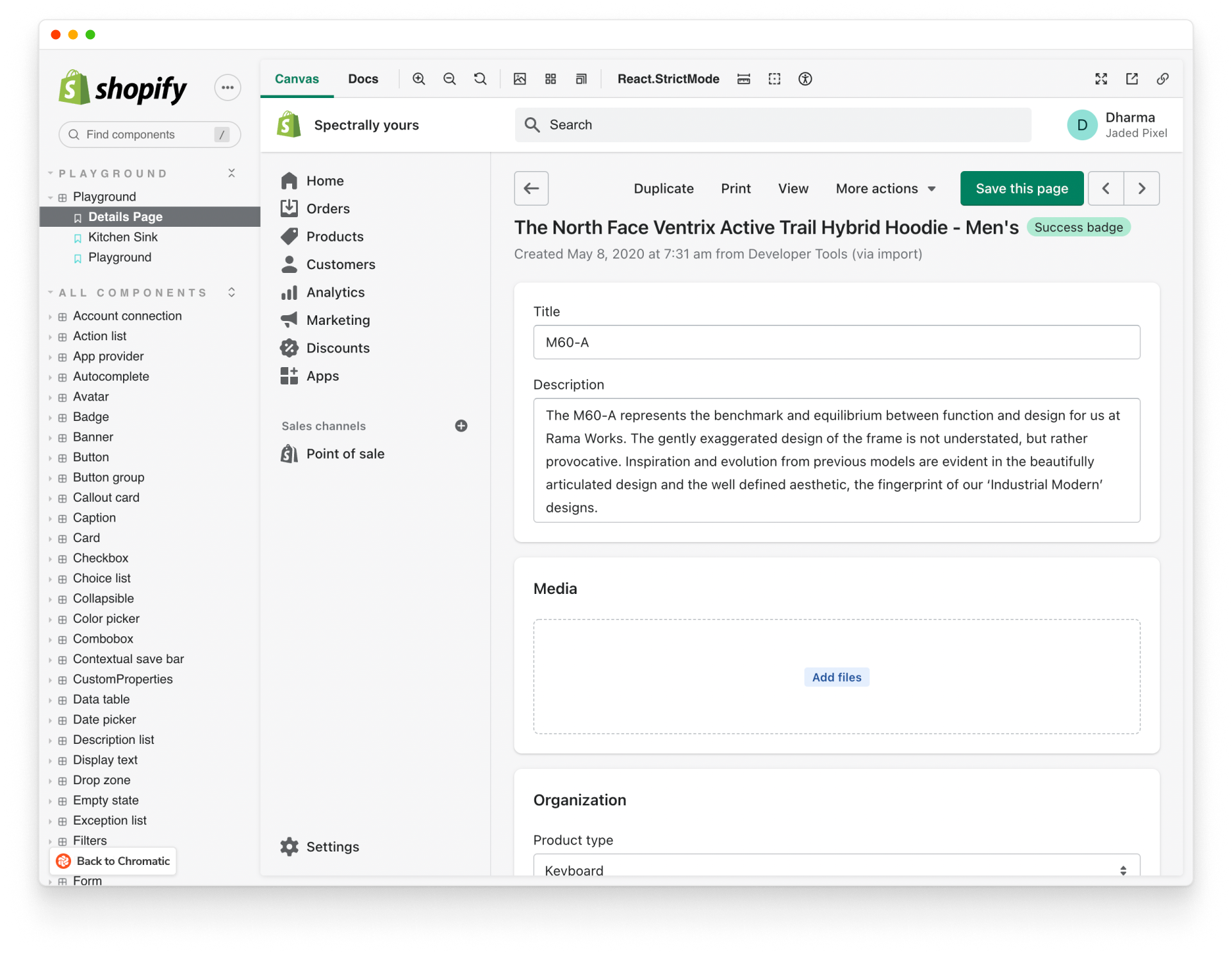
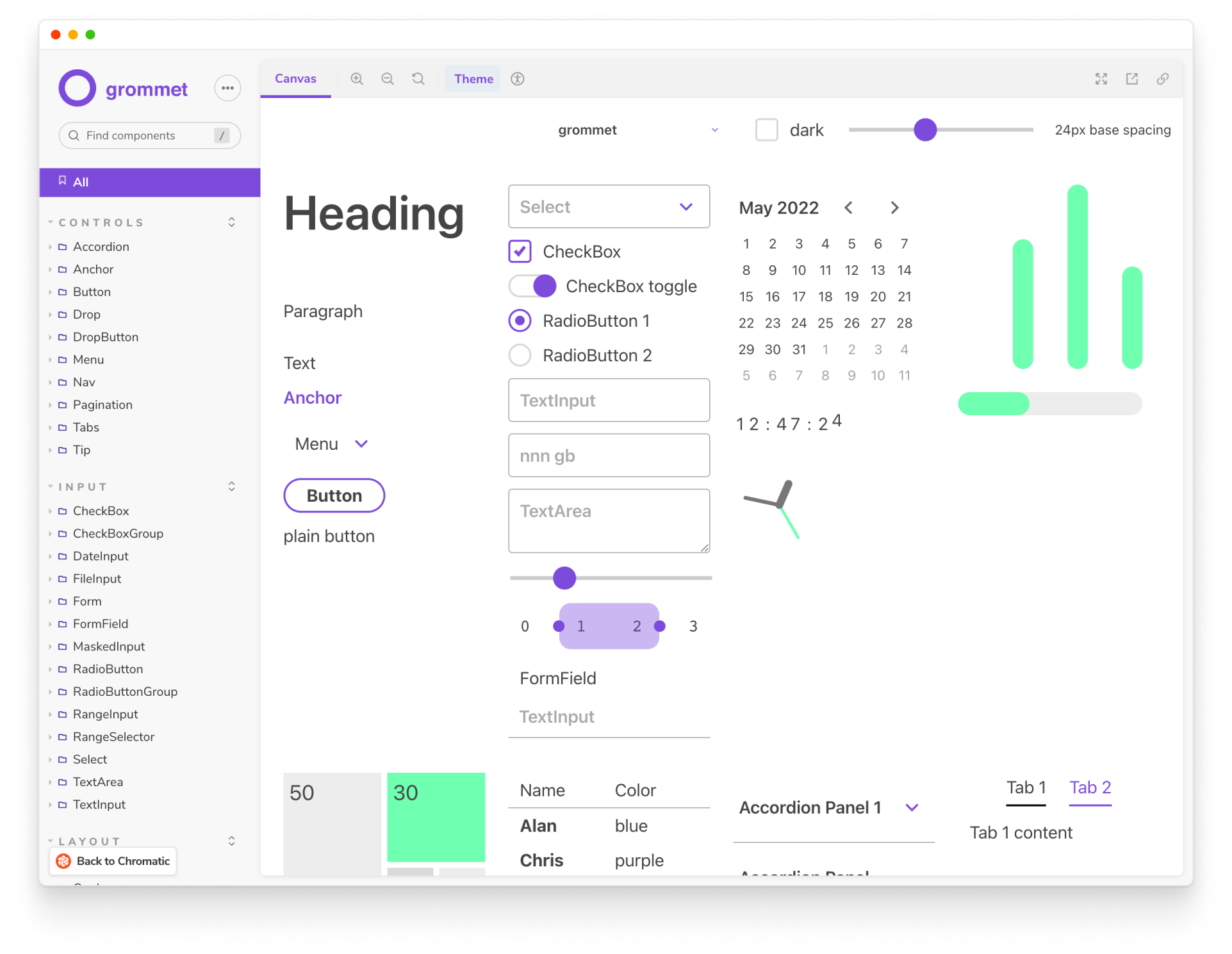
Teams around the world use Storybook to power their frontend workflows. But how it is used can vary immensely. Microsoft documents their Fluent design system. Mozilla develops pages for their web apps in isolation. While BBC automates testing for readers in every locale.
The breadth of Storybook’s use cases makes it tricky for new folks to understand the core value. Why do developers actually use Storybook in 2022? This article breaks down the what, how, and why behind Storybook to help you decide whether it’s right for you.
Frontend development is easy… right?
Before we begin, let’s squash software engineering’s top misconception: “frontend is easy”.
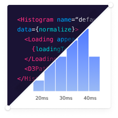
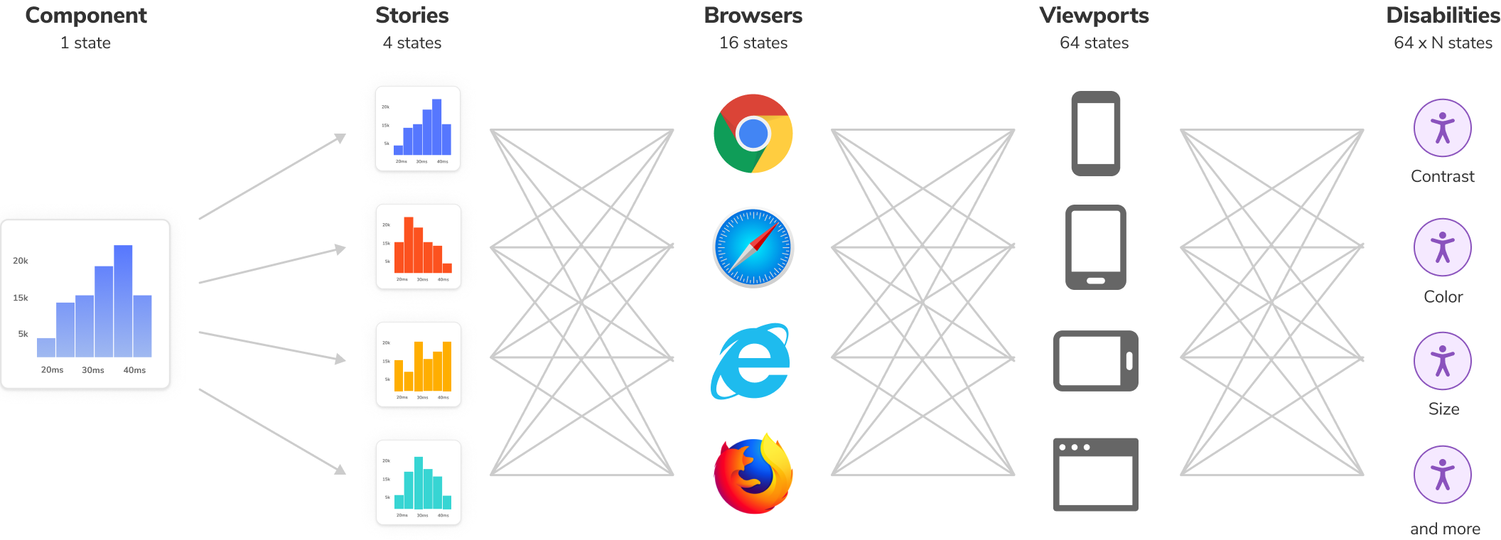
Responsive web design turned every user interface from one to 10, 100, 1000 different user interfaces – each with unique constraints. Over time, additional UI requirements piled on like devices, browsers, accessibility, performance, and async states. This ended up pushing more complexity into the frontend.
Component-driven tools like React, Vue, and Angular help break down complex UIs into simple components but they’re not silver bullets. As frontends grow, the number of components swells. Mature projects can contain hundreds of components that yield thousands of discrete variations.
To complicate matters further, those UIs are painful to debug because they’re entangled in business logic, interactive states, and app context.
Think of the explosion in UI complexity as the user interface multiverse – a sprawling blob of discrete variations. Development in this multiverse is a mind-bending maze of constraints and gotchas. So how do you navigate it all?
How to develop in the user interface multiverse
Imagine a map that tracked every possible UI variation down to the component: shopping cart on mobile, network loading in dark mode, homepage with high contrast theme.
In the past, you'd have to spin up the app, navigate to a page, and contort the UI into the right state. This is a huge waste of time and bogs down frontend development.
If you had a map of every UI state your app supports, you could jump to any spot in the UI and see it as your users do. You could then run automated tests against these states to catch bugs, statically analyze them, and even generate UI docs. This is why “Stories” were invented.
Stories capture UI states in isolation
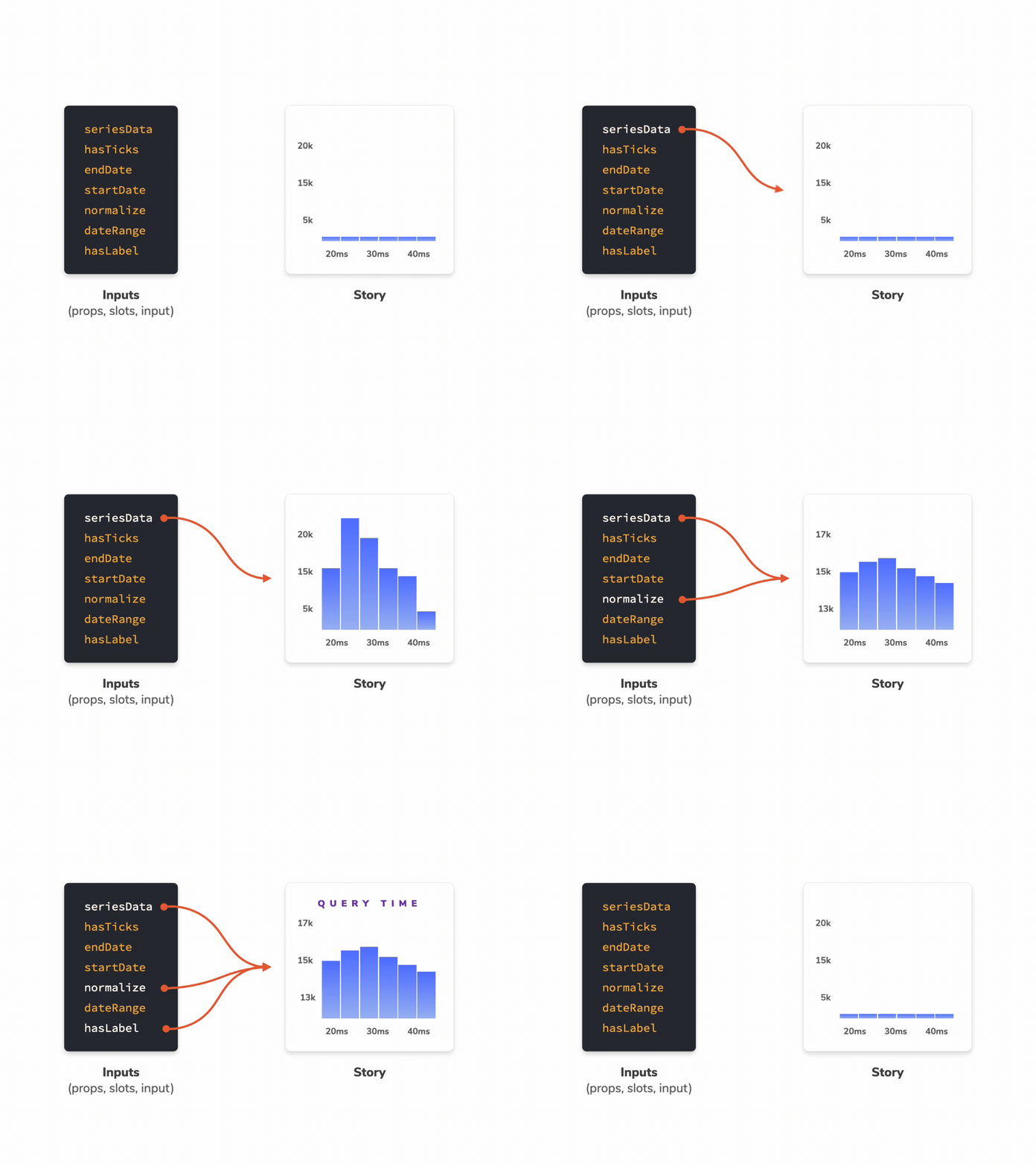
Every piece of UI is now a component. The superpower of components is that you don't need to spin up the whole app just to see how they render. You can render a specific variation in isolation by passing in props, mocking data, or faking events.
Stories are a declarative syntax for supplying props and mock data to simulate component variations. They’re the core construct behind Storybook. Each component can have multiple stories. Each story allows you to demonstrate a specific state of that component to verify appearance and behavior.
You write stories for granular UI component states and then use those stories to verify appearance during development, testing, and documentation.

Storybook keeps track of stories
Storybook is packaged as a small, development-only, workshop that lives alongside your app. It provides an isolated iframe to render components without interference from app business logic and context. That helps you focus development on each variation of a component, even the hard-to-reach edge cases.
As a product’s UI expands, Storybook becomes a living directory that organizes every UI component and its stories. During development, run it in a separate node process from the app. That way you can go to any story, at any time, without needing to spin up your entire app.
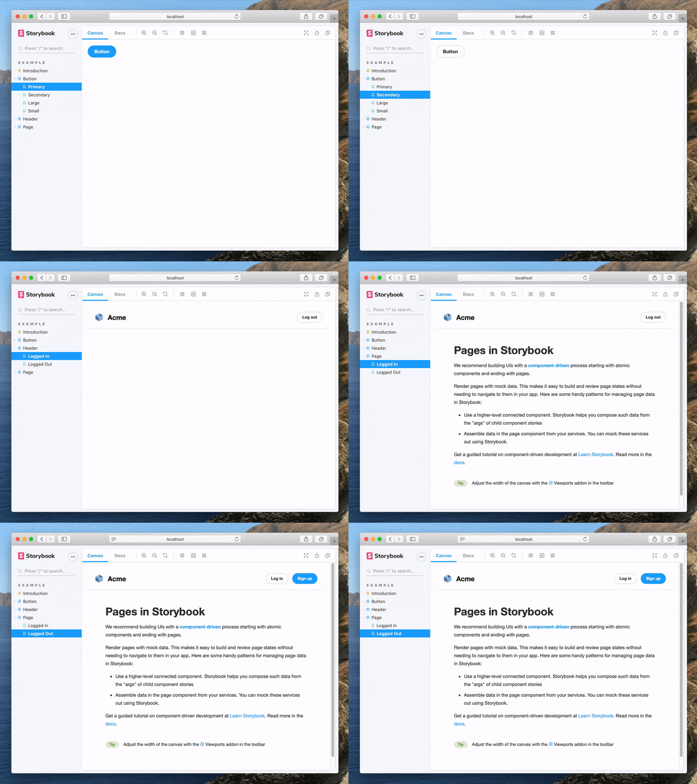
That sounds like extra work…
Developers often build UI components and states in the context of their app. But in an app, the components are wired up to messy business logic, app context, and global state, making debugging tricky. You can sidestep these time-wasting complications by developing in Storybook's isolated environment.
It's not uncommon for developers to spin up their entire stack to update some CSS. Not only is that cumbersome, but you also waste time waiting for the whole app to rebuild. Storybook offers a lighter alternative by building the UI layer only. That way you can focus your effort on individual components.
Getting the app UI in the right state to begin work is challenging. You drop in temporary data to trigger a state, comment out code to see an empty state, or fiddle with the devtools to simulate a loading state. Stories are portable fixtures that let you supply mock data, providers and even network requests to yield specific component states on demand.
Benefits
When you write stories, you get a bunch of additional benefits for free.
📝 Develop UIs that are more durable
Isolate components, and pages, then track their use cases as stories. Verify hard-to-reach edge cases of UI. Use addons to mock everything a component needs—context, API requests, device features, etc.
✅ Test UIs with less effort and no flake
Stories are a pragmatic, reproducible way of tracking UI states. Use them to spot-test the UI during development. Storybook offers built-in workflows for automated Accessibility, Interaction, and Visual testing. Or use stories as test cases by importing them into other JavaScript testing tools.
📚 Document UI for your team to reuse
Storybook is the single source of truth for your UI. Stories index all your components and their various states, making it easy for your team to find and reuse existing UI patterns. Storybook also auto-generates documentation from those stories.
📤 Share how the UI actually works
Stories show how UIs actually work, not just a picture of how they're supposed to work. That keeps everyone aligned on what's currently in production. Publish Storybook to get sign-off from teammates. Or embed them in wikis, Markdown, and Figma to streamline collaboration.
Write stories once, reuse everywhere
Storybook is powered by Component Story Format, an open standard based on JavaScript ES6 modules for component variations. This enables interoperation between development, testing, and design tools. Each story is exported as a JavaScript function enabling you to reuse them with other tools. No vendor lock-in.
Reuse stories with Jest and Testing Library to verify interactions. Put them in Chromatic for visual testing. Audit story accessibility with Axe. Or test user flows with Playwright and Cypress. Reuse unlocks more workflows at no extra maintenance cost.
Build UIs without the grunt work
77% of developers agree that development is more complex than 10 years ago. Despite the advances in JavaScript tooling, devs continue to face ever trickier frontend challenges.
Storybook is purpose-built to help you develop complex UIs faster with greater durability and lower maintenance. It should come as no surprise that Storybook is used by 100s of leading companies and thousands of developers .
With 7.0 around the corner, Storybook continues to get better. Here’s a peek into the future:
- ✅ “It just works” SLA for our core frameworks
- ⚡️ Performance overhaul to reduce start and build times
- 💅 Design and usability refresh
- 🧩 Integrations for popular JavaScript tools
- 🔬 Interaction Testing updates and new Test Runner
- 📕 Documentation addon revamp to 2.0
Why actually use Storybook in 2022?
— Storybook (@storybookjs) September 1, 2022
1000s of companies love Storybook. But the variety of possible use cases makes it tough to see Storybook’s core value.
This article breaks down the what, how, and why behind Storybook in 2022.
read >>https://t.co/34JDlA9ayO
1/🧵 pic.twitter.com/tj35y9yViv