Integrate Emotion with Storybook
This recipe assumes that you have a React app using Emotion and have just set up Storybook >=7.0 using the getting started guide. Don’t have this? Follow Emotion's installation instructions then run:
# Add Storybook:
npx storybook@latest init
1. Add @storybook/addon-themes
To get started, you'll need to install @storybook/addon-themes.
Run the following script to install and register the addon:
npx storybook@latest add @storybook/addon-themesDid the configuration script fail?
Under the hood, this runs npx @storybook/auto-config themes, which should read your project and try to configure your Storybook with the correct decorator. If running that command directly does not solve your problem, please file a bug on the @storybook/auto-config repository so that we can further improve it. To manually add this addon, install it, and then add it to the addons array in your .storybook/main.ts.
2. Provide GlobalStyles
Inside of .storybook/preview.js, create a <GlobalStyles /> component that includes a font-family. Then apply it to your stories with the withThemeFromJSXProvider decorator by adding it to the decorators array.
// .storybook/preview.jsx

import { withThemeFromJSXProvider } from '@storybook/addon-themes';
import { Global, css } from '@emotion/react';

const GlobalStyles = () => (
  <Global
    styles={css`
      body {
        font-family: 'Nunito Sans', 'Helvetica Neue', Helvetica, Arial, sans-serif;
      }
    `}
  />
);

export const decorators = [
  withThemeFromJSXProvider({
    GlobalStyles, // Adds your GlobalStyles component to all stories
  }),
];If you already have <Global /> in your app, you can import it into .storybook/preview.js instead of creating it anew.
3. Provide your theme(s)
To share your theme(s) with the components in Storybook, you'll need to provide them to the withThemeFromJSXProvider decorator along with @emotion/styled's <ThemeProvider /> component.
// .storybook/preview.jsx

import { withThemeFromJSXProvider } from '@storybook/addon-themes';
import { Global, css, ThemeProvider } from '@emotion/react';

import { lightTheme, darkTheme } from '../src/themes';

const GlobalStyles = () => (
  <Global
    styles={css`
      body {
        font-family: 'Nunito Sans', 'Helvetica Neue', Helvetica, Arial, sans-serif;
      }
    `}
  />
);

export const decorators = [
  withThemeFromJSXProvider({
  themes: {
    light: lightTheme,
    dark: darkTheme,
  }
  defaultTheme: 'light',
  Provider: ThemeProvider,
  GlobalStyles,
})];
Now, components made with Emotion will get the theme through the theme prop along with the styles inherited from <Global />.
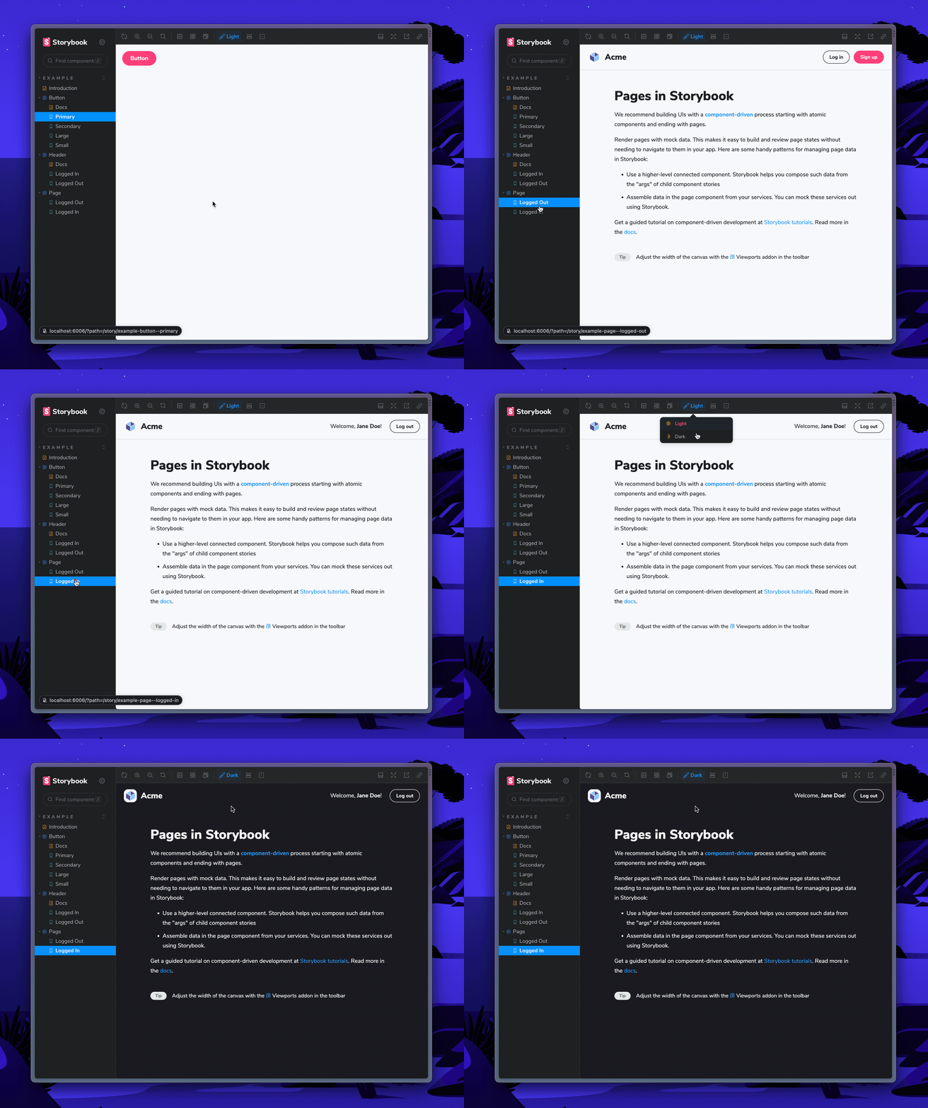
When you provide more than one theme, a toolbar menu will appear in the Storybook UI to select your desired theme for your stories.

Get involved
Now you're ready to use Emotion with Storybook. 🎉
If you use Emotion at work, we'd love your help making this setup even better. Join the maintainers in Discord to get involved, or jump into addon docs.
- ShaunEvening