Integrate Material UI with Storybook
This recipe assumes that you already have a React app using @mui/material and have just set up Storybook >= 7.0 using the getting started guide. Don't have this? Follow MUI's setup instructions then run:
# Add Storybook:
npm create storybook@latest
1. Add @storybook/addon-themes
To get started, you'll need to install @storybook/addon-themes.
Run the following script to install and register the addon:
npx storybook@latest add @storybook/addon-themesDid the configuration script fail?
Under the hood, this runs npx @storybook/auto-config themes, which should read your project and try to configure your Storybook with the correct decorator. If running that command directly does not solve your problem, please file a bug on the @storybook/auto-config repository so that we can further improve it. To manually add this addon, install it, and then add it to the addons array in your .storybook/main.ts.
2. Bundle fonts and icons for better perf
Material UI depends on two fonts to render as intended, Google’s Roboto and Material Icons. While you can load these fonts directly from the Google Fonts CDN, bundling fonts with Storybook is better for performance.
- 🏎️ Fonts load faster because they are coming from the same place as your app
- ✈️ Font will load offline so you can continue developing your stories anywhere
- 📸 No more inconsistent snapshot tests because fonts load instantly
To get started, install the fonts as dependencies.
yarn add @fontsource/roboto @fontsource/material-iconsThen import the CSS files into .storybook/preview.js, the entry point of your Storybook.
// .storybook/preview.js

import '@fontsource/roboto/300.css';
import '@fontsource/roboto/400.css';
import '@fontsource/roboto/500.css';
import '@fontsource/roboto/700.css';
import '@fontsource/material-icons';
3. Load your theme(s) and global CSS
Inside of .storybook/preview.js, import <CssBaseline />, <ThemeProvider />, and your theme(s), then apply them to your stories with the withThemeFromJSXProvider decorator by adding it to the decorators array.
// .storybook/preview.js

import { CssBaseline, ThemeProvider } from '@mui/material';
import { withThemeFromJSXProvider } from '@storybook/addon-themes';
import { lightTheme, darkTheme } from '../src/themes.js';

/* snipped for brevity */

export const decorators = [
  withThemeFromJSXProvider({
    themes: {
      light: lightTheme,
      dark: darkTheme,
    },
    defaultTheme: 'light',
    Provider: ThemeProvider,
    GlobalStyles: CssBaseline,
  }),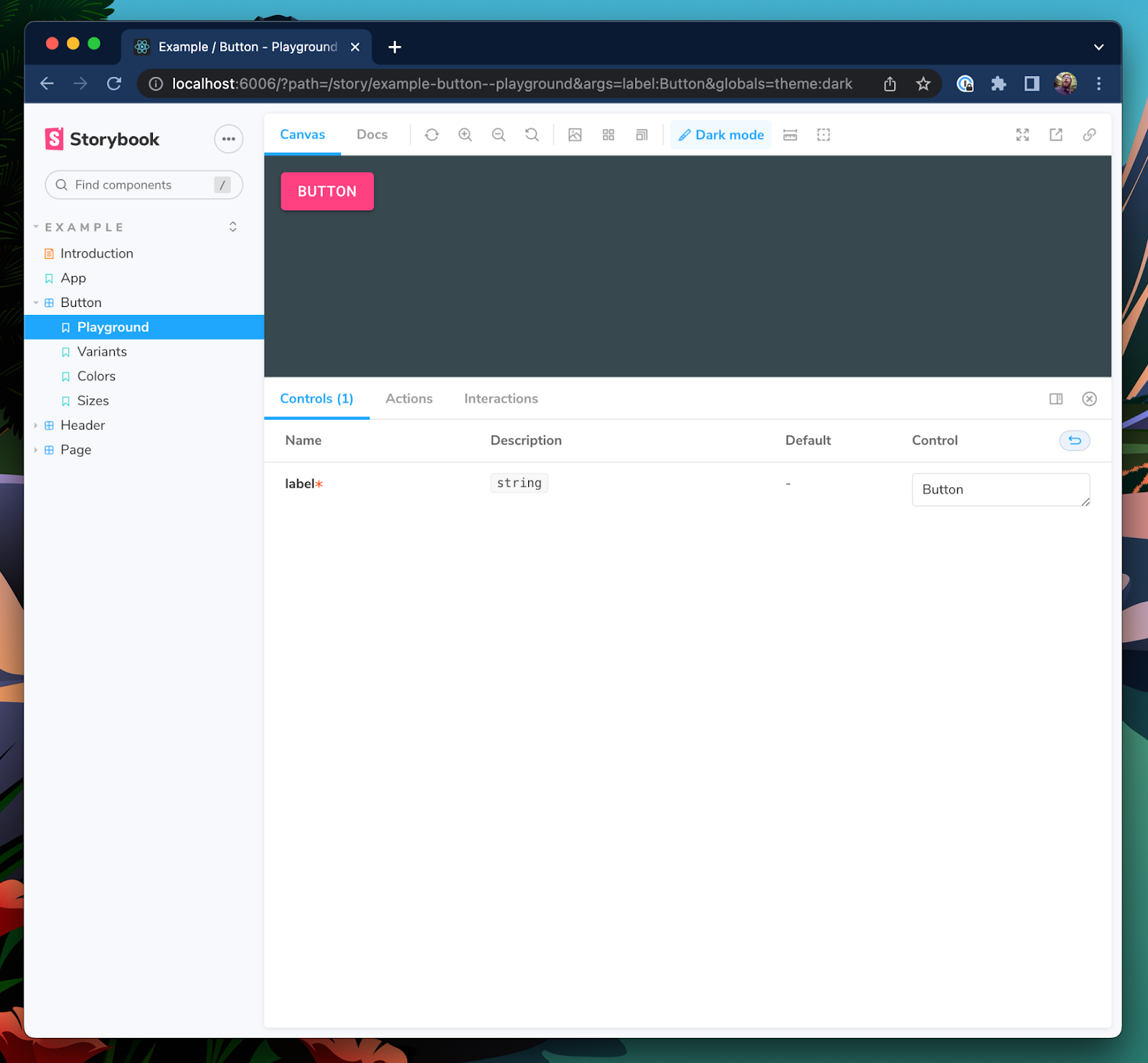
];When you provide more than one theme, a toolbar menu will appear in the Storybook UI to select your desired theme for your stories.
4. Use Material UI prop types for better controls and docs
Storybook controls give you graphical controls to manipulate a component’s props. They’re handy for finding edge cases of a component and prototyping in the browser.
Usually, you have to manually configure controls. But if you’re using Typescript, you can reuse Material UI’s component prop types to auto-generate story controls. As a bonus, this will also automatically populate the prop table in your documentation tab.
Let’s take the following Button component for example.
// button.component.tsx

import React from 'react';
import { Button as MuiButton } from '@mui/material';

export interface ButtonProps {
  label: string;
}

export const Button = ({ label, ...rest }: ButtonProps) => <MuiButton {...rest}>{label}</MuiButton>;
Here I’m using the label prop as the MuiButton’s child and passing all other props through. However, when we render this into Storybook, our controls panel only lets us change the label prop that we declared ourselves.
This is because Storybook only adds props to the controls table that are explicitly declared in the component’s prop types or in the Story Args. Let’s update Storybook’s Docgen configuration to bring Material UI‘s Button props into the controls table as well.
// .storybook/main.ts

module.exports = {
  stories: ['../src/**/*.mdx', '../src/**/*.stories.@(js|jsx|ts|tsx)'],
  addons: ['@storybook/addon-essentials', '@storybook/addon-styling'],
  framework: '@storybook/your-framework',
  typescript: {
    reactDocgen: 'react-docgen-typescript',
    reactDocgenTypescriptOptions: {
      // Speeds up Storybook build time
      compilerOptions: {
        allowSyntheticDefaultImports: false,
        esModuleInterop: false,
      },
      // Makes union prop types like variant and size appear as select controls
      shouldExtractLiteralValuesFromEnum: true,
      // Makes string and boolean types that can be undefined appear as inputs and switches
      shouldRemoveUndefinedFromOptional: true,
      // Filter out third-party props from node_modules except @mui packages
      propFilter: (prop) =>
        prop.parent
          ? !/node_modules\/(?!@mui)/.test(prop.parent.fileName)
          : true,
    },
  },
};
We also want to update the parameters in .storybook/preview.js to show the description and default columns for the controls table.
// .storybook/preview.js

export const parameters = {
  actions: { argTypesRegex: '^on[A-Z].*' },
  controls: {
    expanded: true, // Adds the description and default columns
    matchers: {
      color: /(background|color)$/i,
      date: /Date$/,
    },
  },
};
Lastly, update the ButtonProps type to extend from Material UI’s Button props to add all of these props to the controls.
// button.component.tsx
import React from 'react';
import {
Button as MuiButton,
ButtonProps as MuiButtonProps,
} from '@mui/material';
export interface ButtonProps extends MuiButtonProps {
label: string;
}
export const Button = ({ label, ...rest }: ButtonProps) => (
<MuiButton {...rest}>{label}</MuiButton>
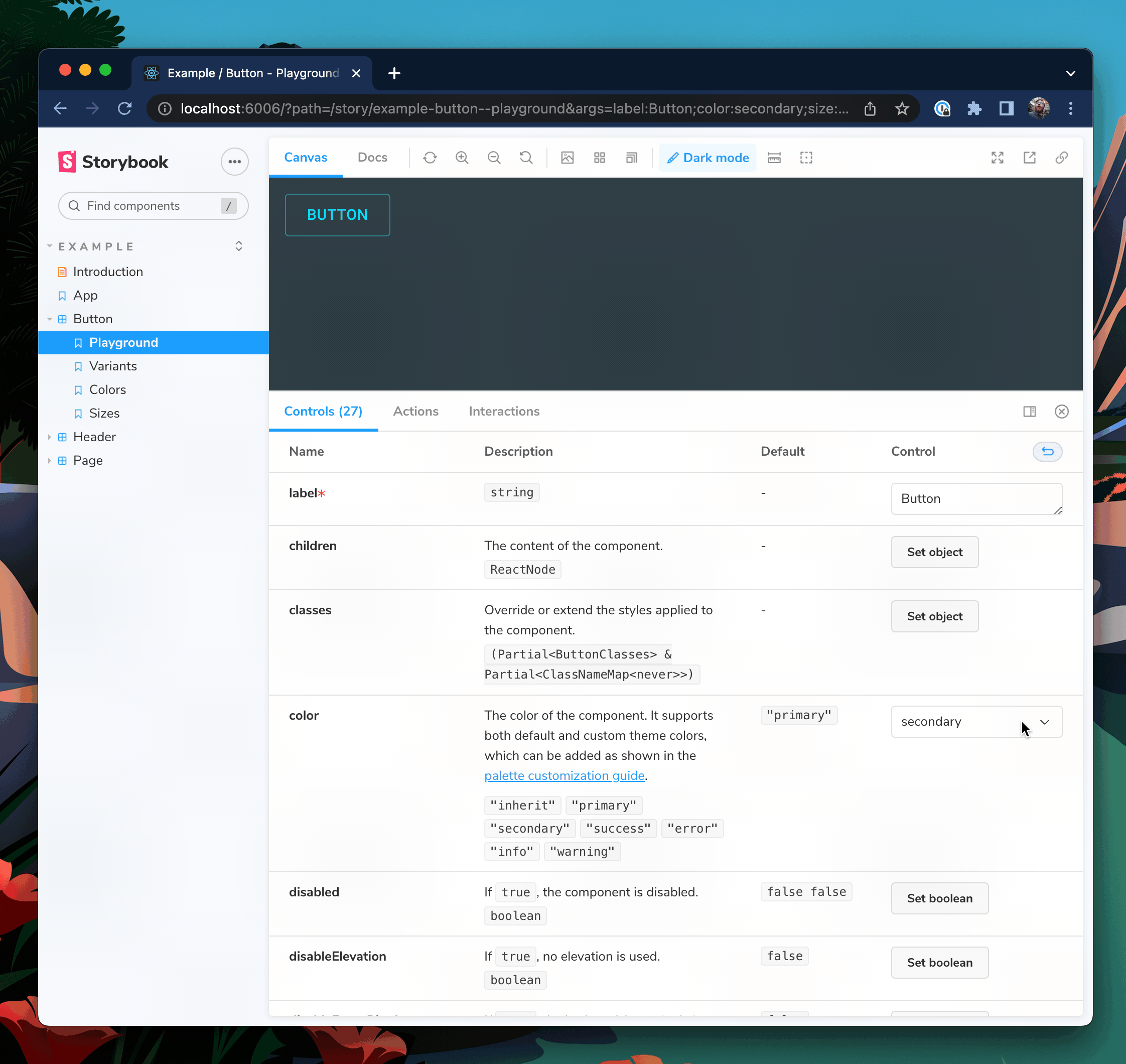
);Restart your Storybook server so that these config changes take effect. You should now see that Button has controls for all of MuiButton's props as well.
Choose which controls are visible
Our button now has 27 props, which is perhaps a little much for your use case. To control which props are visible we can use TypeScript’s Pick<type, keys> and Omit<type, keys> utilities.
// button.component.tsx

import React from 'react';
import {
  Button as MuiButton,
  ButtonProps as MuiButtonProps,
} from '@mui/material';

// Only include variant, size, and color
type ButtonBaseProps = Pick<MuiButtonProps, 'variant' | 'size' | 'color'>;

// Use all except disableRipple
// type ButtonBaseProps = Omit<MuiButtonProps, "disableRipple">;

export interface ButtonProps extends ButtonBaseProps {
  label: string;
}

export const Button = ({ label, ...rest }: ButtonProps) => (
  <MuiButton {...rest}>{label}</MuiButton>
);
And now our Button will only take the variant, size, and color props from MuiButton.
📣 Shout out to Eric Mudrak’s awesome Storybook with React & TypeScript article that inspired this tip.
- shaunlloyd
