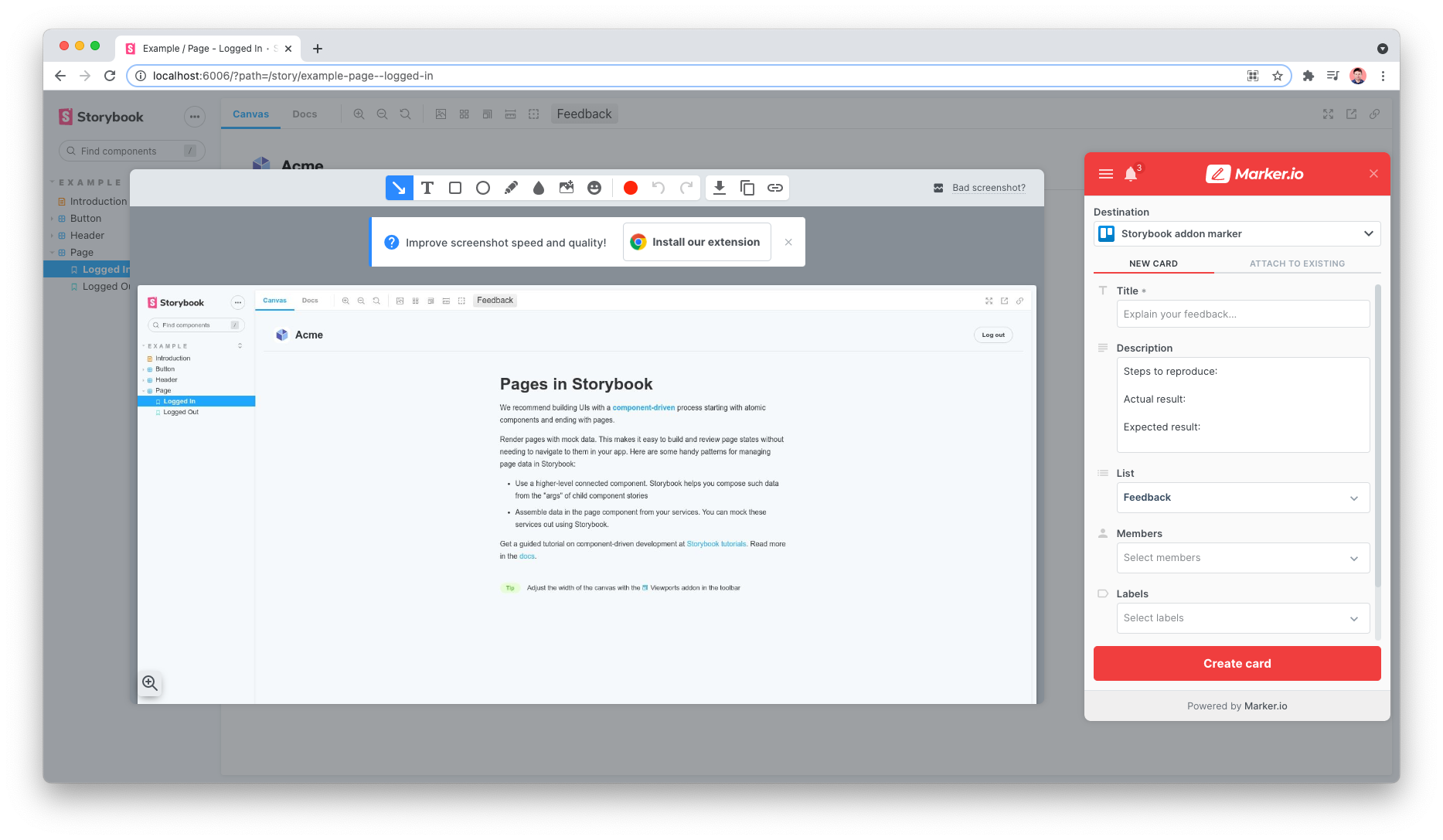
Storybook Addon Marker
A Storybook Addon to add a Marker.io feedback button in Storybook.
Installation
npm install @etchteam/storybook-addon-marker --save-dev
Configuring Storybook
Create a file called main.js in your .storybook config folder.
Add the following content to it:
export default {
  addons: ['@etchteam/storybook-addon-marker']
}
Then create a file called preview.js in the same folder and add your Marker project ID in the initalGlobals.
export default {
  initialGlobals: {
    marker: {
      project: 'abcd1234567890', // Your unique project ID
    },
  },
}
Only project is required, the rest of the marker widget params are accepted and will be passed down to the loadWidget method.
Additionally, the mode option of the browser SDK capture method can be added to this config:
export default {
  initialGlobals: {
    marker: {
      project: 'abcd1234567890', // <- Your unique project ID
      mode: 'fullscreen', // fullscreen | advanced
    },
  },
}
Configuring Marker
Guidance on how to locate your Marker project and other Marker configuration options can be found on the Marker website.
Hiding the Marker widget button
This addon places a feedback button in the Storybook toolbar and automatically hides the default Marker button.
If you're finding the duplicate button still appears, there is a Marker setting under Widget > Button > Button visibility that can be set to "hidden".
Screenshot rendering
If screenshots aren’t rendering correctly check Markers tips and limitations.
Made with ☕ at Etch


