Storybook Toolbars Addon
The Toolbars addon controls global story rendering options from Storybook's toolbar UI. It's a general purpose addon that can be used to:
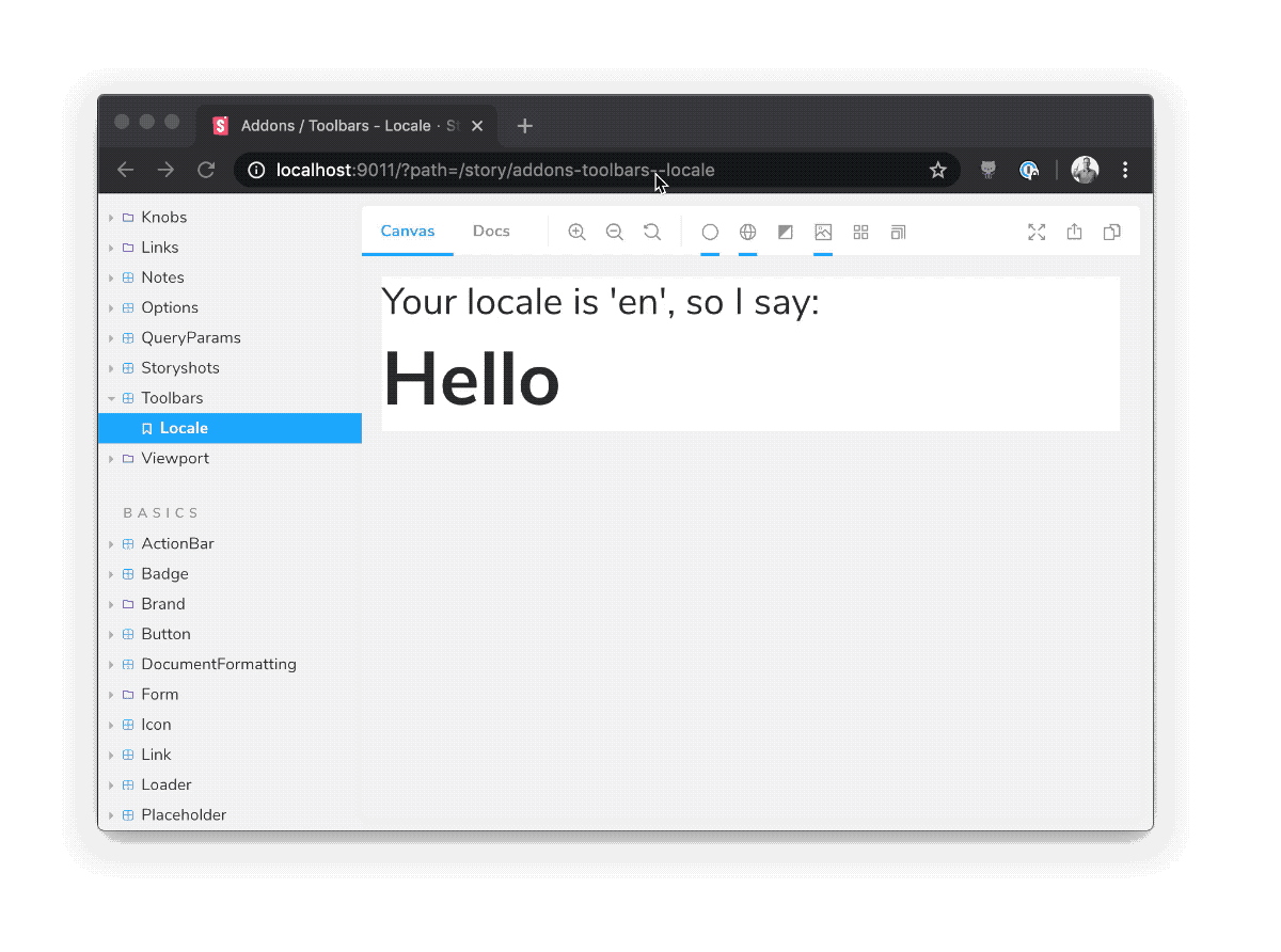
- set a theme for your components
- set your components' internationalization (i18n) locale
- configure just about anything in Storybook that makes use of a global variable
Installation
Toolbars is part of essentials and so is installed in all new Storybooks by default. If you need to add it to your Storybook, you can run:
npm i -D @storybook/addon-toolbars
Then, add following content to .storybook/main.js:
export default {
  addons: ['@storybook/addon-toolbars'],
};
Usage
The usage is documented in the documentation.
FAQs
How does this compare to addon-contexts?
Addon-toolbars is the successor to addon-contexts, which provided convenient global toolbars in Storybook's toolbar.
The primary difference between the two packages is that addon-toolbars makes use of Storybook's new Story Args feature, which has the following advantages:
-
Standardization. Args are built into Storybook in 6.x. Since
addon-toolbarsis based on args, you don't need to learn any addon-specific APIs to use it. -
Ergonomics. Global args are easy to consume in stories, in Storybook Docs, or even in other addons.
- Framework compatibility. Args are completely framework-independent, so
addon-toolbarsis compatible with React, Vue 3, Angular, etc. out of the box with no framework logic needed in the addon.
- domyen
- kasperpeulen
- valentinpalkovic
- jreinhold
- kylegach
- ndelangen


