NextAuth.js Mock
NextAuth.js mockup provider for jest, storybook and others.
next-auth-mock
Installation
Install this library by adding it to your devDependencies:
pnpm add --save-dev @tomfreudenberg/next-auth-mock
Storybook
Add to your storybook preview
Update .storybook/main.js and append to your list of addons:
module.exports = {
  addons: ['@tomfreudenberg/next-auth-mock/storybook']
}
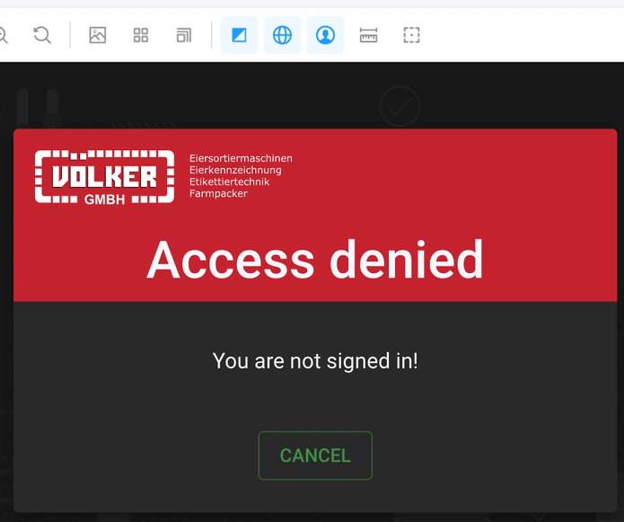
Use toolbar menu
After restarting your storybook, an additional icon will appear in the toolbar:
That allows you to select the session state.
Write stories and include your components
// ./stories/pages/denied.stories.jsx

import DeniedPage from '@/pages/auth/denied';

export default {
  title: 'Pages/Auth',
  component: DeniedPage
};

export const DeniedPageStory = (args) => <DeniedPage />;

DeniedPageStory.parameters = {};
You may now control and test your component state of useSession() by the toolbar items:
Use a fix state to test a component
To make sure that your component may be tested with a fixed auth state regardless the toolbar selection, you may overwrite the session properties by using parameters in your stories:
// /stories/pages/signin.stories.jsx

import SigninPage from '@/pages/auth/signin';

export default {
  title: 'Pages/Auth',
  component: SigninPage
};

export const SigninPageStory = (props) => <SigninPage />;

SigninPageStory.parameters = {
  nextAuthMock: {
    session: 'unknown'
  }
};
The above will load the session set defined by id unknown. You may also define a full session object like:
SigninPageStory.parameters = {
  nextAuthMock: {
    session: {
      data: {
        id: 999,
        login: 'user',
        role: 'user',
        roles: ['user'],
        username: 'User',
        email: 'user@local'
      },
      status: 'unauthenticated'
    }
  }
};
Access current session data in stories
If you need to change your stories code while using session values, you may access those by the useSession hook.
import { useSession } from 'next-auth/react';

export const MyStory = (props) => {
  // get access to current session data
  const session = useSession();

  ...
Customize session auth states
This component brings a default set of auth states: unknown, loading, admin, adminAuthed, user, userAuthed.
/**
 *
 * default items for toolbar menu to select different auth-states while mocking
 *
 */
export const mockAuthStates = {
  unknown: {
    title: 'session unknown',
    session: null
  },
  loading: {
    title: 'session loading',
    session: {
      data: null,
      status: 'loading'
    }
  },
  admin: {
    title: 'admin not authenticated',
    session: {
      data: {
        id: 1,
        login: 'admin',
        role: 'admin',
        roles: ['admin', 'user'],
        username: 'Administrator',
        email: 'admin@local'
      },
      status: 'unauthenticated'
    }
  },
  adminAuthed: {
    title: 'admin authenticated',
    session: {
      data: {
        id: 1,
        login: 'admin',
        role: 'admin',
        roles: ['admin', 'user'],
        username: 'Administrator',
        email: 'admin@local'
      },
      status: 'authenticated'
    }
  },
  user: {
    title: 'user not authenticated',
    session: {
      data: {
        id: 999,
        login: 'user',
        role: 'user',
        roles: ['user'],
        username: 'User',
        email: 'user@local'
      },
      status: 'unauthenticated'
    }
  },
  userAuthed: {
    title: 'user authenticated',
    session: {
      data: {
        id: 999,
        login: 'user',
        role: 'user',
        roles: ['user'],
        username: 'User',
        email: 'user@local'
      },
      status: 'authenticated'
    }
  }
};
This set may be changed completely or in partials for your own needs. Therefore you may create a file in your local folder named .storybook/previewMockAuthStates.js and define an alias for webpack.
Update .storybook/main.js:
module.exports = {
  addons: ['@tomfreudenberg/next-auth-mock/storybook'],
  webpackFinal: async (config) => {
    config.resolve.alias['@tomfreudenberg/next-auth-mock/storybook/preview-mock-auth-states'] = path.resolve(__dirname, 'previewMockAuthStates.js');
  }
};
Webpack will now load your file .storybook/previewMockAuthStates.js for the previewMockAuthStates set:
just clone the default states:
const defaultMockAuthStates = require('@tomfreudenberg/next-auth-mock').mockAuthStates;

module.exports = defaultMockAuthStates;
change partial states:
const defaultMockAuthStates = require('@tomfreudenberg/next-auth-mock').mockAuthStates;

module.exports = {
  ...defaultMockAuthStates,
  admin: {
    title: 'My Admin unauthenticated',
    session: {
      data: {
        id: 777,
        field: 'Additional session field'
      }
    }
  }
}
just your own states:
module.exports = {
  state0: {
    title: 'State zero',
    session: null
  },
  state1: {
    title: 'A State',
    session: {
      data: {
        id: 1,
        user: 'What you like'
      }
    }
  }
}
Customize toolbar icon and items
The toolbar entry can also be changed completely. For that you need to implement manually the decorator in preview.js and just set the options to mockAuthPreviewToolbarItem() as you like. Attention: Do not add the component to the addons in this case.
Update .storybook/preview.js:
import { mockAuthPreviewToolbarItem, withMockAuth } from '@tomfreudenberg/next-auth-mock/storybook';
import { previewMockAuthStates } from '@tomfreudenberg/next-auth-mock/storybook/preview-mock-auth-states';

export const globalTypes = {
  ...mockAuthPreviewToolbarItem({
    description: 'Auswahl Anmeldestatus',
    defaultValue = null,
    icon = 'user',
    items = previewMockAuthStates
  })
};

export const decorators = [withMockAuth];
Jest
Write tests and include your components
// ./tests/pages/signout.stories.jsx

import { render, screen } from '@testing-library/react'
import { withMockAuth } from '@tomfreudenberg/next-auth-mock/jest';
import SignoutPage from '@/pages/auth/signout';

describe('Pages', () => {
  describe('Signout', () => {
    it('should render want to sign out', () => {
      render(withMockAuth(<SignoutPage />, 'userAuthed'));
      expect(screen.getByText('Do you want to sign out?'));
    });
    it('should render not signed in', () => {
      render(withMockAuth(<SignoutPage />, 'unknown'));
      expect(screen.getByText('You are not signed in!'));
    });
  });
});
You may enter the name of an mockAuthStates entry as argument for withMockAuth or put in a session object.
import { mockAuthStates } from '@tomfreudenberg/next-auth-mock';
render(withMockAuth(<SignoutPage />, mockAuthStates.userAuthed.session));

// is equal to

render(withMockAuth(<SignoutPage />, 'userAuthed'));
Valid states are: unknown, loading, admin, adminAuthed, user, userAuthed
Contributing
If you like to contribute to next-auth-mock package or need to use it from source, you have to install the devDependencies and build the dist package.
Just go for:
git clone git@github.com:TomFreudenberg/next-auth-mock.git

cd next-auth-mock

pnpm install

pnpm build
Your ideas and PRs are welcome.
npm Package
You may find, use and download the npm package on npmjs.com.
Documentation
Project homepage - you will find a README at Github
Author & Credits
Author: Tom Freudenberg
Copyright (c) 2022 Tom Freudenberg, released under the MIT license
