storybook-addon-figma
Quickstart
Install the addon
npm i --save-dev matts-storybook-addon-figma
Register the plugin
// in .storybook/addons.js
import '@storybook/addon-actions/register'
// register the Figma addon
import 'storybook-addon-figma/register'
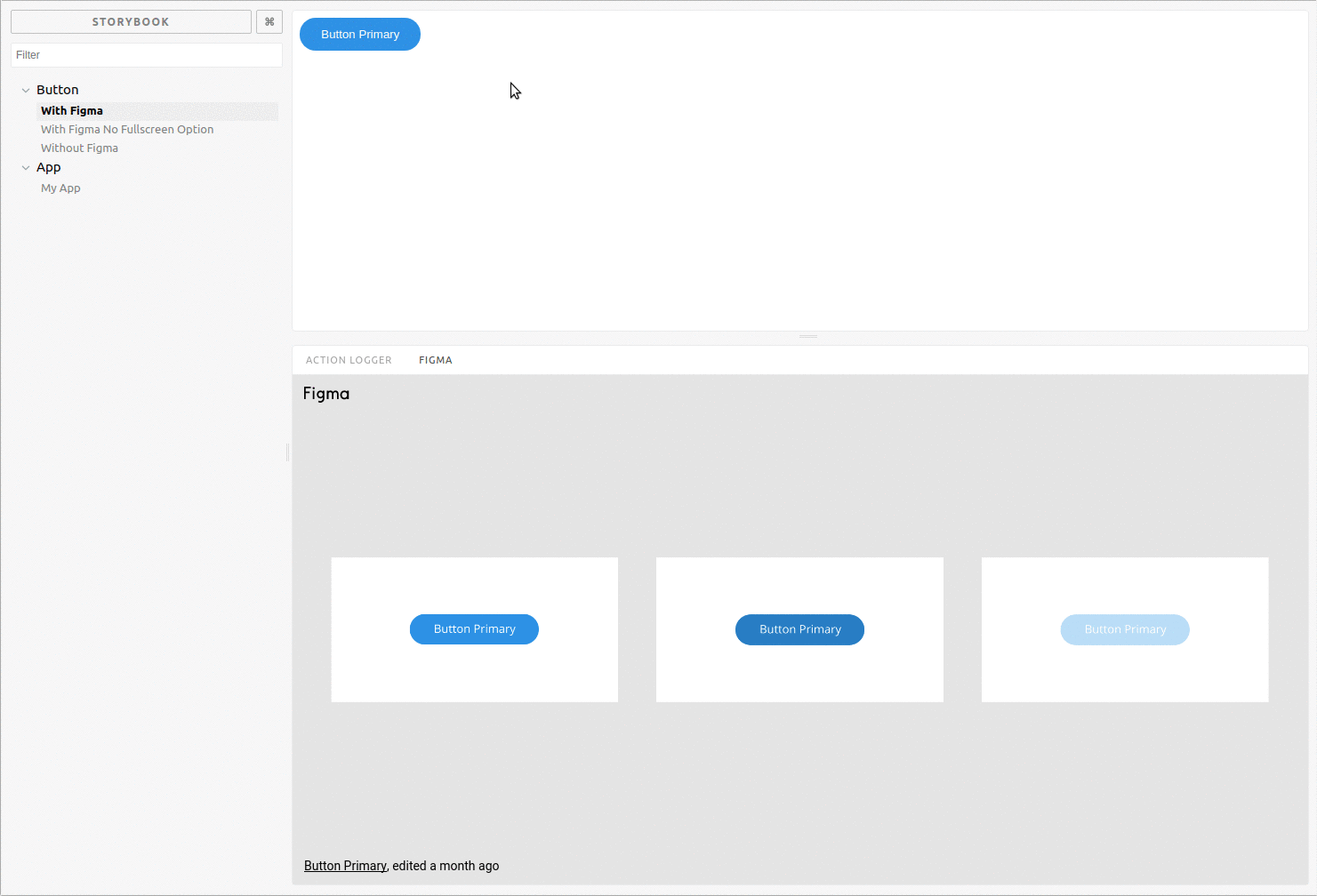
Link a Figma design to your story
import React from 'react'
import { storiesOf } from '@storybook/react'
import { WithFigma } from 'storybook-addon-figma'

storiesOf('Button')
  .add('With Figma', () => (
    <WithFigma
      url={'https://www.figma.com/file/LbcvMJxDtshDmYtdyfJfkA72/Button-Primary'}
    >
      <button>My Button</button>
    </WithFigma>
  ))
Embed a different design on each story
import React from 'react'
import { storiesOf } from '@storybook/react'
import { WithFigma } from 'storybook-addon-figma'

storiesOf('Button')
  .add('primary', () => (
    <WithFigma
      url={'https://www.figma.com/file/LbcvMJxDtshDmYtdyfJfkA72/Button-Primary'}
    >
      <button>My Button</button>
    </WithFigma>
  ))
  .add('secondary', () => (
    <WithFigma
      url={'https://www.figma.com/file/LbcvMJxDtshDmYtdyfJfkA72/Button-Secondary'}
    >
      <button>My Secondary Button</button>
    </WithFigma>
  ))
Or use the decorator to put the same design on each story
import React from 'react'
import { storiesOf } from '@storybook/react'
import figmaDecorator from 'storybook-addon-figma'
import App from './components/App'

storiesOf('App')
  .addDecorator(figmaDecorator({
    url: 'https://www.figma.com/file/LKQ4FJ4bTnCSjedbRpk931/Sample-File',
  }))
  .add('My App', () => (
    <App />
  ))
