Storybook Addon Apollo Client
Use Apollo Client in your Storybook stories.
Versions
- If you're using Apollo Client 2.x and Storybook 5.x use version 1.x
- If you're using Apollo Client 2.x or 3.x and Storybook 6.x use version 4.x
- If you're using Apollo Client 2.x or 3.x and Storybook 7.x use version 5.x
- If you're using Apollo Client 2.x or 3.x and Storybook 8.x use version 7.x
- If you're using Apollo Client 3.x and Storybook 8.3+ use version 8.x
- If you're using Apollo Client 3.x and Storybook 9+ use version 9.x
- If you're using Apollo Client 3.x or 4.x and Storybook 10.0 use version 10.x
- If you're using Apollo Client 3.x or 4.x and Storybook 10.1+ or 11 use version 11.x
Version 11.x changes the setup of the addon. To upgrade from 10.x, see Migrate from 10.x to 11.x.
Install
pnpm
pnpm add -D storybook-addon-apollo-client
yarn
yarn add -D storybook-addon-apollo-client
npm
npm install -D storybook-addon-apollo-client
Add the addon to .storybook/main.ts. This adds the Apollo Client panel.
import { defineMain } from '@storybook/react-vite/node';

export default defineMain({
  // ...rest of config
  addons: ['storybook-addon-apollo-client'],
});
Setup
Register the addon in .storybook/preview.ts and give it a createClient function. The addon:
- calls
createClientwith theapolloClientparameter of each story that has one, each time that the story mounts, so each story gets a new cache and new mocks - gives the client to the story with the provider of your framework
- sends the mocks of the current story to the Apollo Client panel
- types the
apolloClientparameter with the type of the argument ofcreateClient
The setup is the same for each framework. Only the import of the addon changes. For Vue and Angular, also install @vue/apollo-composable or apollo-angular.
| Framework | Import the addon from | The addon gives the client to the story with |
|---|---|---|
| React | storybook-addon-apollo-client |
ApolloProvider from @apollo/client/react |
| Vue 3 | storybook-addon-apollo-client/vue |
@vue/apollo-composable |
| Angular | storybook-addon-apollo-client/angular |
the Apollo service of apollo-angular |
import { definePreview } from '@storybook/react-vite';
import { ApolloClient, InMemoryCache } from '@apollo/client';
import { MockLink } from '@apollo/client/testing';
import apolloClient from 'storybook-addon-apollo-client';

export default definePreview({
  // ...rest of preview
  addons: [
    apolloClient({
      createClient: ({ mocks = [] }: { mocks?: ReadonlyArray<MockLink.MockedResponse> }) =>
        new ApolloClient({ cache: new InMemoryCache(), link: new MockLink(mocks) }),
    }),
  ],
});
This example uses Apollo Client 4. With Apollo Client 3, import MockLink and MockedResponse from @apollo/client/testing, and use MockedResponse in place of MockLink.MockedResponse. For Vue, import from @apollo/client/core and @apollo/client/testing/core, because the other entries of Apollo Client 3 import React. @vue/apollo-composable supports only Apollo Client 3.
Your own options
The apolloClient parameter can hold any options that createClient takes. For example, give MockLink options or a cache with your type policies. This example uses Apollo Client 4:
apolloClient({
  createClient: ({
    mocks = [],
    showWarnings = true,
  }: {
    mocks?: ReadonlyArray<MockLink.MockedResponse>;
    showWarnings?: boolean;
  }) =>
    new ApolloClient({
      cache: new InMemoryCache({ typePolicies }),
      link: new MockLink(mocks, { showWarnings }),
    }),
});
If your options have mocks, they must be mocked responses, so that the panel can show them. Options without mocks are also correct, but then the panel has nothing to show.
Other renderers
For other renderers, for example Svelte, use the /core entry. It connects the panel and types the apolloClient parameter, but you supply the Apollo Client in your own decorator. Give the type of the parameter as a type argument.
import type { MockLink } from '@apollo/client/testing';
import apolloClient from 'storybook-addon-apollo-client/core';

export default definePreview({
  addons: [apolloClient<{ mocks?: ReadonlyArray<MockLink.MockedResponse> }>()],
  decorators: [
    // Your decorator: make a client from context.parameters.apolloClient and give it to the story.
  ],
});
Writing your stories with queries
import preview from '../.storybook/preview';
import { DashboardPage, DashboardPageQuery } from './DashboardPage';

const meta = preview.meta({
  component: DashboardPage,
});

export const Example = meta.story({
  parameters: {
    apolloClient: {
      mocks: [
        {
          request: {
            query: DashboardPageQuery,
          },
          result: {
            data: {
              viewer: null,
            },
          },
        },
      ],
    },
  },
});
Read more about mocked responses at https://www.apollographql.com/docs/react/development-testing/testing
Usage
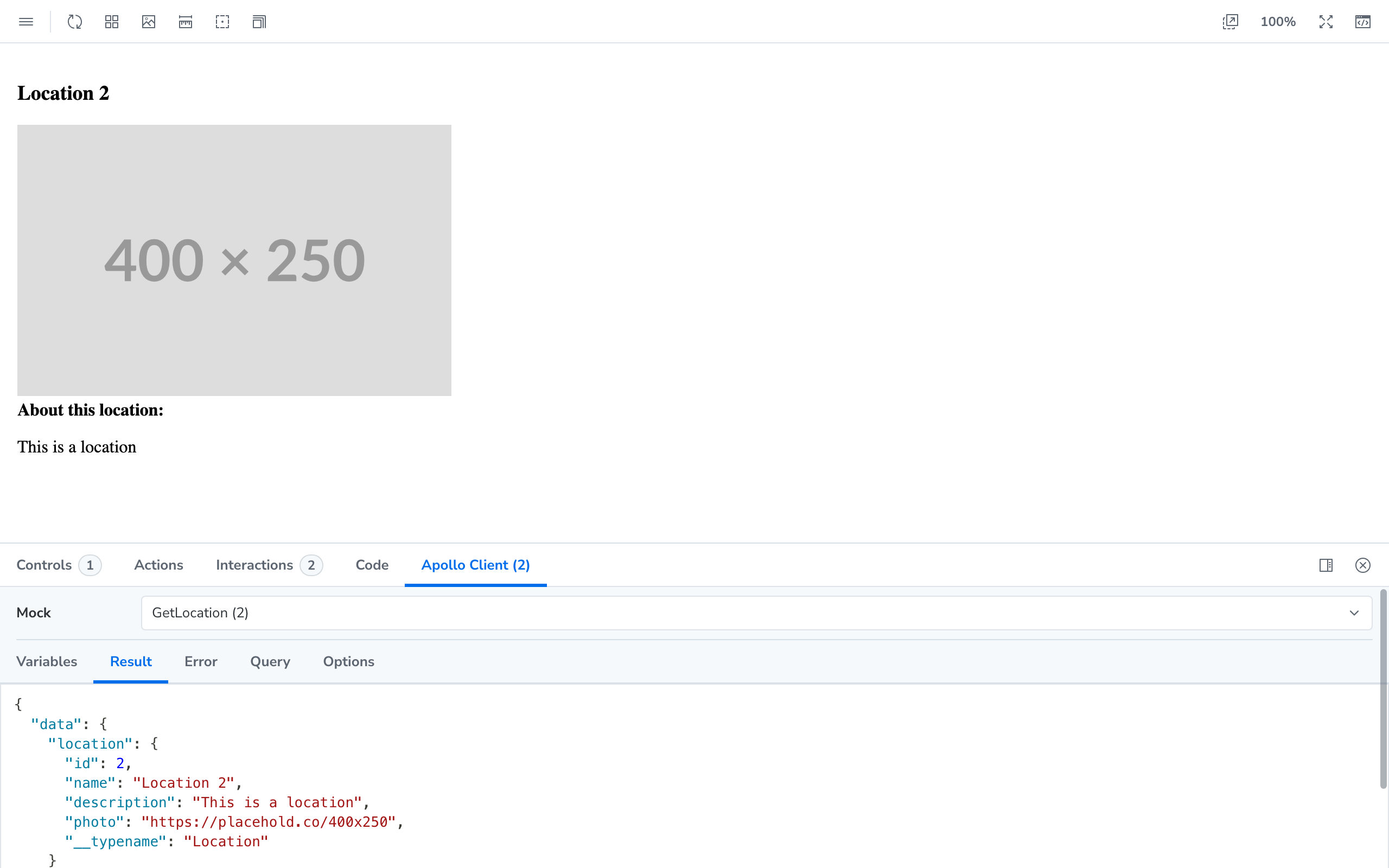
In Storybook, open the addon panel and select the "Apollo Client" tab. Select a mock to see its query, variables, result, error, extensions, and context.
Loading State
Use the delay property to show the loading state.
export const Loading = meta.story({
  parameters: {
    apolloClient: {
      mocks: [
        {
          // The response comes after 1000 ms
          delay: 1000,
          request: {
            query: DashboardPageQuery,
          },
          result: {
            data: {},
          },
        },
      ],
    },
  },
});
Error State
Use the error property to show the error state.
export const Failure = meta.story({
  parameters: {
    apolloClient: {
      mocks: [
        {
          request: {
            query: DashboardPageQuery,
          },
          error: new Error('This is a mock network error'),
        },
      ],
    },
  },
});
Without definePreview
If your preview.ts does not use definePreview, Storybook loads the panel decorator from main.ts automatically. Add the withApolloClient decorator from the entry for your framework. The apolloClient parameter is not typed in this setup.
import type { Preview } from '@storybook/react-vite';
import { withApolloClient } from 'storybook-addon-apollo-client';

const preview: Preview = {
  decorators: [withApolloClient(createClient)],
};

export default preview;
Migrate from 10.x to 11.x
- Update to Storybook 10.1 or later.
- Remove the Apollo Client decorator and its helper functions from
.storybook/preview.ts. The addon supplies them now. - Add the addon with a
createClientfunction toaddonsindefinePreview, as shown in Setup. - If you gave
MockedProviderprops in yourapolloClientparameters, for examplecacheordefaultOptions, add them to the options ofcreateClient. Then use them when you make the client. - Fix the type errors that this shows in your
apolloClientparameters.
Example App
To see real world usage of how to use this addon, check out the example app:
