Storybook Addon Preview can show user selected knobs in various framework code in Storybook
Storybook Addon Preview

Storybook Addon Preview can show user selected controls(args)) or knobs in various framework code in Storybook
Getting Started
- Storybook 6 or newer is required.
- If you use Storybook 5, use version 1.x.
npm i storybook-addon-preview --dev
.storybook/main.js
module.exports = {
    addons: [
        "storybook-addon-preview/register"
    ],
};
Now, write your stories with preview.
How to use with controls(args)
import { previewTemplate, DEFAULT_VANILLA_CODESANDBOX } from "storybook-addon-preview";
// CSF https://storybook.js.org/docs/react/api/csf

export default {
    title: "Example",
}
export const example = e => {
    e.opt1;
    e.num1;
    return ....;
}
example.parameters = {
    preview: [
        {
            tab: "Vanilla",
            template: previewTemplate`
const inst = new Instance({
    opt1: ${"opt1"},
    num1: ${"num1"},
});
            `,
            language: "ts",
            copy: true,
            codesandbox: DEFAULT_VANILLA_CODESANDBOX(["@egjs/infinitegrid"]),
        },
    ],
};
example.args = {
    opt1: false,
    num1: 0,
};
example.argTypes = {
    opt1: {
        control: { type: "boolean" },
        defaultValue: false,
    },
    num1: {
        control: { type: "number" },
        defaultValue: 0,
    },
};
How to use with knobs (deprecated)
import { withPreview, previewTemplate, DEFAULT_VANILLA_CODESANDBOX } from "storybook-addon-preview";
import { withKnobs, boolean, number } from "@storybook/addon-knobs";

const stories = storiesOf("Example", module);

stories.addDecorator(withKnobs).addDecorator(withPreview);

stories.add("example", e => {
    const opt1Value = boolean("opt1", false);
    const num1Value = number("num1", 0);

    return ....;
}, {
    preview: [
        {
            tab: "Vanilla",
            template: previewTemplate`
const inst = new Instance({
    opt1: ${"opt1"},
    num1: ${"num1"},
});
            `,
            language: "ts",
            copy: true,
            codesandbox: DEFAULT_VANILLA_CODESANDBOX(["@egjs/infinitegrid"]),
        },
    ]
});
// CSF https://storybook.js.org/docs/react/api/csf

export default {
    title: "Example",
    decorators: [withKnobs, withPreview],
    parameters: {
        preview: [
            {
                tab: "Vanilla",
                template: previewTemplate`
    const inst = new Instance({
        opt1: ${"opt1"},
        num1: ${"num1"},
    });
                `,
                language: "ts",
                copy: true,
                codesandbox: DEFAULT_VANILLA_CODESANDBOX(["@egjs/infinitegrid"]),
            },
        ],
    },
}
export const example = e => {
    const opt1Value = boolean("opt1", false);
    const num1Value = number("num1", 0);

    return ....;
}
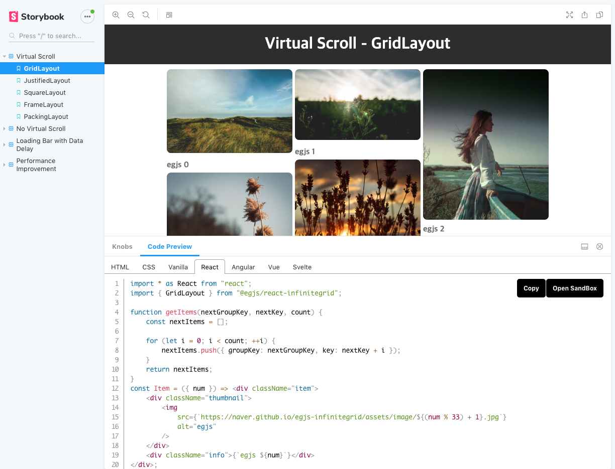
InfiniteGrid's Storybook Example
Properties
export interface PreviewParameter {
    /**
     * The name of the tab to appear in the preview panel
     */
    tab?: string;
    /**
     * Code to appear in the corresponding tab of the preview panel.
     */
    template?: string
    | ((props: Record<string, any>, globals: Record<string, any>) => any)
    | ReturnType<typeof previewTemplate>;
    /**
     * Description of the corresponding template code
     */
    description?: string;
    /**
     * Custom args or knobs that can be used in the preview template.
     */
    knobs?: Record<string, any>;
    /**
     * Custom args or knobs that can be used in the preview template.
     */
    args?: Record<string, any>;
    /**
     * Whether to display the copy button
     */
    copy?: boolean;
    /**
     * Language to highlight its code ("html", "css", "jsx", "tsx", "ts", "js")
     */
    language?: string;
    /**
     * Language presets to link to codesandbox
     * @see {@link https://github.com/naver/storybook-addon-preview/blob/master/README.md}
     */
    codesandbox?: CodeSandboxValue
    | ((previewMap: Record<string, string[]>) => CodeSandboxValue);
    /**
     * Whether to share line numbers when tab names are the same
     */
    continue?: boolean;
    /**
     * Formatting type for that code if you want formatting
     * Only "html" is supported as built-in support.
     * If you want to use custom formatter, use `previewFormatter` config in manager.js
     * @see {@link https://github.com/naver/storybook-addon-preview/blob/master/README.md}
     */
    format?: string | boolean;
}
Formatting
Storybook basically uses the standalone version of prettier and parser-html.
So PreviewParameter format only supports "html".
If you use a custom formatter, be careful as the file size may increase.
See: https://prettier.io/docs/en/browser.html
// .storybook/manager.js
import { addons } from "@storybook/addons";
import * as prettier from "prettier/standalone";
import * as htmlParser from "prettier/parser-html";
import * as babelParser from "prettier/parser-babel";
import * as postCSSParser from "prettier/parser-postcss";

addons.setConfig({
    previewFormatter: (format, code) => {
        if (format === "tsx") {
            return prettier.format(code, {
                parser: "babel-ts",
                plugins: [
                    htmlParser,
                    babelParser,
                    postCSSParser,
                ],
            });
        } else if (format === "vue") {
            return prettier.format(code, {
                parser: "vue",
                plugins: [
                    htmlParser,
                    babelParser,
                    postCSSParser,
                ],
            });
        }
        return code;
    },
});
// stories.js

export const Story = {
    parameters: {
        preview: [
            {
                tab: "Vanilla",
                template: `
const inst = new Instance({
    opt1: "opt1",
    num1: "num1",
});
                `,
                language: "ts",
                format: "tsx",
            },
        ],
    }
}
Template
- If the template is code that does not use knobs, you can just write it as
stringtype.
{
    template: `
const inst = new Instance({
    opt1: 1,
    num1: 1,
});
`,
}
- If you simply want to express knobs as they are, use
previewTemplatefunction
import { previewTemplate } from "storybook-addon-preview";

{
    args: {
        args1: true,
    },
    template: previewTemplate`
const inst = new Instance({
    opt1: ${"opt1"},
    num1: ${"num1"},
    args1: ${"args1"},
});
`,
}
- Use functions if you want to work with variables
{
    args: {
        args1: true,
    },
    template: (props, globals) => `
const inst = new Instance({
    opt1: ${props.opt1},
    num1: ${props.num1},
    args1: ${props.args1},
});
`,
}
Highlight
- If you want to highlight your code, add a
[highlight]comment.
[
    {
        template: previewTemplate`
    const inst = new Instance({
        /* [highlight] highlight opt1 */
        opt1: ${"opt1"},
        num1: ${"num1"},
    });
        `,
        language: "js",
    },
    {
        template: previewTemplate`
<!-- [highlight] highlight html -->
<div style="width: ${"width"}px;"></div>
        `,
        language: "html",
    },
]
- If you want to highlight your code area, add the
[highlight-start]and[highlight-end]comments.
[
    {
        template: previewTemplate`
    const inst = new Instance({
        /* [highlight-start] highlight options */
        opt1: ${"opt1"},
        num1: ${"num1"},
        /* [highlight-end] */
    });
    `,
    },
    {
        template: previewTemplate`
<!-- [highlight-start] highlight html -->
<div style="width: ${"width"}px;"></div>
<!-- [highlight-end] -->
        `,
        language: "html",
    },
]
Props
Easily use options or props or use props template when you have many options
export interface PropsOptions {
    indent?: number;
    wrap?: string;
    prefix?: string;
}
- DEFAULT_PROPS_TEMPLATE(names: string[], options: PropsOptions)
import { previewTemplate, DEFAULT_PROPS_TEMPLATE } from "storybook-addon-preview";

{
    template: previewTemplate`
/* [highlight] You can see opt1, num1 options. */
const inst = new Instance({
${DEFAULT_PROPS_TEMPLATE(["opt1", "num1"], { indent: 4 })}
});
`,
}
- JSX_PROPS_TEMPLATE(names: string[], options: PropsOptions)
import { previewTemplate, JSX_PROPS_TEMPLATE } from "storybook-addon-preview";

{
    template: previewTemplate`
/* [highlight] You can see opt1, num1 options. */
<Instance
${JSX_PROPS_TEMPLATE(["opt1", "num1"], { indent: 4 })}
    />
`,
    language: "jsx",
}
- ANGULAR_PROPS_TEMPLATE(names: string[], options: PropsOptions)
import { previewTemplate, ANGULAR_PROPS_TEMPLATE } from "storybook-addon-preview";

{
    template: previewTemplate`
/* [highlight] You can see opt1, num1 options. */
<ngx-instance
${ANGULAR_PROPS_TEMPLATE(["opt1", "num1"], { indent: 4 })}
    ></ngx-instance>
`,
    language: "html",
}
- VUE_PROPS_TEMPLATE(names: string[], options: PropsOptions)
import { previewTemplate, VUE_PROPS_TEMPLATE } from "storybook-addon-preview";

{
    template: previewTemplate`
/* [highlight] You can see opt1, num1 options. */
<vue-instance
${VUE_PROPS_TEMPLATE(["opt1", "num1"], { indent: 4 })}
    ></vue-instance>
`,
    language: "html",
}
- LIT_PROPS_TEMPLATE(names: string[], options: PropsOptions)
import { previewTemplate, LIT_PROPS_TEMPLATE } from "storybook-addon-preview";

{
    template: previewTemplate`
/* [highlight] You can see opt1, num1 options. */
html${"`"}<lit-instance
${LIT_PROPS_TEMPLATE(["opt1", "num1"], { indent: 4 })}
    ></lit-instance>${"`"};
`,
    language: "js",
}
CodeSandBox
Link the code you used to the code sandbox. There is a dependency and initial settings file for linking code sandboxes. The frameworks we support are react, angular, svelte, lit, preact, and vue.
const CodeSandboxValue = {
    // https://github.com/codesandbox/codesandbox-importers/blob/master/packages/import-utils/src/create-sandbox/templates.ts#L63
    template: "vue-cli",
    files: {
        "src/main.js": `
import Vue from "vue";
import App from "./App.vue";

Vue.config.productionTip = false;

new Vue({
render: h => h(App)
}).$mount("#app");
    `,
        "src/App.vue": {
            tab: "Vue",
        },
    },
    dependencies: {
        "vue": "^2.6.0",
    },
    userDependencies: ["@egjs/vue-infinitegrid@^3"],
});
You can use the default codesandbox presets.
- External modules except framework modules used in code
// DEFAULT_(VANILLA)_CODESANDBOX
// DEFAULT_(REACT)_CODESANDBOX
// DEFAULT_(ANGULAR)_CODESANDBOX
type DEFAULT_FRAMEWORK_CODESANDBOX: CodeSandboxTemplate = (userDependencies?: string[], files?: FilesParam) => CodeSandboxValue;
- The codesandbox presets provided in the preview are vanilla, react, angular, vue, preact, lit and svelte.
| Name | Default Tab Names | Code |
|---|---|---|
| DEFAULT_VANILLAJS_CODESANDBOX(JS) | HTML, VANILLA, CSS(optional) | View Code |
| DEFAULT_VANILLA_CODESANDBOX(TS) | HTML, VANILLA, CSS(optional) | View Code |
| DEFAULT_REACT_CODESANDBOX(TS) | React, CSS(optional) | View Code |
| DEFAULT_REACTJS_CODESANDBOX(TS) | ReactJS, CSS(optional) | View Code |
| DEFAULT_ANGULAR_CODESANDBOX | Angular(html, component, module), CSS(optional) | View Code |
| DEFAULT_VUE_CODESANDBOX | Vue | View Code |
| DEFAULT_VUE3_CODESANDBOX | Vue3 | View Code |
| DEFAULT_SVELTE_CODESANDBOX | Svelte | View Code |
| DEFAULT_LIT_CODESANDBOX | Lit, CSS(optional) | View Code |
The following explains how to use the default codesandbox preset.
import {
    DEFAULT_VANILLA_CODESANDBOX,
    DEFAULT_REACT_CODESANDBOX,
    DEFAULT_ANGULAR_CODESANDBOX,
} from "storybook-addon-preview";

{
    preview: [
        {
            // { tab: "HTML" }
            tab: "HTML",
            template: ...,
        },
        {
            // { tab: "CSS" }
            tab: "CSS",
            template: ...,
        },
        {
            // { tab: "Vanilla" }
            tab: "Vanilla",
            template: ...,
            codesandbox: DEFAULT_VANILLA_CODESANDBOX(["@egjs/infinitegrid"]),
        },
        {
            // { tab: "React" }
            tab: "React",
            template: ...,
            codesandbox: DEFAULT_REACT_CODESANDBOX(["@egjs/react-infinitegrid"]),
        },
        {
            // { tab: "Angular", index: 0 }
            tab: "Angular",
            description: "app.component.html",
            template: ...,
            language: "markup",
            codesandbox: DEFAULT_ANGULAR_CODESANDBOX(["@egjs/ngx-infinitegrid"]),
        },
        {
            // { tab: "Angular", index: 1 }
            tab: "Angular",
            description: "app.component.ts",
            template: ...,
            language: "tsx",
            codesandbox: DEFAULT_ANGULAR_CODESANDBOX(["@egjs/ngx-infinitegrid"]),
        },
        {
            // { tab: "Angular", index: 2 }
            tab: "Angular",
            description: "app.module.ts",
            template: ...,
            language: "typescript",
            codesandbox: DEFAULT_ANGULAR_CODESANDBOX(["@egjs/ngx-infinitegrid"]),
        },
    ],
}
Change tab names
Check the code sandbox preset code for the file names.
import {
    DEFAULT_VANILLA_CODESANDBOX,
    DEFAULT_REACT_CODESANDBOX,
    DEFAULT_ANGULAR_CODESANDBOX,
} from "storybook-addon-preview";

{
    preview: [
        {
            tab: "Custom HTML",
            template: ...,
        },
        {
            tab: "Custom CSS",
            template: ...,
        },
        {
            tab: "Vanilla",
            template: ...,
            codesandbox: DEFAULT_VANILLA_CODESANDBOX(["@egjs/infinitegrid"], {
                "index.html": {
                    tab: "Custom HTML",
                    template: "html",
                    values: {
                        cssFiles: ["src/styles.css"],
                        jsFiles: ["src/index.ts"],
                    },
                },
                "src/styles.css" : { tab: "Custom CSS" },
            }),
        },
        {
            tab: "Angular Component HTML",
            description: "app.component.html",
            template: ...,
            language: "markup",
            codesandbox: DEFAULT_ANGULAR_CODESANDBOX(["@egjs/ngx-infinitegrid"], {
                "src/app/app.component.html": { tab: "Angular Component HTML" },
                "src/app/app.component.ts": { tab: "Angular Component" },
                "src/app/app.module.ts": { tab: "Angular Module" },
            }),
        },
        {
            tab: "Angular Component",
            description: "app.component.ts",
            template: ...,
            language: "tsx",
            codesandbox: DEFAULT_ANGULAR_CODESANDBOX(["@egjs/ngx-infinitegrid"], {
                "src/app/app.component.html": { tab: "Angular Component HTML" },
                "src/app/app.component.ts": { tab: "Angular Component" },
                "src/app/app.module.ts": { tab: "Angular Module" },
            }),
        },
        {
            tab: "Angular Module",
            description: "app.module.ts",
            template: ...,
            language: "typescript",
            codesandbox: DEFAULT_ANGULAR_CODESANDBOX(["@egjs/ngx-infinitegrid"], {
                "src/app/app.component.html": { tab: "Angular Component HTML" },
                "src/app/app.component.ts": { tab: "Angular Component" },
                "src/app/app.module.ts": { tab: "Angular Module" },
            }),
        },
    ],
};
Make Custom CodeSandbox
templateis based on this logic.dependencies,devDependencies,scriptsare based onpackage.json'sdependencies,devDependencies,scriptsuserDependenciesare dependencies of type array. ([vue@^2.6.0])fileshas string, CodeFileTab(object), and null types.- CodeFileTab: Returns the preview tab as a string value.
- null: Delete the existing file.
CodeSandbox supports various templates. To use the template, you need to define the basic files yourself. Please refer to the template in the CodeSandbox.
export const DEFAULT_VUE_CODESANDBOX: CodeSandboxTemplate = (userDependencies = [], files = {}) => {
    return {
        template: "vue-cli",
        files: {
            "src/main.js": `
import Vue from "vue";
import App from "./App.vue";

Vue.config.productionTip = false;

new Vue({
    render: h => h(App)
}).$mount("#app");
        `,
            "src/App.vue": {
                tab: "Vue",
            },
            ...files,
        },
        dependencies: {
            "vue": "^2.6.0",
        },
        userDependencies,
    };
};
Contributing
See CONTRIBUTING.md.
License
storybook-addon-preview is released under the MIT license.
Copyright (c) 2020-present NAVER Corp.

Permission is hereby granted, free of charge, to any person obtaining a copy
of this software and associated documentation files (the "Software"), to deal
in the Software without restriction, including without limitation the rights
to use, copy, modify, merge, publish, distribute, sublicense, and/or sell
copies of the Software, and to permit persons to whom the Software is
furnished to do so, subject to the following conditions:

The above copyright notice and this permission notice shall be included in
all copies or substantial portions of the Software.

THE SOFTWARE IS PROVIDED "AS IS", WITHOUT WARRANTY OF ANY KIND, EXPRESS OR
IMPLIED, INCLUDING BUT NOT LIMITED TO THE WARRANTIES OF MERCHANTABILITY,
FITNESS FOR A PARTICULAR PURPOSE AND NONINFRINGEMENT.  IN NO EVENT SHALL THE
AUTHORS OR COPYRIGHT HOLDERS BE LIABLE FOR ANY CLAIM, DAMAGES OR OTHER
LIABILITY, WHETHER IN AN ACTION OF CONTRACT, TORT OR OTHERWISE, ARISING FROM,
OUT OF OR IN CONNECTION WITH THE SOFTWARE OR THE USE OR OTHER DEALINGS IN
THE SOFTWARE.
