Story HTML
Displays the story's compiled HTML in both the addon panel and autodocs canvas.
View on GithubNew to Storybook?Get started
6
Downloads per week
Storybook Addon | Story HTML
Displays the story's compiled HTML in both the addon panel and the autodocs canvas.
Requirements
- Storybook 9 or higher (lower versions have not been tested)
- Node.js 18+
Installation
pnpm
pnpm add -D storybook-addon-story-html
npm
npm install --save-dev storybook-addon-story-html
yarn
yarn add -D storybook-addon-story-html
Registering the addon
Add the addon to your Storybook configuration in .storybook/main.js:
const config: StorybookConfig = {
  // ...rest of config
  addons: [
    'storybook-addon-story-html',
    // other addons...
  ],
};
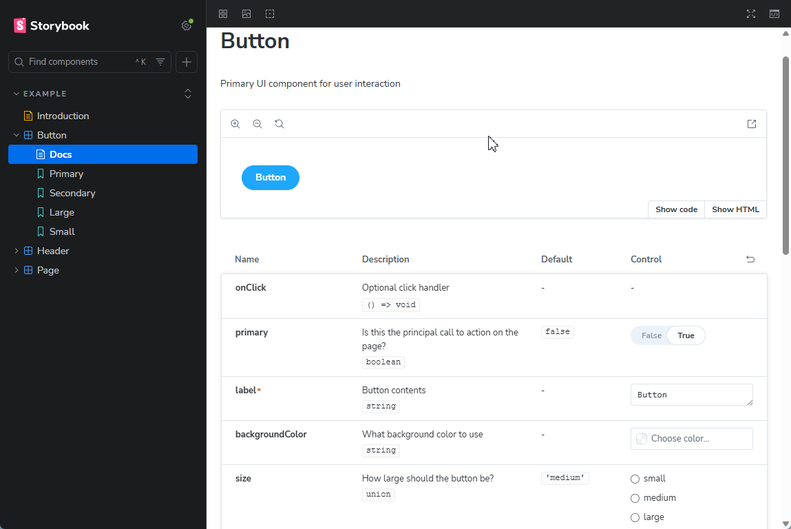
Basic Usage / Example
The addon is enabled globally. You can tweak its behavior with the storyHtml parameter available in preview.js/preview.ts or per-story.
Example .storybook/preview.ts:
import type { Preview } from '@storybook/react-vite';

const preview: Preview = {
  parameters: {
    storyHtml: {
      // customize options here (see Parameters below)
    },
  },
};

export default preview;
You can also set storyHtml per-story or per-component in the parameters object in your story files:
export default {
  title: 'Example/Button',
  component: Button,
  parameters: {
    storyHtml: {
      panelTitle: 'Rendered HTML',
    },
  },
};
Parameters
root:string | (storyFn, context) => string— Selector or a function returning a selector to specify the root element to extract HTML from. Example:'.component-wrapper'or(storyFn, context) => { const root = getMyDynamicRoot(storyFn, context); return root; }.panelTitle:string— Title shown in the addon panel. Default:HTMLcanvasToggleText:{ opened: string; closed: string }— Custom text for the toggle that shows/hides the HTML overlay in the canvas. Default:{ opened: 'Hide HTML'; closed: 'Show HTML' }theme:string— highlight.js theme name. (https://highlightjs.org/examples). Default:github-dark-dimmedsyncCanvasTogglesAsTabs:boolean— Treat the HTML and code views as exclusive tabs (opening one closes the other). Default:falsedisable:boolean— Disable the addon when true.waitForRender:number— The timeout value (in milliseconds) that is used to ensure the DOM has finished loading. Default:0debounceDelay:number— Delay in milliseconds before formatting HTML to debounce rapid changes. Default:300retrieveHtml:(storyFn, context) => string | Promise<string>— Custom function to retrieve the HTML string for the story. Useful for server-side rendering or custom renderers. By default the markup is extracted from the DOM.transform:(code: string) => string | Promise<string>— Transform the captured HTML (e.g., to post-process or wrap it) before display.prettierOptions:Prettier Options— Formatting options passed to Prettier when formatting. (https://prettier.io/docs/options)
Example with several options:
const preview: Preview = {
  parameters: {
    storyHtml: {
      panelTitle: 'Markup',
      canvasToggleText: {
        opened: 'Hide Markup',
        closed: 'Show Markup',
      },
      root: '.component-wrapper',
      theme: 'shades-of-purple',
      waitForRender: 1000,
      prettierOptions: {
        tabWidth: 2,
        useTabs: false
      },
    },
  },
};
Specific Examples
- Per-story disabling:
export default {
  title: 'Example/Button',
  component: Button,
  parameters: {
    storyHtml: {
      disable: true,
    },
  },
};
- Use
transformto remove html comments
export default {
  title: 'Example/Button',
  component: Button,
  parameters: {
    transform: (html) => html.replace(/<!--.*?-->/g, ''),
  },
};
- Use a custom
retrieveHtmlto render server-side markup:
import { renderToStaticMarkup } from 'react-dom/server';

const preview: Preview = {
  parameters: {
    storyHtml: {
      retrieveHtml: (storyFn, context) => renderToStaticMarkup(storyFn(context)),
    },
  },
};
Notes & Troubleshooting
- This addon relies heavily on Storybook's markup structure and class names. There is a possibility of conflicting with other addons/configurations.
- The
rootandwaitForRenderparameters will not have an impact when utilizing a customretrieveHtmlfunction.
Contributing / Development
- Build locally with:
pnpm run build - Run storybook:
pnpm run storybook.
Made by
- dawhite

Work with
Angular
Ember
HTML
Preact
React
React native
Svelte
Vue
Web Components
Tags