storybook-addon-vite-mock
Provides module mocking functionality like `jest.mock` on Storybook.
npm install storybook-addon-vite-mock
335
Downloads per week
Readme View on GitHub
storybook-addon-vite-mock
Provides module mocking functionality like jest.mock on Storybook.
usage
Added 'storybook-addon-vite-mock' to Storybook addons. Only works if Webpack is used in the Builder.
Addon options
Include and exclude are enabled for storybook build where Babel is used.
Not used in storybook dev.
If include is omitted, all modules are covered.
  addons: [
    {
      name: 'storybook-addon-vite-mock',
      options: {
        //ignore 'abc.js'
        exclude: (id)=>id==="abc.js",
      }
    }
  ],
Storybook@8 & @storybook/react-vite
- .storybook/main.ts
import { mergeConfig } from 'vite';
import { viteMockPlugin } from 'storybook-addon-vite-mock';

/** @type { import('@storybook/react-vite').StorybookConfig } */
const config = {
  stories: ['../stories/**/*.mdx', '../stories/**/*.stories.@(js|jsx|mjs|ts|tsx)'],
  addons: [
    '@storybook/addon-onboarding',
    '@storybook/addon-links',
    '@storybook/addon-essentials',
    '@chromatic-com/storybook',
    '@storybook/addon-interactions',
    'storybook-addon-vite-mock', // Add this line
  ],
  framework: {
    name: '@storybook/react-vite',
    options: {},
  },
  docs: {
    autodocs: 'tag',
  },
};
export default config;
Sample1
test.ts
export const Test = () => 'Test';
Button.tsx
import React from 'react';
import PropTypes from 'prop-types';
import './button.css';
import { Test } from './test';

/**
 * Primary UI component for user interaction
 */
export const Button = ({ primary, backgroundColor, size, label, ...props }) => {
  const mode = primary ? 'storybook-button--primary' : 'storybook-button--secondary';
  return (
    <button
      type="button"
      className={['storybook-button', `storybook-button--${size}`, mode].join(' ')}
      style={backgroundColor && { backgroundColor }}
      {...props}
      onClick={() => {
        props.onClick();
      }}
    >
      {label}
      <div>
        {
          // insert mock here
          Test()
        }
      </div>
    </button>
  );
};

Button.propTypes = {
  /**
   * Is this the principal call to action on the page?
   */
  primary: PropTypes.bool,
  /**
   * What background color to use
   */
  backgroundColor: PropTypes.string,
  /**
   * How large should the button be?
   */
  size: PropTypes.oneOf(['small', 'medium', 'large']),
  /**
   * Button contents
   */
  label: PropTypes.string.isRequired,
  /**
   * Optional click handler
   */
  onClick: PropTypes.func,
};

Button.defaultProps = {
  backgroundColor: null,
  primary: false,
  size: 'medium',
  onClick: undefined,
};
Button.stories.ts
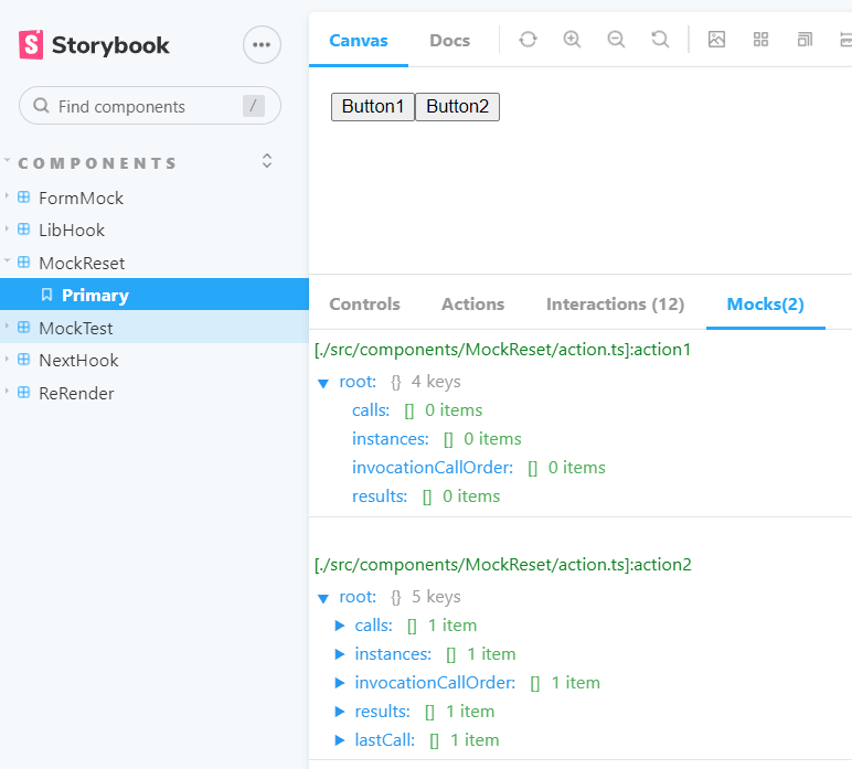
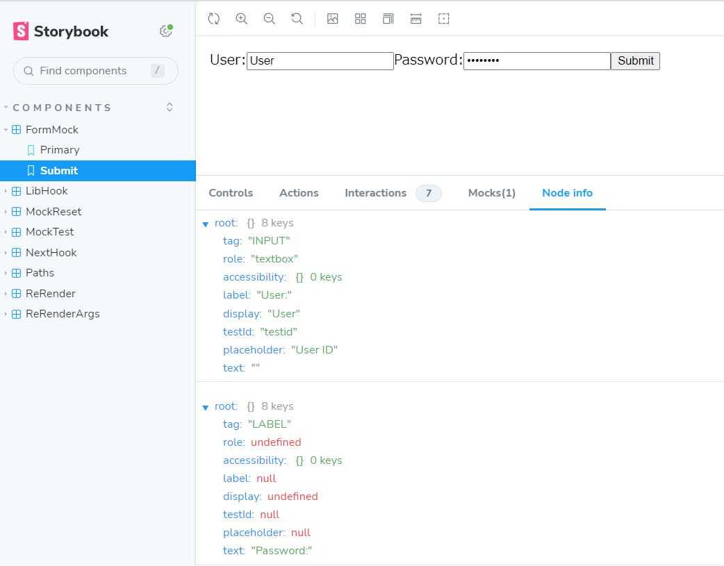
createMock replaces the target module function with the return value of jest.fn().
The mockRestore() is automatically performed after the Story display is finished.
import { fn } from '@storybook/test';
import { StoryObj } from '@storybook/react';
import { Button } from './Button';
import { Test } from './test';
import { createMock, getMock, render } from 'storybook-addon-vite-mock';

// More on how to set up stories at: https://storybook.js.org/docs/writing-stories#default-export
export default {
  title: 'Example/Button',
  component: Button,
  parameters: {
    // Optional parameter to center the component in the Canvas. More info: https://storybook.js.org/docs/configure/story-layout
    layout: 'centered',
    moduleMock: {
      mock: () => {
        const mock = createMock(Test);
        return [mock];
      },
    },
  },
  // This component will have an automatically generated Autodocs entry: https://storybook.js.org/docs/writing-docs/autodocs
  tags: ['autodocs'],
  // More on argTypes: https://storybook.js.org/docs/api/argtypes
  argTypes: {
    backgroundColor: { control: 'color' },
  },
  // Use `fn` to spy on the onClick arg, which will appear in the actions panel once invoked: https://storybook.js.org/docs/essentials/actions#action-args
  args: {
    onClick: () => {
      fn();
    },
  },
};

// More on writing stories with args: https://storybook.js.org/docs/writing-stories/args
export const Primary: StoryObj = {
  args: {
    primary: true,
    label: 'Button',
  },
  play: async ({ parameters }) => {
    const mock = getMock(parameters, Test);
    mock.mockReturnValue('Primary');
    render(parameters);
  },
};

export const Secondary = {
  args: {
    label: 'Button',
  },
  play: async ({ parameters }) => {
    const mock = getMock(parameters, Test);
    mock.mockReturnValue('Secondary');
    render(parameters);
  },
};

export const Large = {
  args: {
    size: 'large',
    label: 'Button',
  },
  play: async ({ parameters }) => {
    const mock = getMock(parameters, Test);
    mock.mockReturnValue('Large');
    render(parameters);
  },
};

export const Small = {
  args: {
    size: 'small',
    label: 'Button',
  },
  play: async ({ parameters }) => {
    const mock = getMock(parameters, Test);
    mock.mockReturnValue('Small');
    render(parameters);
  },
};