Conditional Toolbar Selector
Helper Storybook addon to define story specific toolbar dropdown to use in custom decorators

storybook-conditional-toolbar-selector
Helper Storybook addon to define story specific toolbar dropdown to use in custom decorators, similar to globals but with multiple variants.
E.g. for different sets of languages or themes available for backend vs public site specific stories or having some options not available on all stories.
Setup / Usage
With npm:
npm install --save-dev storybook-conditional-toolbar-selector
With yarn:
yarn add -D storybook-conditional-toolbar-selector
Register addon in .storybook/main.js or .storybook/main.ts
module.exports = {
  // ...
  addons: [
    'storybook-conditional-toolbar-selector',
    // ...
  ],
};
Define available sets and options in .storybook/preview.js or .storybook/preview.ts
export const parameters = {
actions: { argTypesRegex: '^on[A-Z].*' },
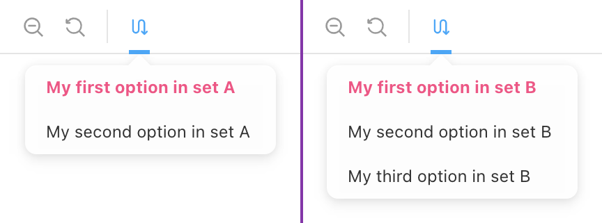
customConditionalToolbar: {
/** Defines the possible sets that can be shown */
sets: [
{
id: 'set-a',
options: [
{ id: 'a1', title: 'My First Option in Set A' },
{ id: 'a2', title: 'My Second Option in Set B' },
],
},
{
id: 'set-b',
options: [{ id: 'b1', title: 'Set B Option 1' }, { id: 'b2' }],
},
],
/** Icon to use in toolbar, defaults to `switchalt`. All possible icons here: https://storybookjs.netlify.app/official-storybook/?path=/story/basics-icon--labels */
icon: 'redirect',
/** title when hovering over the icon */
title: 'Test title',
/** Setting disable to true makes the addon disabled by default */
// disable: true,
},
};
Use the customConditionalToolbar parameter in you story to define if and which set to use:
export const MyStory = Template.bind({});
MyStory.parameters = {
  customConditionalToolbar: {
    setToUse: 'set-b',
    defaultOption: 'b2',
  },
};
Preview Parameters API (Global)
{
  /** Title for the toolbar icon - (Optional) */
  title?: string;

  /** Icon to use in toolbar, defaults to `switchalt`. All possible icons here: https://storybookjs.netlify.app/official-storybook/?path=/story/basics-icon--labels - (Optional) */
  icon?: IconsProps["icon"];

  /** Sets of dropdown options */
  sets: DropdownSet[];

  /** Default set to use `null | undefined` do disable theme selection if not explicitly set - (Optional) */
  default?: string | null;

  /** If nothing is selected the first option is auto-selected - defaults to `true` - (Optional)*/
  autoSelectFirstOption?: boolean;

  /** If `true` toolbar item is disabled (hidden) - (Optional) */
  disable?: boolean;
};
Typescript type ConditionalToolbarSelectorParameter
Story Parameter API (Per Story)
All options that Preview Parameters API (Global) provides (all as optional) plus the options below:
{
  /** Set to pick the theme from - (Optional)*/
  setToUse?: string | null;

  /** default option to select - (Optional) */
  defaultOption?: string | null;
}
Typescript type CustomConditionalToolbarStoryParameter
Consumption
Notes:
- Per Set selection persists across stories until refresh/reload of storybook
- If needed the defaults and fallbacks need to be set manually (Example)
- All examples are in react, but it should in theory work in all frameworks
