storybook-addon-figma
Live Demo: https://swapkats.github.io/storybook-addon-figma
Quickstart
Install the addon
npm i --save-dev storybook-figma
Register the plugin
// in .storybook/addons.js
import '@storybook/addon-actions/register'
// register the Figma addon
import 'storybook-figma/register'
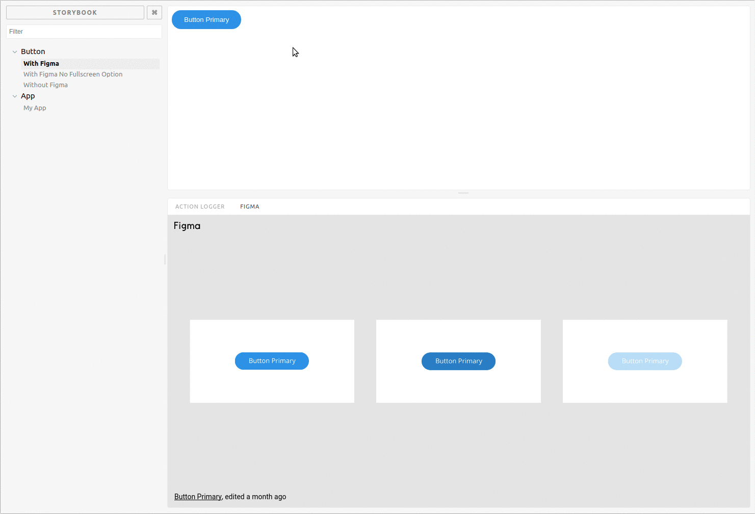
Link a Figma design to your story
import React from 'react'
import { storiesOf } from '@storybook/react'
import { WithFigma } from 'storybook-figma'

storiesOf('Button')
  .add('With Figma', () => (
    <WithFigma
      url={'https://www.figma.com/file/LbcvMJxDtshDmYtdyfJfkA72/Button-Primary'}
    >
      <button>My Button</button>
    </WithFigma>
  ))
Embed a different design on each story
import React from 'react'
import { storiesOf } from '@storybook/react'
import { WithFigma } from 'storybook-figma'

storiesOf('Button')
  .add('primary', () => (
    <WithFigma
      url={'https://www.figma.com/file/LbcvMJxDtshDmYtdyfJfkA72/Button-Primary'}
    >
      <button>My Button</button>
    </WithFigma>
  ))
  .add('secondary', () => (
    <WithFigma
      url={'https://www.figma.com/file/LbcvMJxDtshDmYtdyfJfkA72/Button-Secondary'}
    >
      <button>My Secondary Button</button>
    </WithFigma>
  ))
Or use the decorator to put the same design on each story
import React from 'react'
import { storiesOf } from '@storybook/react'
import figmaDecorator from 'storybook-figma'
import App from './components/App'

storiesOf('App')
  .addDecorator(figmaDecorator({
    url: 'https://www.figma.com/file/LKQ4FJ4bTnCSjedbRpk931/Sample-File',
  }))
  .add('My App', () => (
    <App />
  ))
Show Figma design in right panel
If you find that the Figma panel at the bottom is not big enough to fit your designs, it is possible to move the panel to the right of the window instead, where it is possible to give it more space. This requires the @storybook/addons-options addon. Note however that it is only possible to do this for all stories at once, and will move all addon panels to the right. A simple setup is shown here.
Install the addon
npm install --save-dev @storybook/addon-options
Register the options addon in your addons.js
// in .storybook/addons.js
import '@storybook/addon-actions/register'
import 'storybook-figma/register'
// register the options addon
import '@storybook/addon-options/register';
Import and use the setOptions function in your config.js file
// in .storybook/config.js
import * as storybook from '@storybook/react';
// import the options function
import { setOptions } from '@storybook/addon-options';

// set option to show panel in right side
setOptions({
  downPanelInRight: true,
});

storybook.configure(() => require('./stories'), module);
