Storybook react-live decorator
react-live decorator for Storybook 6+ | renders story as react-live with given code
storybook-react-live
react-live decorator for Storybook v6+


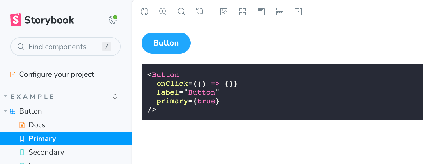
Screenshot
Demo
Installation
npm i -D storybook-react-live-decorator
Usage
// Component.stories.js

import { ReactLiveDecorator } from 'storybook-react-live-decorator';

const code = `() => (
  <Wrapper>
    <Button type="primary" size="large">
      Default
    </Button>
  </Wrapper>
)`;

export const LiveEdit = {
    decorators: [ReactLiveDecorator({ code, scope: { Button, Wrapper } })]
};
Props of ReactLiveDecorator
All props accepted by <LiveProvider /> and:
| Name | PropType | Description |
|---|---|---|
| code | PropTypes.string | Code string |
| scope | PropTypes.object | scope object |
| theme | PropTypes.object | A prism-react-renderer existing theme or theme object. See more here |
| fontFamily | PropTypes.string | css font-family to use in the edirot default monospace |
| debug | PropTypes.bool | Logs whatever goes through decorator into console.log |
Extend globally via .storybook/preview.js
Add property reactLive to parameters object. Accepts: scope and theme
const preview = {
    parameters: {
        reactLive: {
            theme: themes.dracula, // import from `prism-react-renderer`
            scope: {Button, Wrapper},
            debug: false,
            fontFamily: 'monospace'
        }
    }
};

export default preview;
:)
