How we migrated 541 components from Styled Components to Emotion with zero bugs
A case study of how we dogfooded our visual testing tool to streamline a CSS refactor

Refactoring CSS is one of the most challenging tasks as a frontend developer. You need to improve the code without altering the look and feel of the UI.
But it's tricky to catch visual changes as you refactor an entire production codebase across multiple repos. Moreover, dealing with global styles, overrides, pseudo-states and browser quirks makes the job extra complicated.
Last quarter we migrated from Styled Components to Emotion across all our codebases. That meant refactoring 541 components across five codebases and not breaking any UI along the way. We couldn't have done it without automated tests. Read on to learn about the migration and our test setup.
Wait, but why?
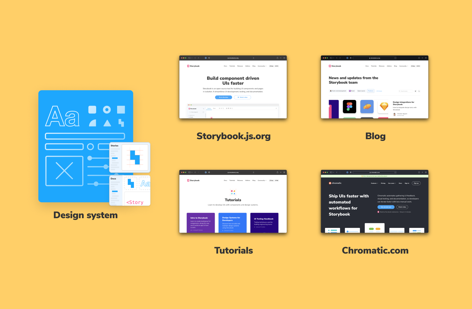
Recently, our team was at a crossroads. For historical reasons, Storybook and Chromatic were built with different styling libraries. Storybook used Emotion. Chromatic, which came later, used Styled Components, as did the design system and all subsequent sites.
Over the past year, the Storybook team launched many features that also introduced new UI patterns. Maintaining parity between two versions of the same components slowed us down and added more work, so it was time to invest in a unified styling strategy.


We considered porting Storybook to use Styled Components, but that would lead to an unnecessary upgrade cycle for users and open the door for dependency headaches. The team felt that Emotion offered better performance and features for our use case so we decided to refactor everything else to use Emotion.
541 components across five codebases needed to be updated! To lead the migration, we enlisted Mateusz Burzyński, one of the maintainers of Emotion.
CSS refactors lead to accidental bugs
CSS is contextual. The styling of a component changes based on the UI and the application state. Take, for example, this Cardinal component. It has multiple variations, which all look slightly different.

As you refactor the CSS, you have to ensure that each variant appears the same as before. But simulating these states for 500+ components is hard to eyeball and extremely tedious.
The cascading nature of CSS means that minor changes in one file can have unintended consequences without warnings or feedback. Components often override the styles for their child components and global styling has unpredictable impacts on UI elements.
Manually checking every components' visual appearance during the refactor would take more time than implementing the actual changes. We needed a quick and automatic mechanism to compare the appearance of all components to their previous versions.
Visual tests to the rescue!
For logic-based code, developers rely on unit tests. If all tests pass, you can assume that the rewritten function works the same as before. Chromatic's visual testing service offers the same security for UI components. It automatically checks the UI for visible changes using the cloud.
As maintainers of Storybook, we practice what we preach. We use a component-driven approach to building interfaces and capture component states as stories—for all levels of components, atoms to pages. We have over 2,300 stories!

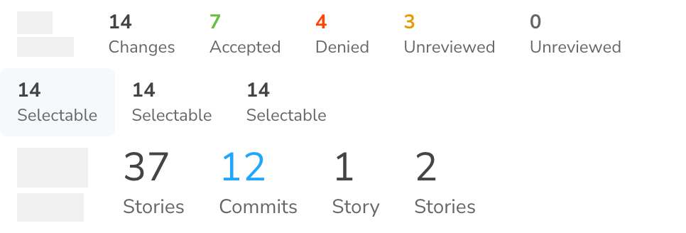
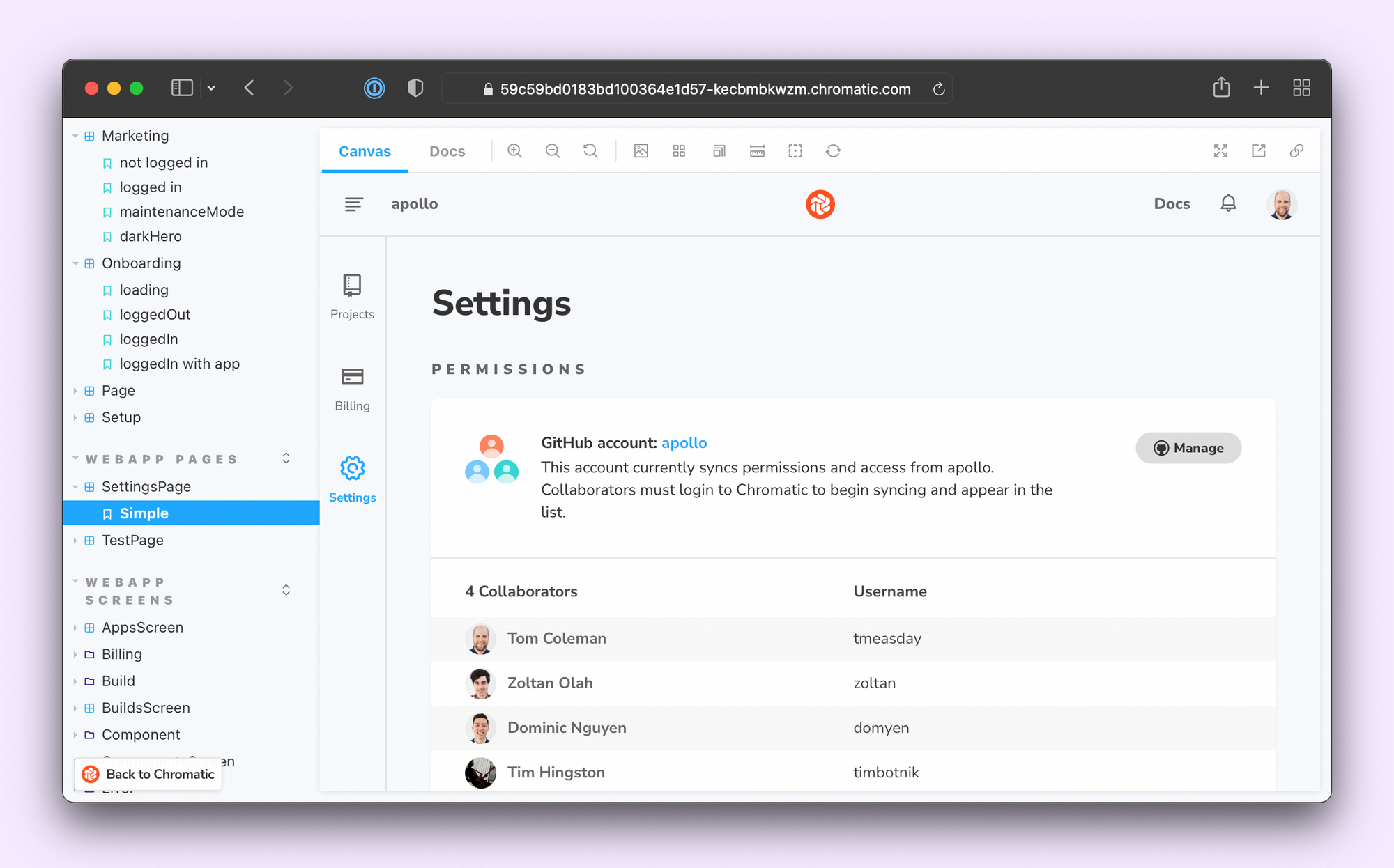
Chromatic captures an image snapshot of every story—as it appears in the browser. Every commit, a new snapshot is captured and compared to the previous one to identify visual differences. You then review the visual changes to decide if they’re intentional updates or accidental bugs.

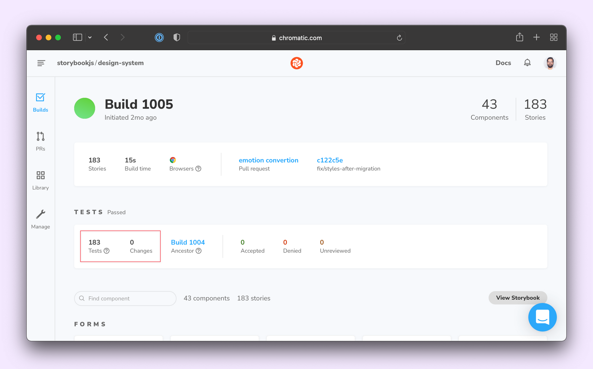
Our strategy for swapping out Styled Components for Emotion was straightforward: switch component styles then run visual tests. There should be zero changes found.
From Styled Components to Emotion
With a visual testing strategy in place, let's talk about the actual code changes. The good news was that Emotion and Styled Components have converged on a common API. That means most changes were just swapping out the import statement:
-import styled from 'styled-components';
+import styled from '@emotion/styled';

const MyComponent = styled.div`...`;
To keep all the codebases in sync, we don’t use Emotion directly and instead export it via the @storybook/theming package:
import { css, Global } from '@storybook/theming';That said, there are some key differences. For starters, Emotion doesn't support attrs, which is useful when you want every instance of a component to have that prop. For example:
const Arrow = styled(Icon).attrs({ icon: 'arrowdown' })``;The workaround is to either use defaultProps or add in a wrapper component, like so:
const Arrow = styled((props: Omit<ComponentProps<typeof Icon>, 'icon'>) => (
 <Icon {...props} icon="arrowdown" />
))``;
The SSR setup is also quite different for the two libraries. Emotion offers zero-config SSR, which worked for most of our sites. However, this default setup doesn't work correctly with components that use nth-child or similar selectors. We had to switch to the explicit manual SSR setup for those cases.
// gatsby-ssr.js
import React from 'react';
import { renderToString } from 'react-dom/server';
import { CacheProvider } from '@storybook/theming';
import createCache from '@emotion/cache';
import createEmotionServer from 'create-emotion-server';

const EMOTION_KEY = 'chr';

export const replaceRenderer = ({
 setHeadComponents,
 replaceBodyHTMLString,
 bodyComponent,
}) => {
 const cache = createCache({ key: EMOTION_KEY });
 cache.compat = true;

 const { extractCritical } = createEmotionServer(cache);
 const { ids, css, html } = extractCritical(
   renderToString(<CacheProvider value={cache}>{bodyComponent}</CacheProvider>)
 );

 setHeadComponents([
   <style
     {...{
       [`data-emotion-${EMOTION_KEY}`]: ids.join(' '),
       dangerouslySetInnerHTML: { __html: css },
     }}
   />,
 ]);

 replaceBodyHTMLString(html);
};
Wrapping up
The visual testing strategy helped Mateusz and the team spot bugs sooner without having to check every story manually. Most of the bugs were caused by same-specificity rules, which were fixed using the && override. Once all tests passed, we could merge with confidence!

"I can not imagine working on such a migration without a visual regression test suite. Chromatic made it super easy to review changes and to ensure that the quality of the product stays high as ever."
— Mateusz Burzyński
How do you refactor 541 components without breaking any UI?
— Storybook (@storybookjs) January 13, 2022
Visual testing! 📸
Check out our case study on migrating 5 codebases from Styled Components to Emotion with easehttps://t.co/HDwRzOUTU7 pic.twitter.com/pLVrjl7r06