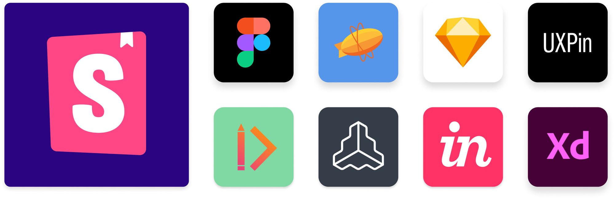
Design integrations for Storybook
How to integrate design tools with Storybook

What if the design to development workflow was seamless? If you could sync design specs to the production UI implementation (and vice versa), you’d build UIs faster with greater certainty.
Questions like “does this look right?” and “where’s the design for this?” would go away. You wouldn’t have to jump between apps to cross reference visual specs, rendered DOM, and usability guidelines.
This article showcases design integrations for Storybook that speed up implementation, ensure pixel perfection, and unlock new design system workflows for your team.
- 🖼 Design handoff
- 📓 Design system docs
- 📲 Prototype with code
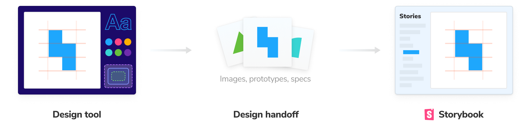
Design handoff
Design handoff is the process of “handing” images, specifications, and prototypes to developers for implementation. In practice, the process is lossy. You end up jumping between design tools and code editors while also juggling spec versions and hitting technical blockers.
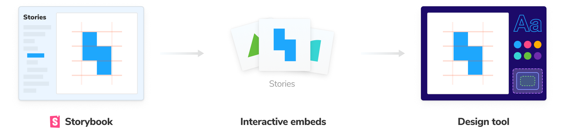
Handoff addons embed design artifacts alongside stories. That speeds up development by allowing you to cross-reference designs in your development tool. What’s more, that connection will persist for the rest of the team to see.
Figma
Figma is a popular collaborative UI design tool used by teams at Slack, Twitter, and Dropbox. It allows multiple people to work on the same design simultaneously in the browser.
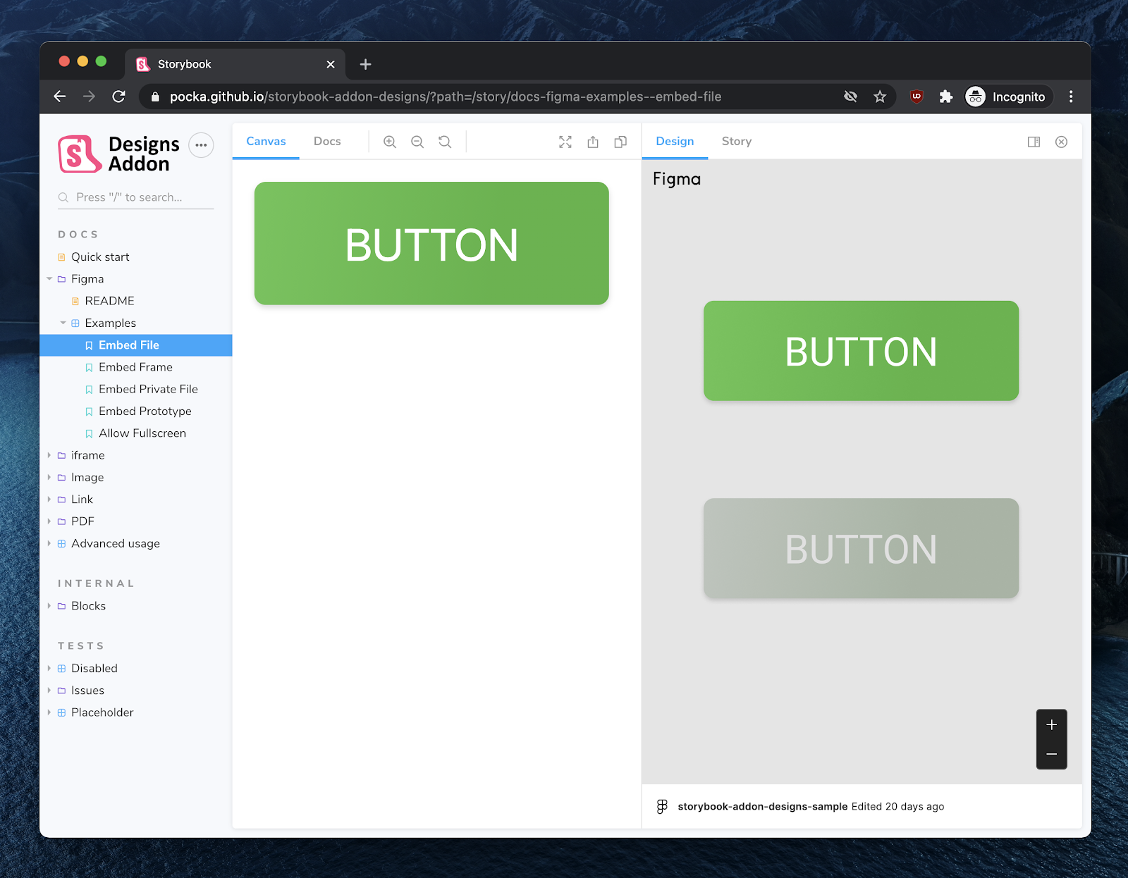
The Figma addon shows the component design next to the implementation and provides handy inspection tools for spacing, text, and CSS. Design changes will automatically be reflected in Storybook.

Zeplin
Zeplin is a design handoff tool that generates styleguides from Sketch, Figma, and Adobe XD. It auto extracts metadata like assets, colors, and measurements from design files to make it easier for developers to follow the design spec.
There are multiple paths to integrate Storybook and Zeplin. In Storybook, the Zeplin addon displays the design alongside the currently selected story and includes convenient tooling to overlay the static design atop the live component.
In Zeplin’s desktop app, embed a story next to a design to reference during handoff. When you connect a story to Zeplin it’ll automatically highlight and link all instances of the designed component to the live implementation in Storybook.
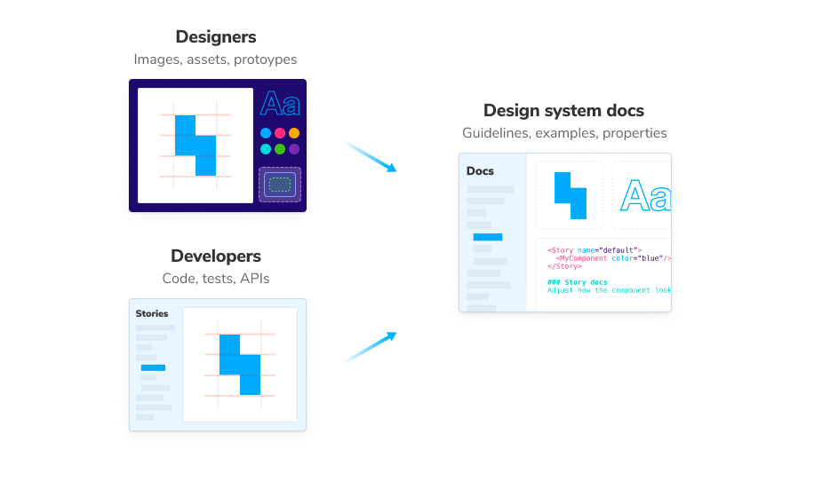
Design system documentation
A design system is only as good as it’s documentation. Earlier this year, we researched the Storybook community and found that design system documentation is fragmented. Every team’s skills are different so nothing is perfect for all situations.
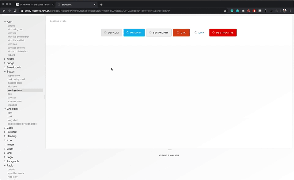
Luckily, Storybook is un-opinionated about how you teach people about your design system. Stories are a lightweight method of documenting component examples made for UI developers. It was designed to be embedded in design and documentation tools.

Zeroheight
Zeroheight is a collaborative design system manager. It gathers design, code, brand, and copywriting documentation in one place. Users can easily edit that documentation with a WYSIWYG editor. The Zeroheight integration embeds stories in Zeroheight to display alongside your Figma, Sketch, or Adobe XD designs.
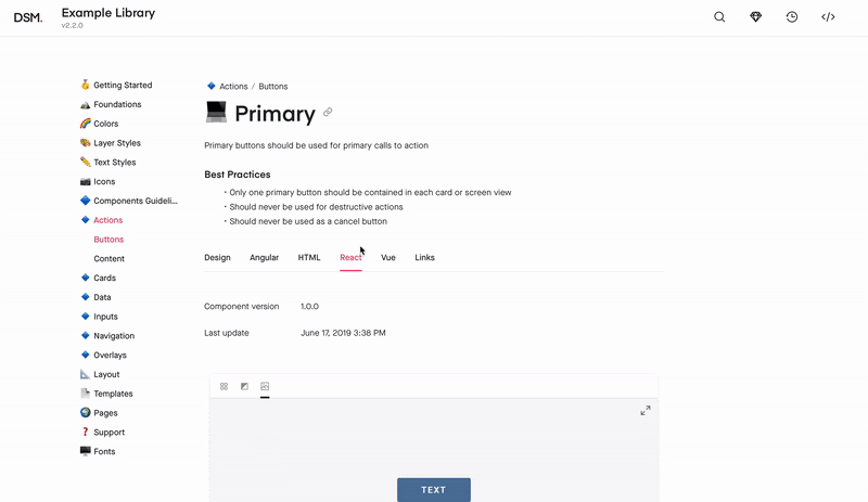
InVision Design System Manager
InVision DSM is a design system documentation tool. It helps design teams consolidate UX principles, user interface design, usage guidelines, tokens, and governance in a shared workspace.
DSM allows you to view Storybook components in the DSM app alongside the designs (which are imported from Sketch).
Frontify
Frontify is a brand management tool that co-locates design assets, stories, code samples, usage guidelines. As a single place for everything about your company’s brand, Frontify enables you to embed stories along with the rest of your brand assets.

oEmbed compatible: Notion, Medium, Wordpress, Ghost, and more
Stories are embeddable in any tool that supports the oEmbed standard. For example Notion, Medium, and Wordpress. All you need to do is publish your Storybook online to Chromatic, a secure CDN service made by the Storybook team.
Prototype with code
Storybook is the industry standard for component development, testing, and documentation. Thousands of companies already use it to catalog their production UI patterns. There’s a new breed of interactive design tools that use your existing stories as a high-fidelity source of truth to prototype user experiences.
UXPin
UXPin is an interactive design tool that uses production code to create design flows. Teams can ship faster because designers use the same building blocks as developers: components.
UXPin embeds stories into their visual editor so that your design team can prototype with production components.
Connect design & development
Developers and designers are converging on the UI component construct. A component encapsulates the visual, functional, and interactive aspects of a piece of UI. But each discipline uses different tools.
Storybook integrates with all your design tools to help your team surface edge cases, ensure consistency, and review work in progress. You end up shipping faster with less effort.
Build your own integration or addon
Storybook’s API allows you to endlessly extend and configure Storybook. Integrate via an addon to customize Storybook’s own UI and functionality. Or export stories into other tools via embedding.
If you’re interested in addons and integrations, our community is here to support you. Find us in Discord #addons channel. Here are some of the top resources:
- 📦 Addon Kit is a starter template that gives you boilerplate and sample code to jumpstart your addon.
- 📖 Addon documentation breaks down everything you need to write an addon. It covers the API, project setup, and use cases.
- 🗺 “Create an addon” provides a step-by-step instructions on building an addon.
Integrate design and development to build UIs faster and with less work.
— Storybook (@storybookjs) January 5, 2022
This week on the Storybook blog, we showcase design integrations that:
🏎️ speed up implementation
🧐 ensure pixel perfection
🌈 unlock new design system workflowshttps://t.co/yxaBW52Z0v pic.twitter.com/5WdXDqGFvu